< swipe >
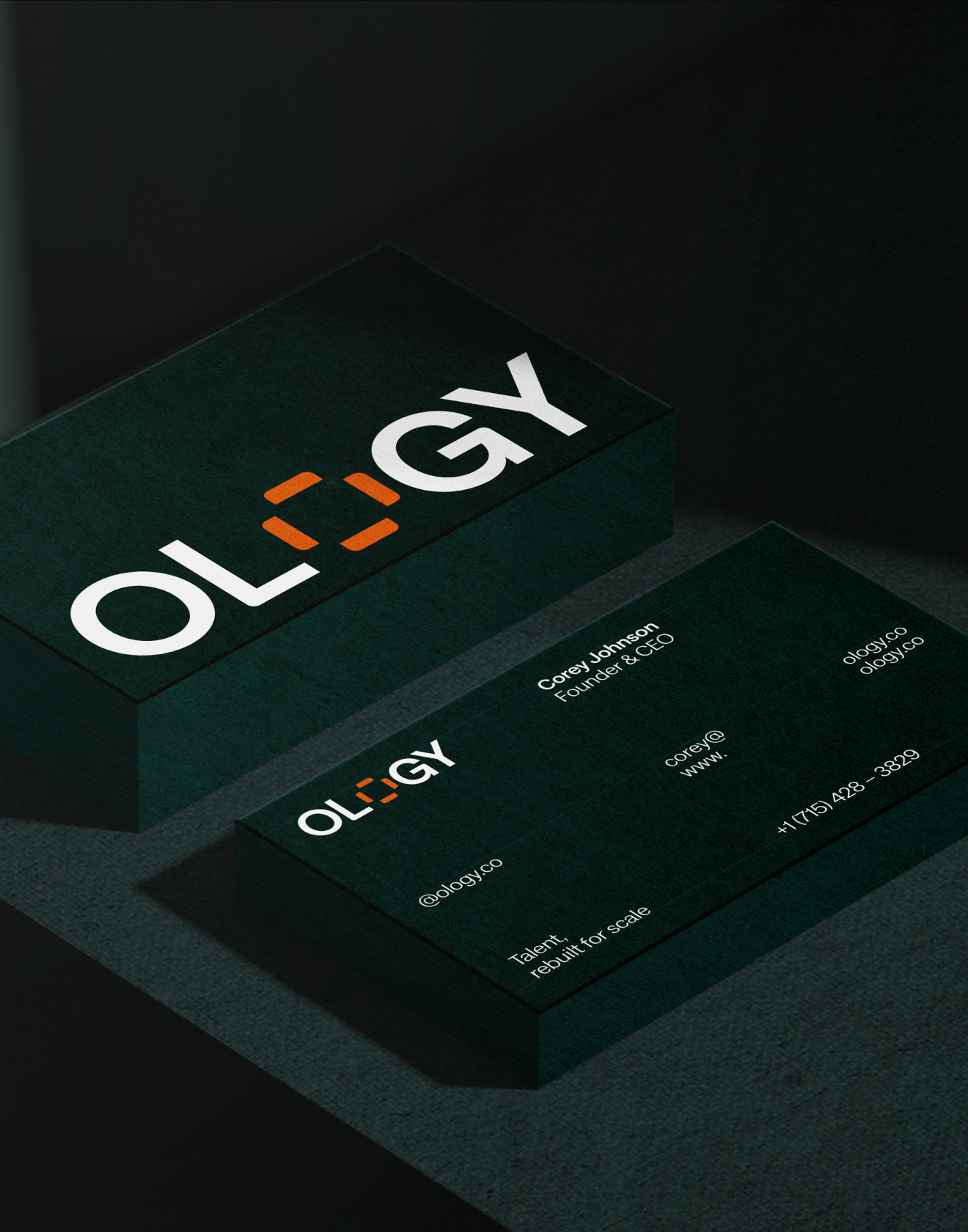
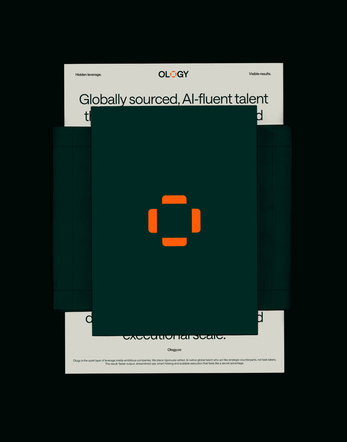

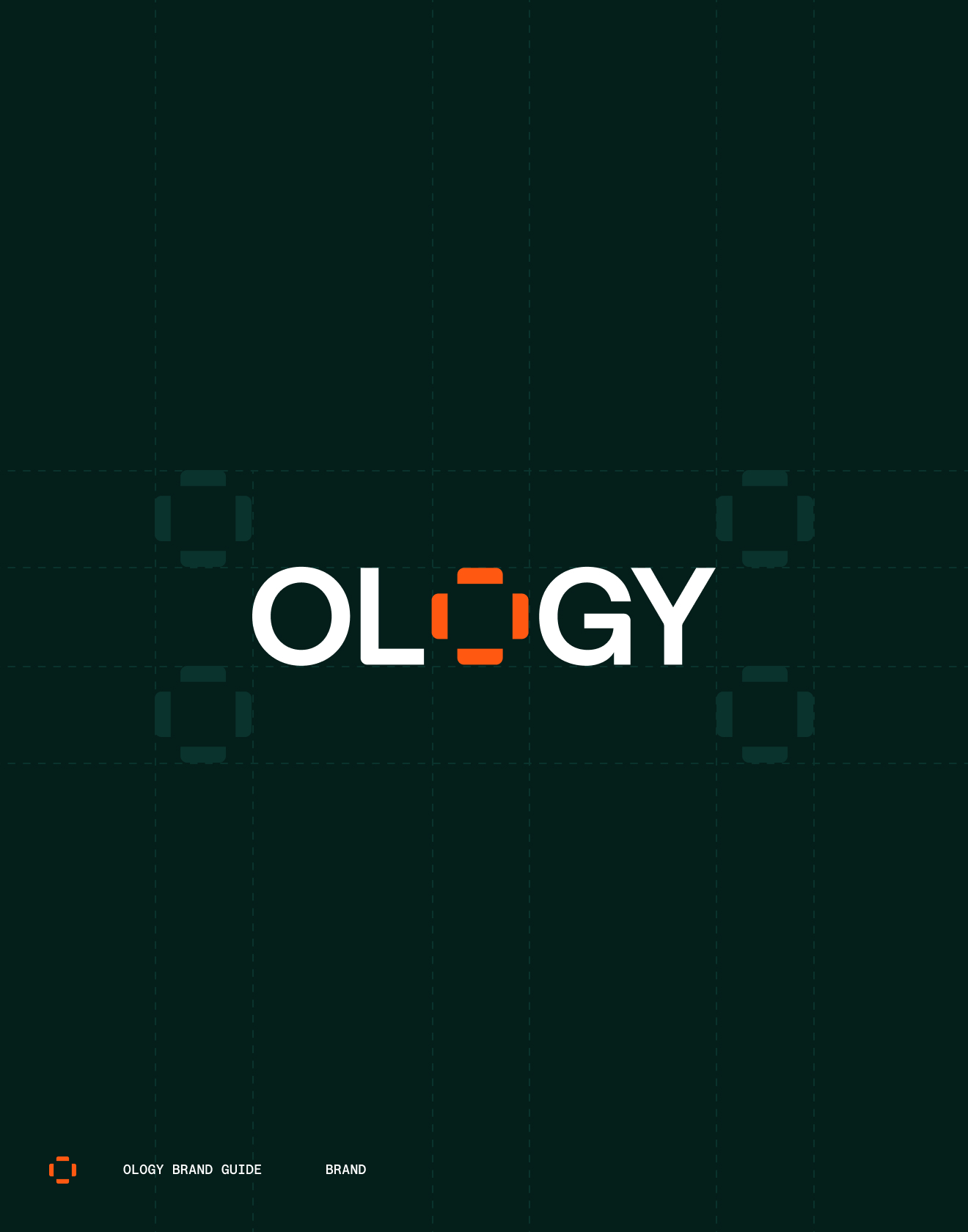

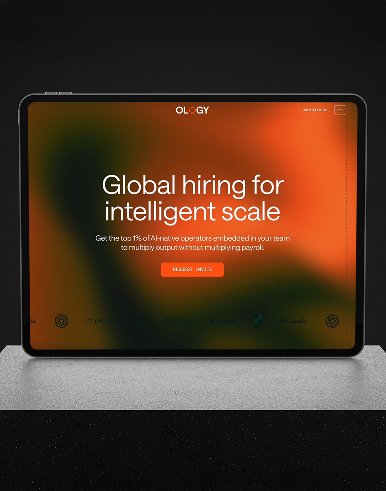
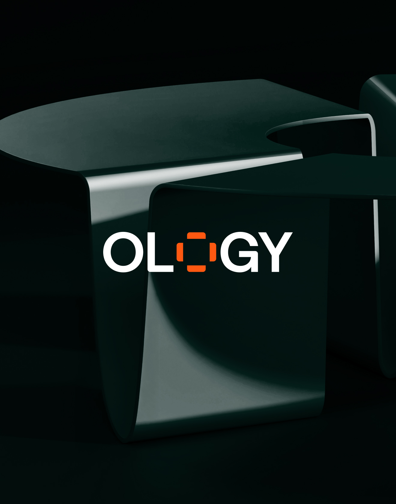
Ology
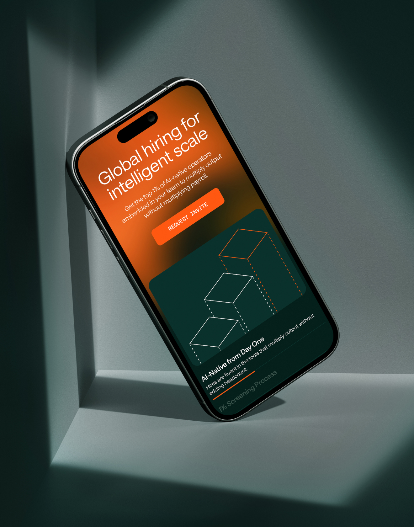
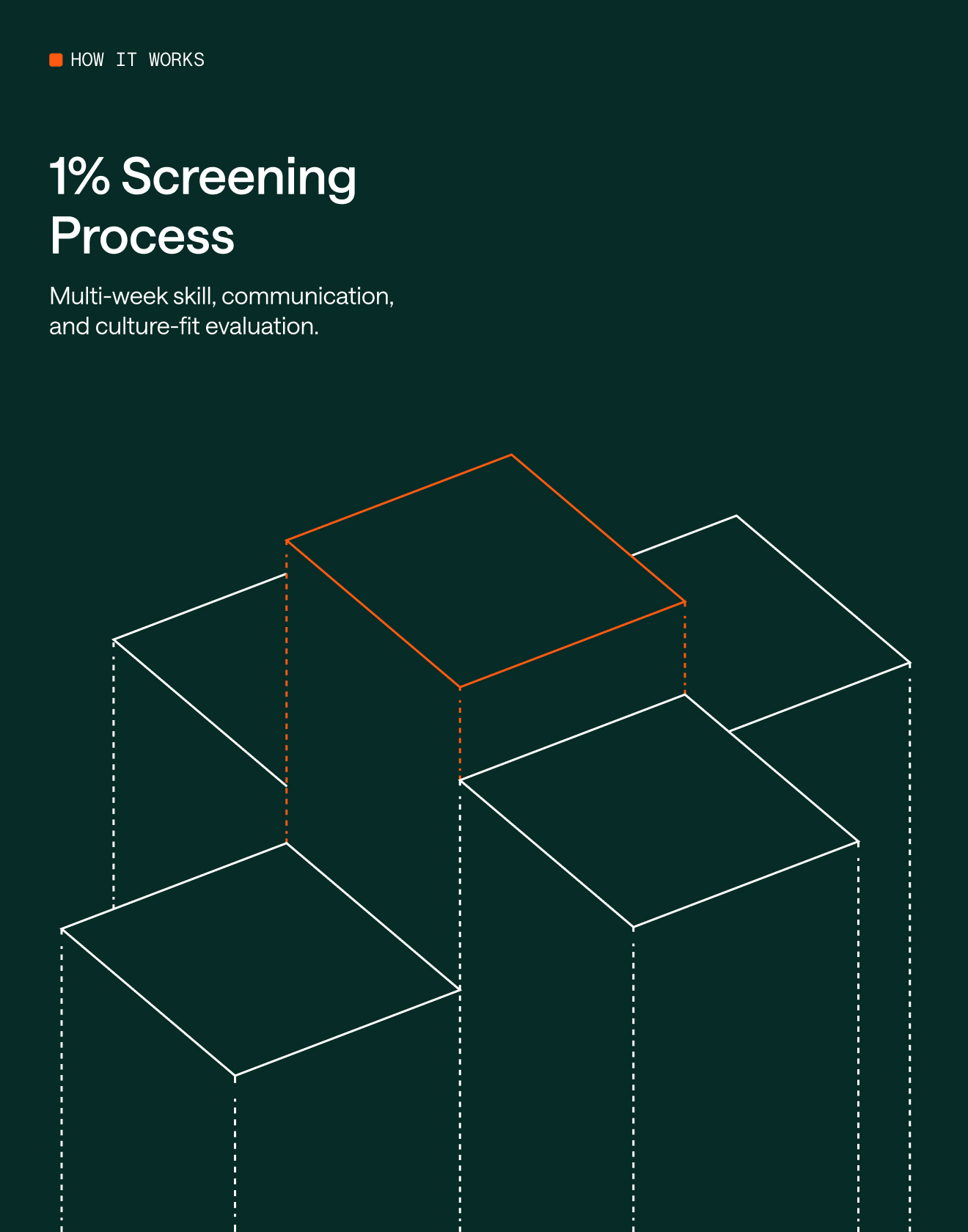
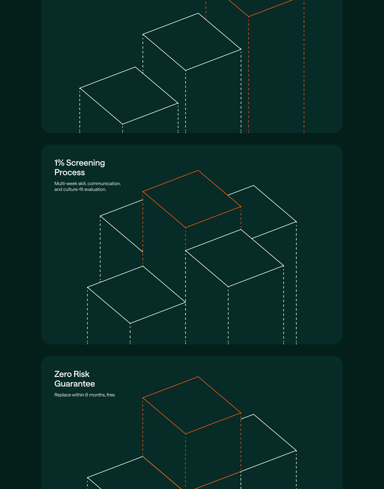
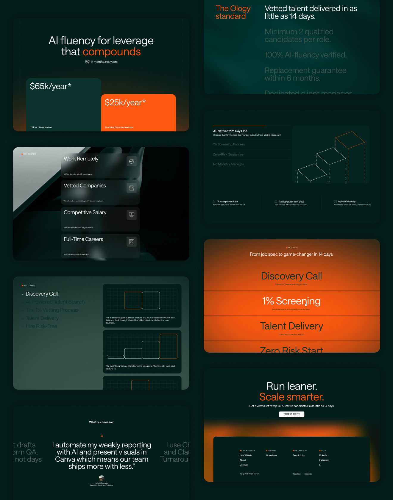
A flexible identity system and web platform that reinforces the core idea of hidden leverage
Ology helps companies gain a hidden leverage in how they scale working with AI-fluent, global staffing. I developed a visual identity and system that channels structure, adaptability, and quiet confidence. A conceptual logo, typography-driven layouts, geometric graphics, and a palette of deep greens and sharp orange accents form the backbone of a flexible brand language. Blurred textures and precise line-work create a sense of depth and intrigue revealing a brand that’s both intelligent and human, built for teams that grow with intention.
Read more
< swipe >
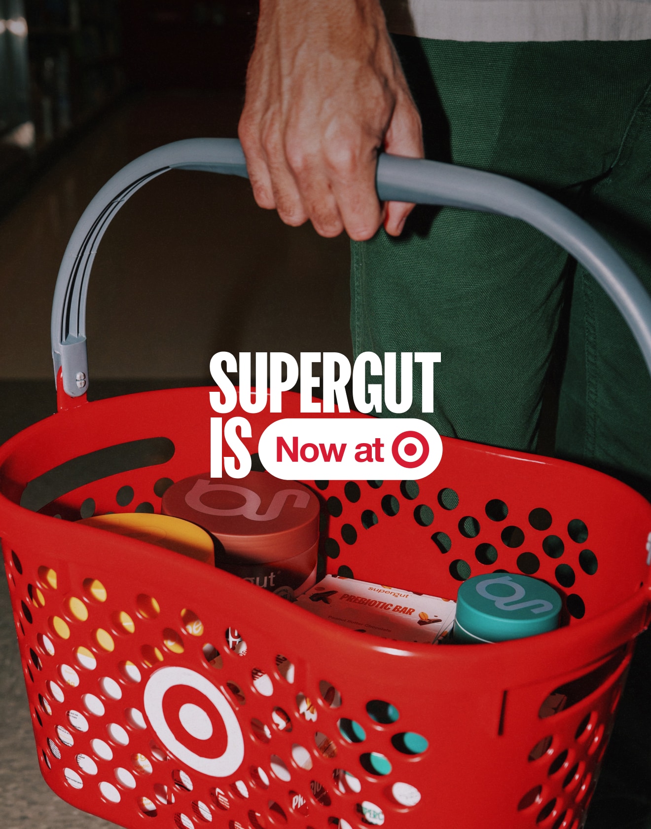
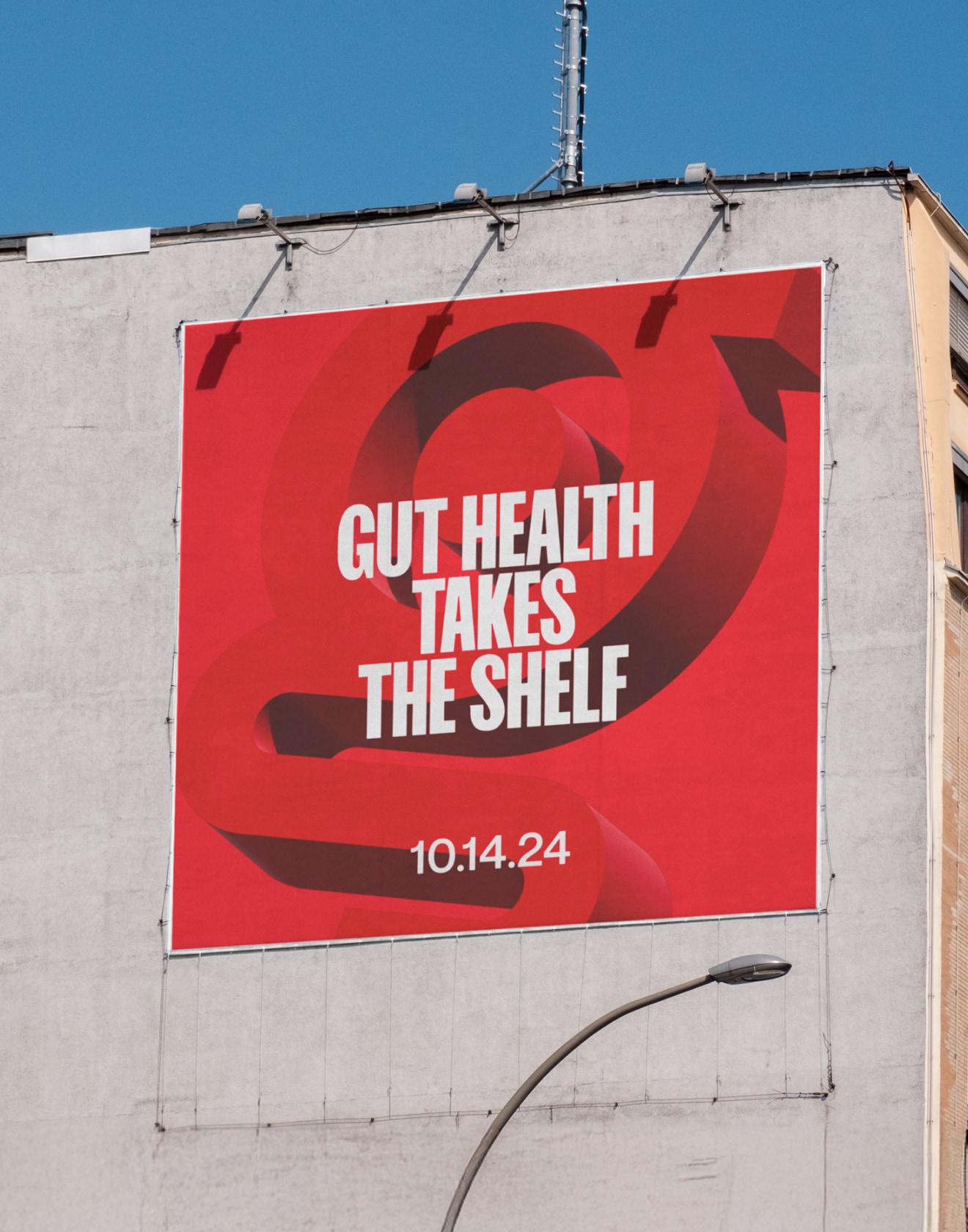

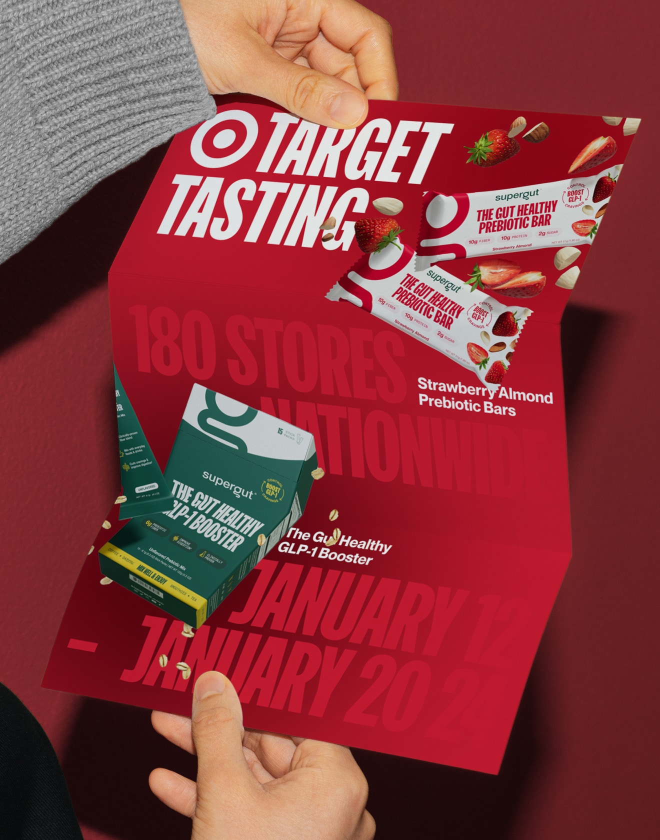

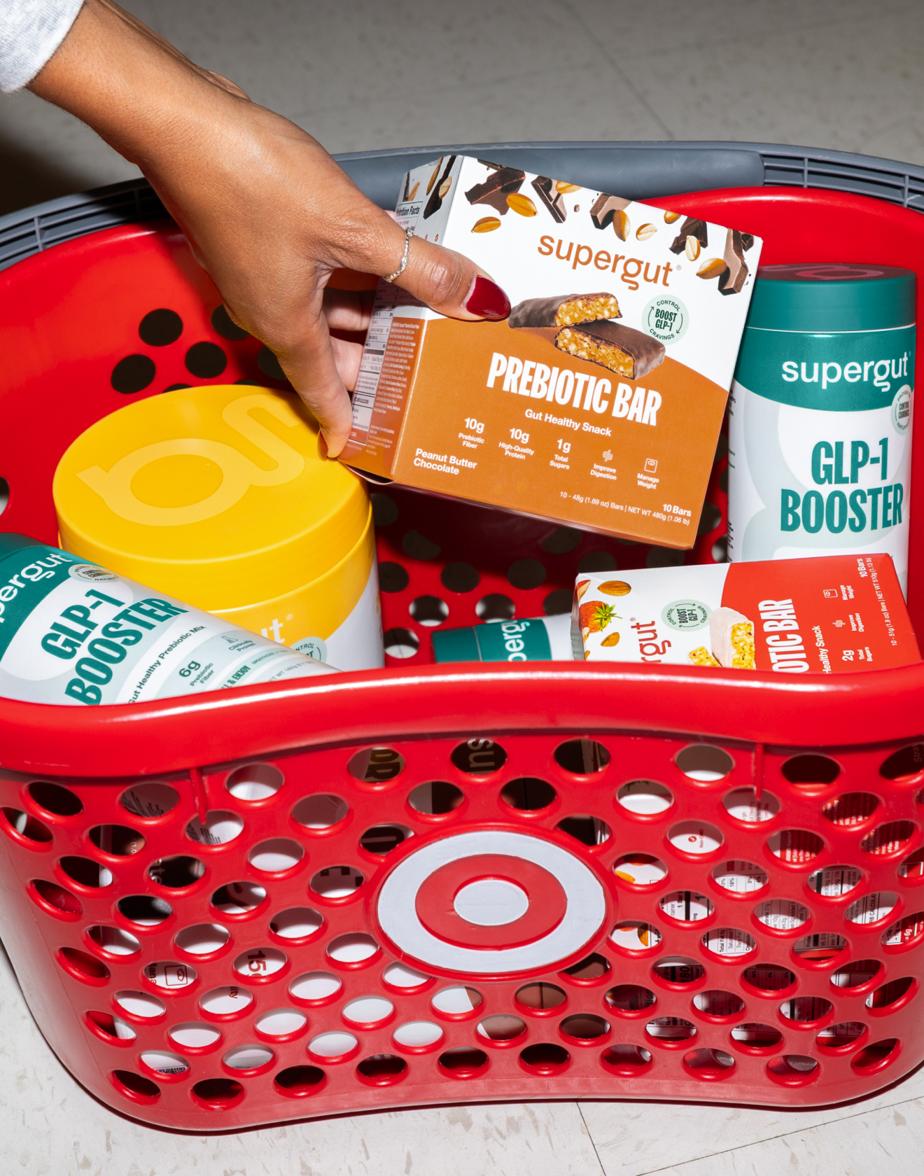
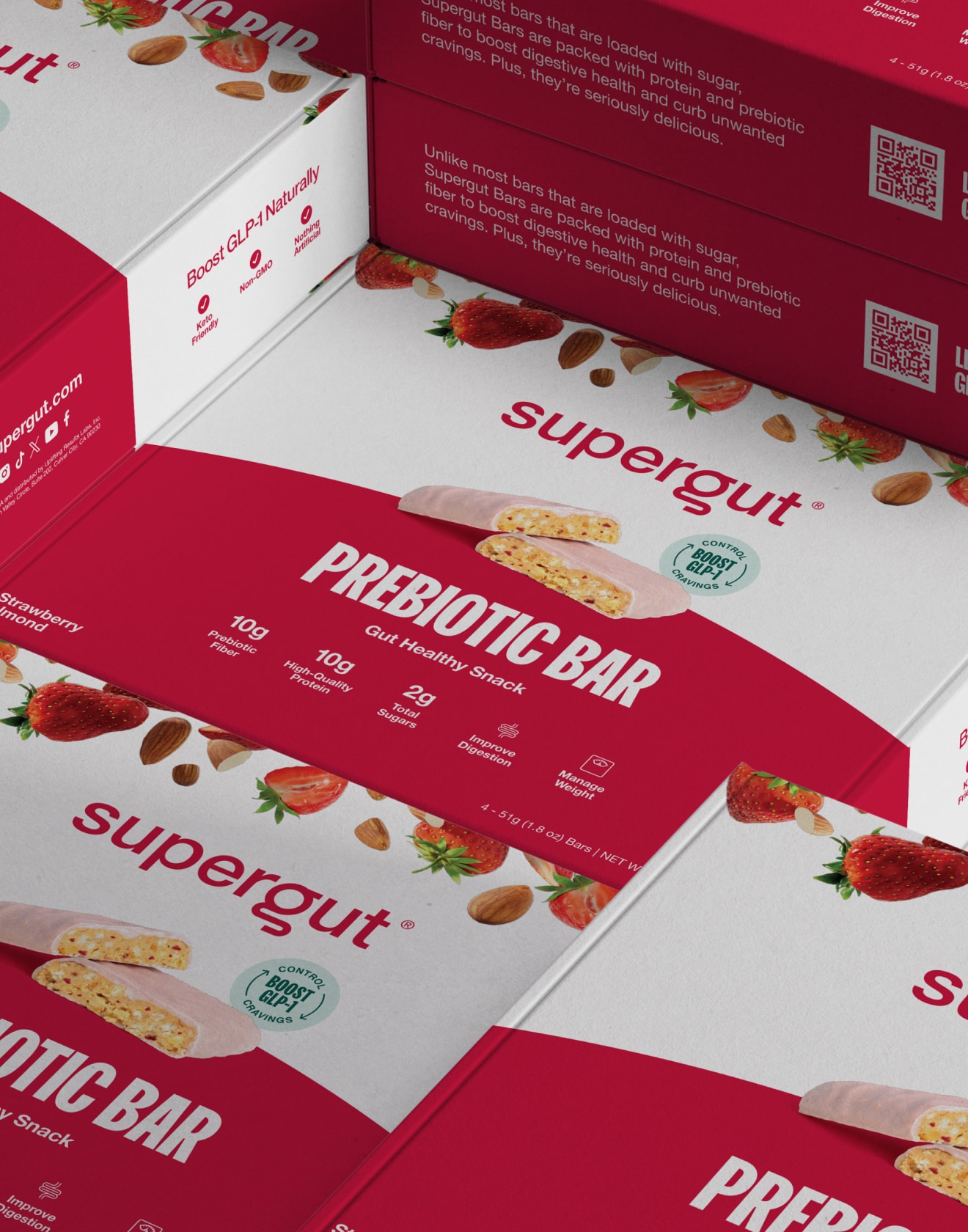
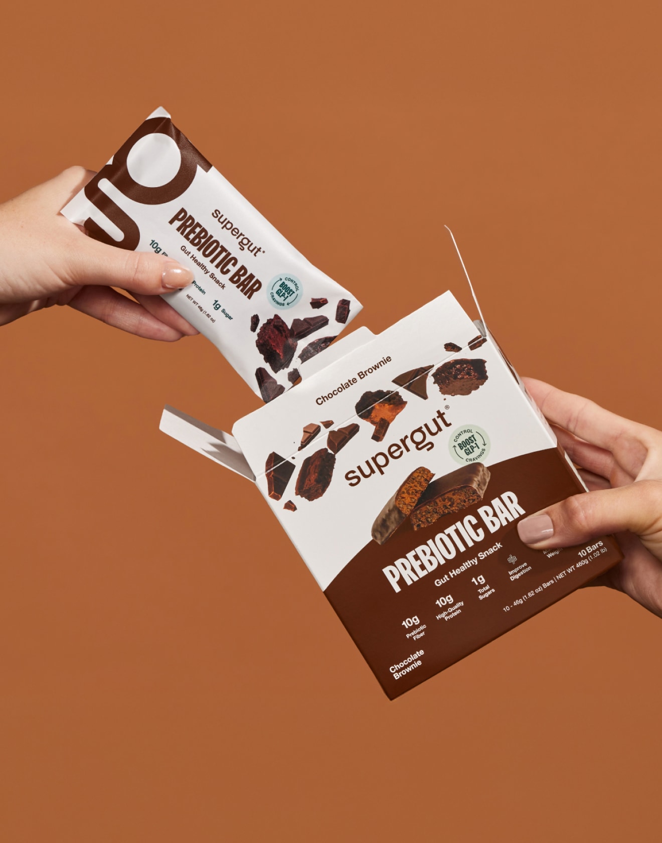
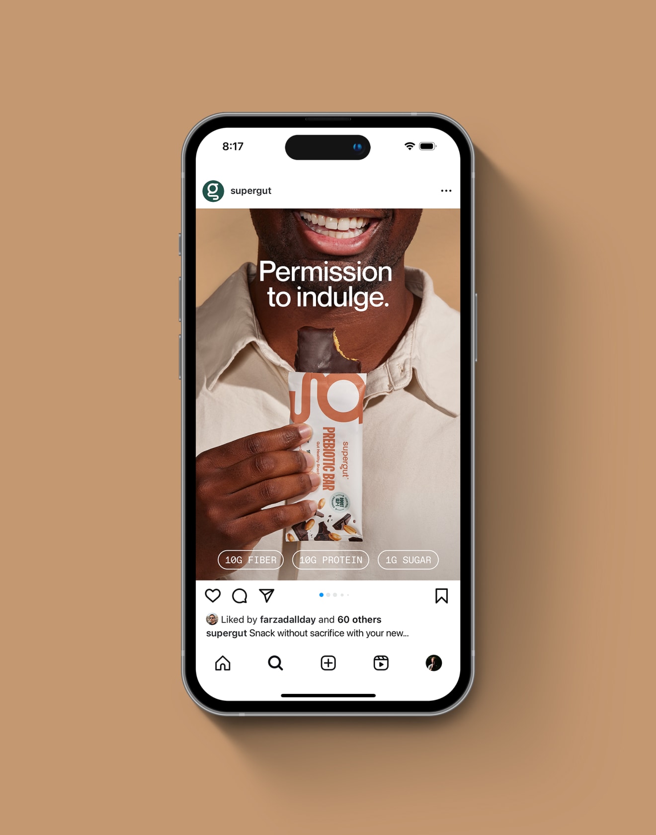


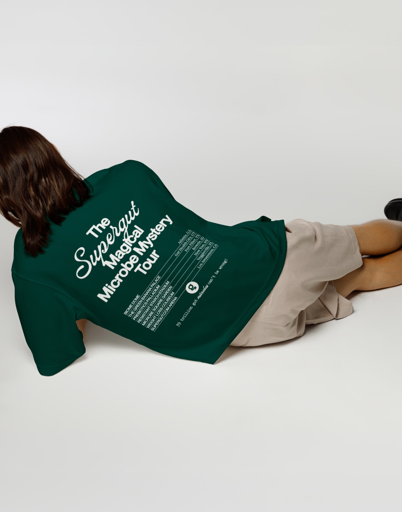
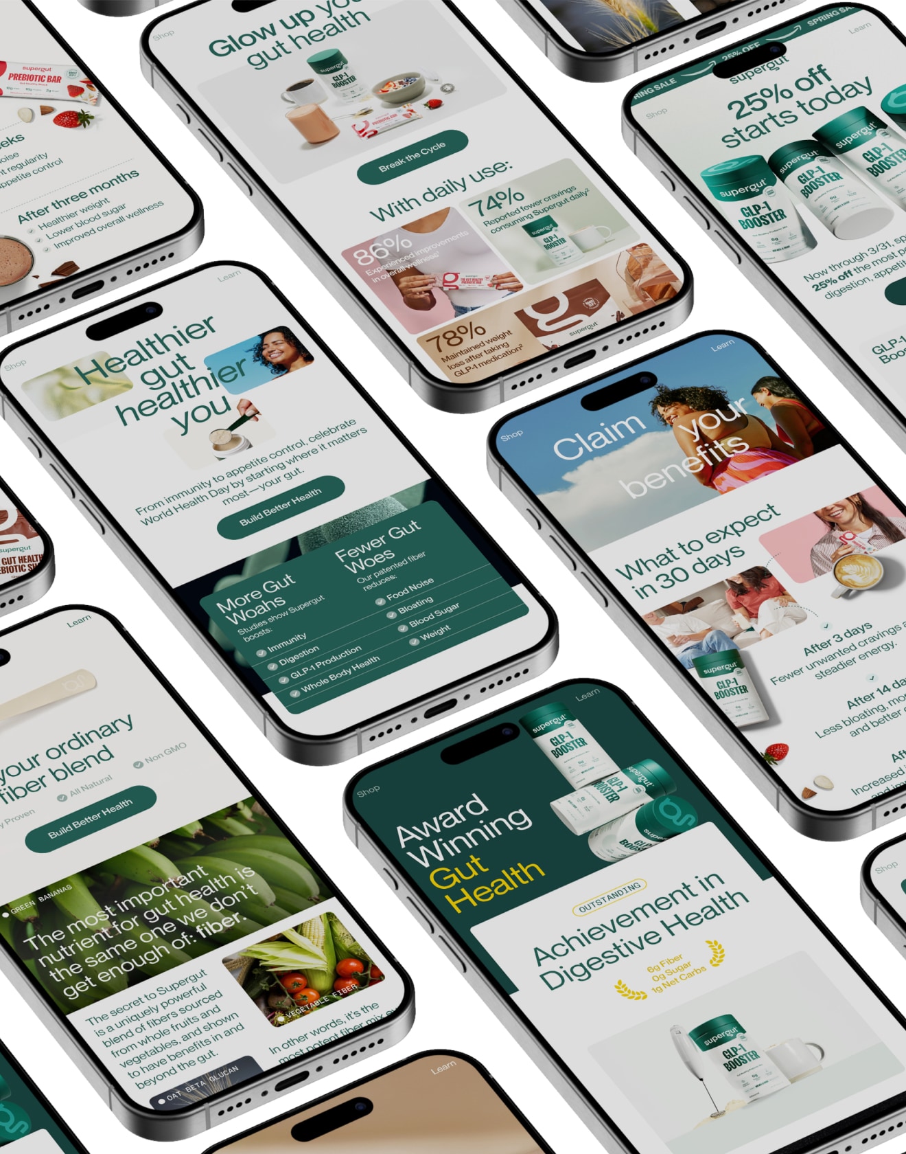
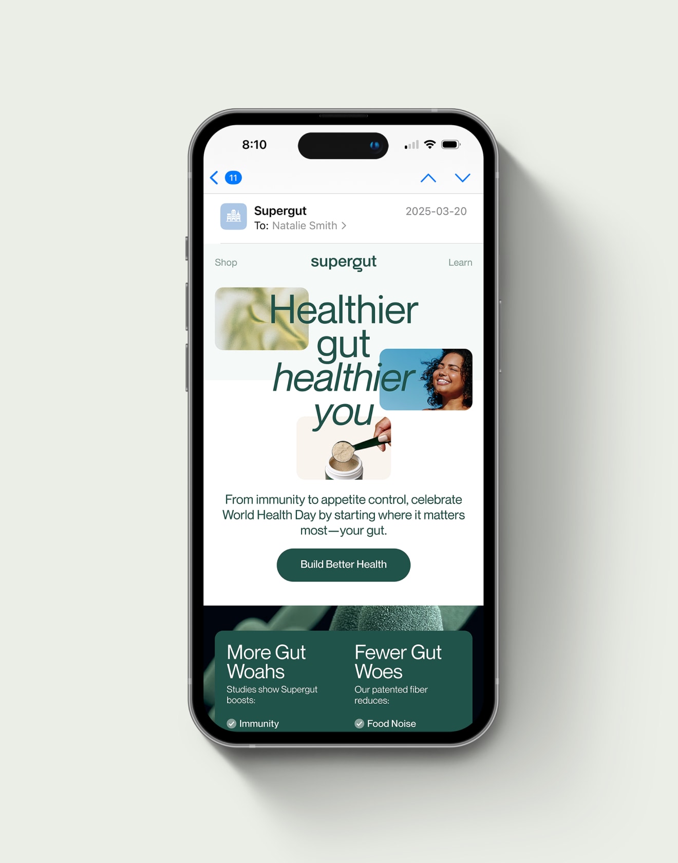
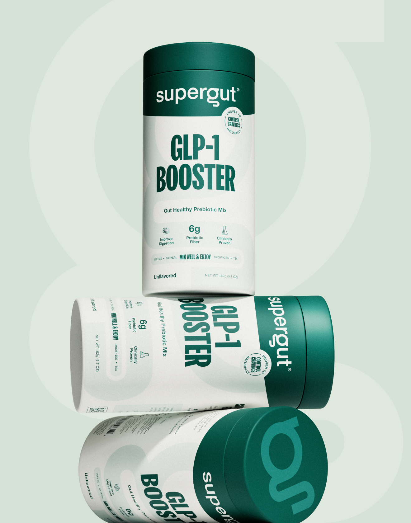
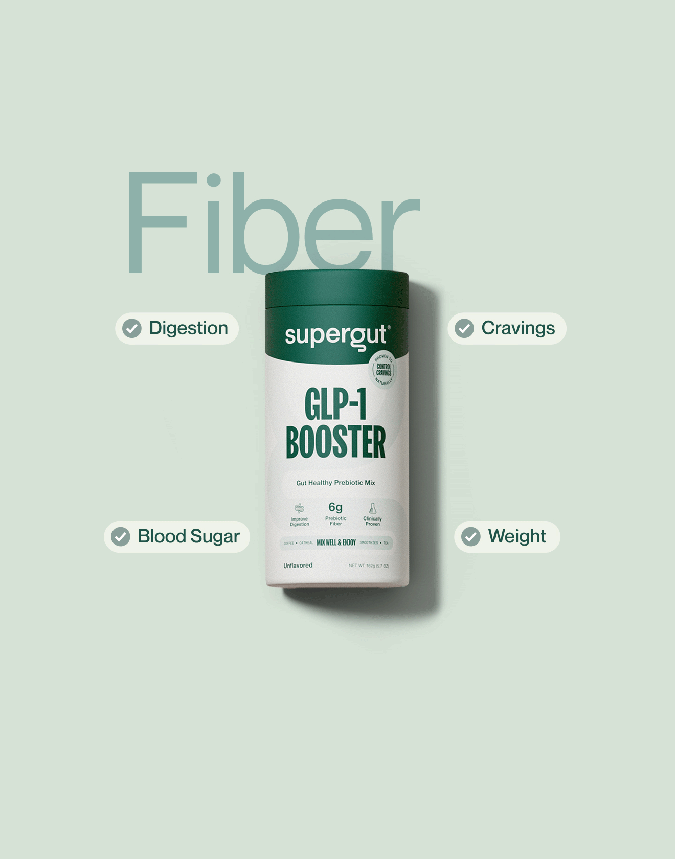
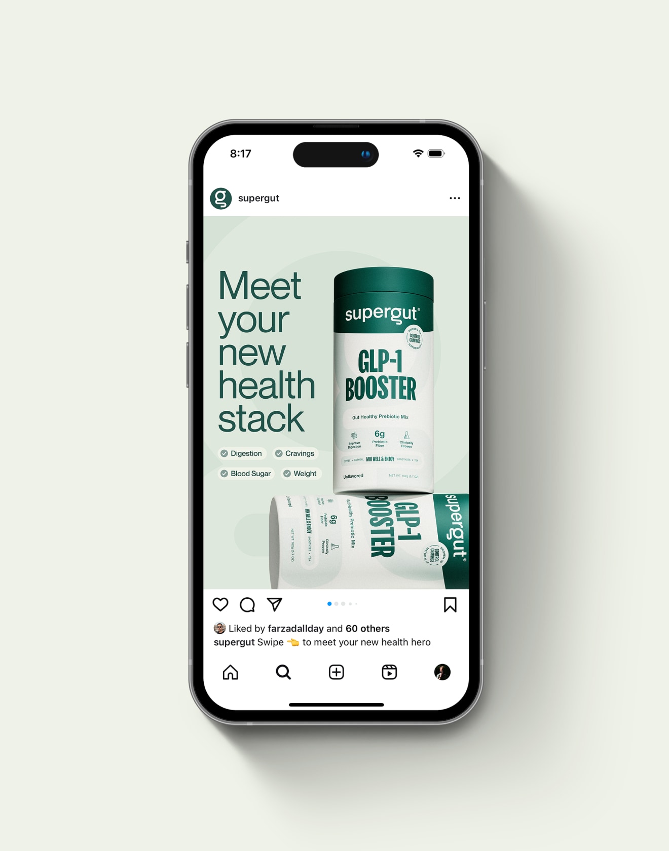
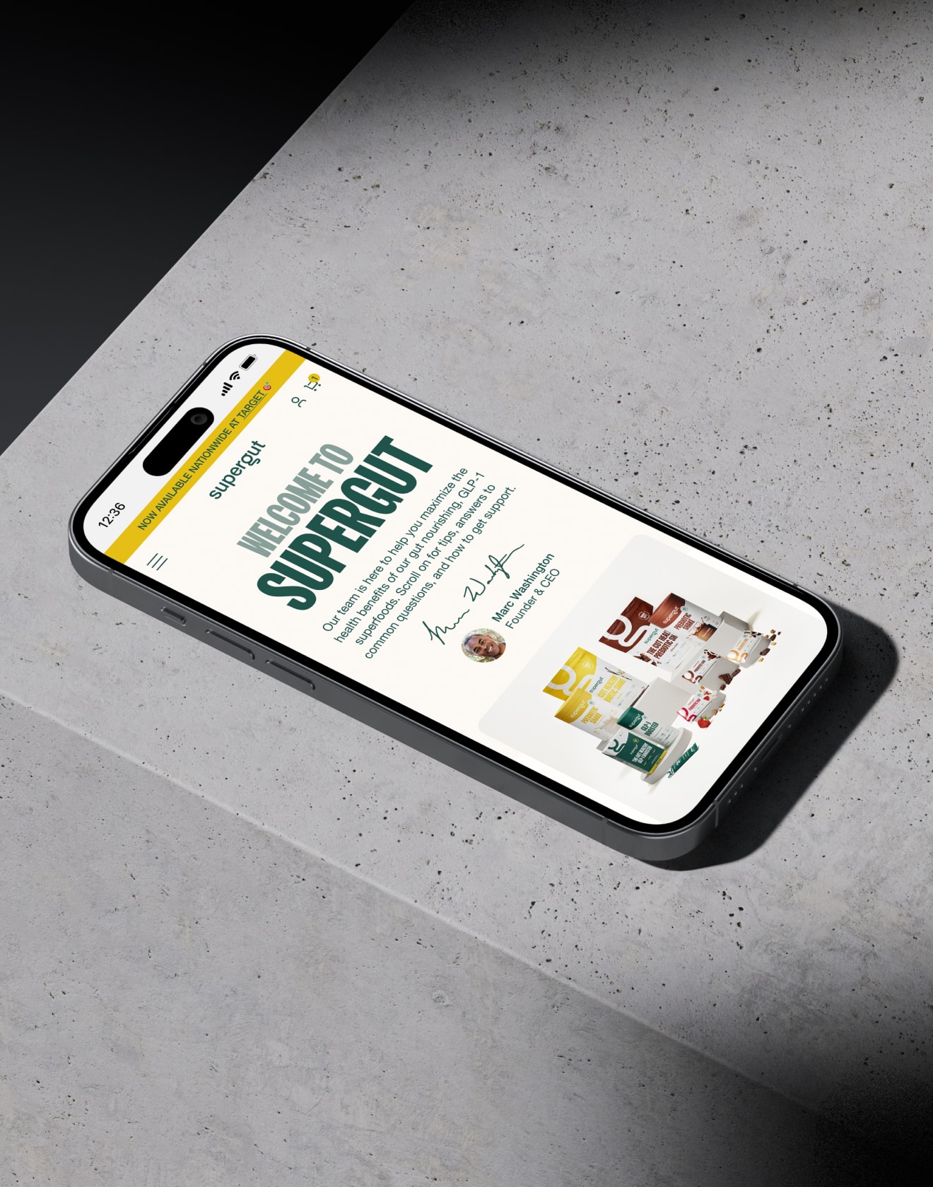
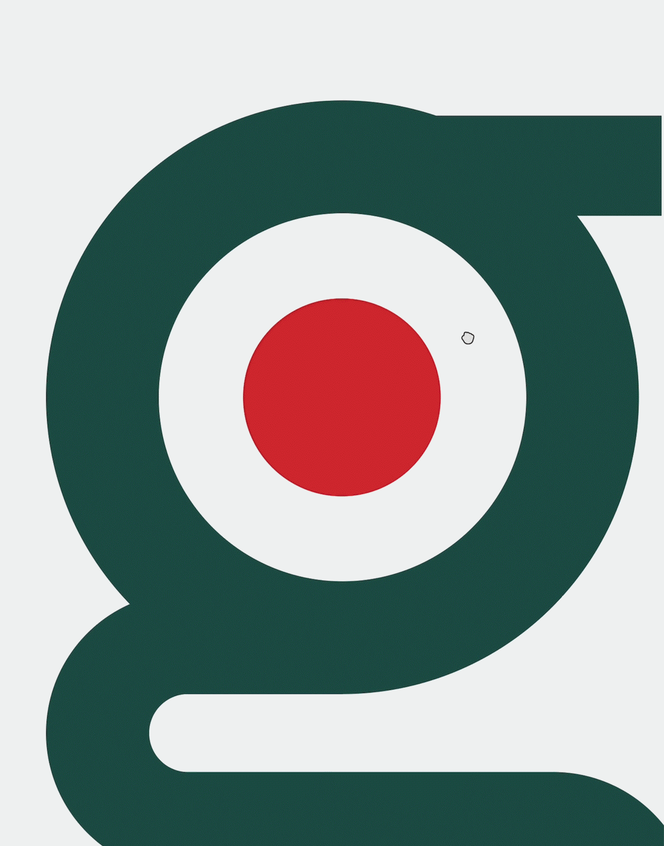
Supergut
Transforming a prebiotic powerhouse for its nationwide Target debut.
Supergut’s mission is simple: help people get the fiber their bodies are missing. But turning that mission into a brand that belongs on Target shelves required more than a great product—it called for a complete design evolution. From in-store launches and retail displays to full email lifecycles and packaging refreshes, I helped shape Supergut’s visual identity into something both scientifically credible and visually impactful.
Read more
< swipe >
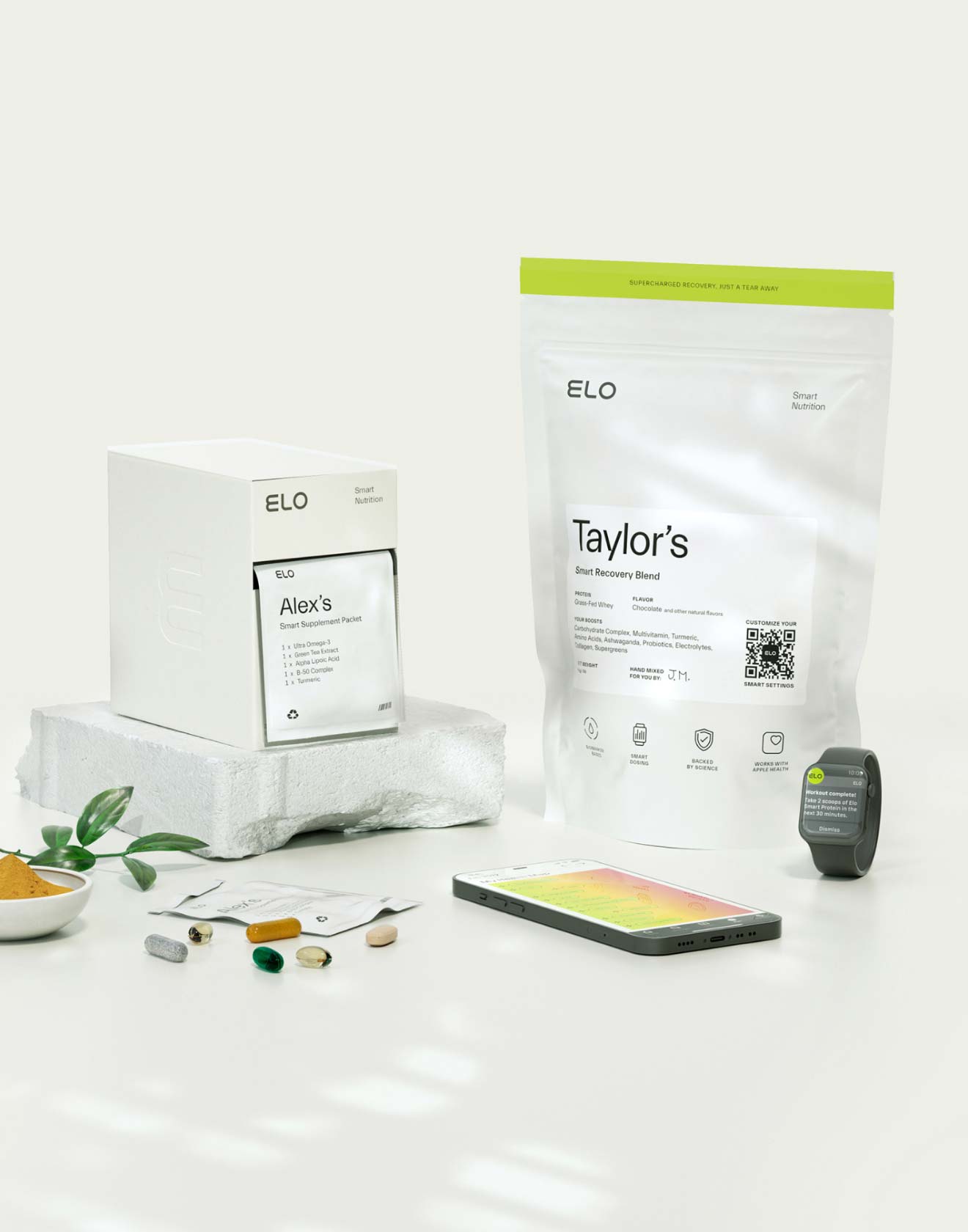


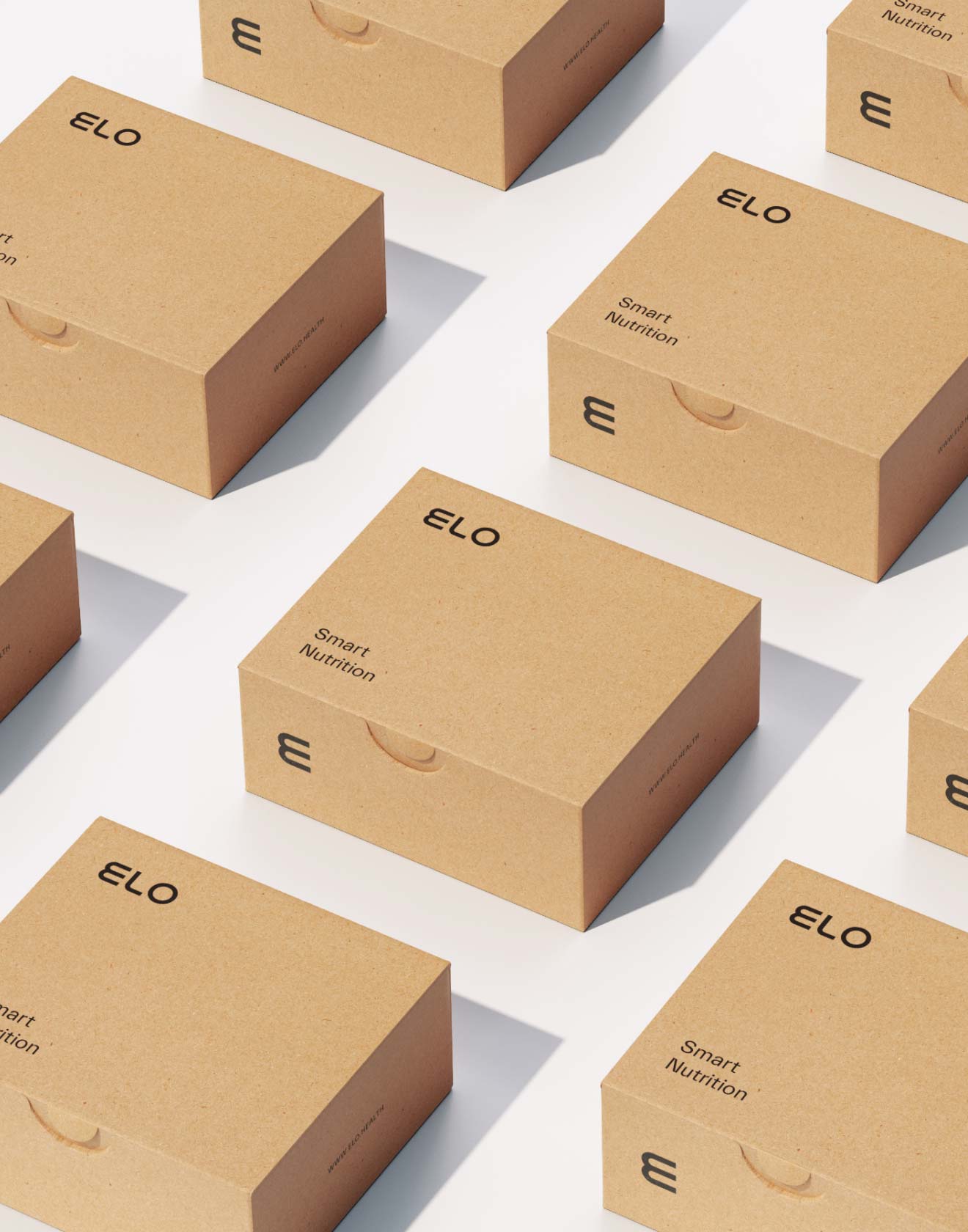

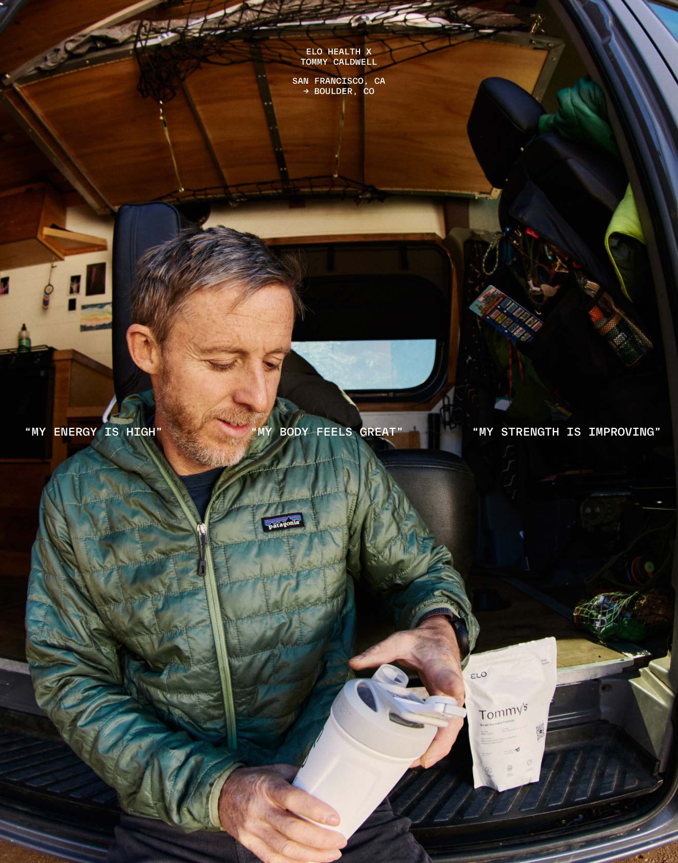
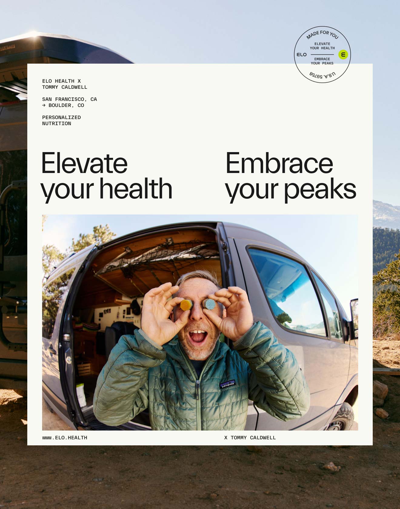

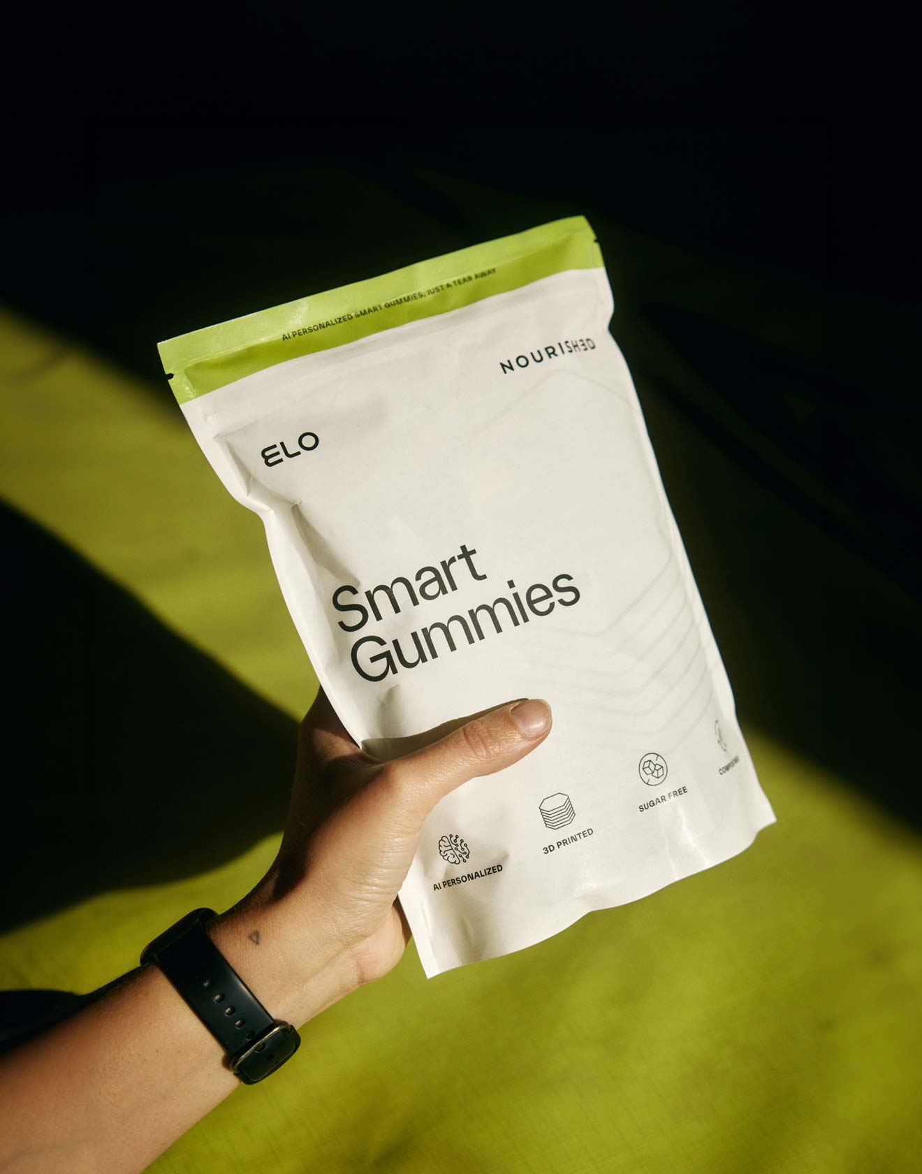
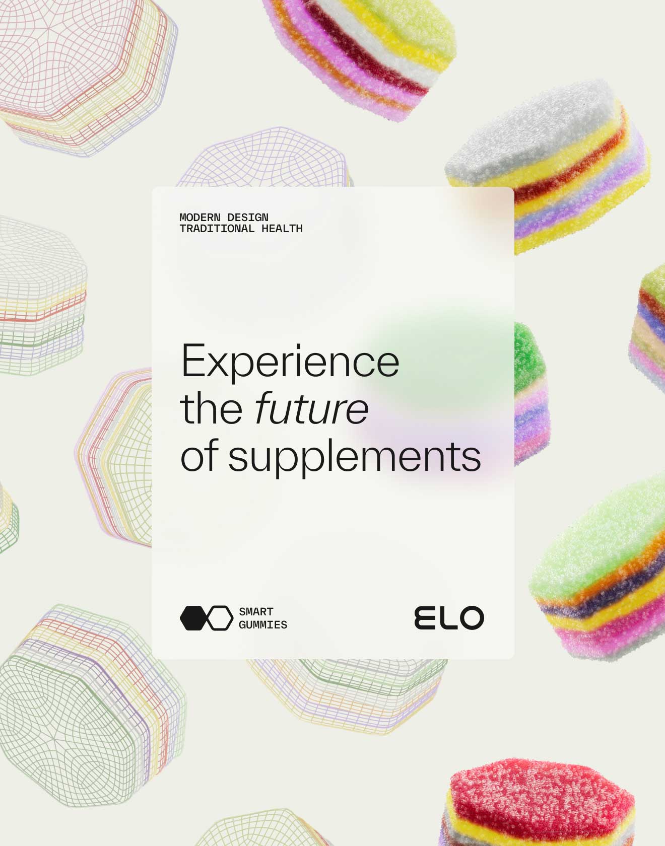


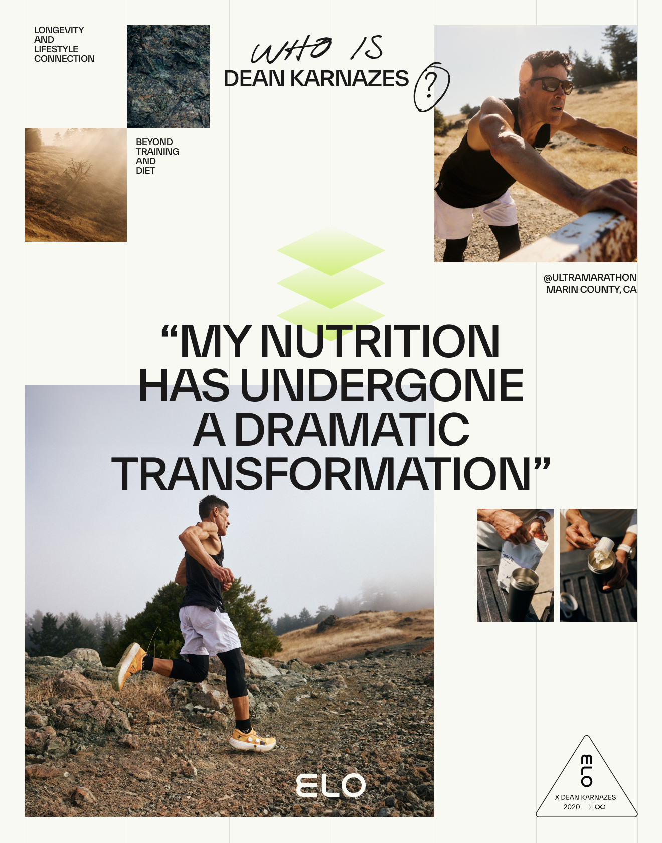
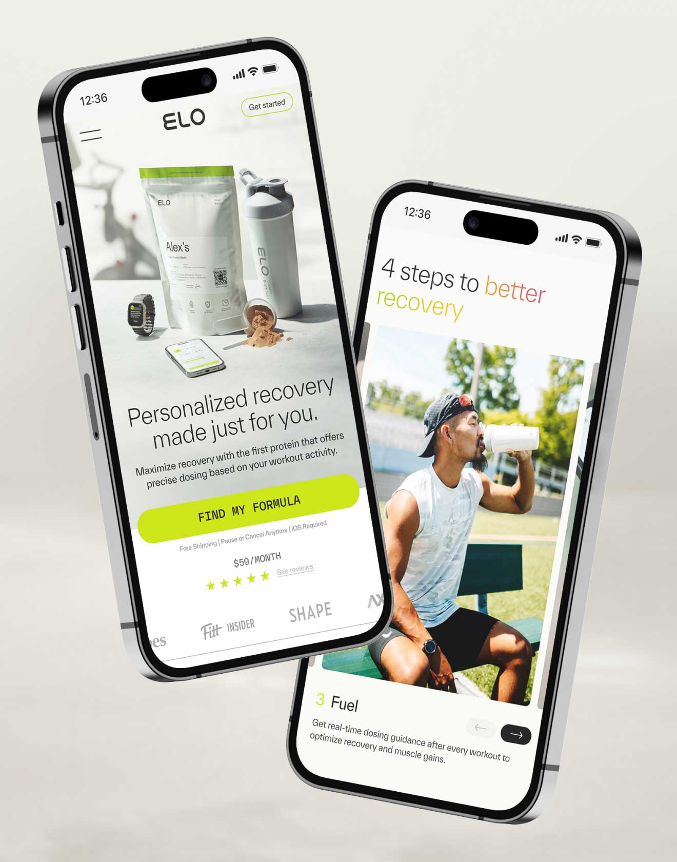
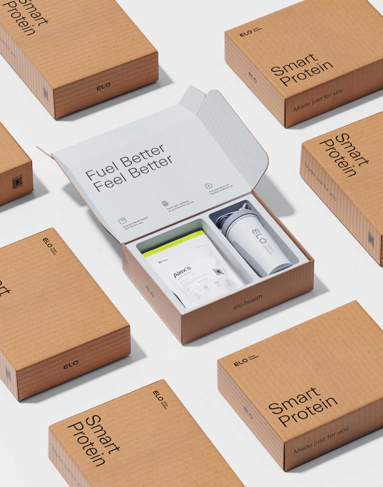
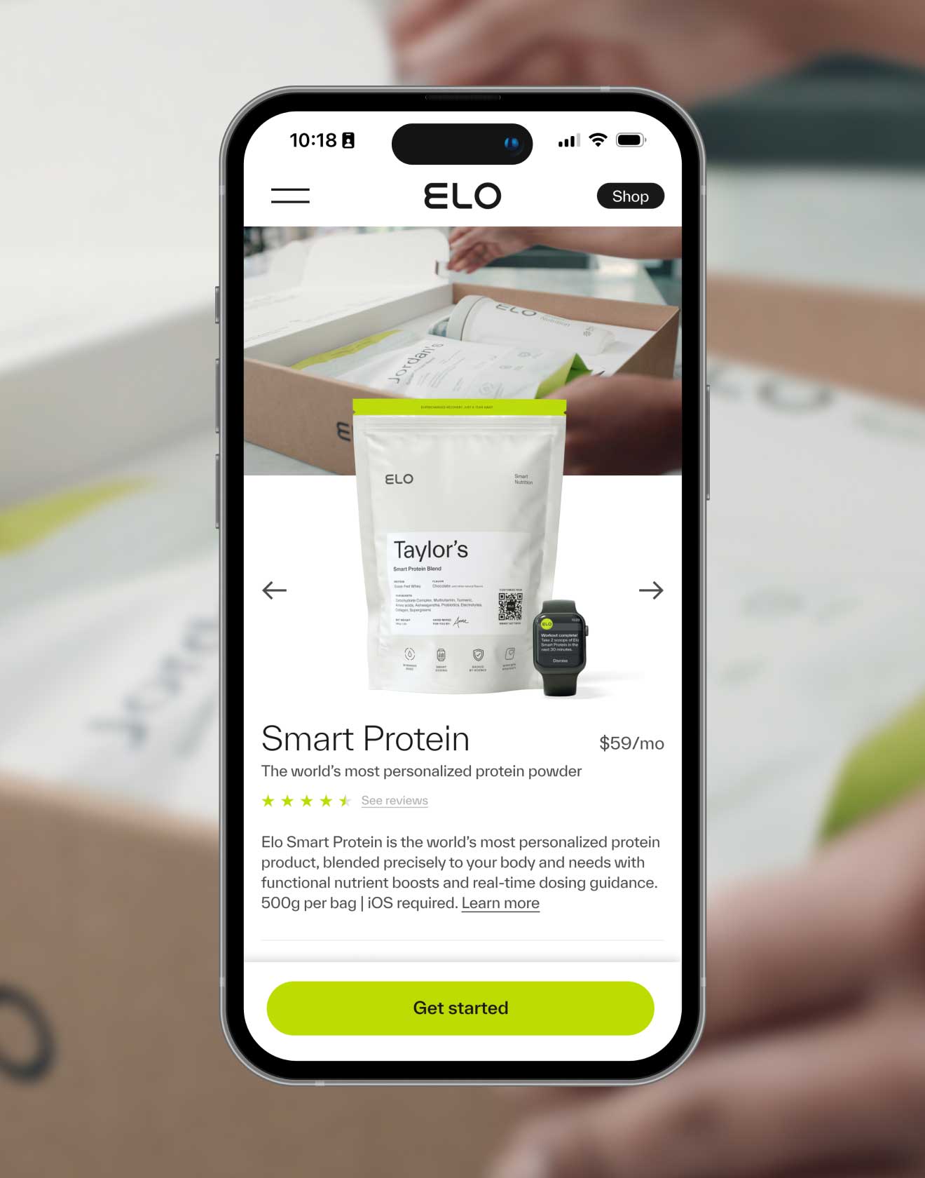
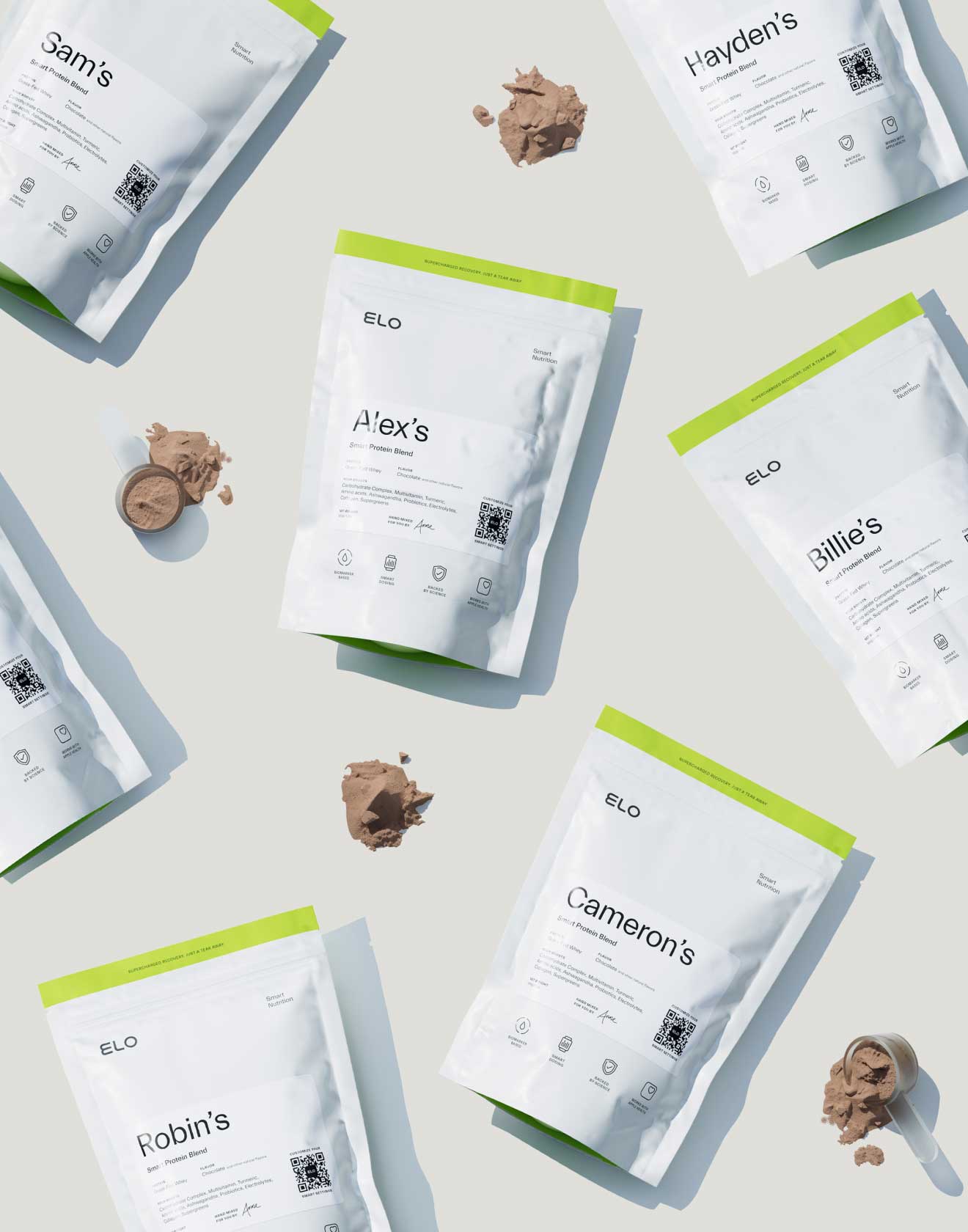

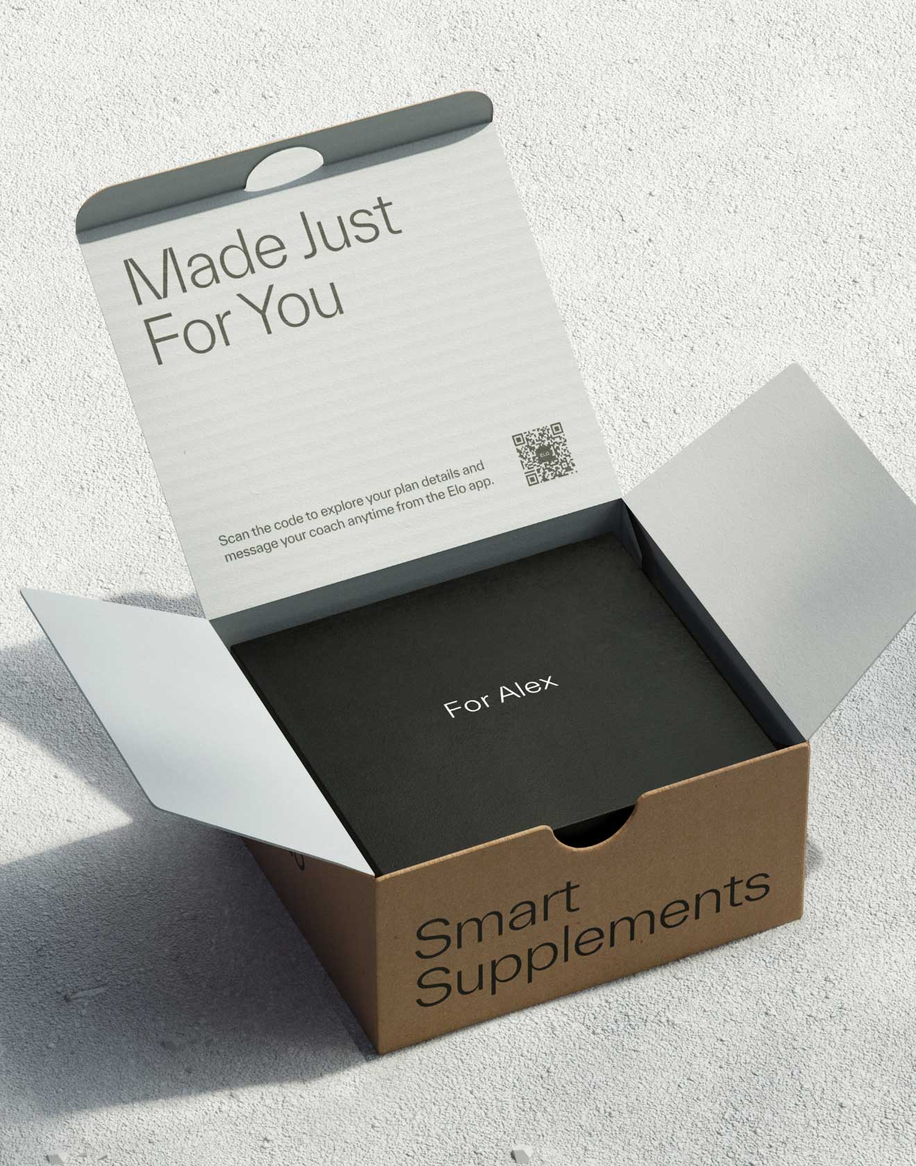
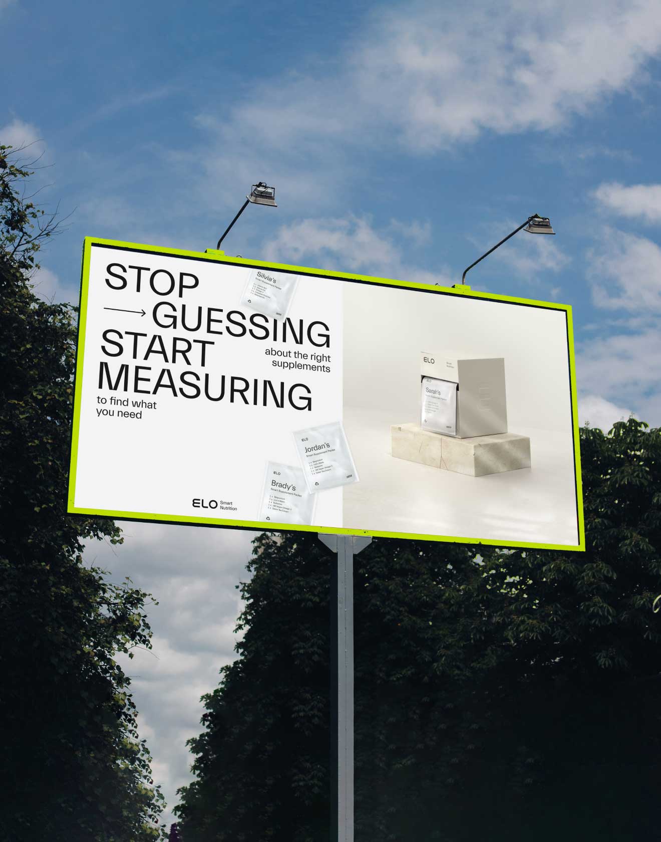
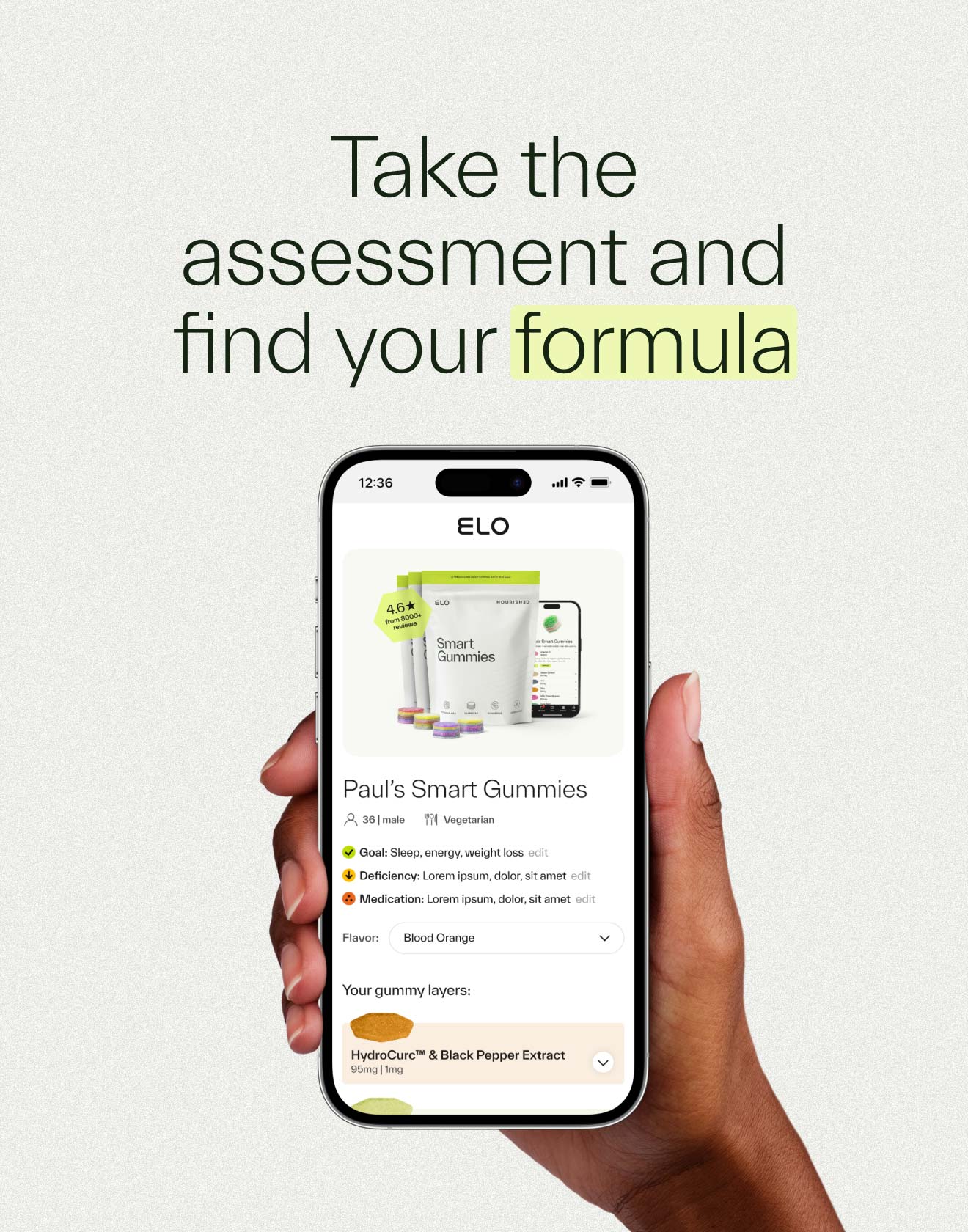
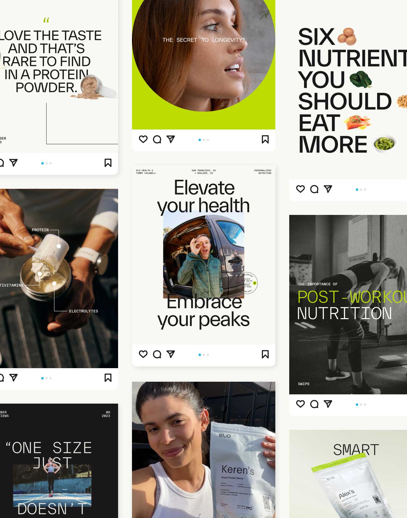
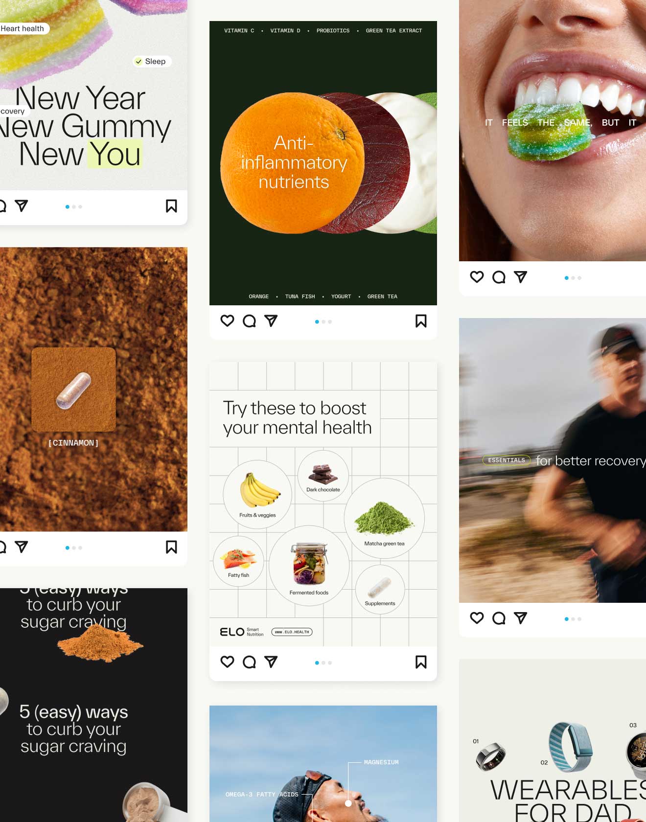
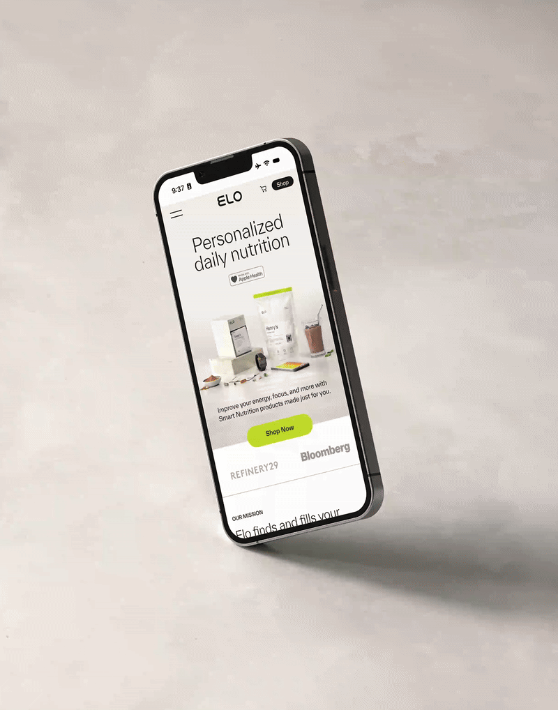
Elo
Leveraging your blood biomarkers for the most personalized supplements and nutrition plans.
As a start-up, Elo is tackling the one-size-fits-all health approach with personalized nutrition products and supplements. In 2020, Elo launched Smart Supplements: a minimally-packaged, personalized daily pill packet with up to 7 supplements based on your blood biomarkers. Since then, the team has launched Smart Protein and Smart Gummies – both tailored to individuals that want to track and improve their nutrient gaps, pair convenient supplements with their health goals, and recover faster after exercise. Over the last two years, I’ve consolidated and evolved the brand elements and visual identity across all of their many touch points: packaging, website and landing pages, organic social, paid ads, collaborations, email lifecycle, and more.
Read more

< swipe >
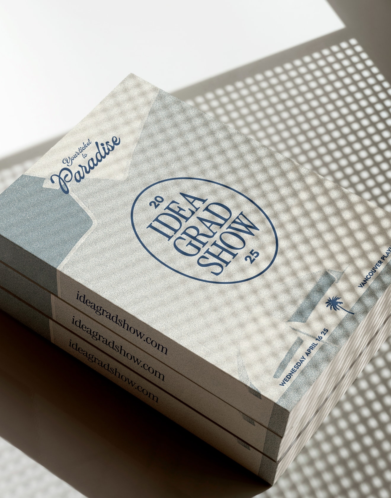
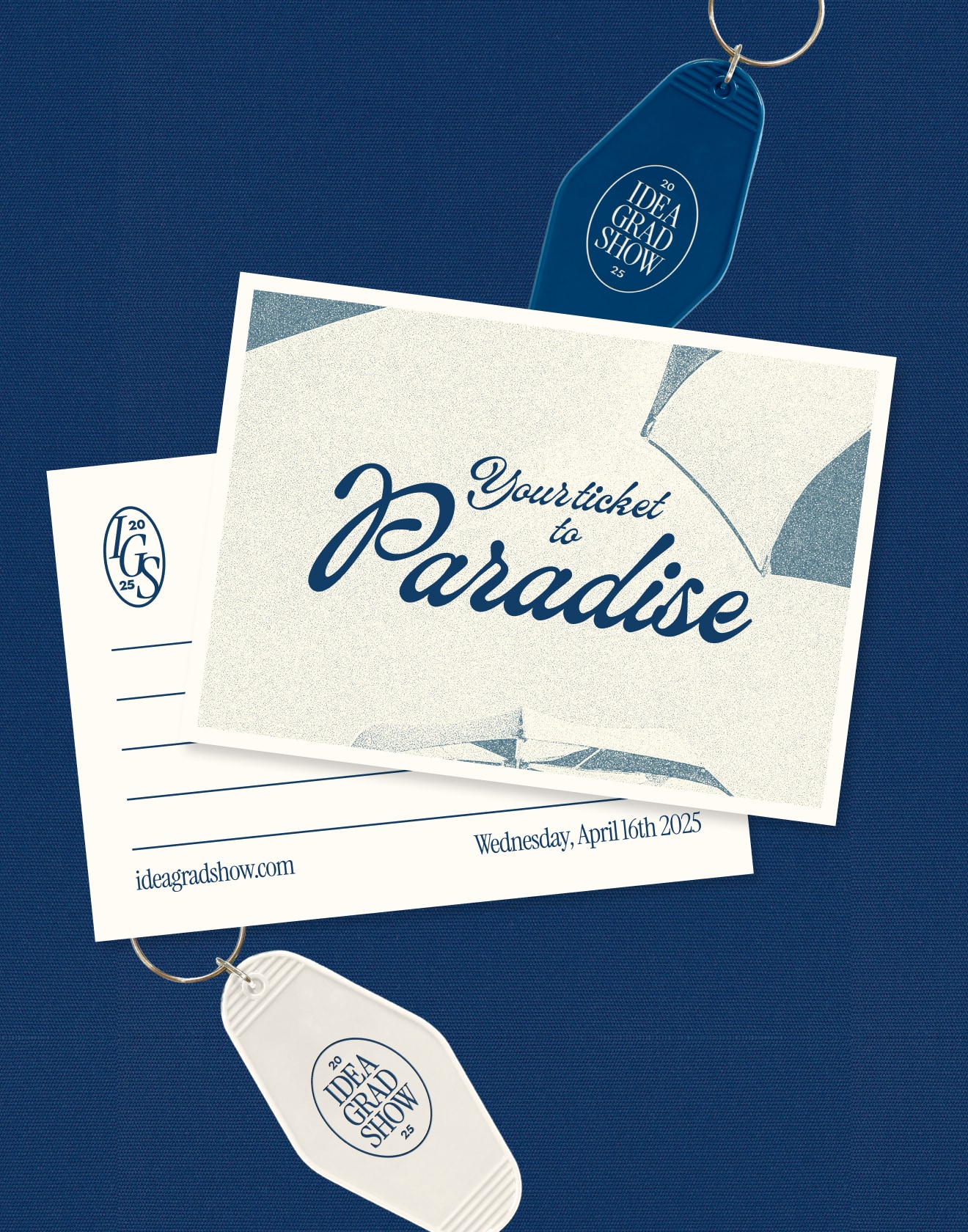
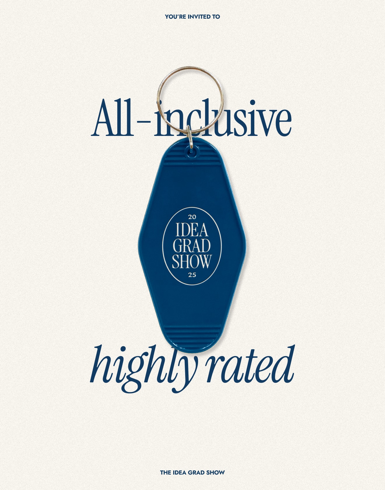
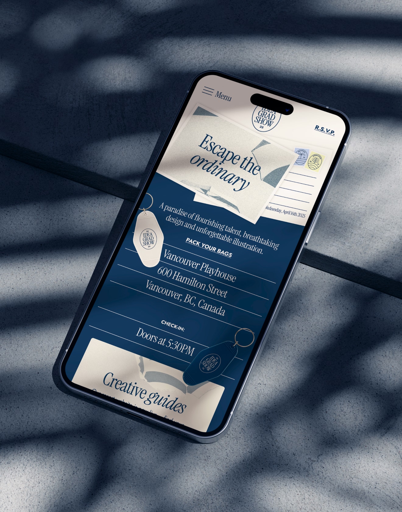

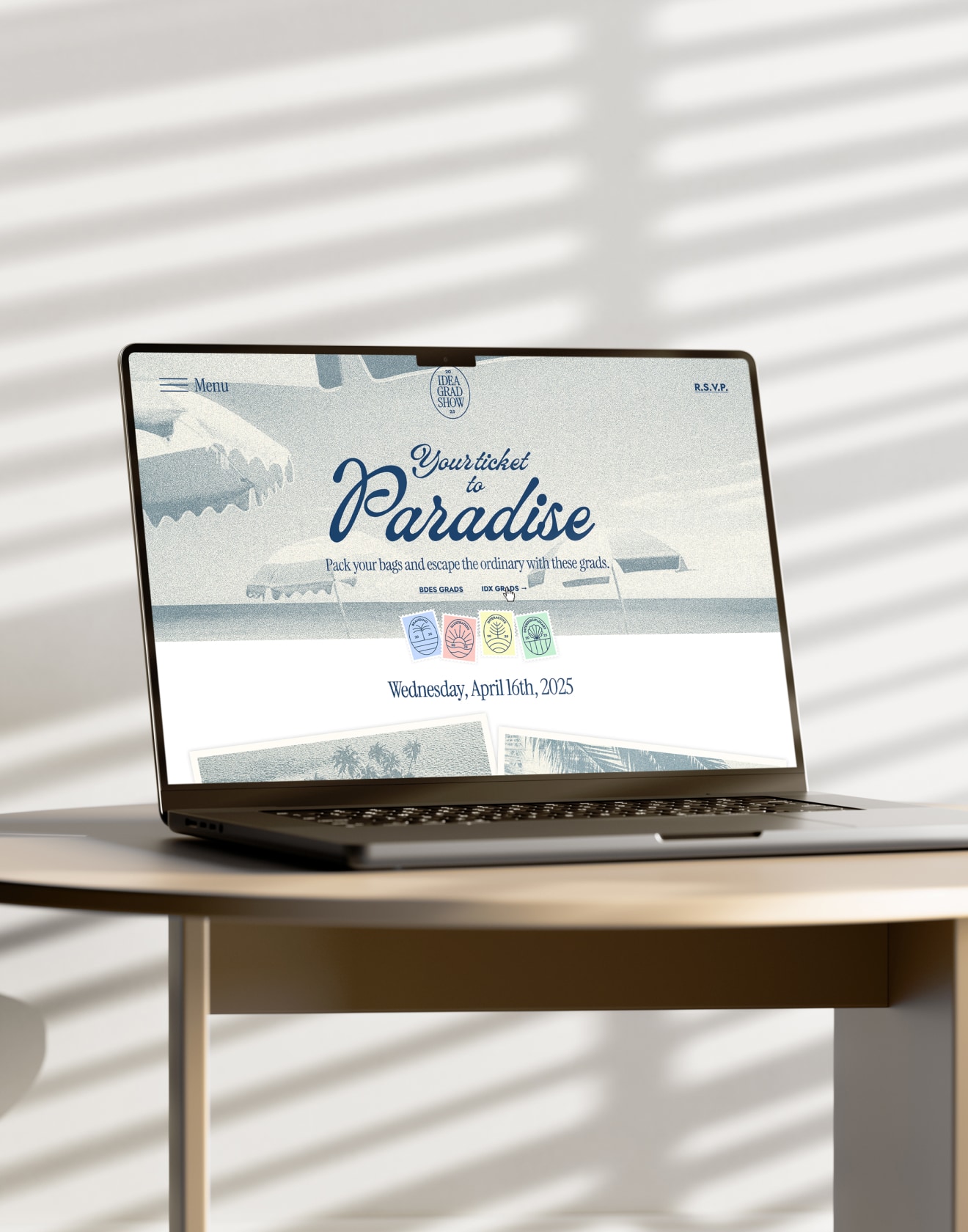
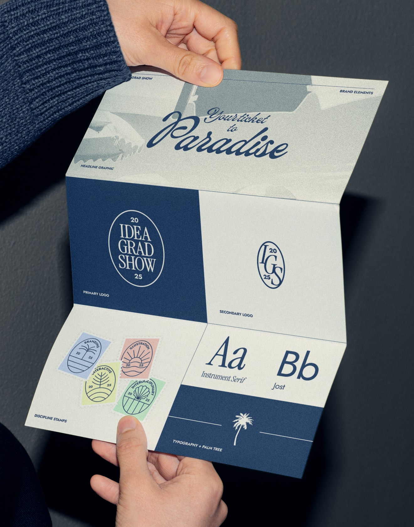

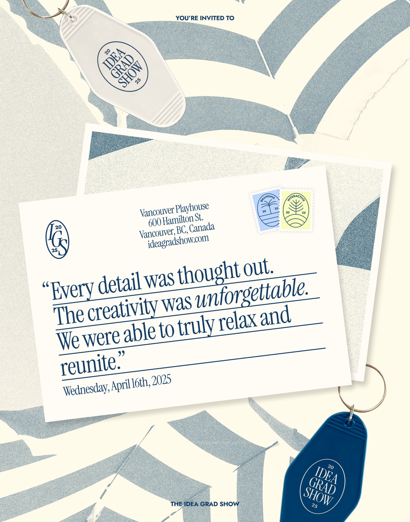
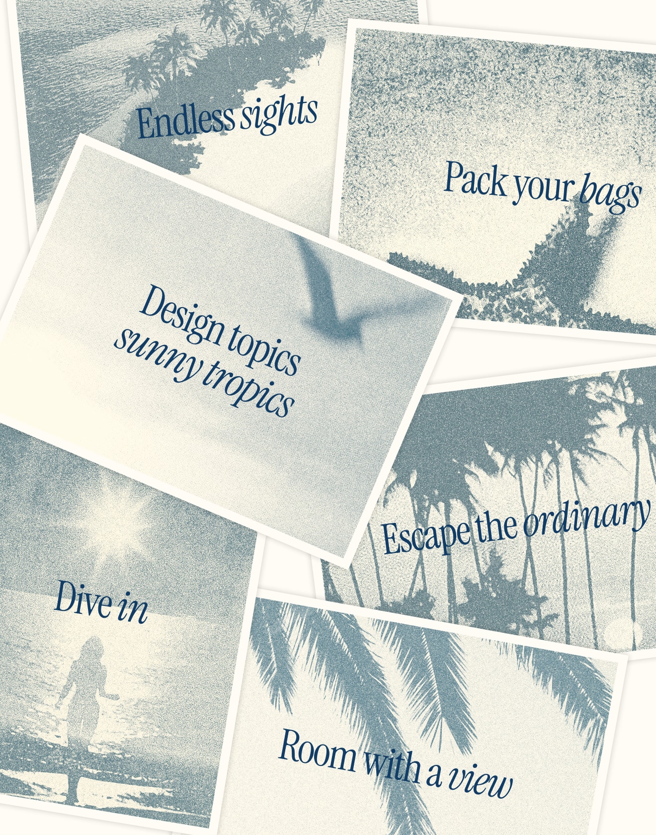
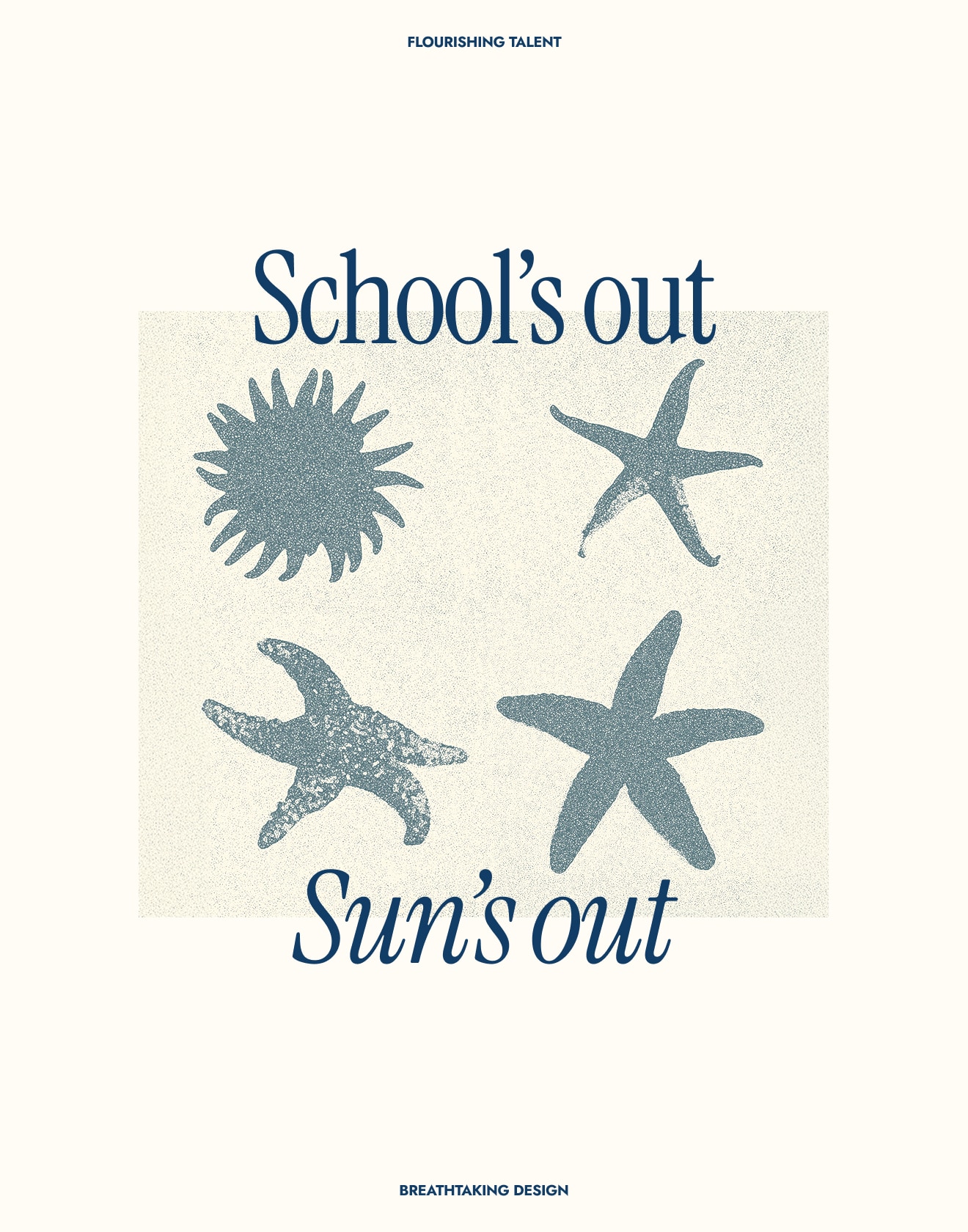
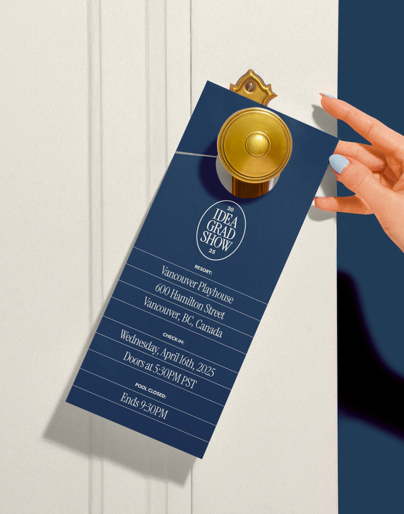
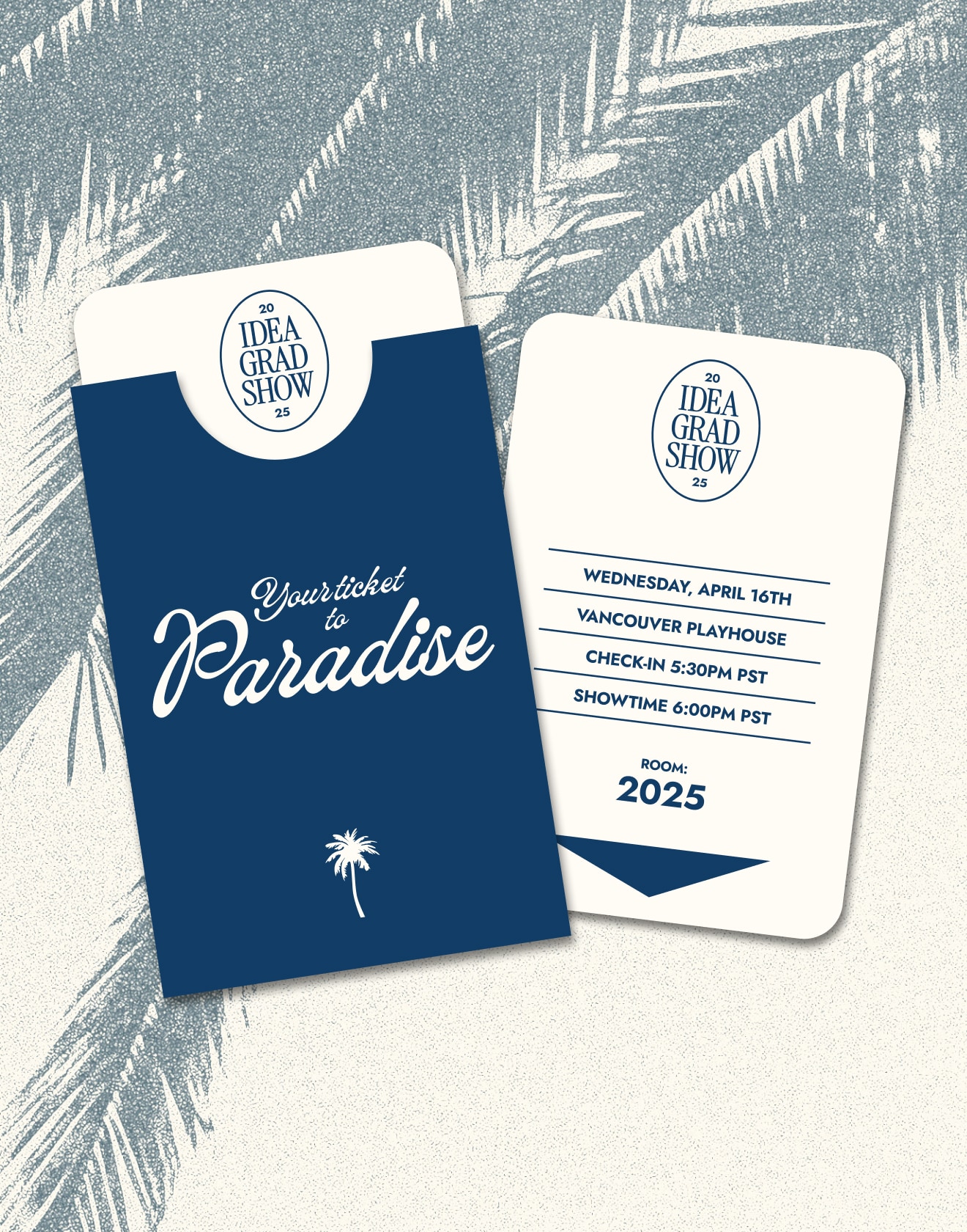

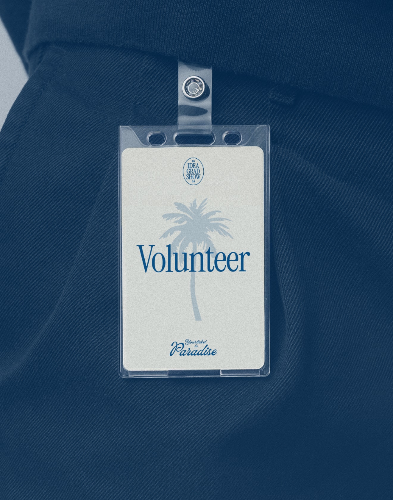
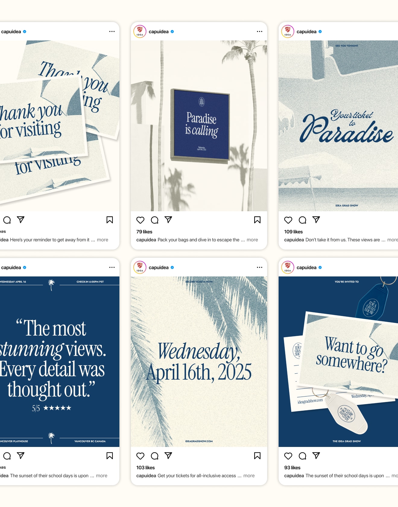
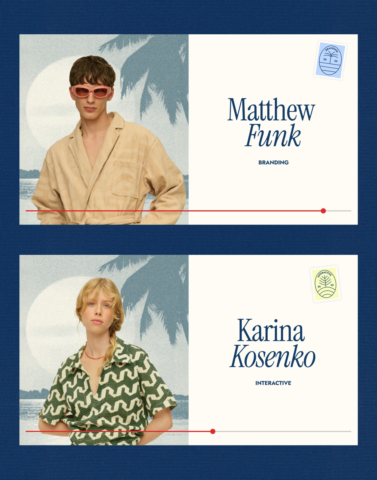
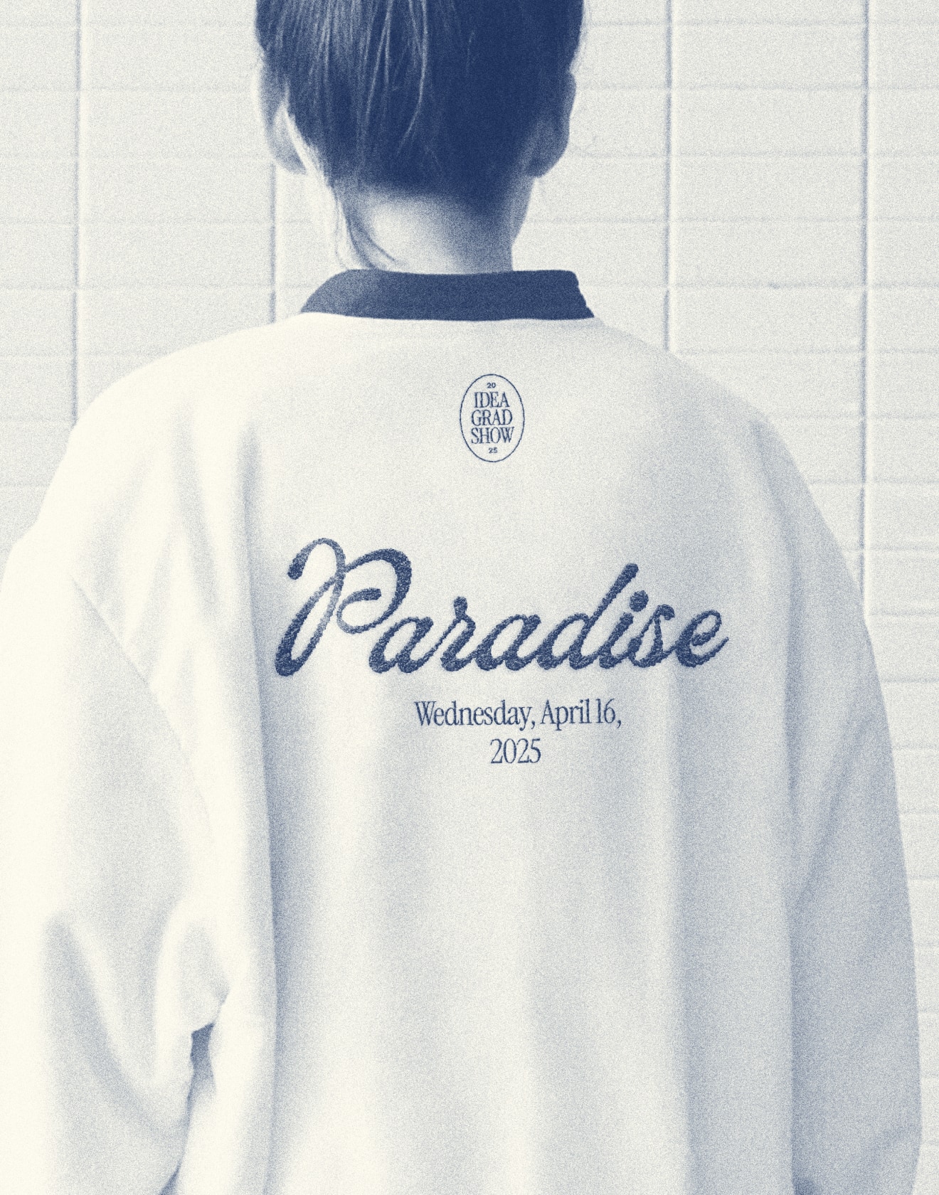
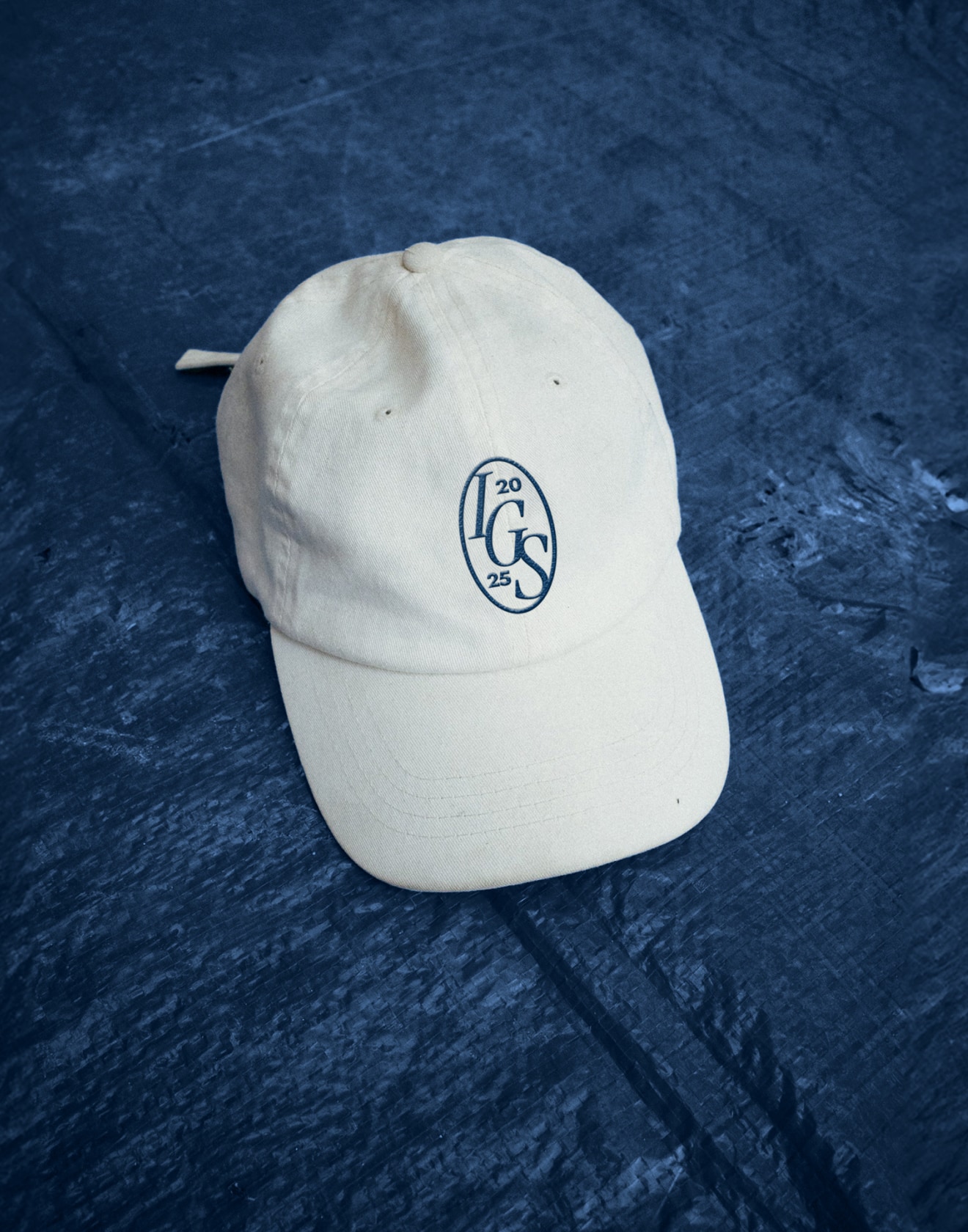
IDEA Grad Show
The beaches are imaginary, but the creativity at Capilano U's design program is all real
Escape to a paradise of flourishing talent, breathtaking design and unforgettable illustration that you simply have to experience to believe at this year’s IDEA Grad Show by Capilano University. Created in collaboration with my friend and fellow alumni, Aleks Jones, this project grew from a shared vision—one where post-grad life feels like stepping off the plane into something bright, bold, and a little surreal. Together, we developed multiple concept iterations, crafted several logo directions, designed a full website, social posts, grad booklet, emails, and more—all while working within a limited colour palette using only Google Fonts 😉
Read more
< swipe >
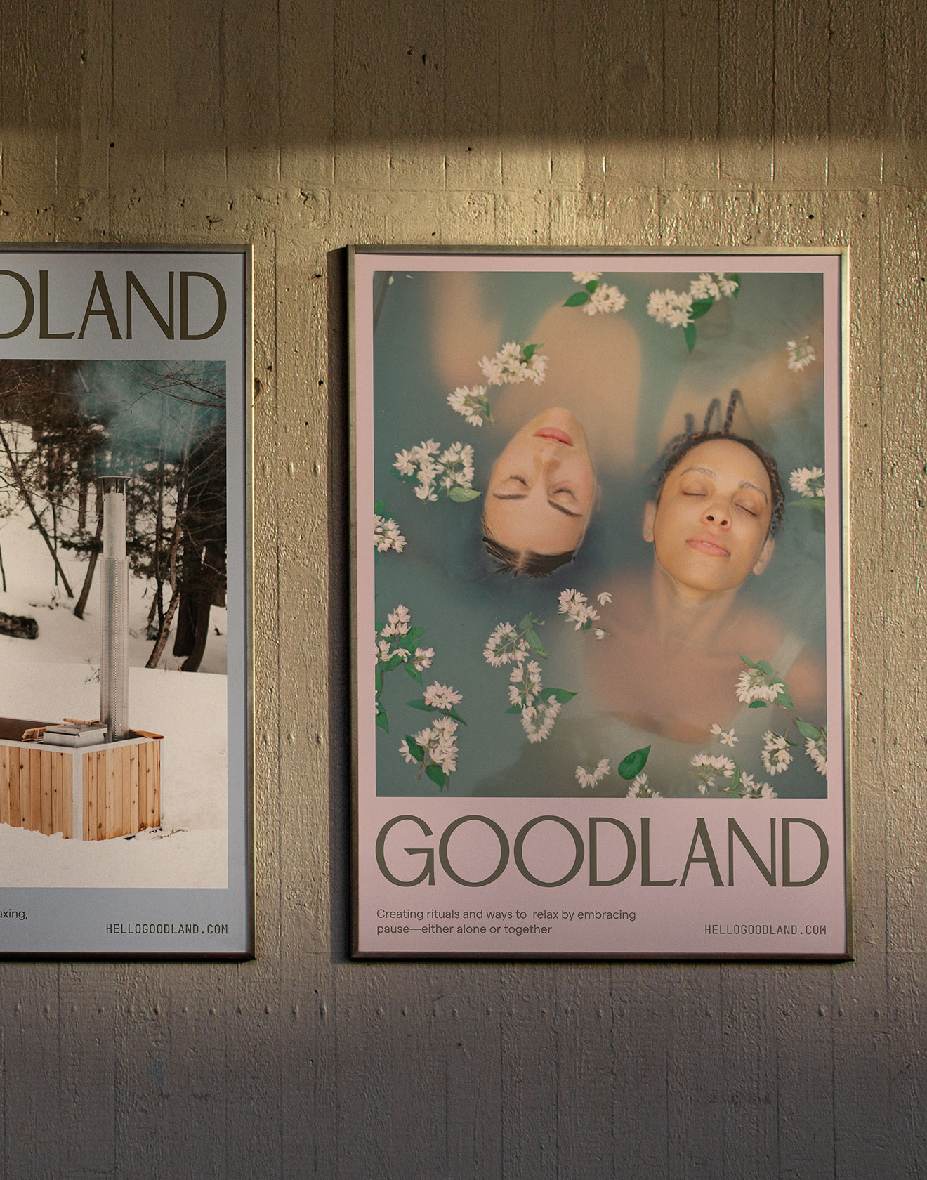
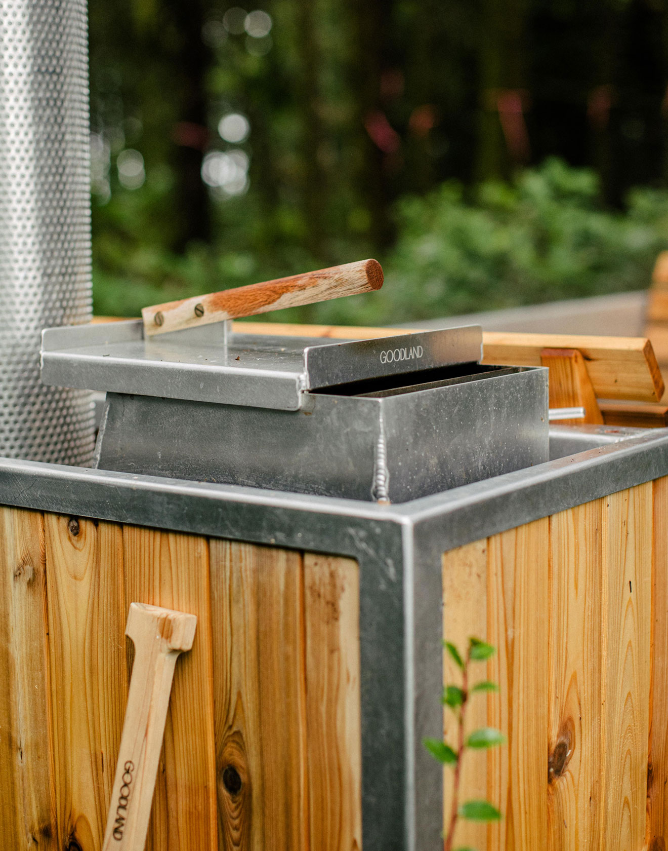
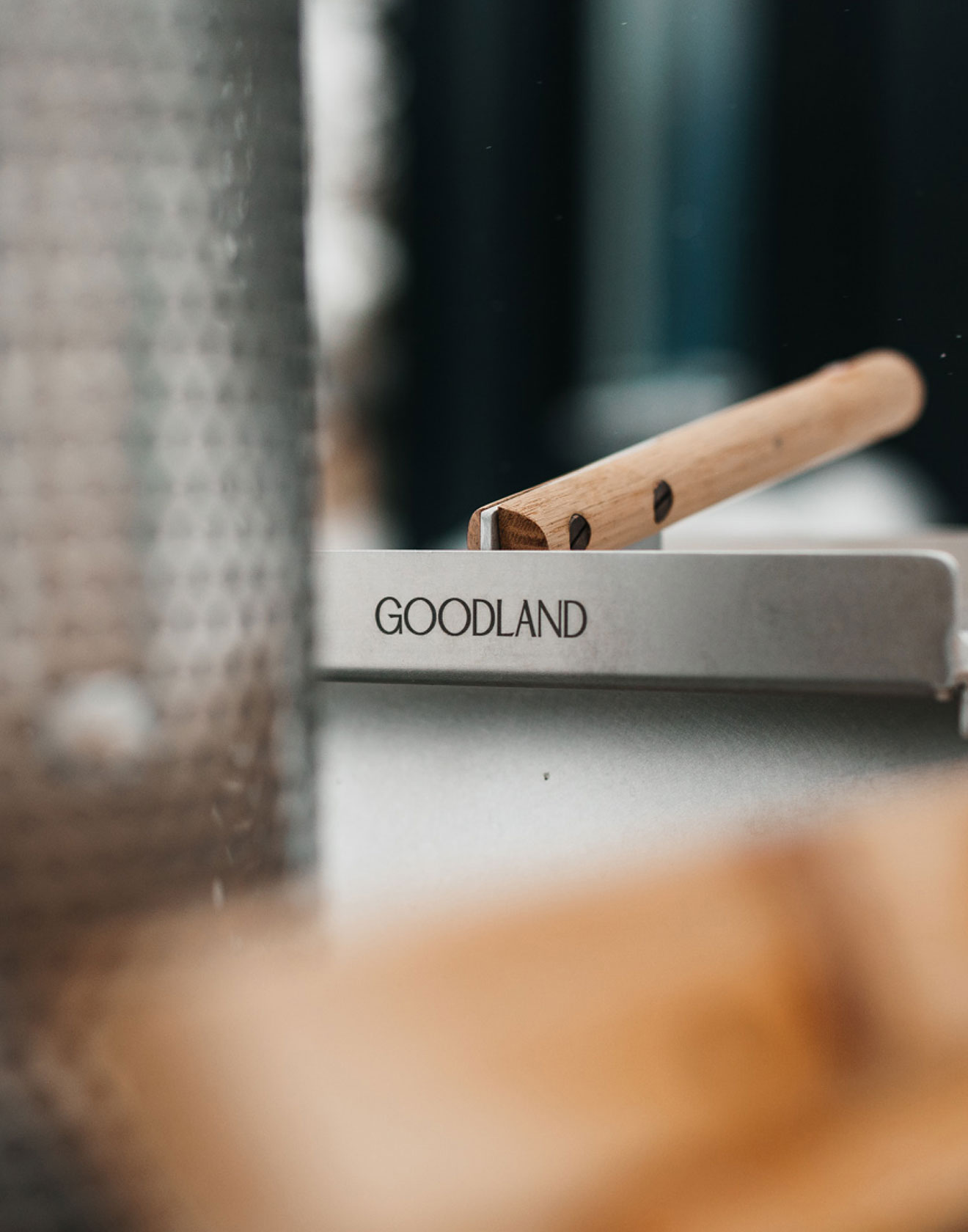
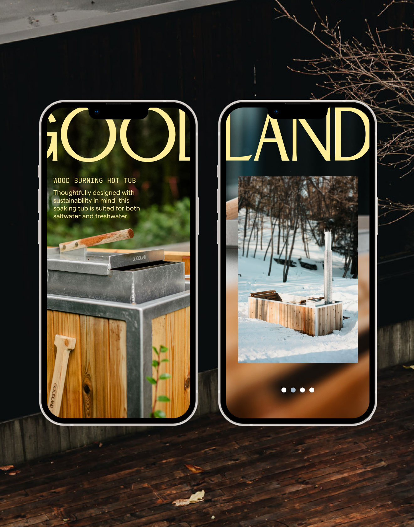
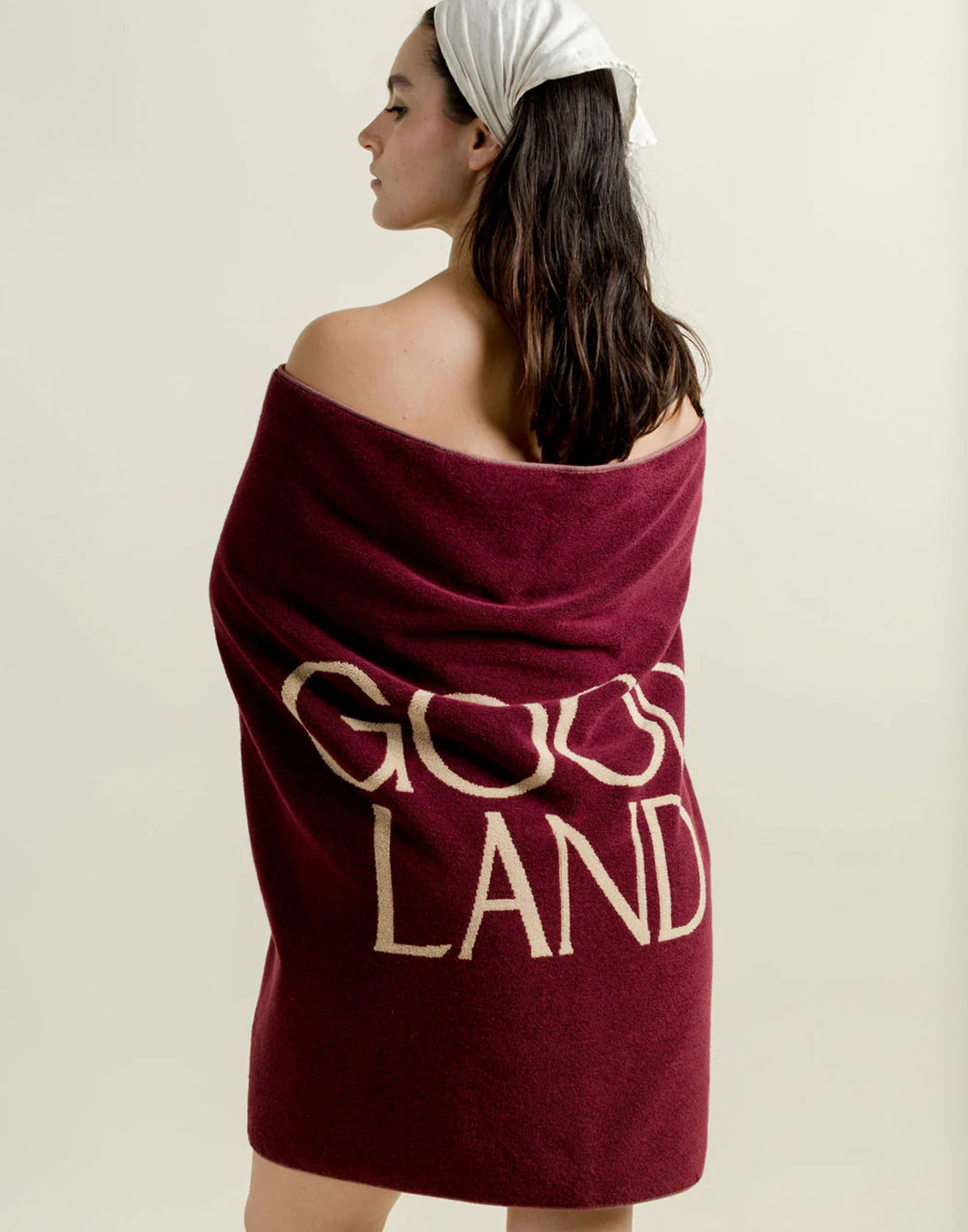
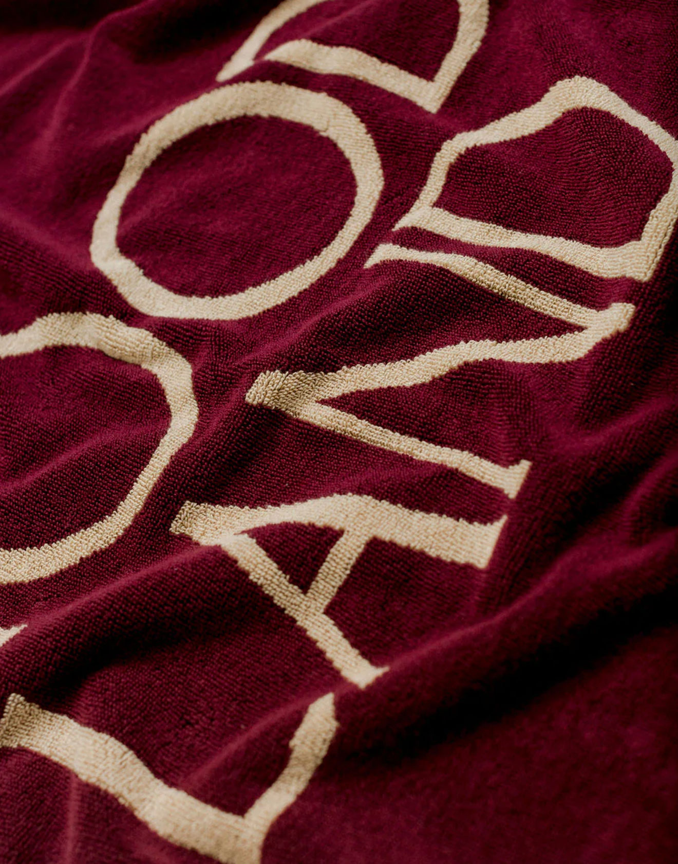
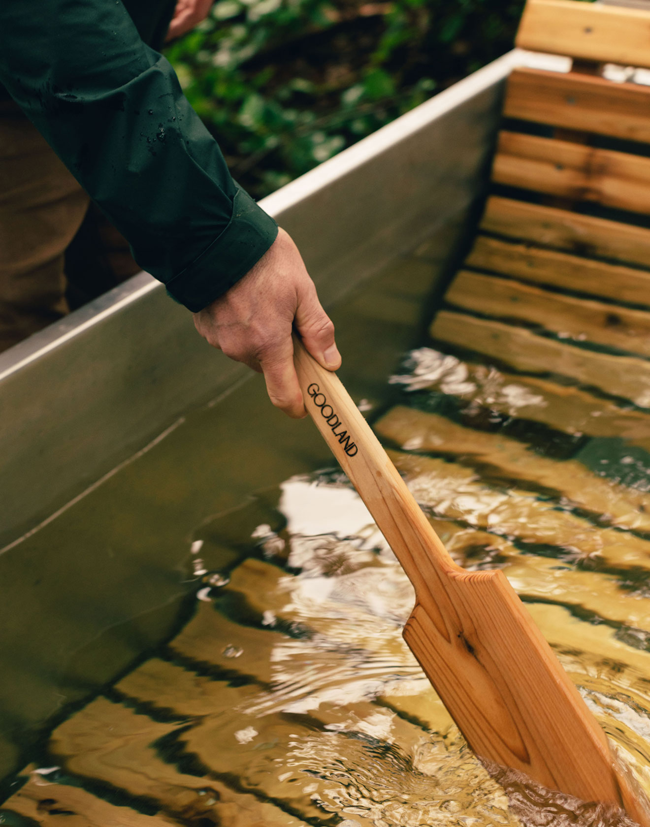
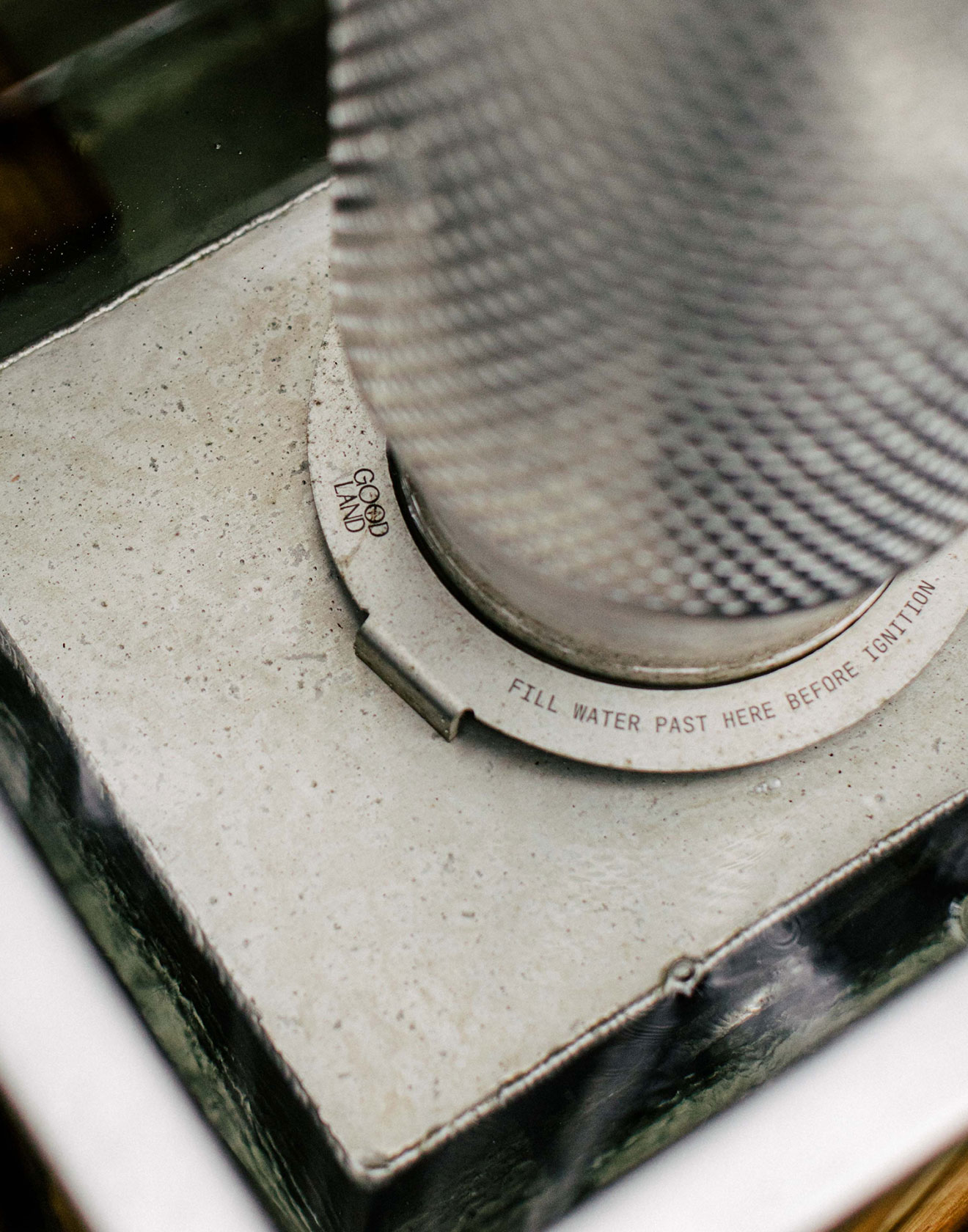
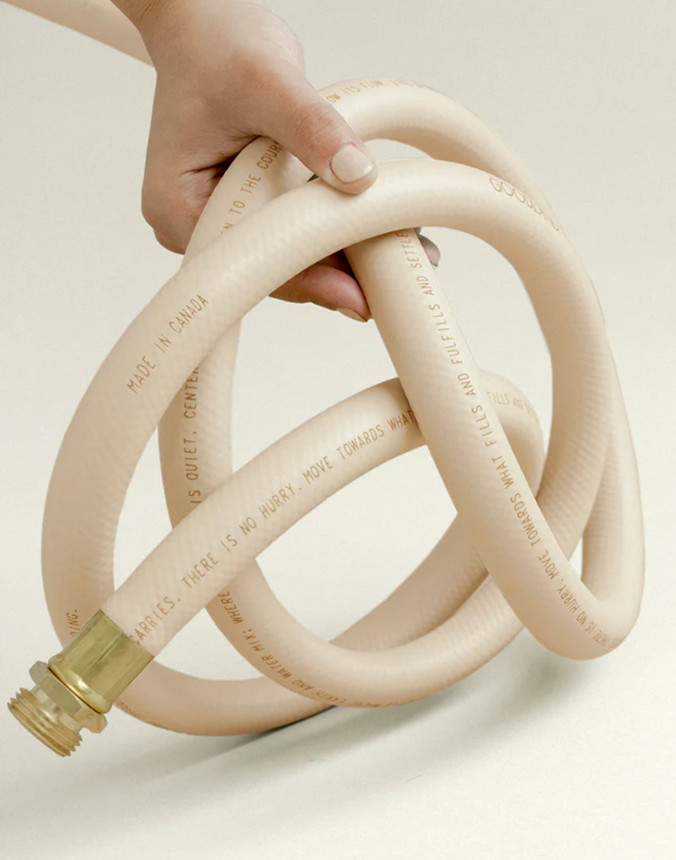
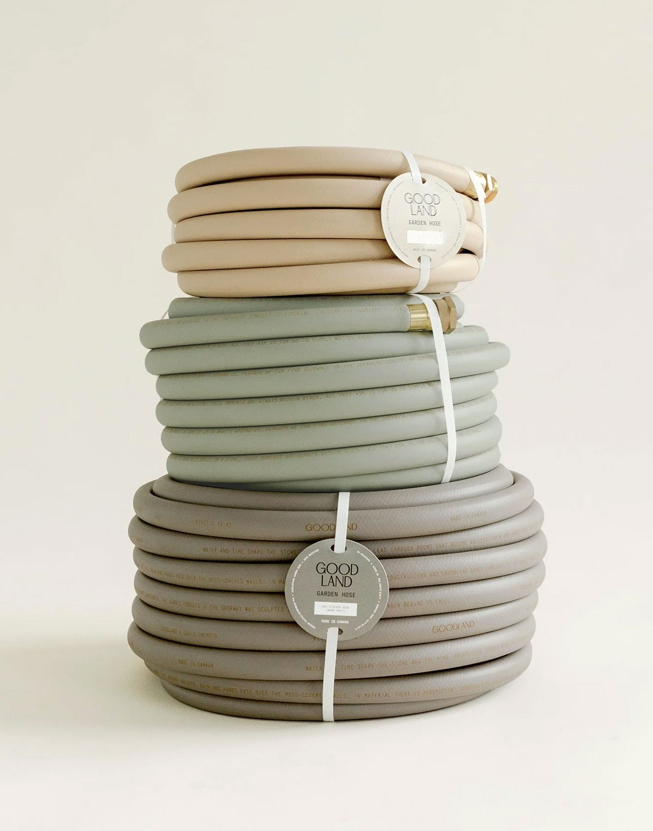
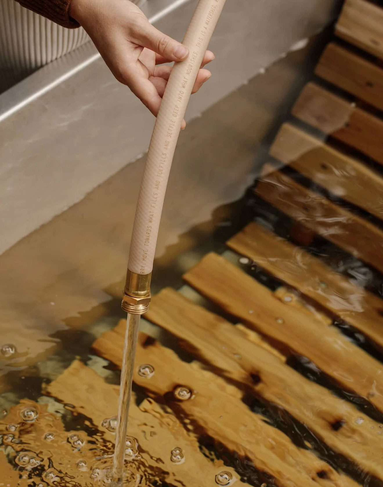
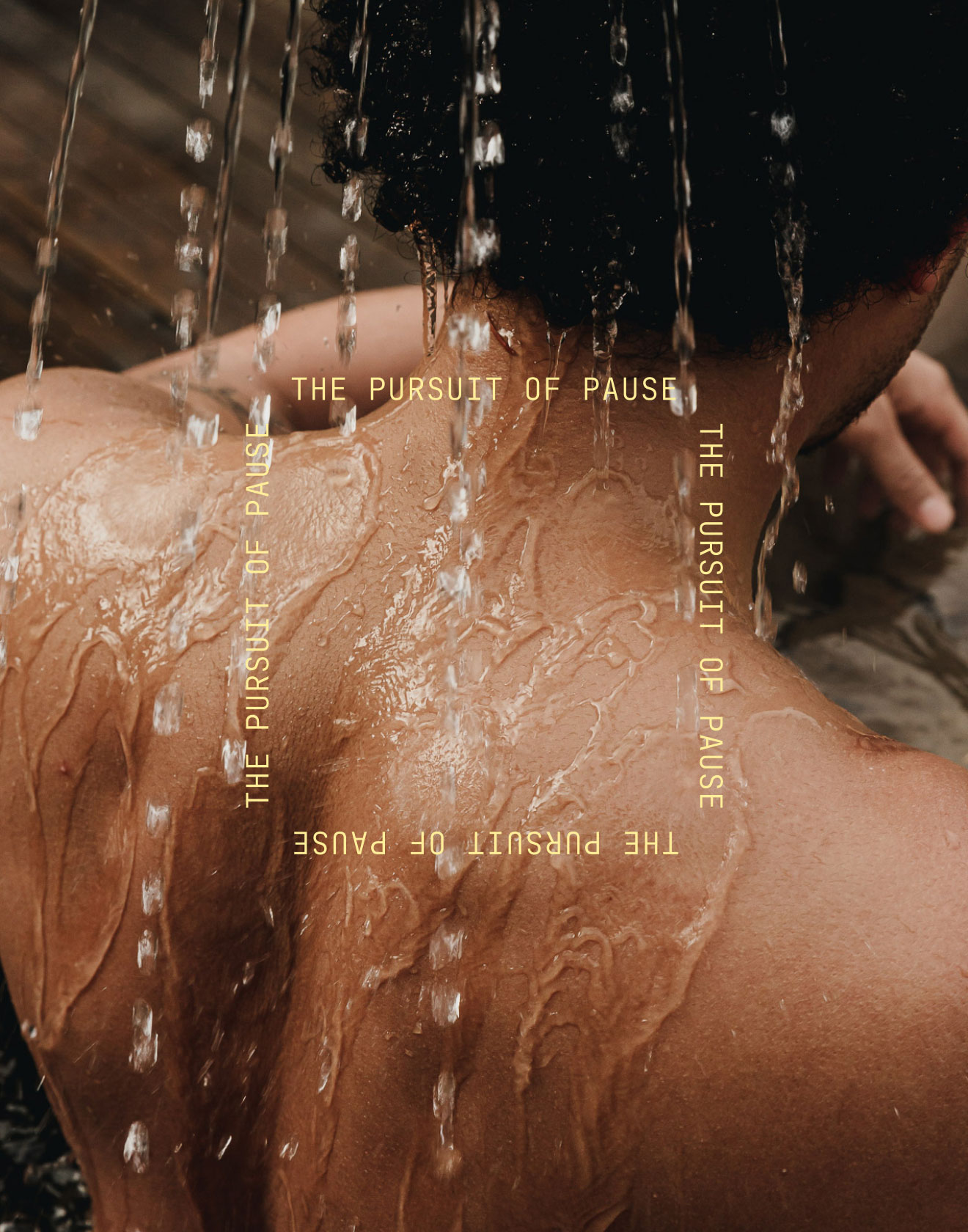
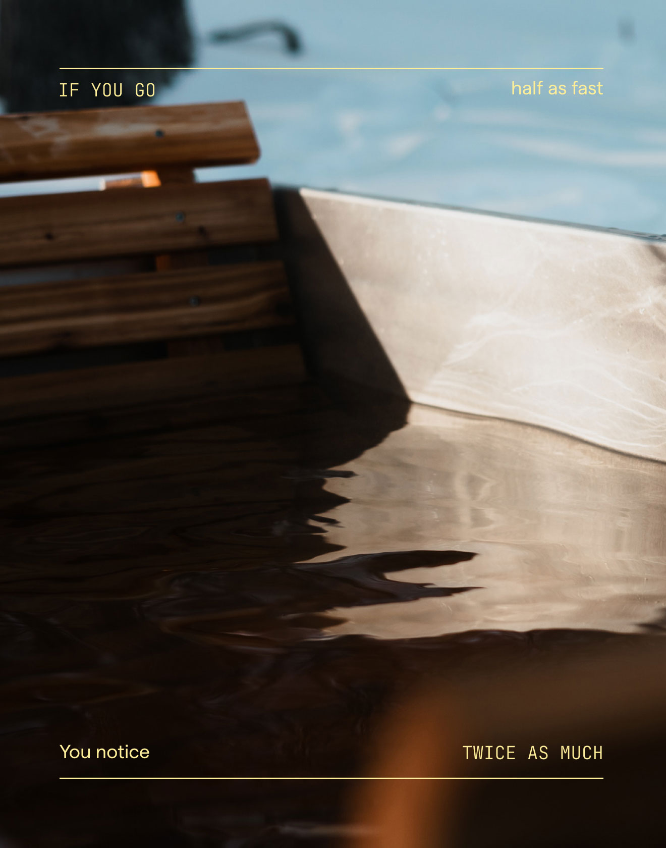
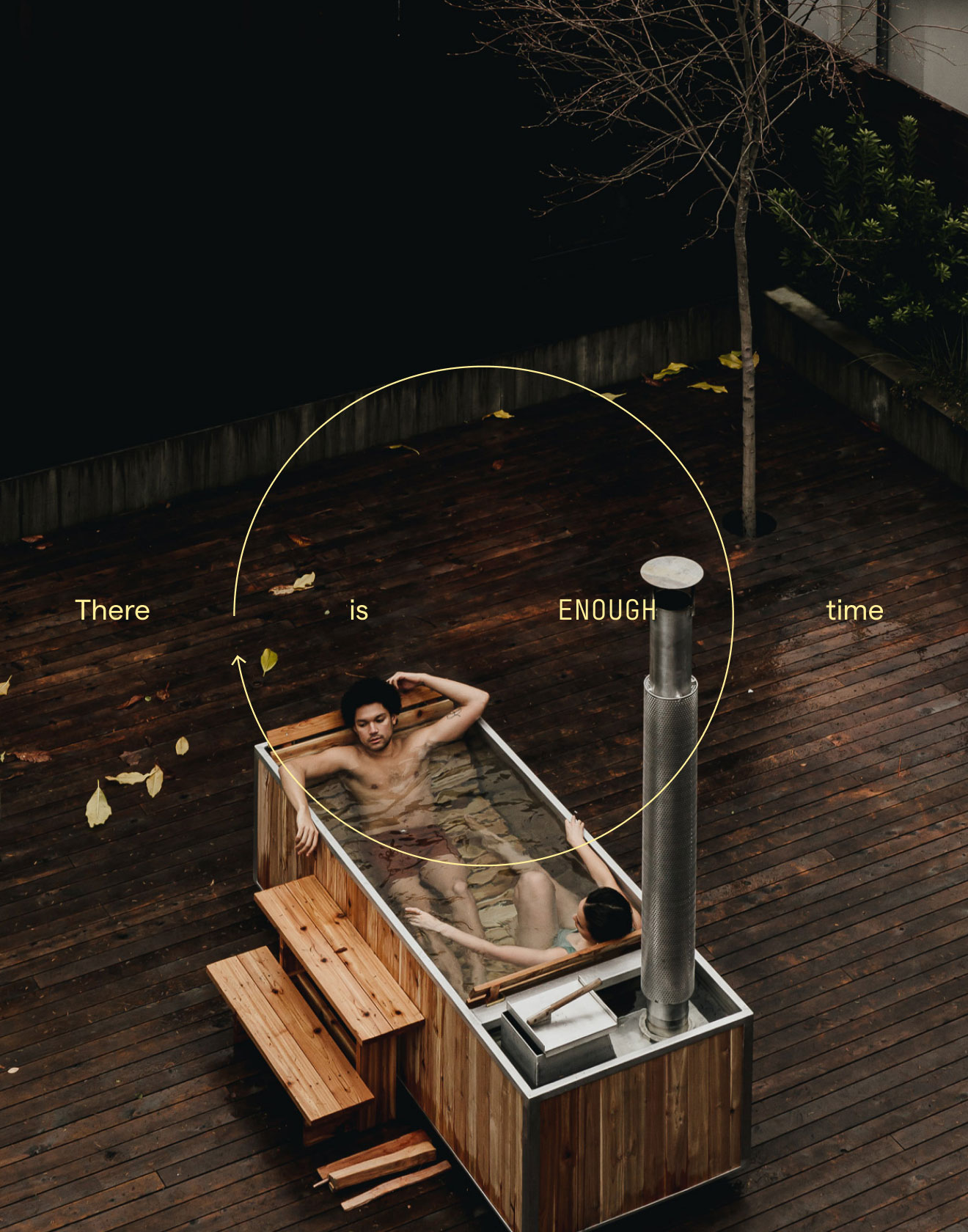
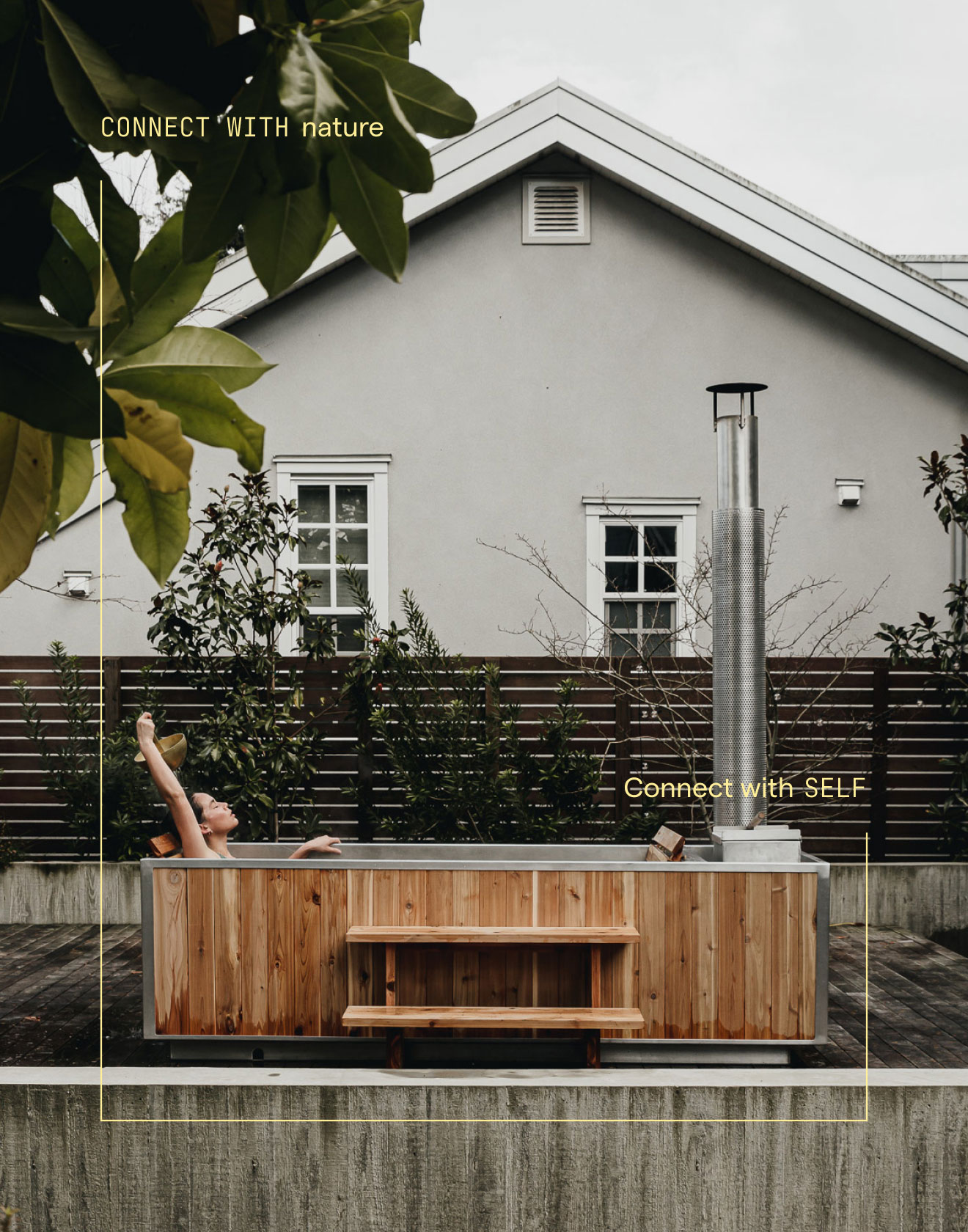
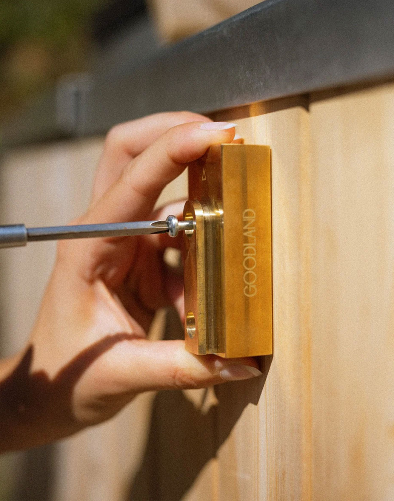
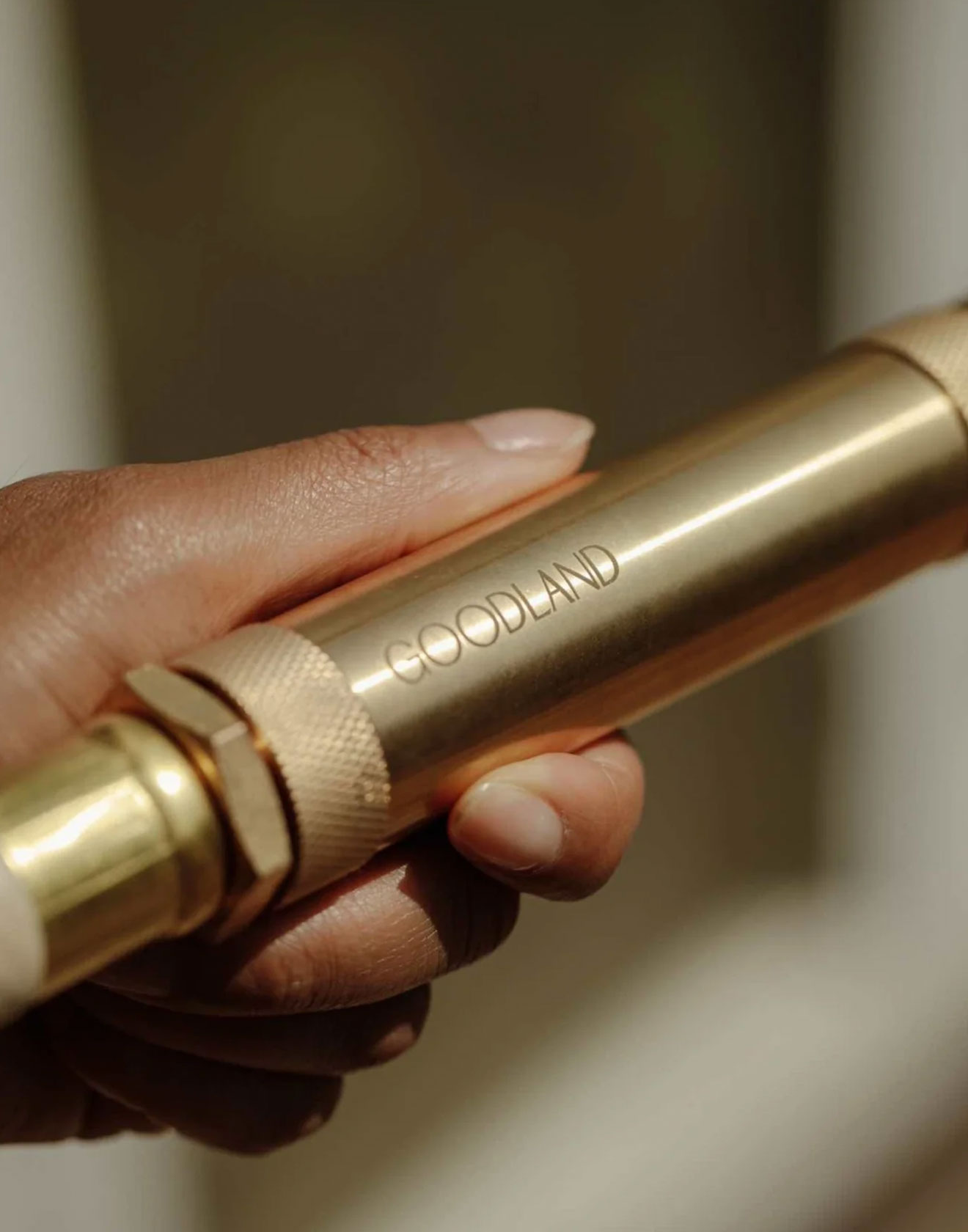
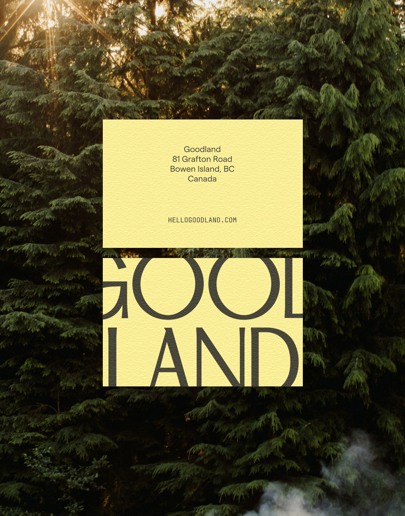
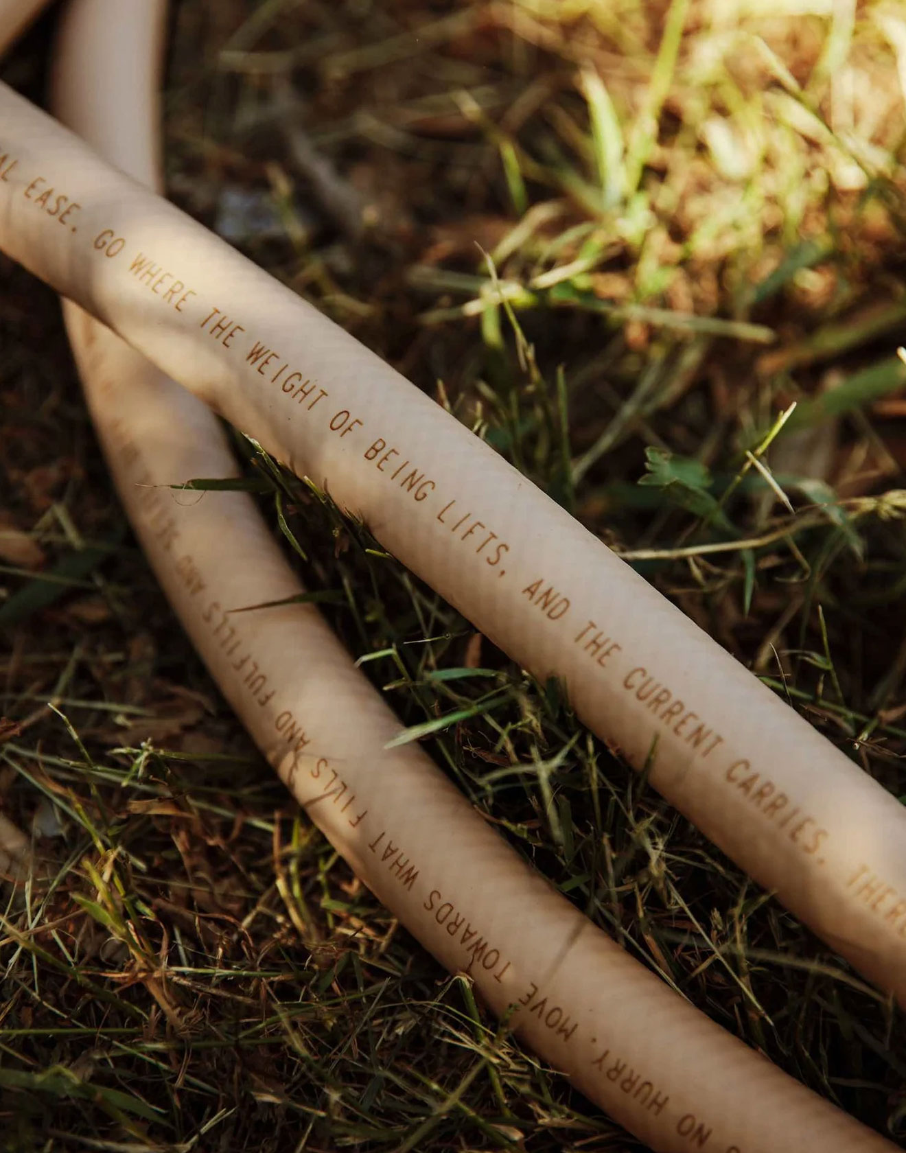
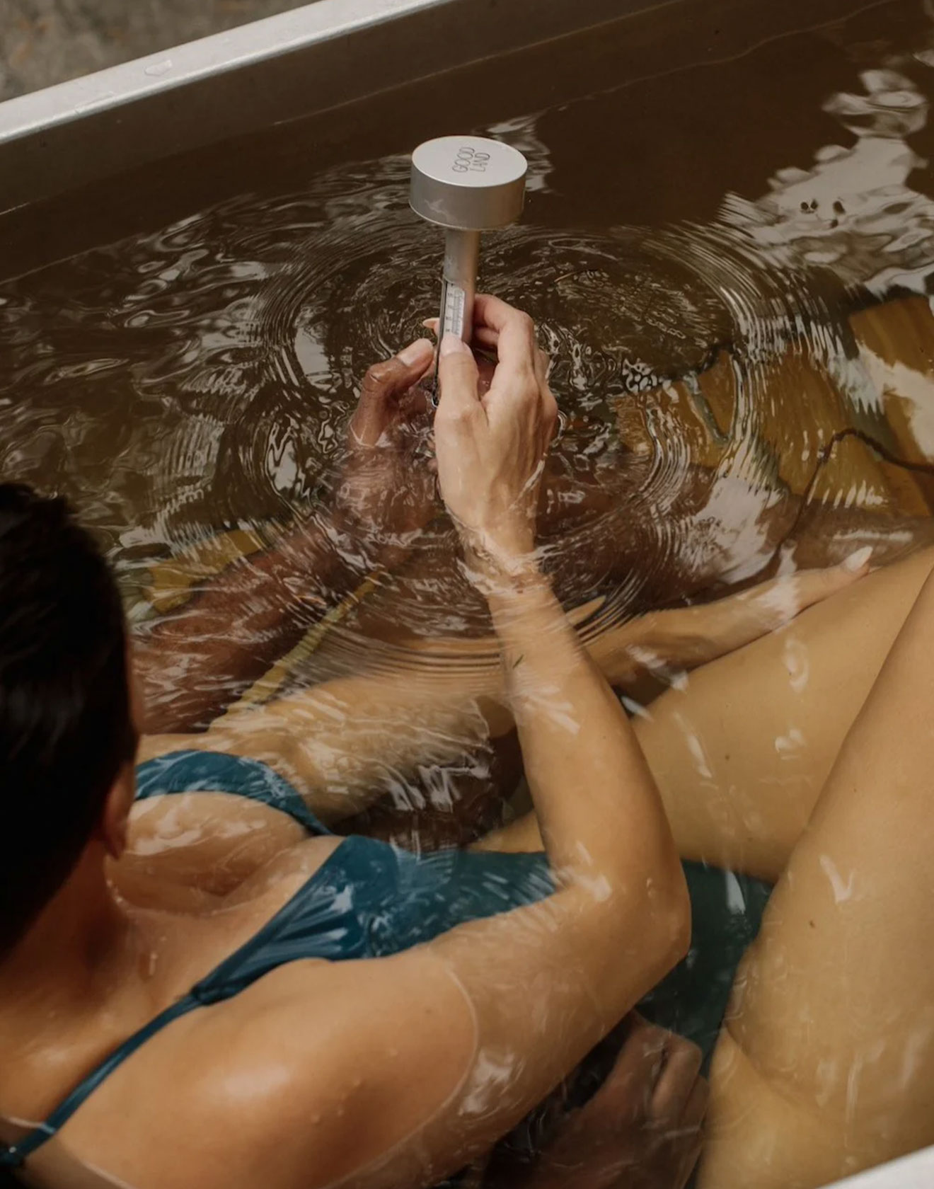
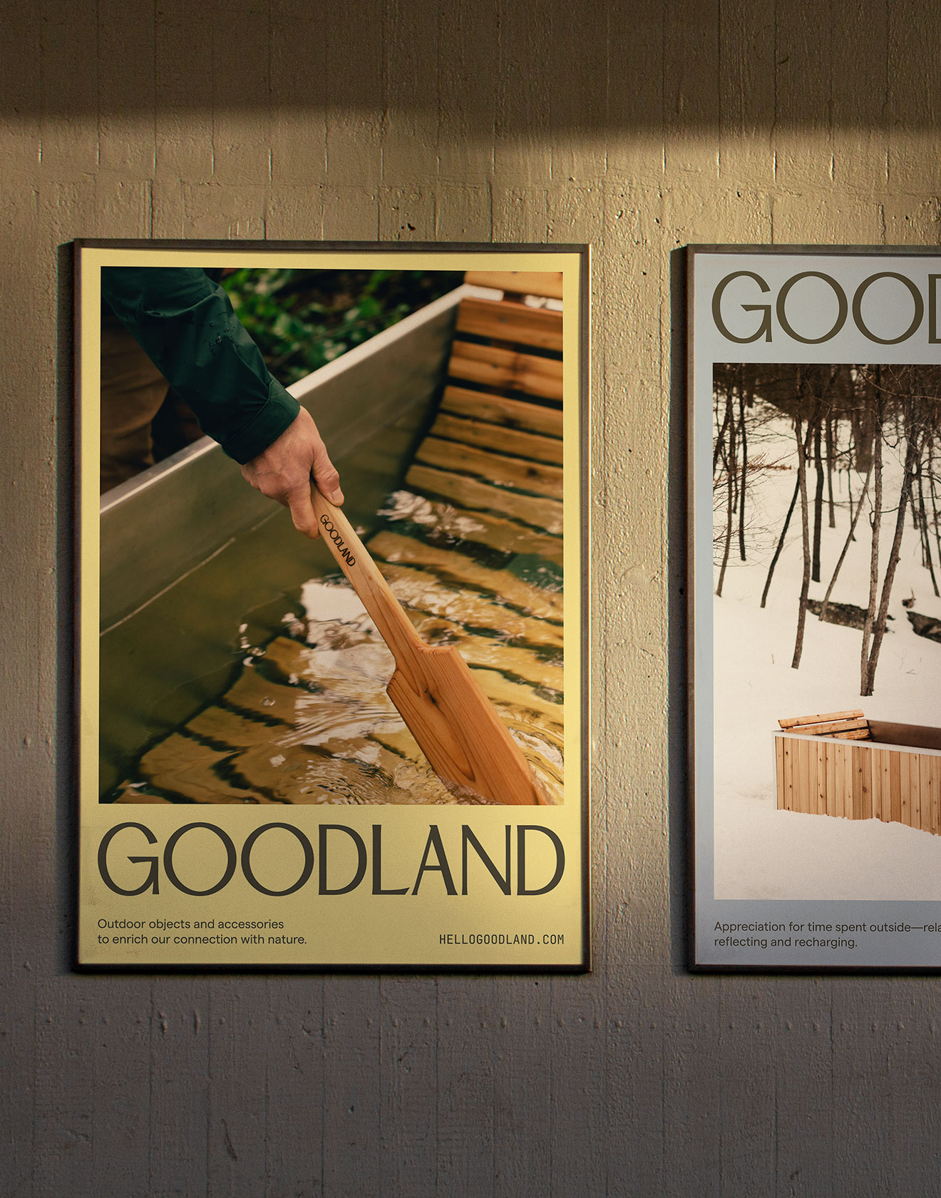
Goodland
Building a brand that turns slowing down into a modern ritual.
Goodland reimagines the timeless ritual of outdoor bathing through beautifully crafted, wood-burning tubs built for modern living. I developed a visual identity that mirrors their design philosophy: simple, elemental, and deeply connected to nature. The wordmark and brand system were designed to feel calm yet confident, extending seamlessly across physical products, packaging, digital touchpoints, and launch collateral. The result is a cohesive identity that celebrates the pleasure of slowing down and the beauty of intentional design.
Read more

< swipe >
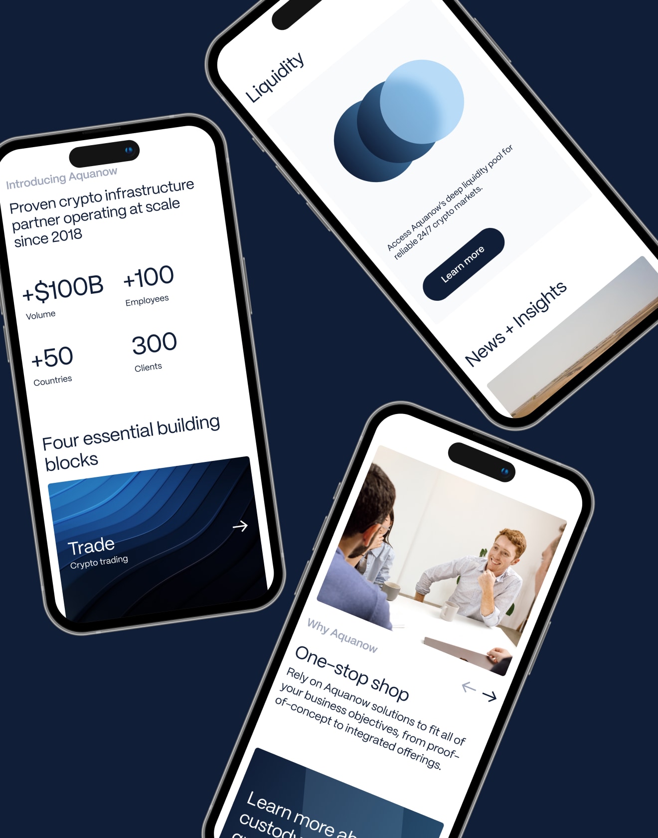


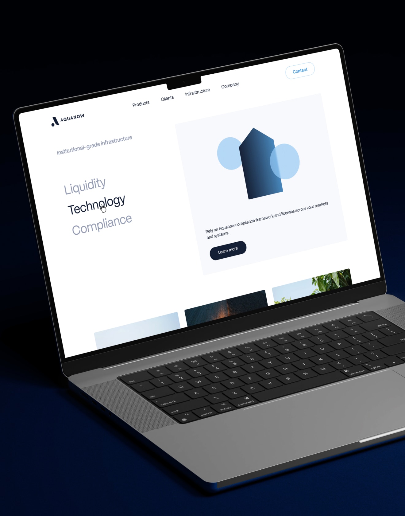


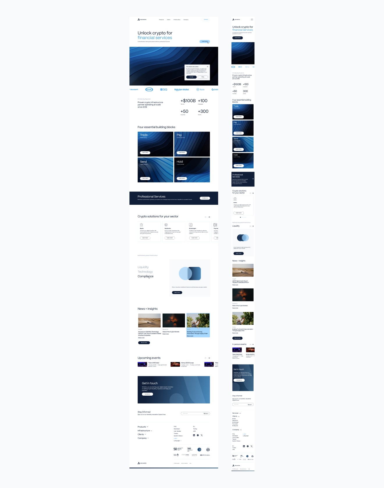
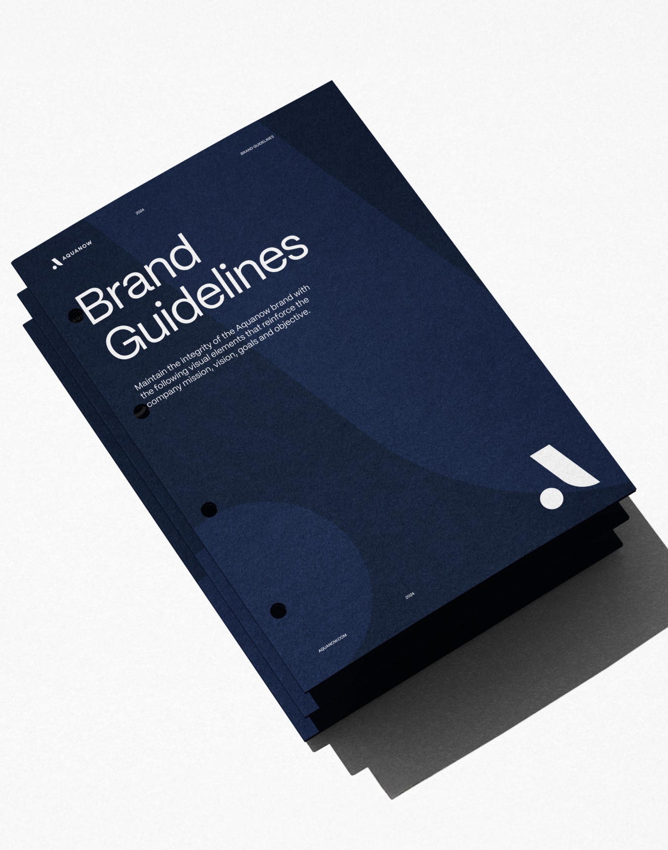
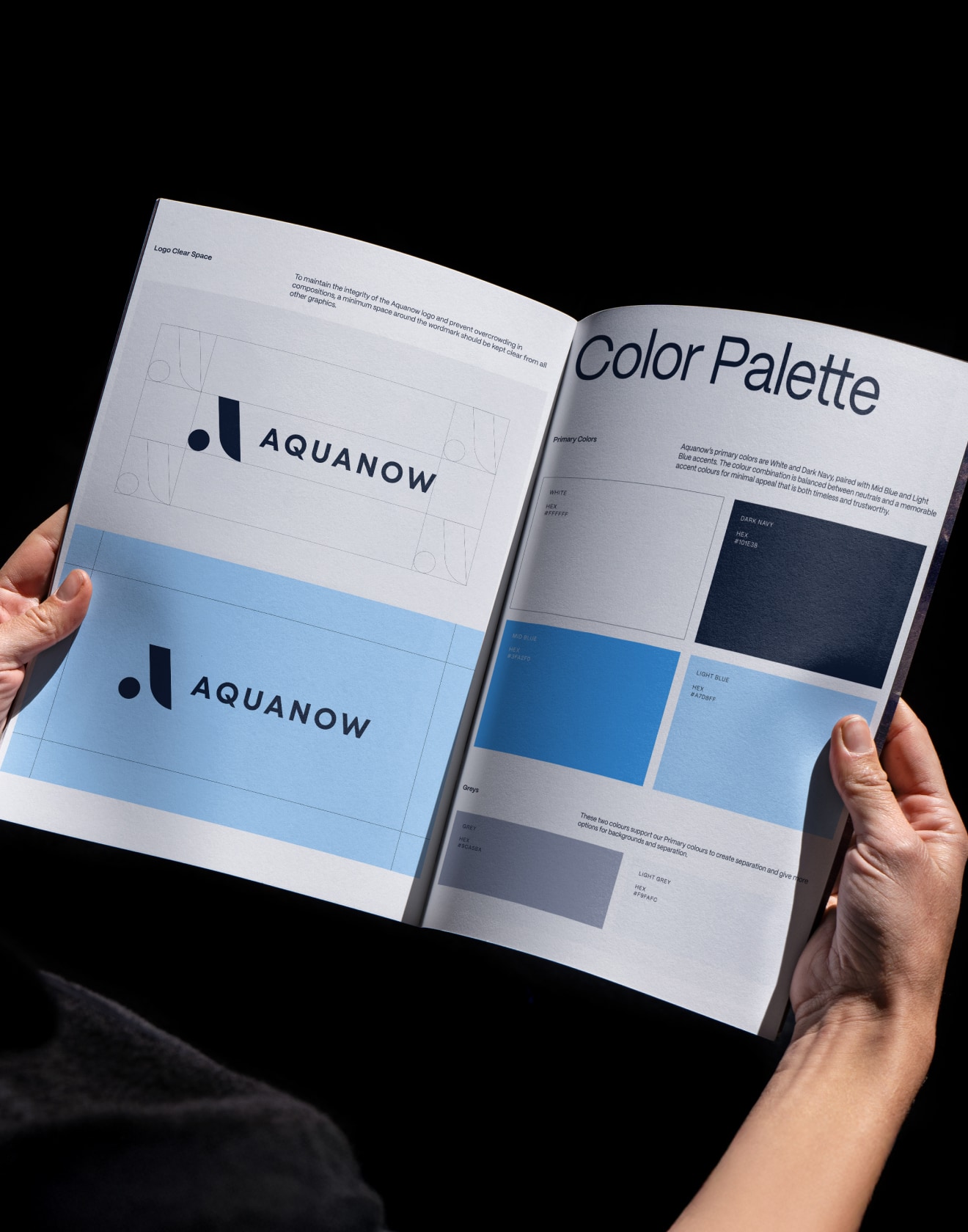
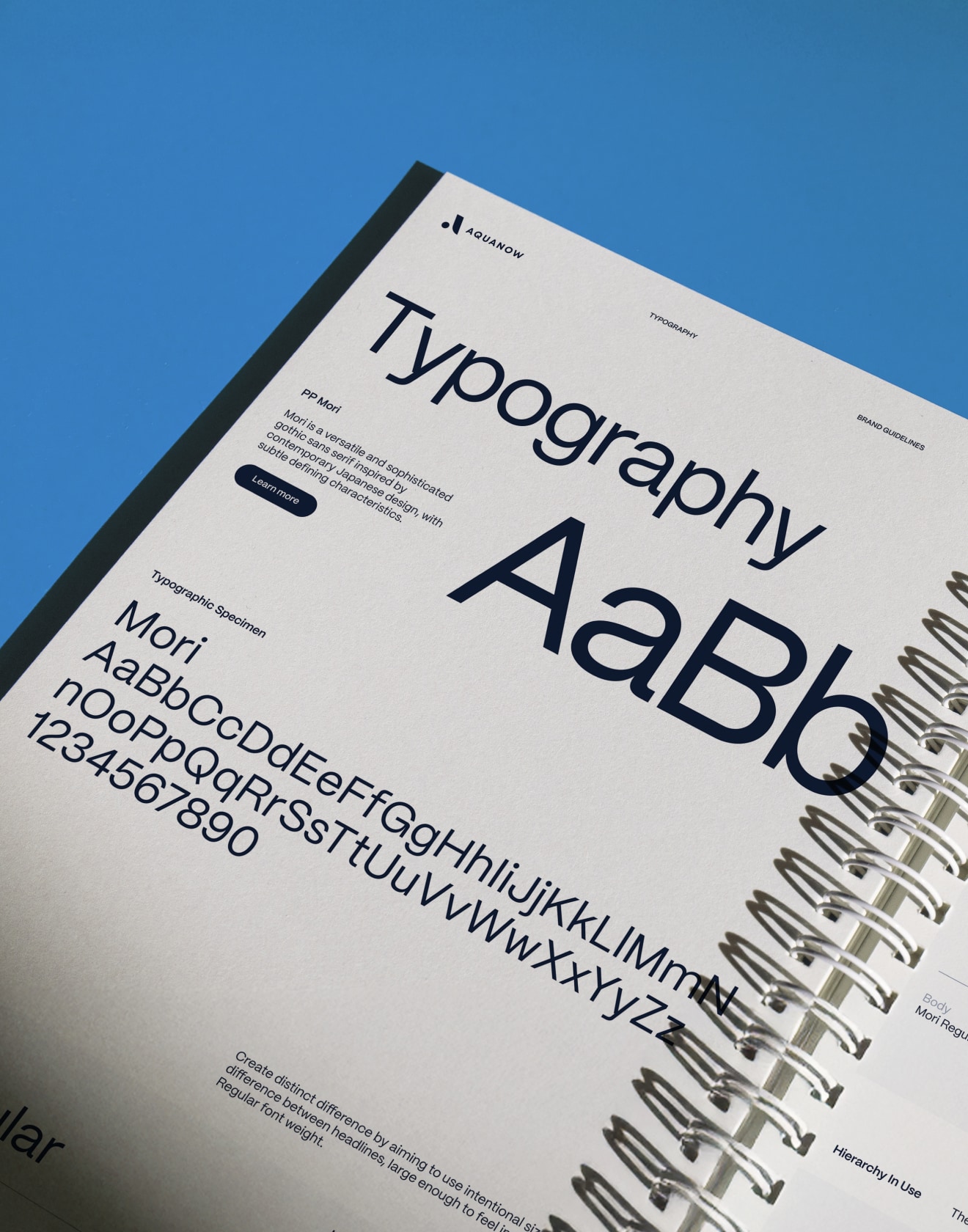
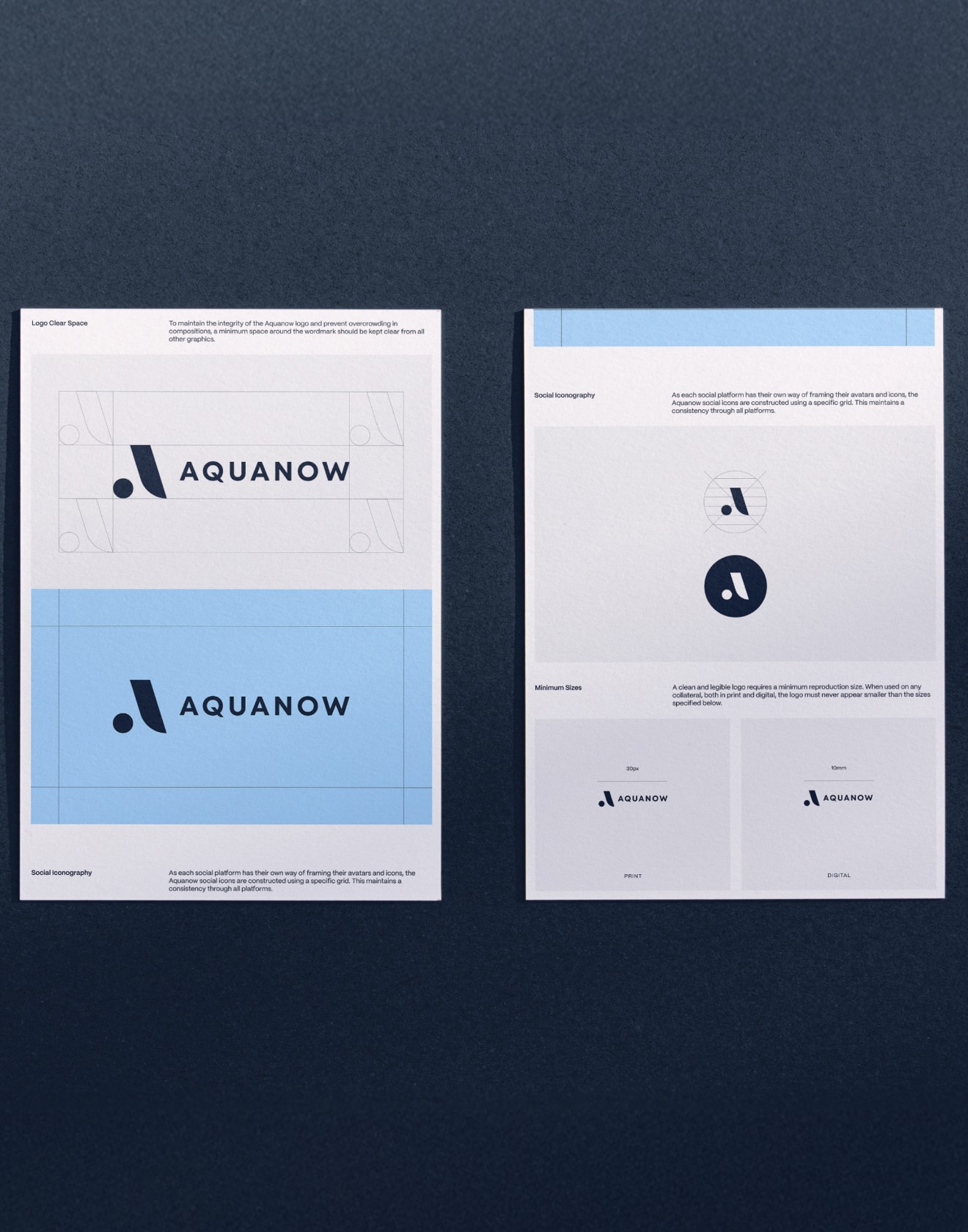


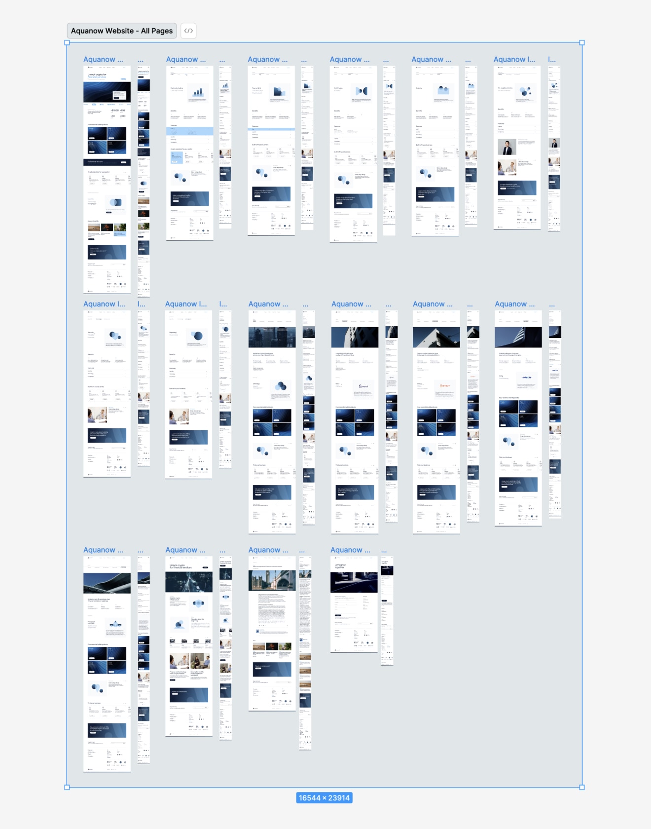
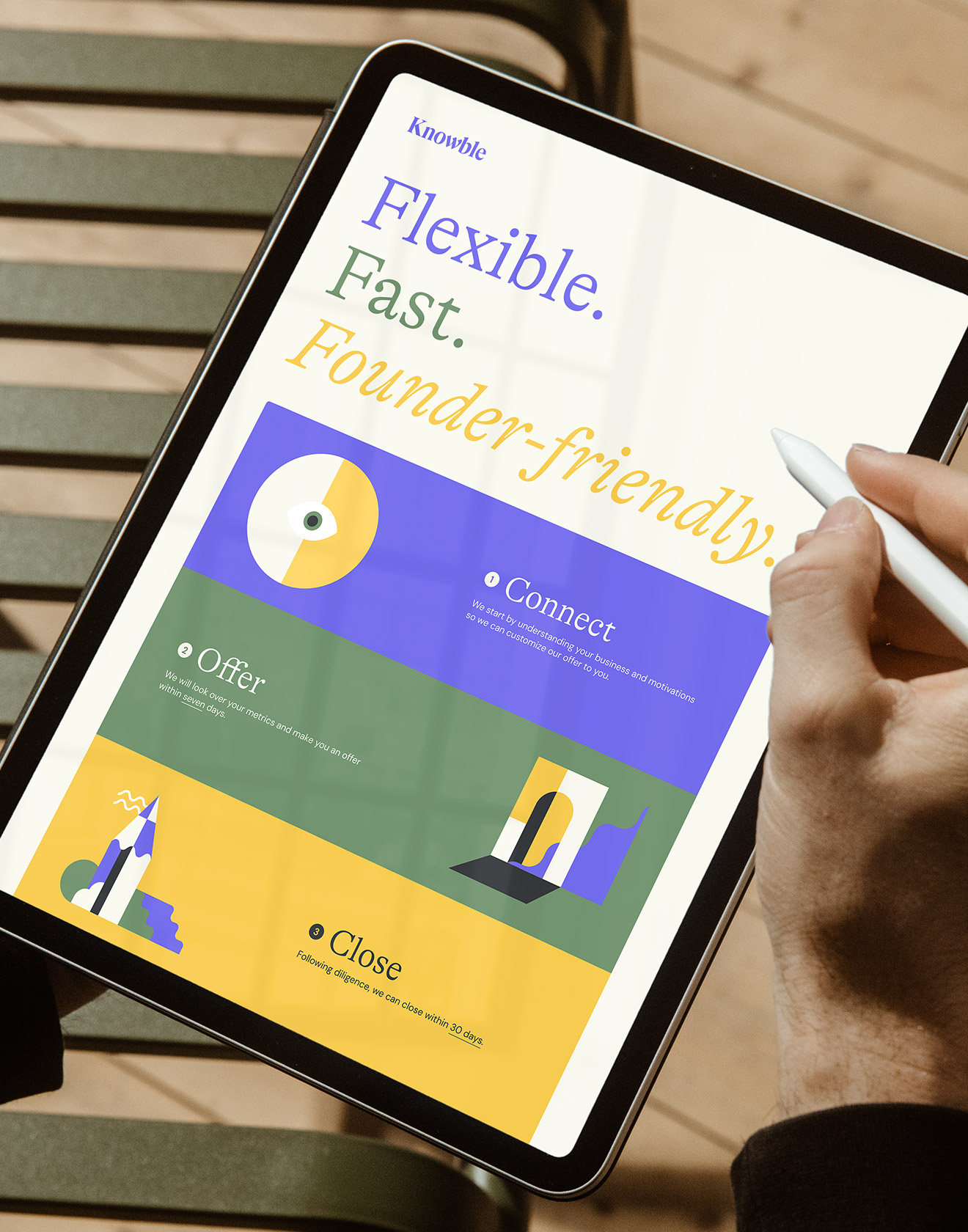
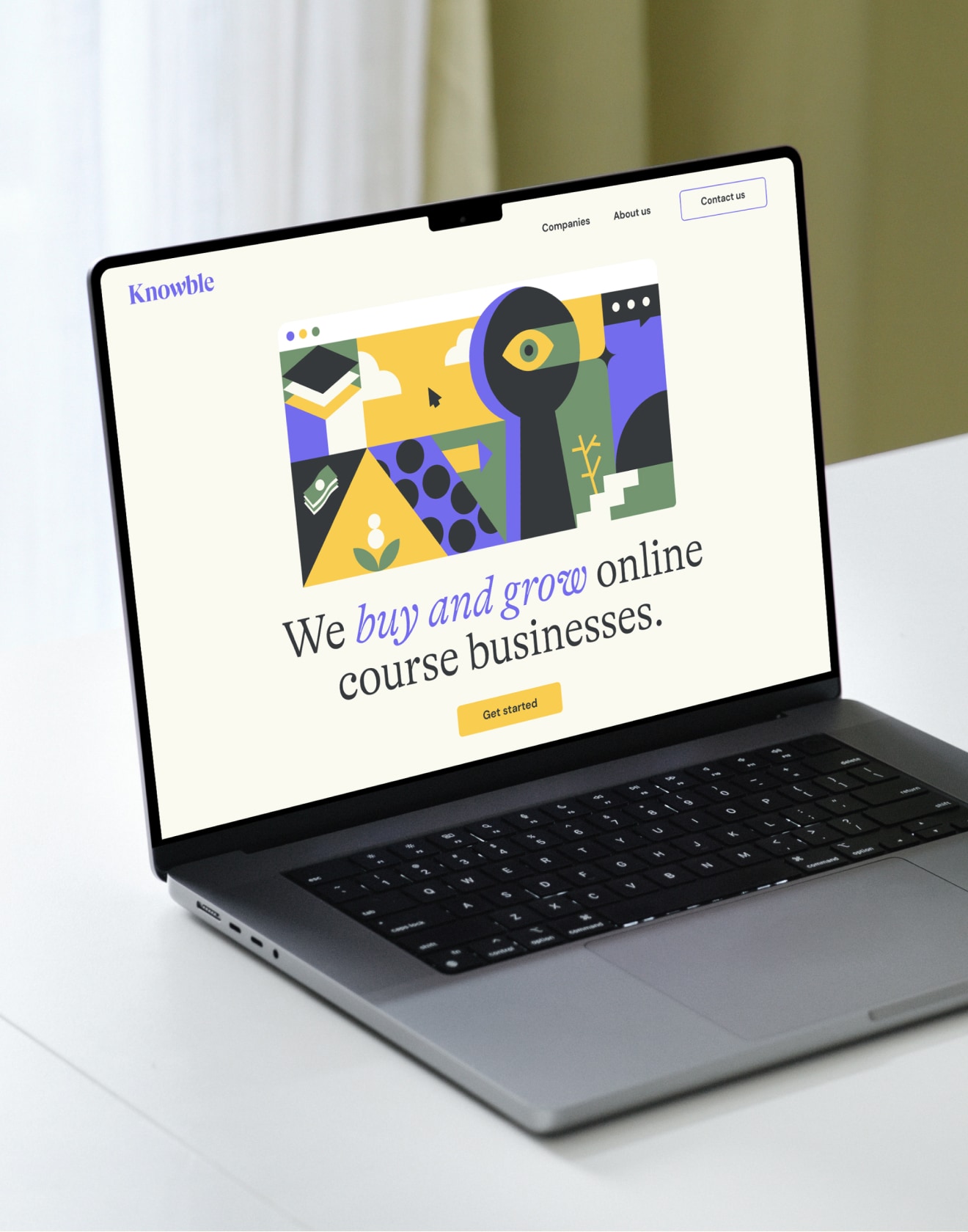
Aquanow
Re-positioning a crypto and digital assets brand within the banking landscape.
From developing a new, contemporary visual direction, strengthening its visual storytelling, and narrowing down which components to focus on, we helped Aquanow achieve the most efficient and impactful way to create a trustworthy perception.
We set out to develop a new visual communication approach that encapsulates their offering while avoiding typical crypto clichés – one that creates memorability in an otherwise futuristic and flashy crypto marketplace.
The rebrand defined all aspects of the identity, along with animated renders and a graphic icon system to represent the various offerings and platforms within Aquanow’s digital asset offering.
Read more
< swipe >
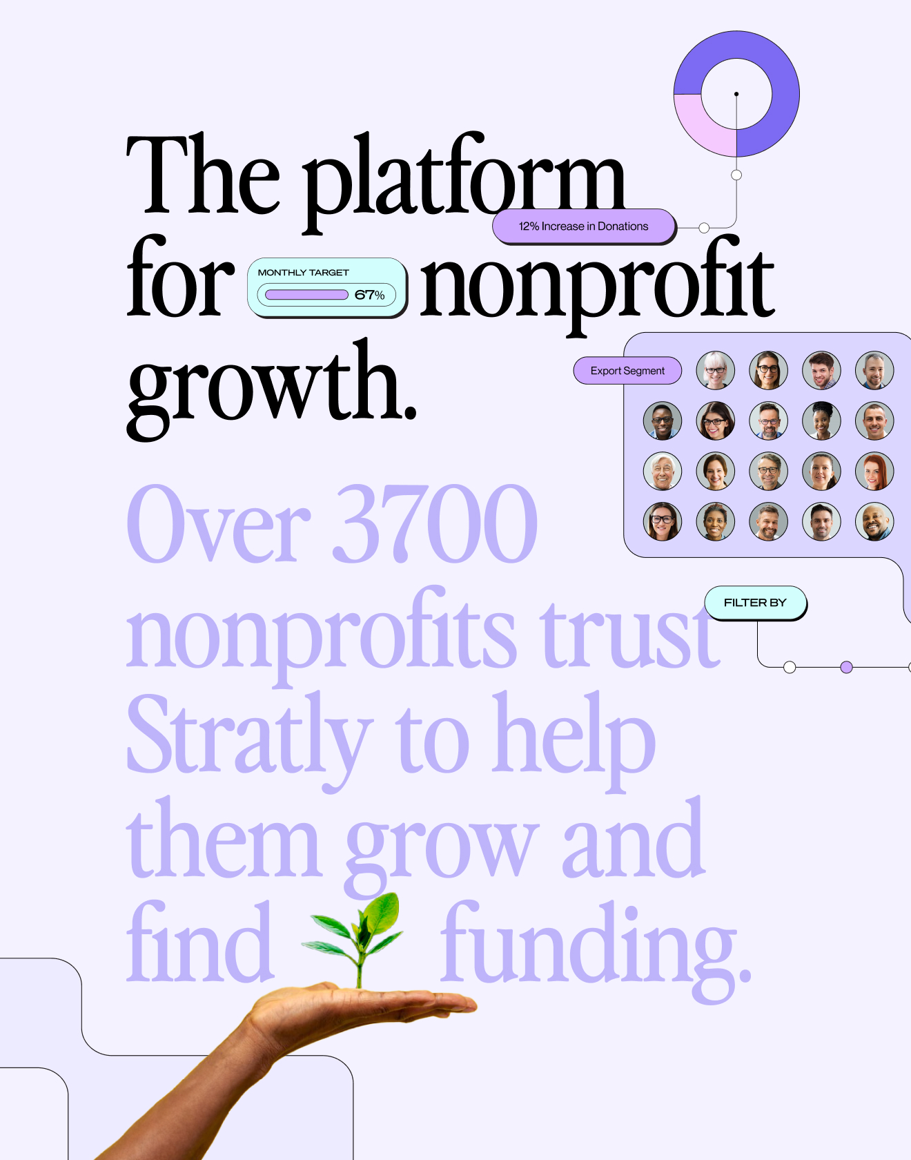
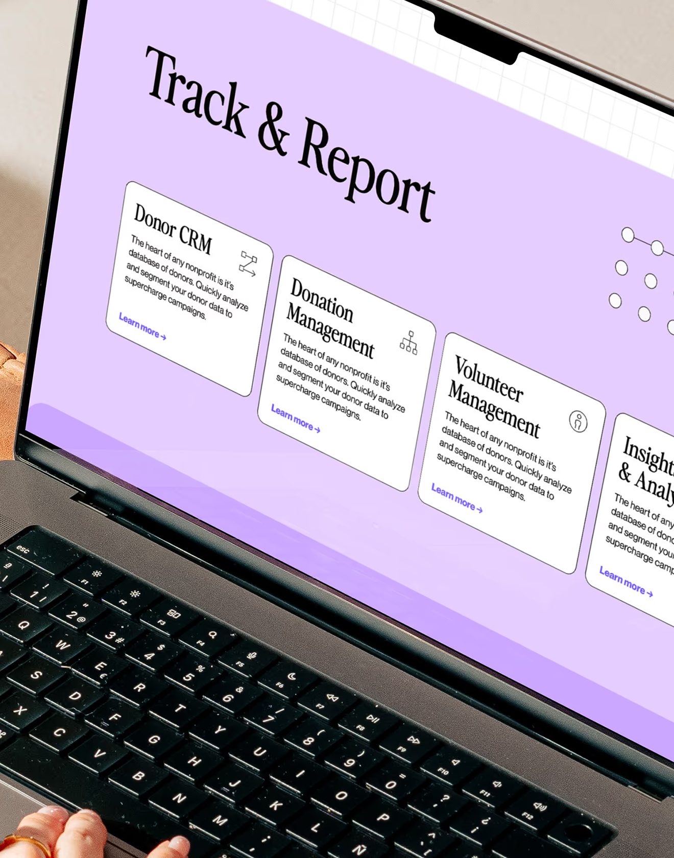

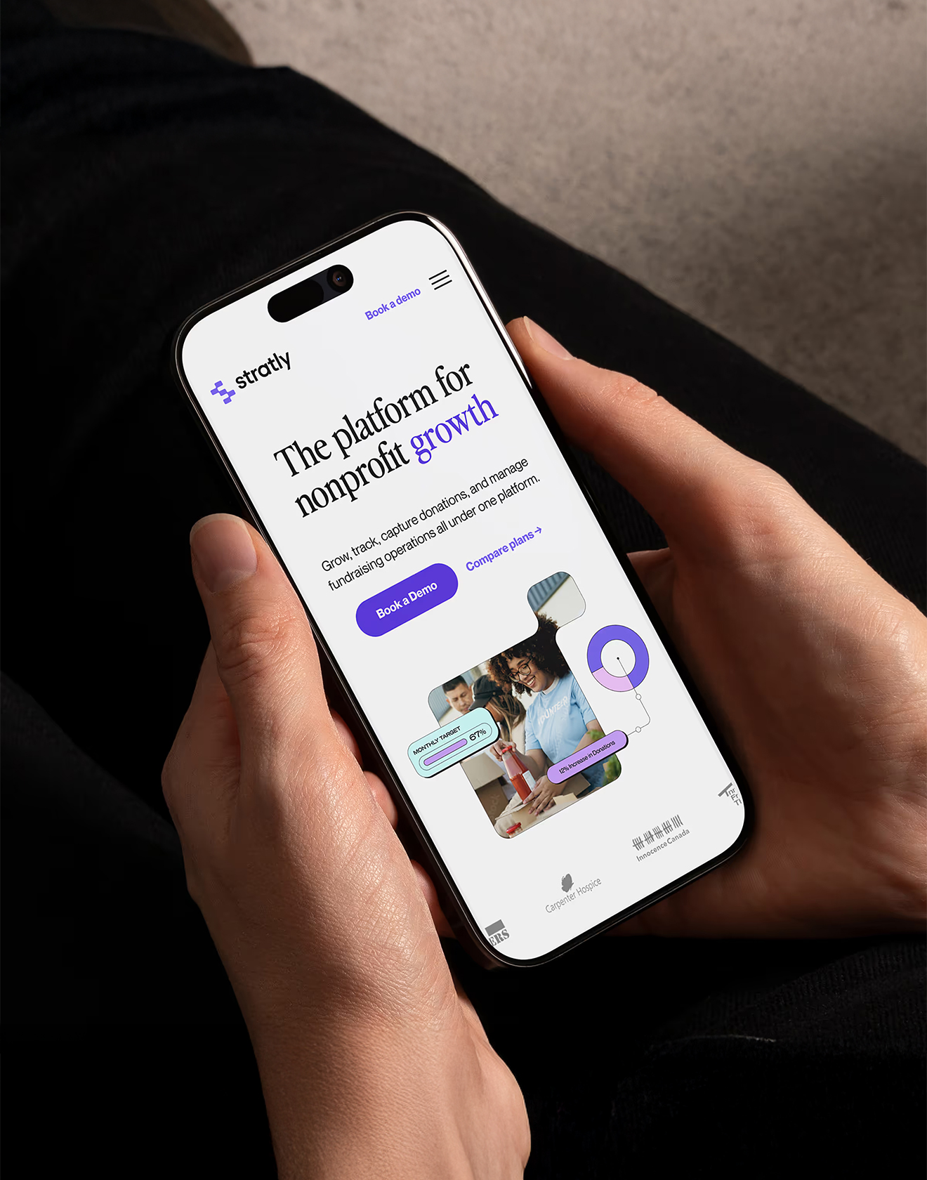
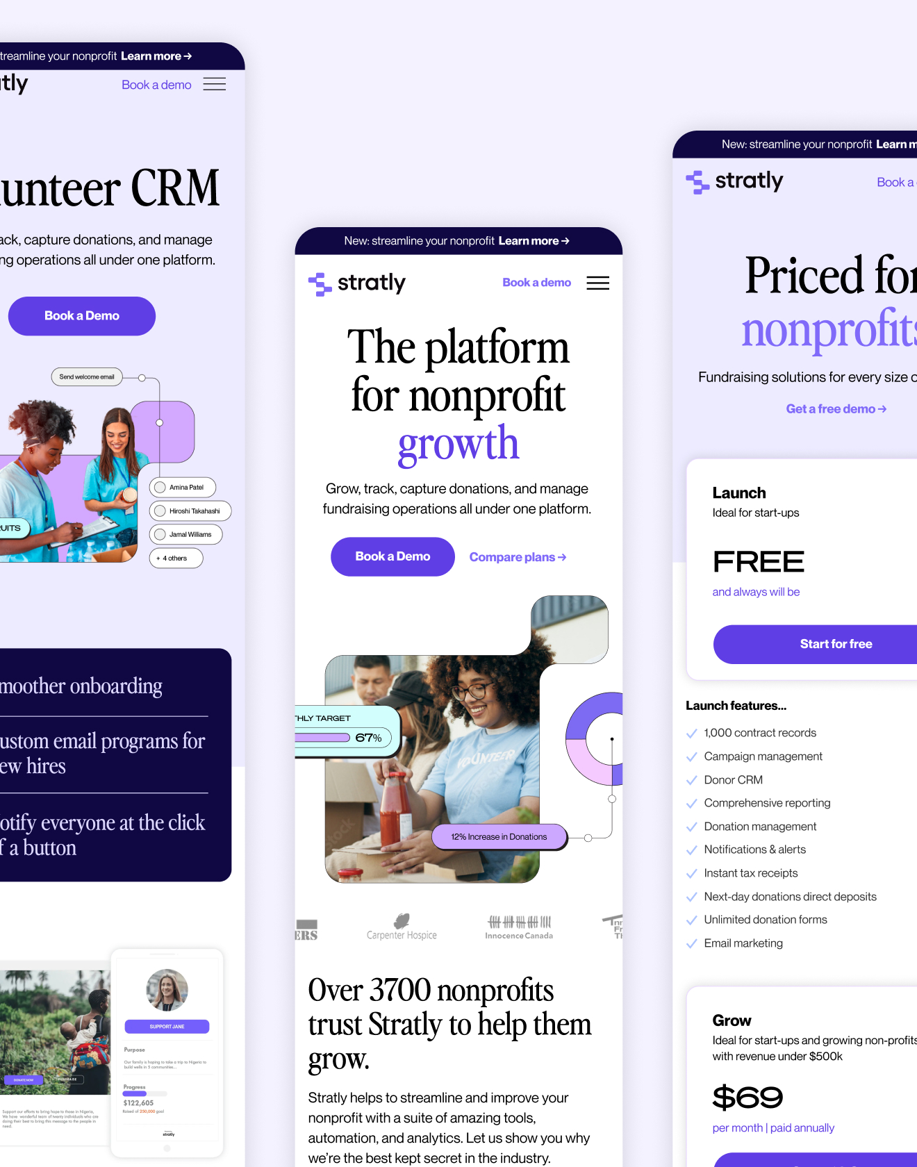
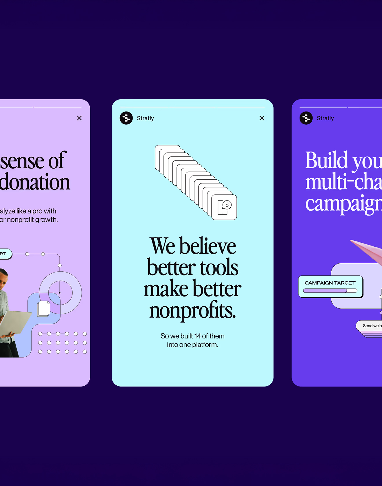
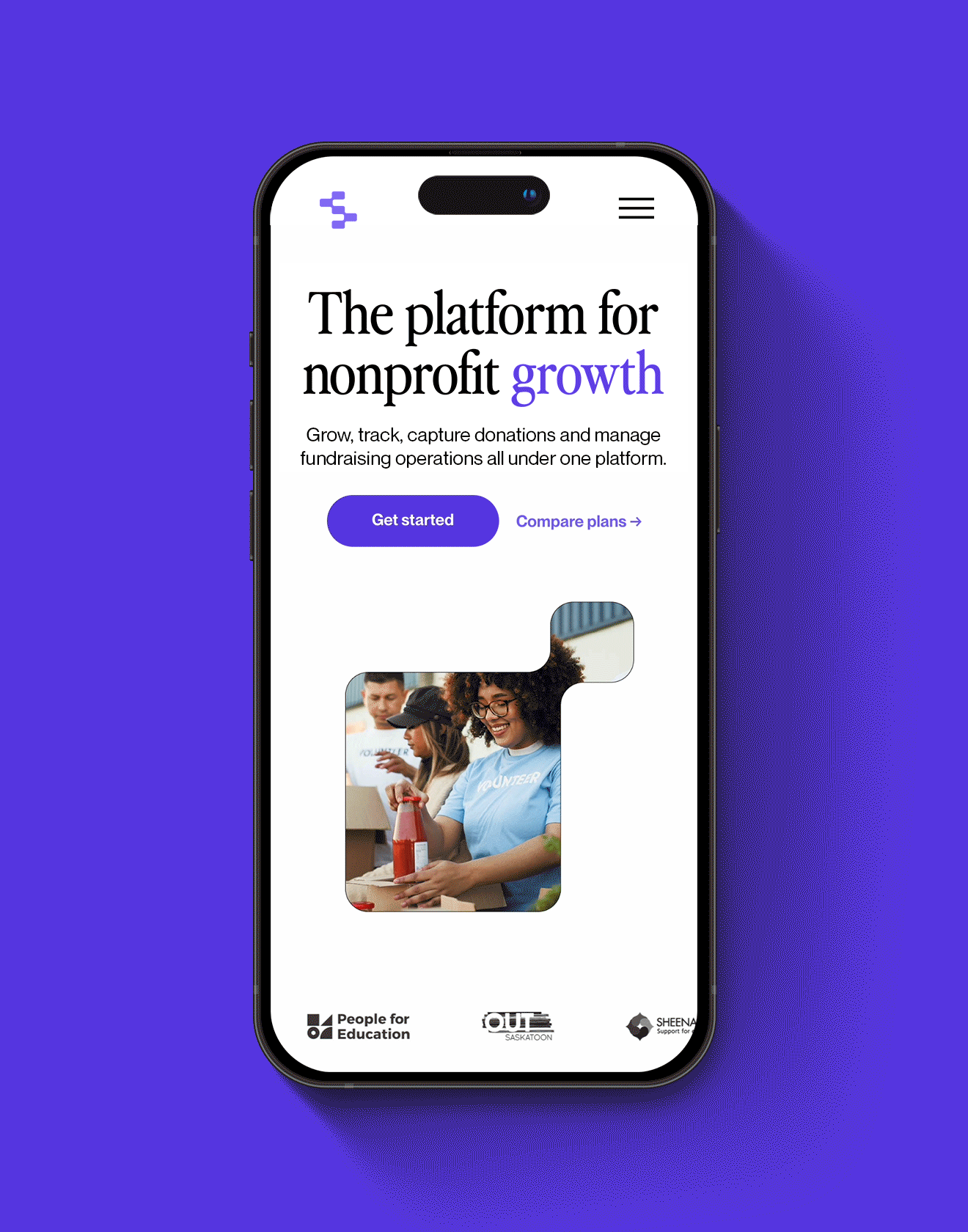
Stratly
Humanizing a SaaS brand built to help nonprofits do more good.
Stratly needed a complete rebrand and web redesign to match its purpose: helping nonprofits do more good, more easily. Together with Adam of TMPO Studio that led renaming and identity, I rebuilt and redesigned their extensive website, creating a system that swapped the cold, corporate SaaS look for something warm and human. With a bold logo, soft type, and a thoughtful mix of illustration and photography, Stratly now feels like what it stands for: technology built with heart.
Read more
< swipe >
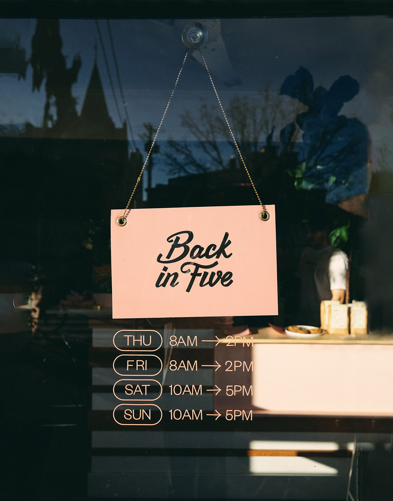
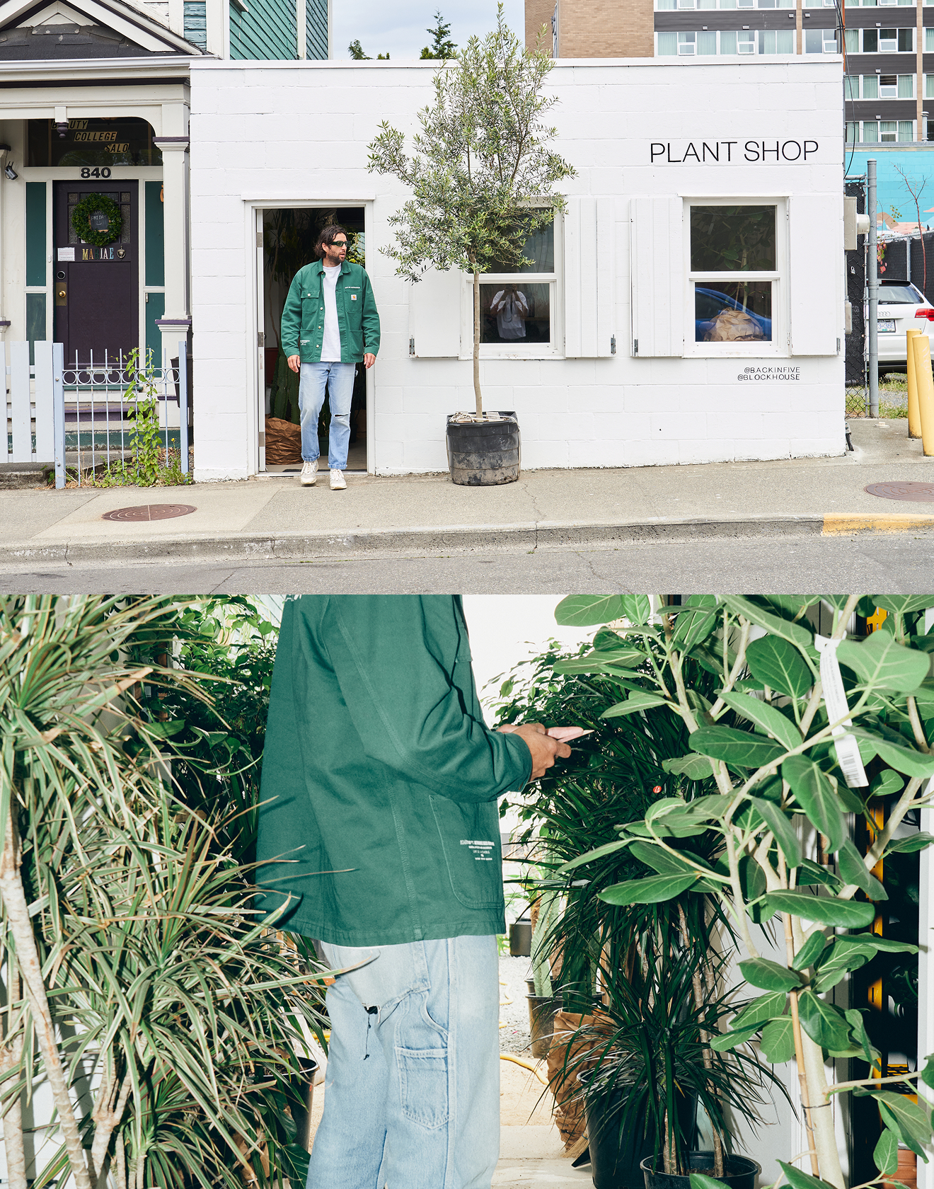
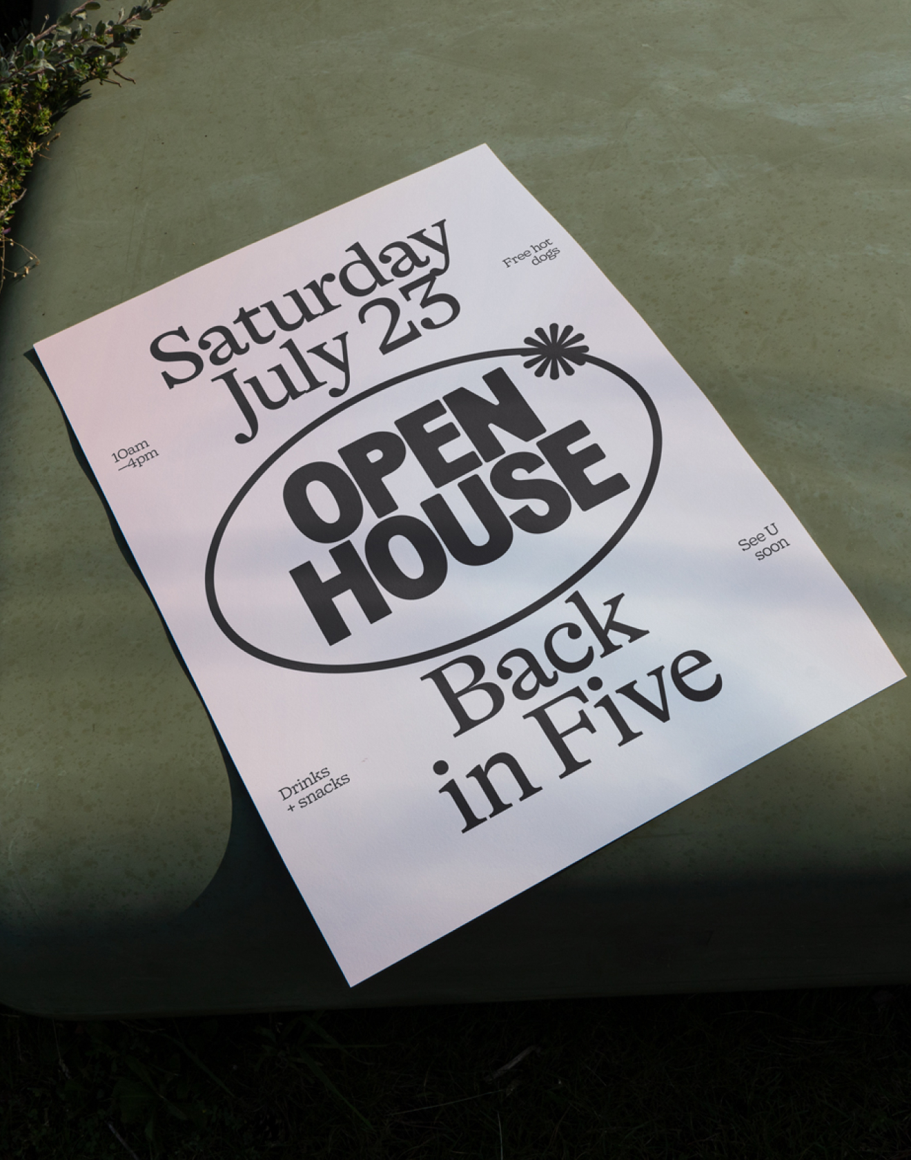
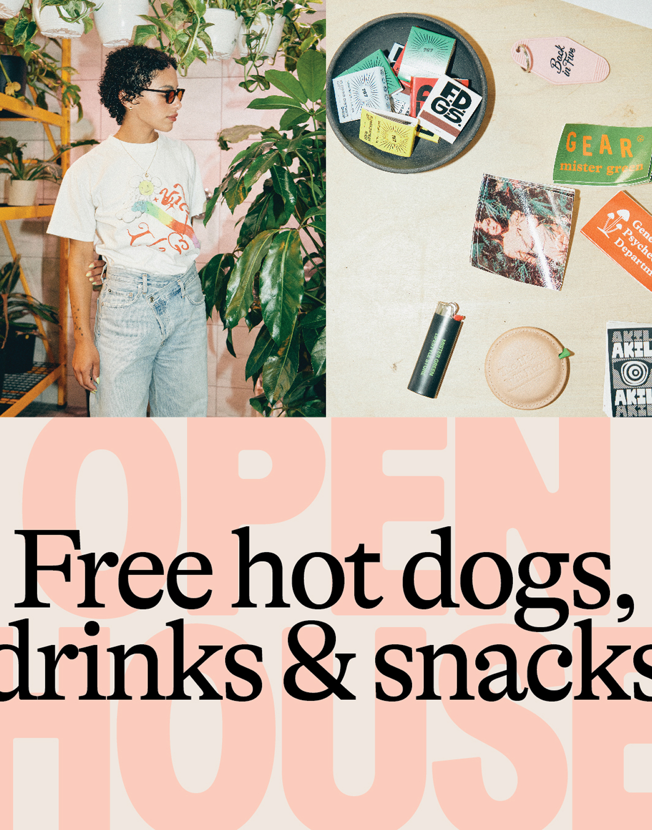
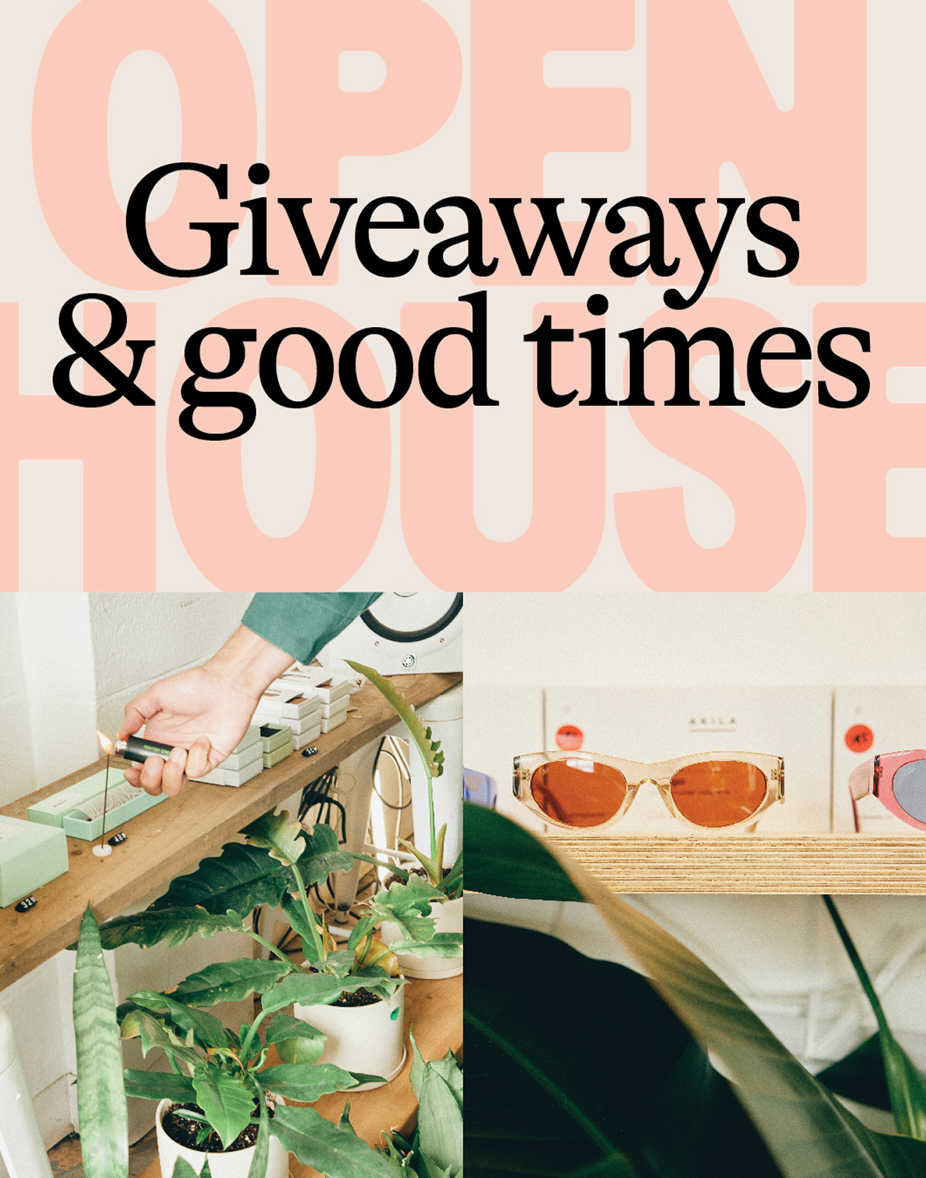
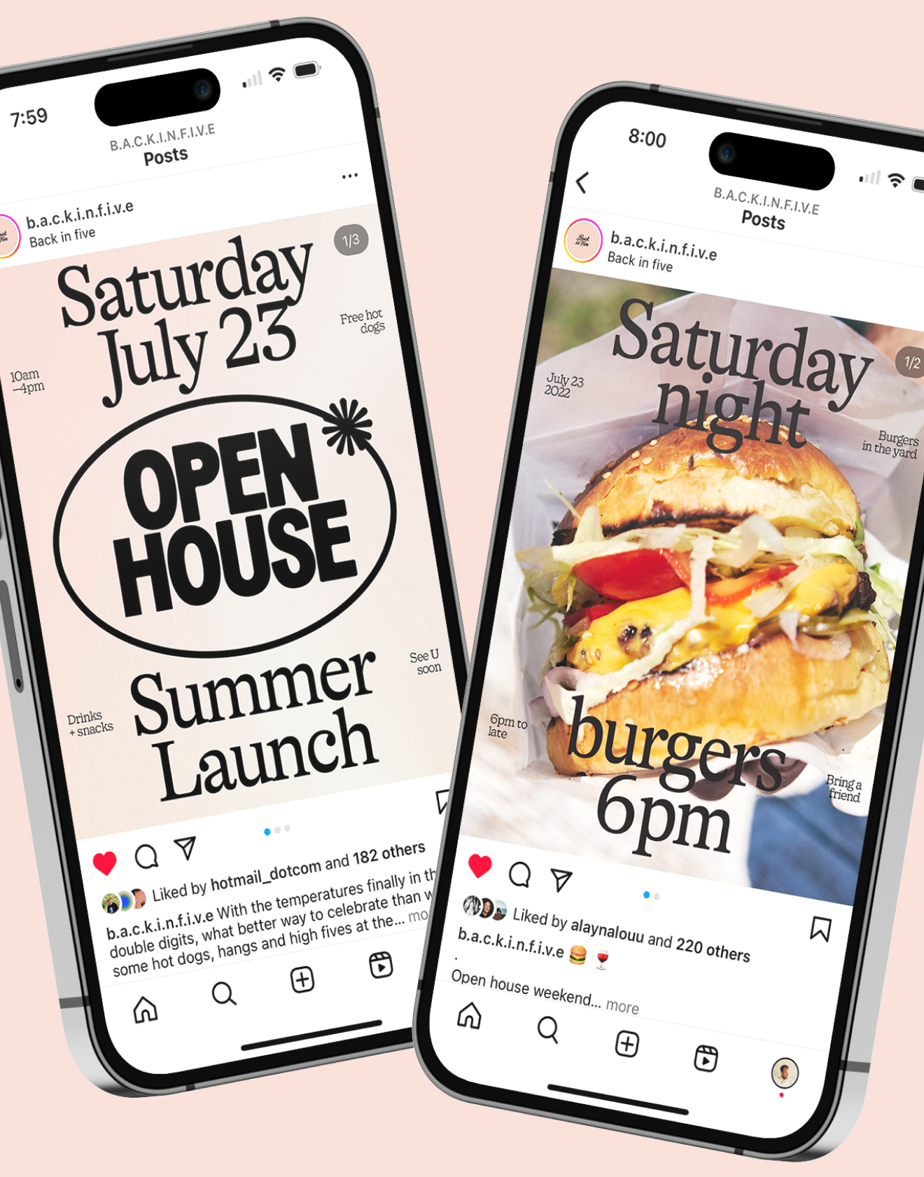
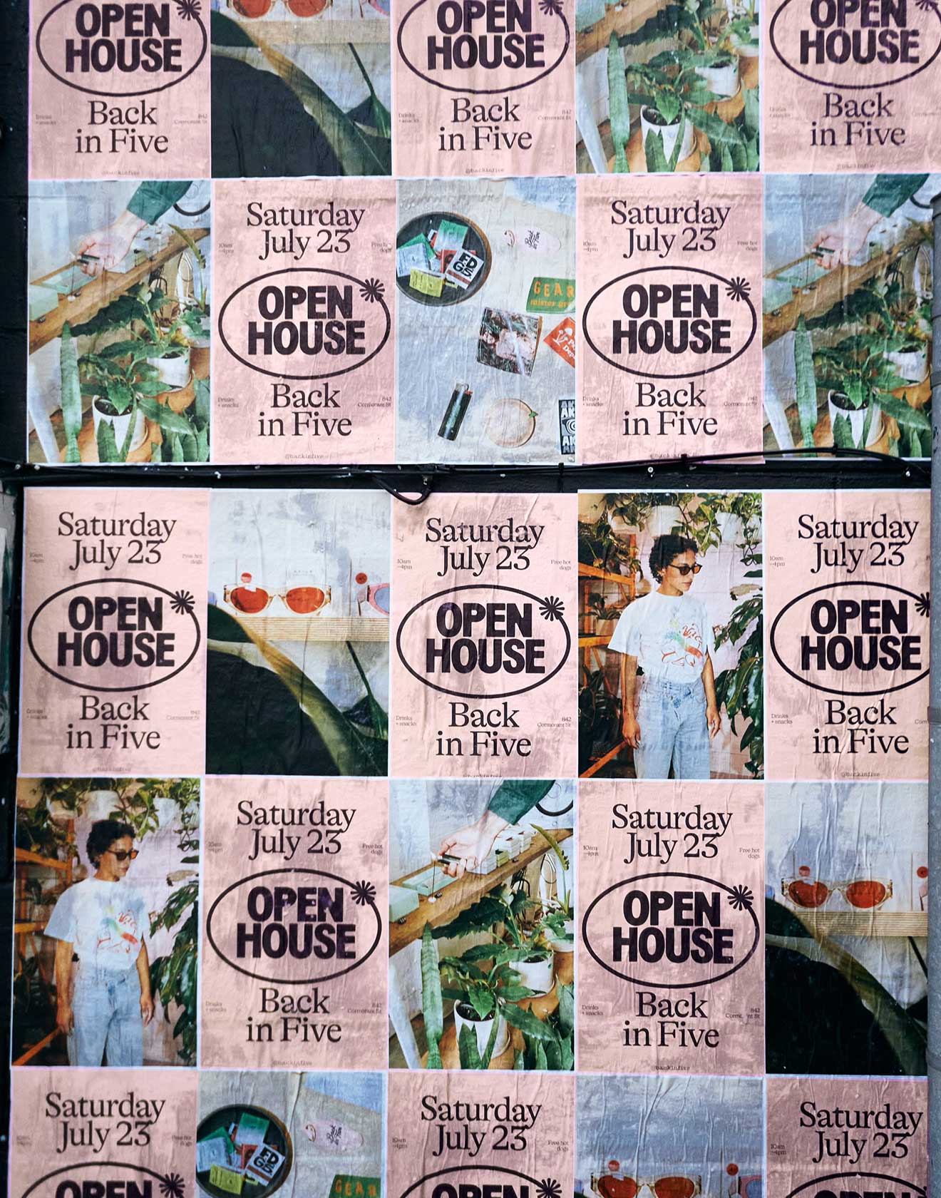
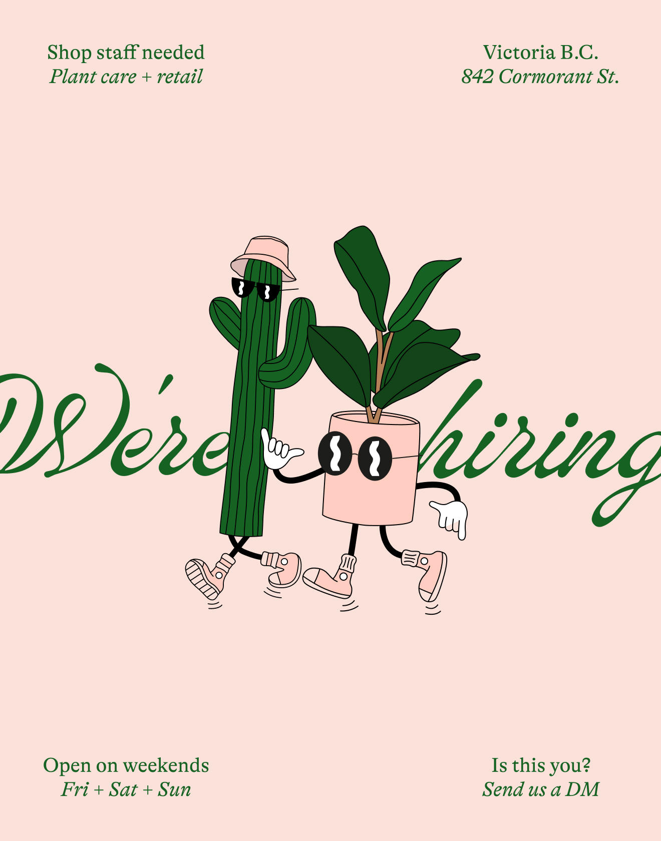
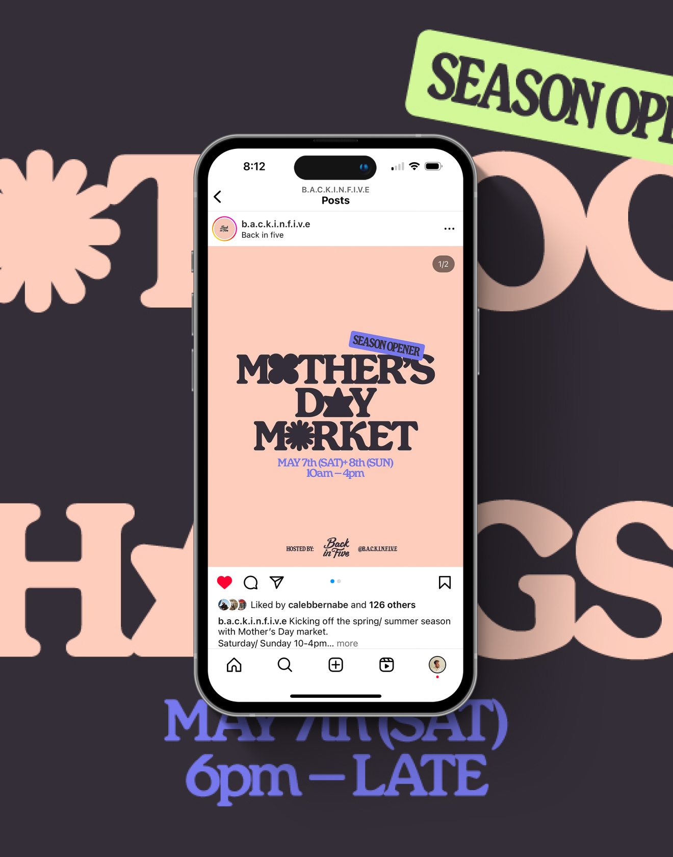
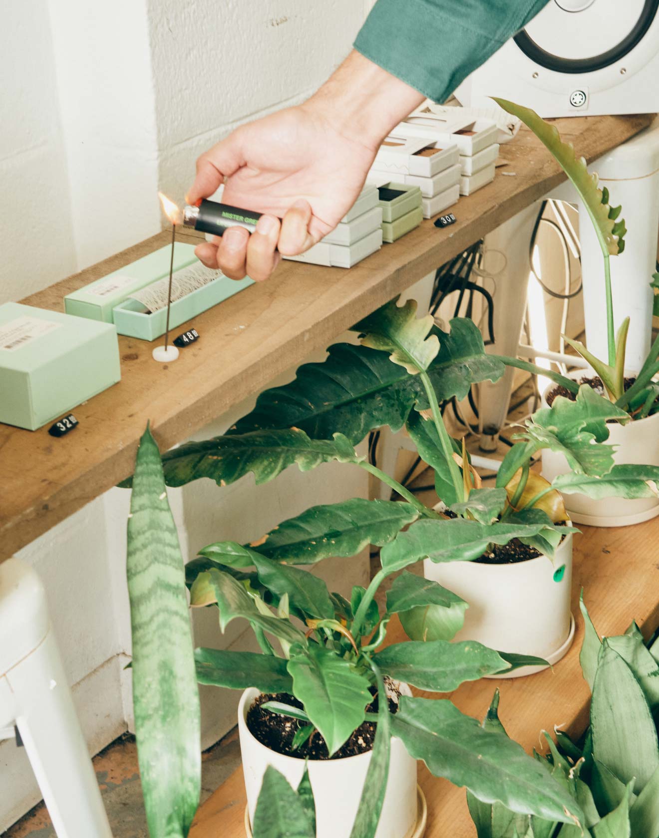
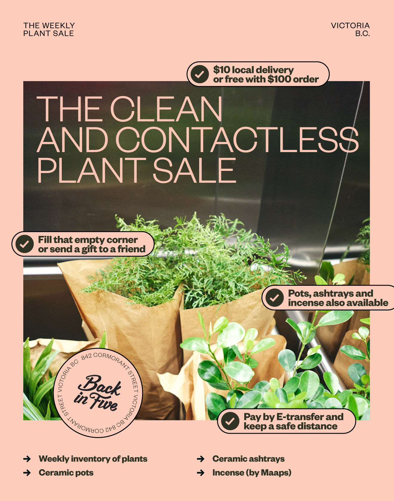
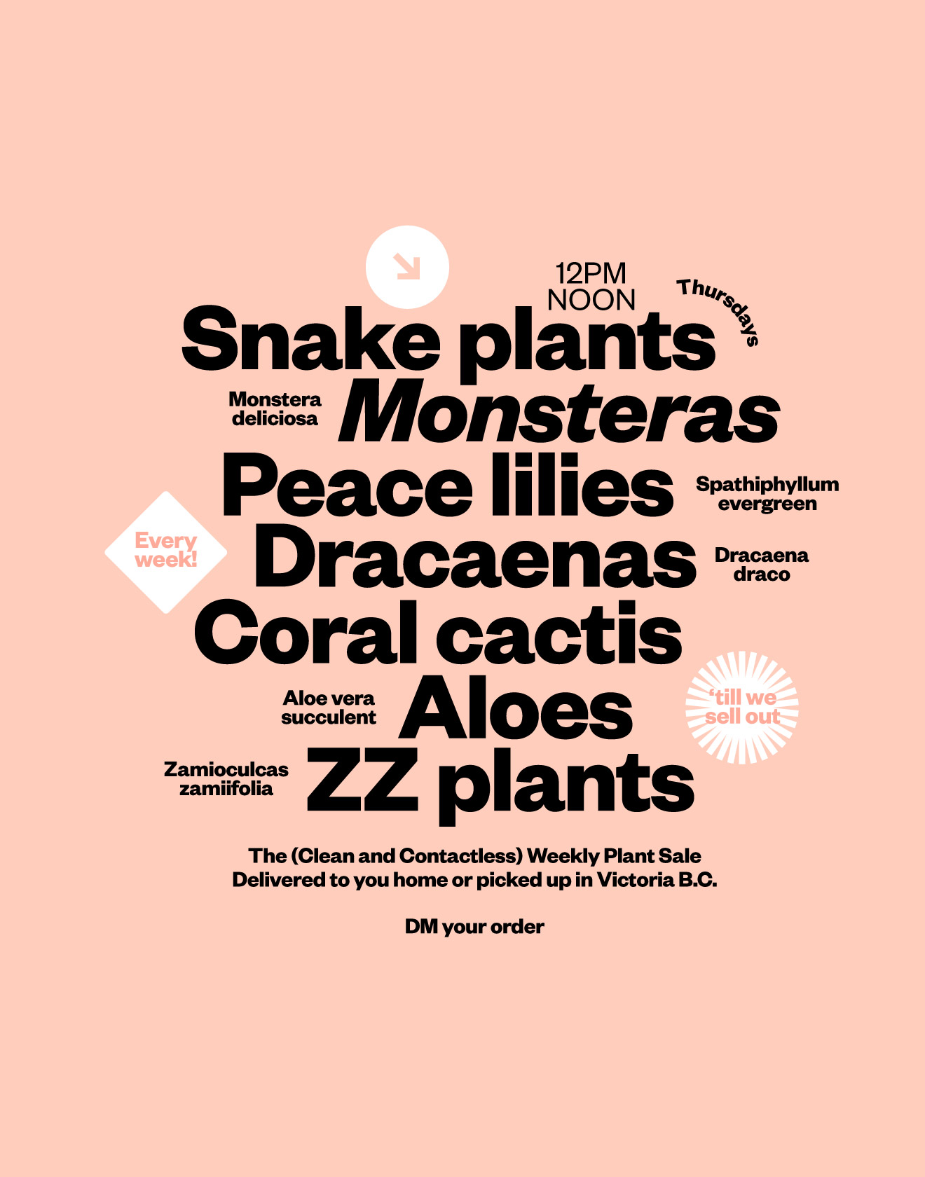
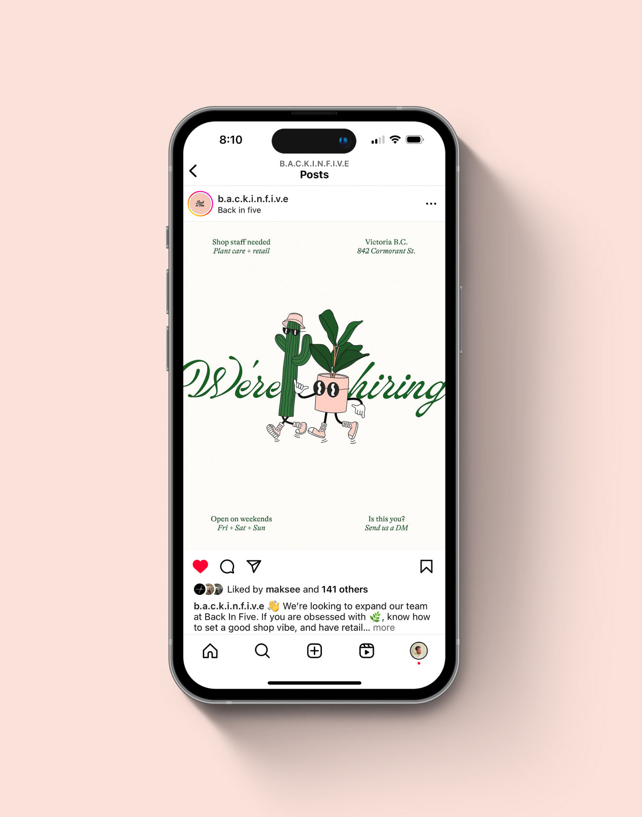
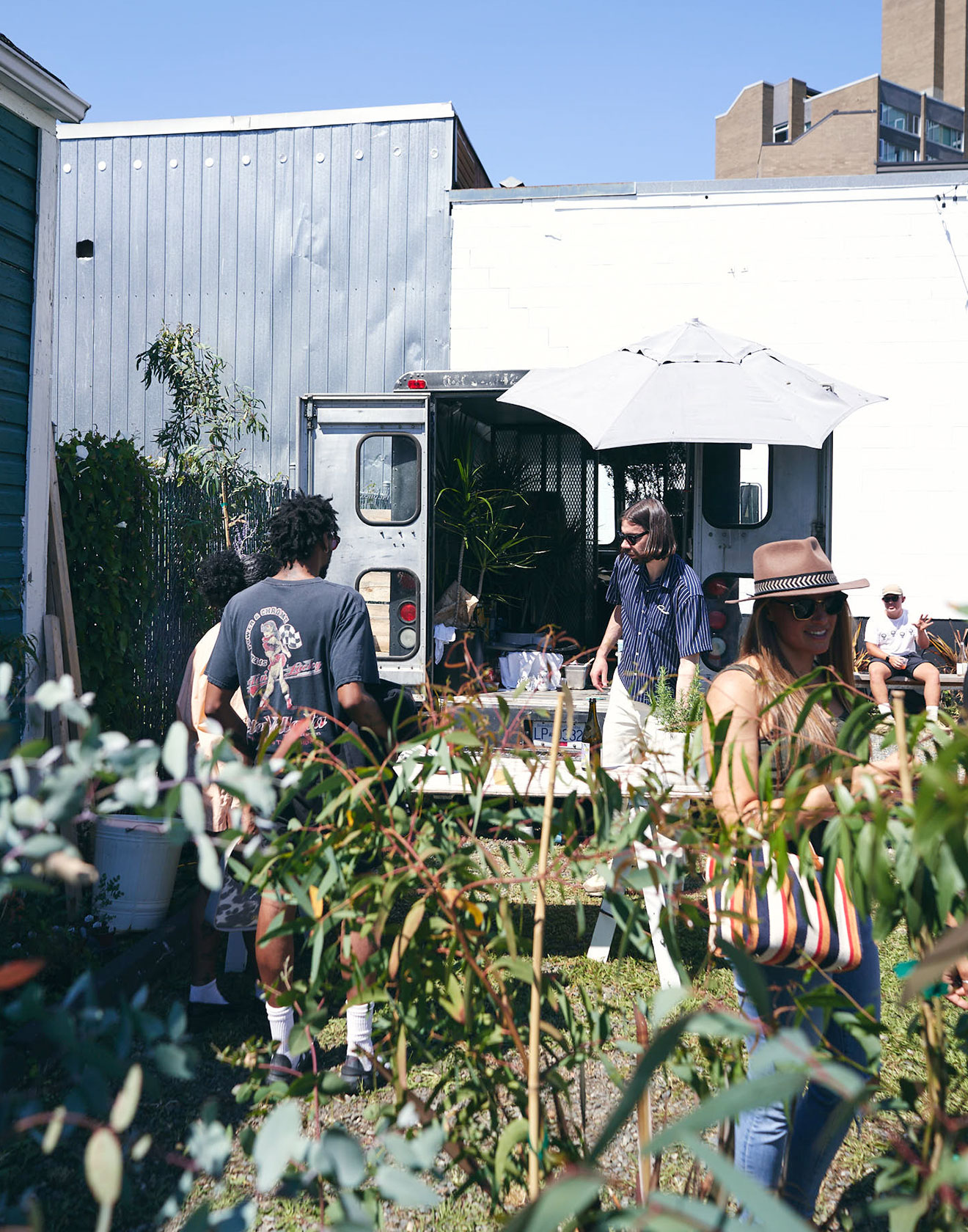
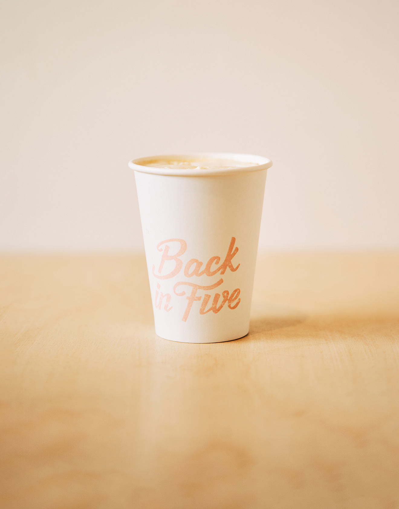
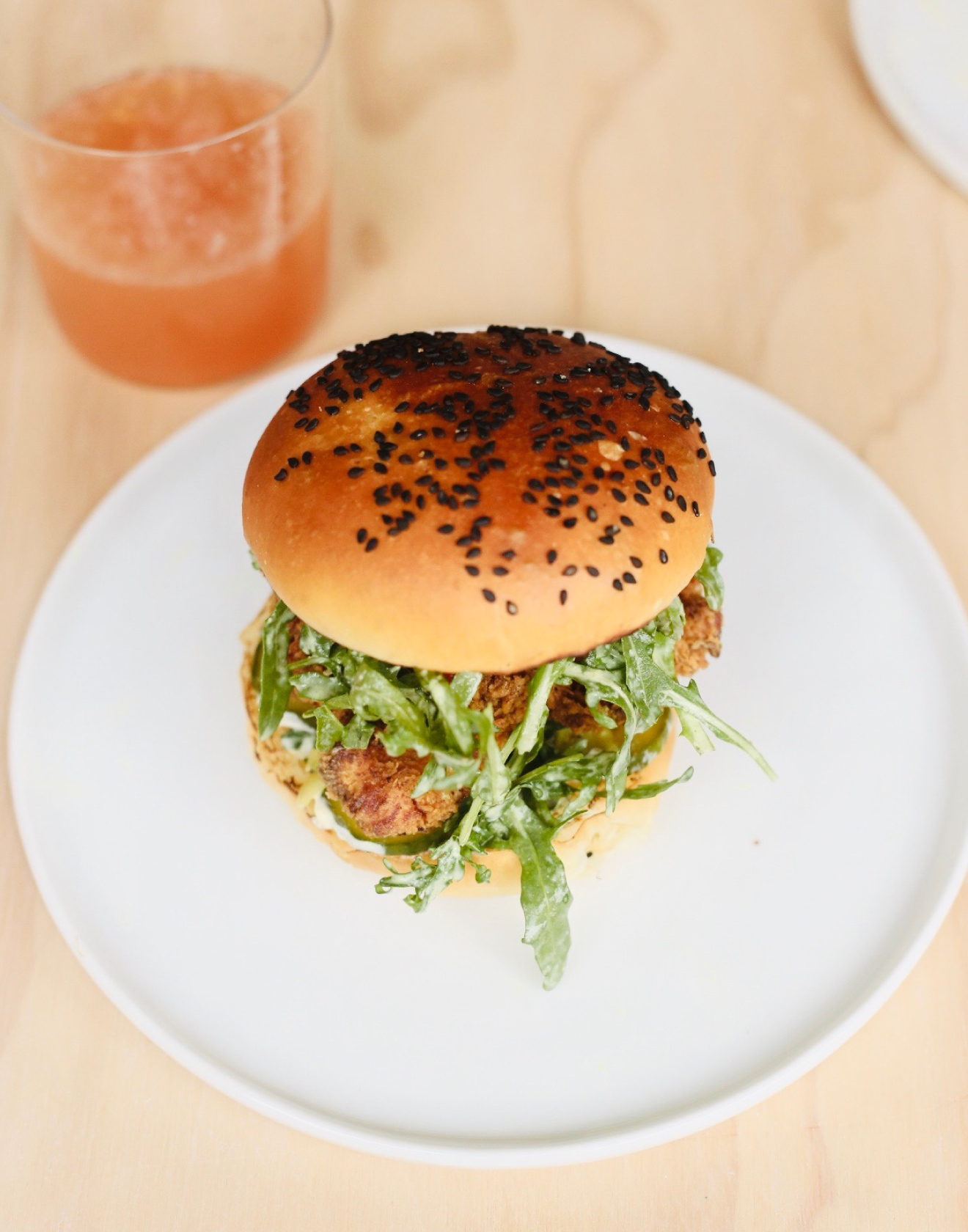
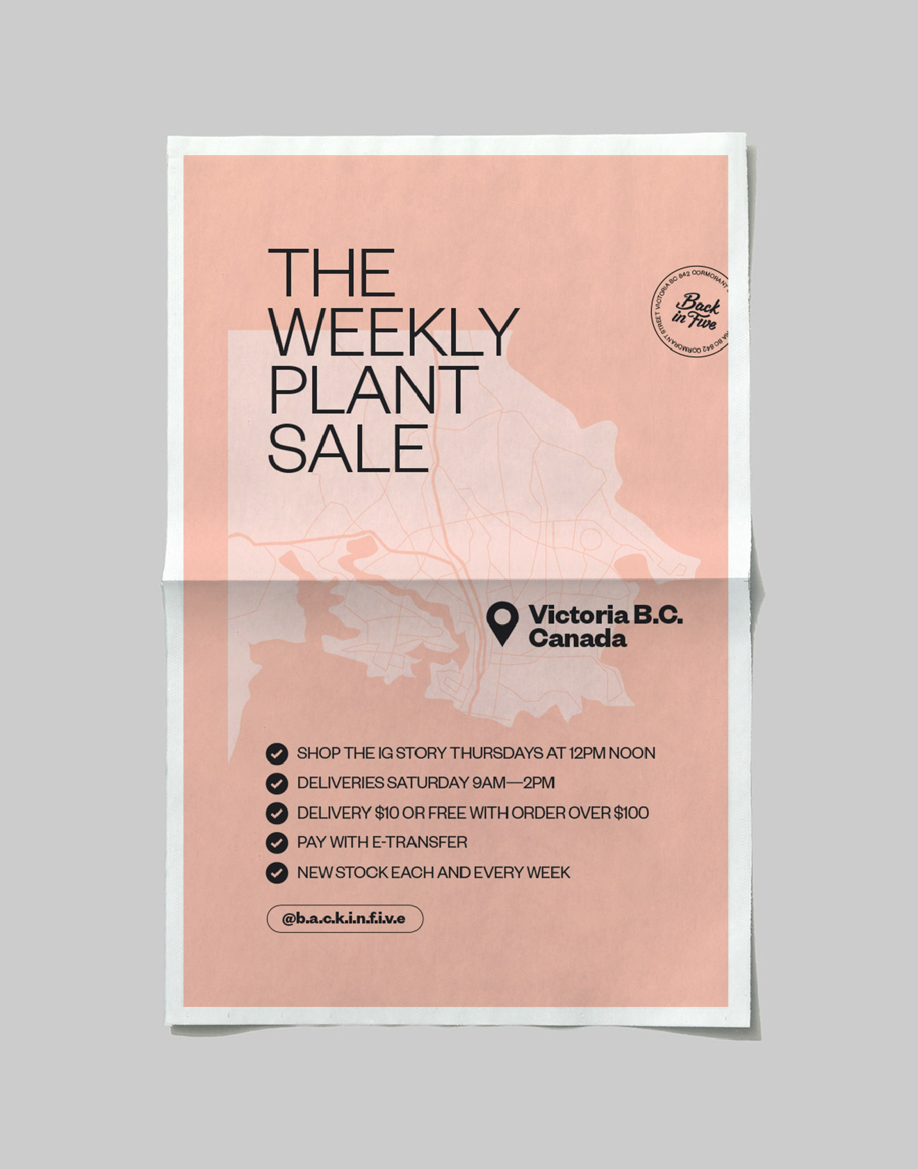
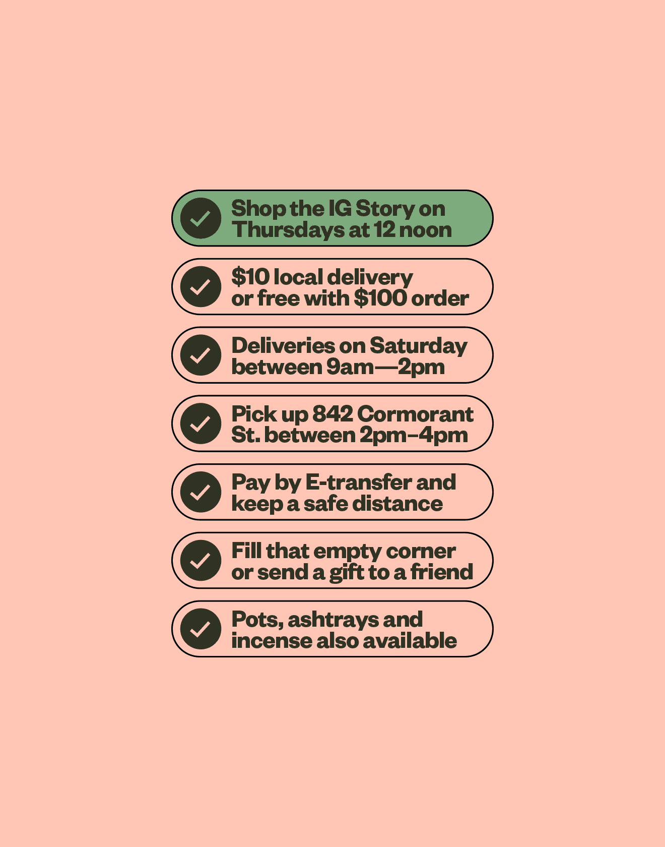
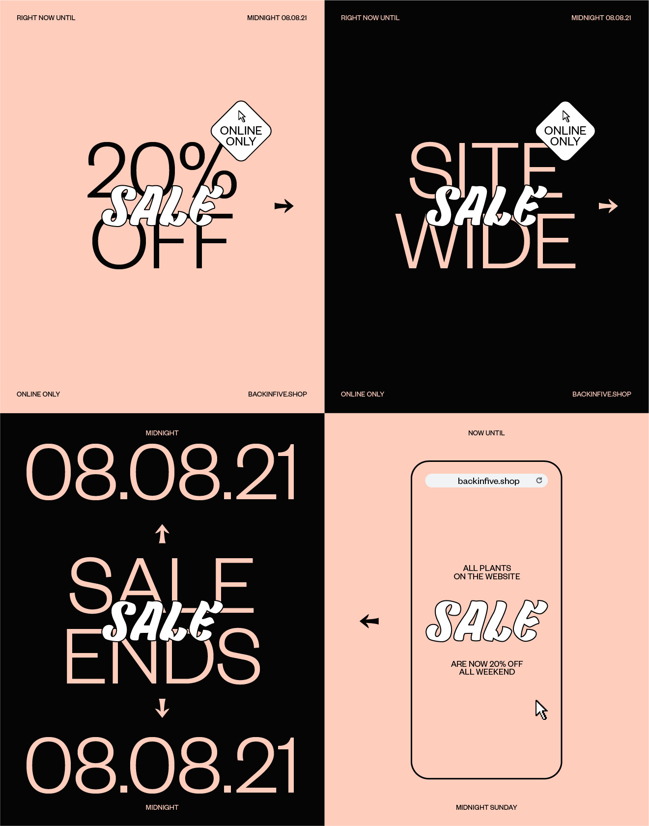
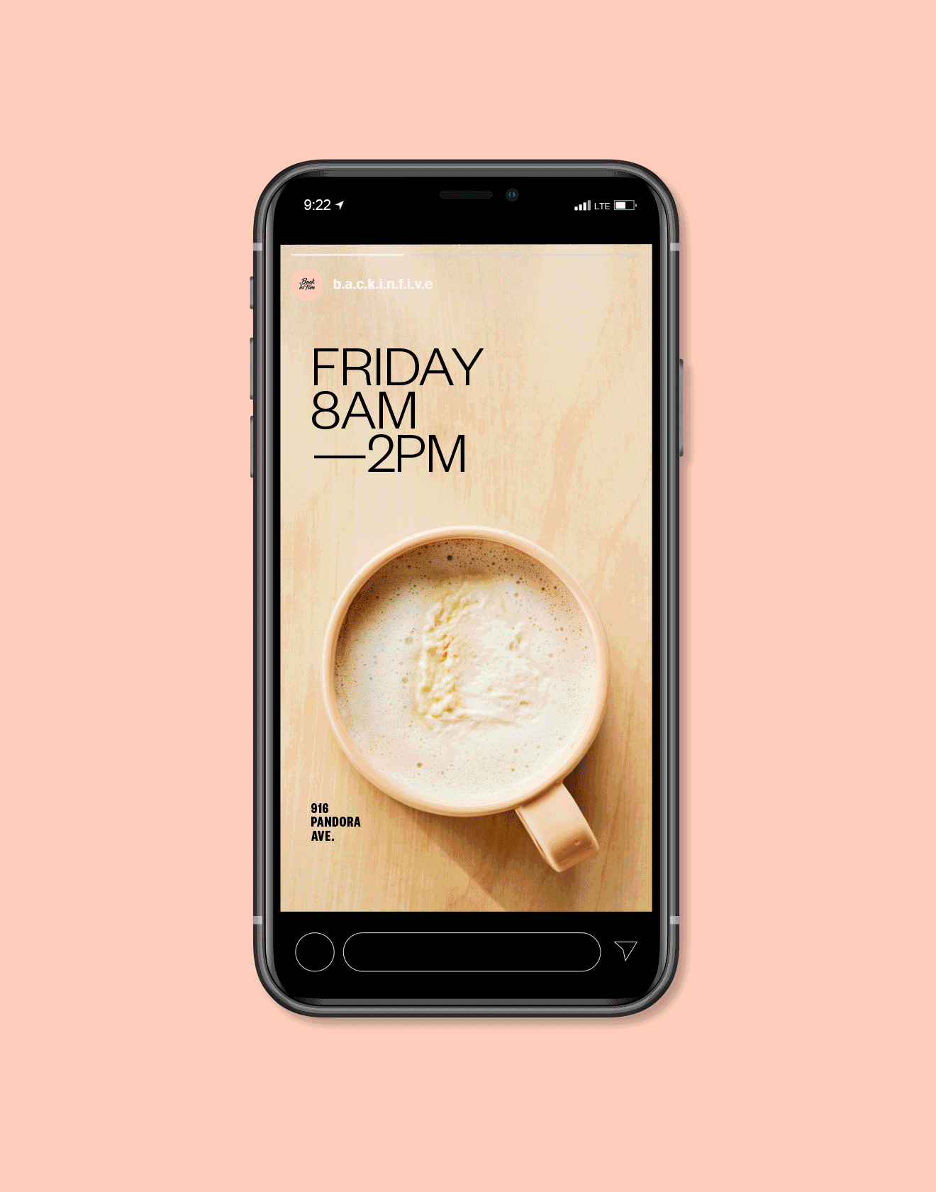
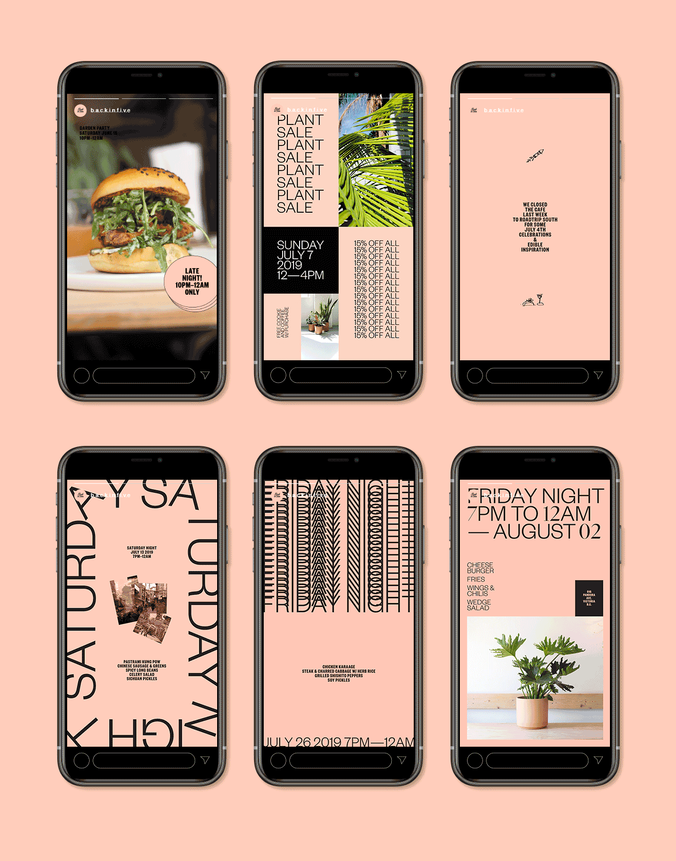
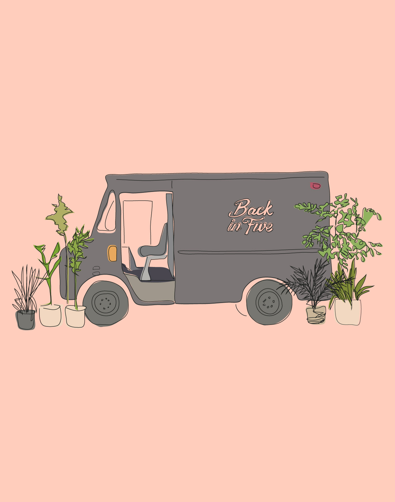
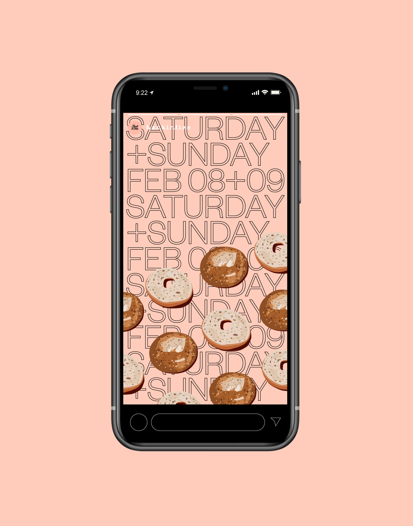
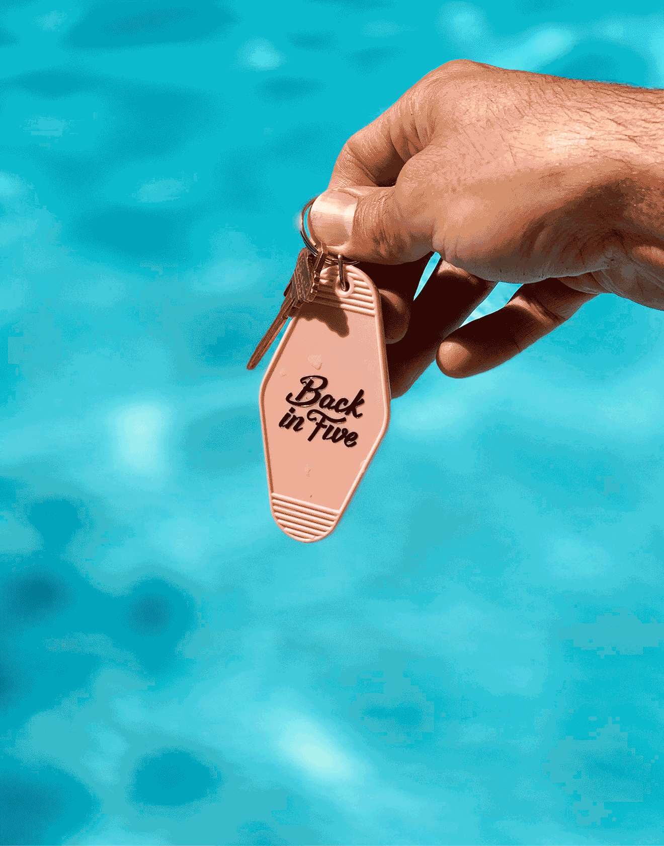
Back in Five
A weekend shop for plant lovers, green people, and interior enthusiasts.
A longtime dream for my friend, Sean, (who works 9 to 5 as a landscape architect) opening a café to share his love for plants and food seemed impossible in 2019 until he called the number below the “For Lease” sign on Pandora Avenue. Within seven days, a new instagram account was created and friends started piling in for dinner, natural wine, plant shopping and whatever new album just dropped. This dream was based on Sean’s original intent: work all week and serve food to the public on weekends. The concept was born: “Back in Five”. Since the pandemic in March of 2020, the café closed, the lease was given up, and the brand has evolved and moved online. Although plants and wellness has become the new focus, the brand ethos remains the same: pink-and-black-everything (with a touch of green) and a great community vibe.
@b.a.c.k.i.n.f.i.v.e.
Read more
< swipe >
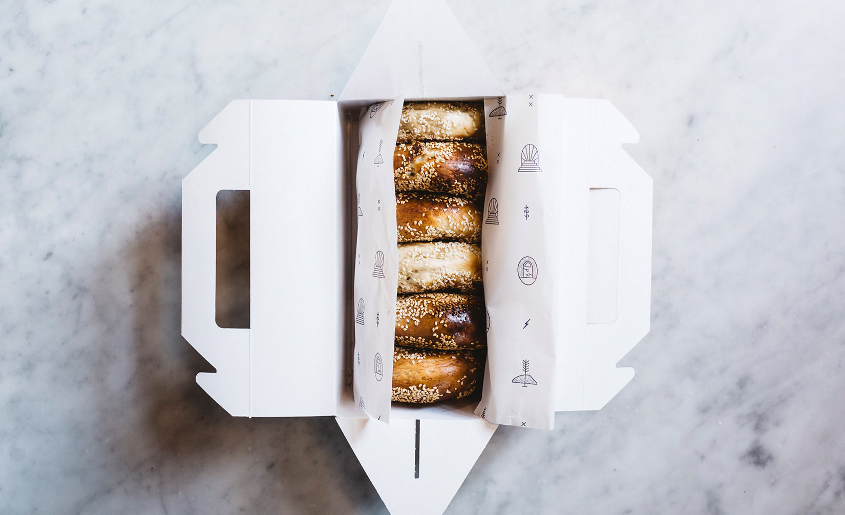
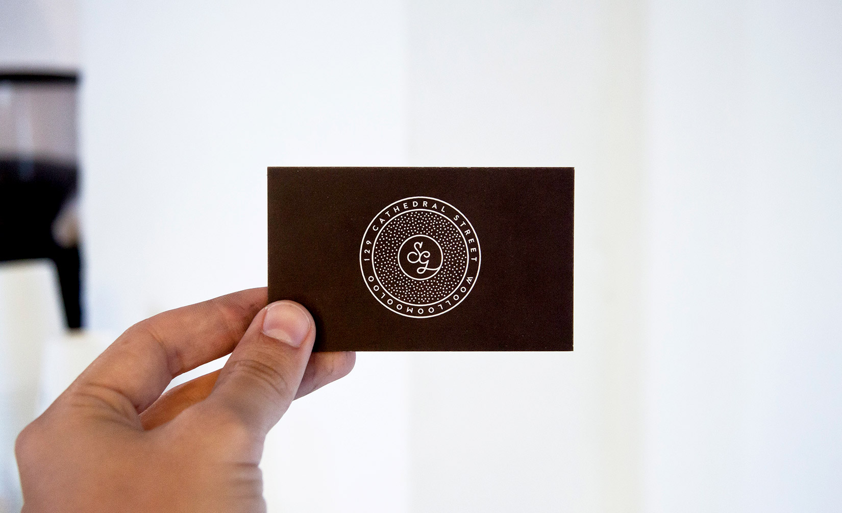
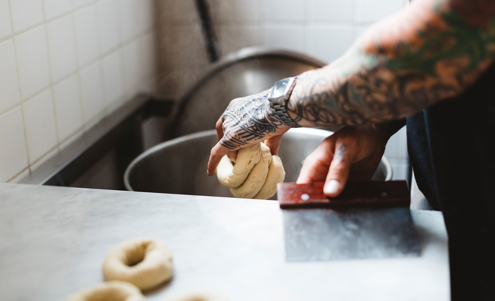
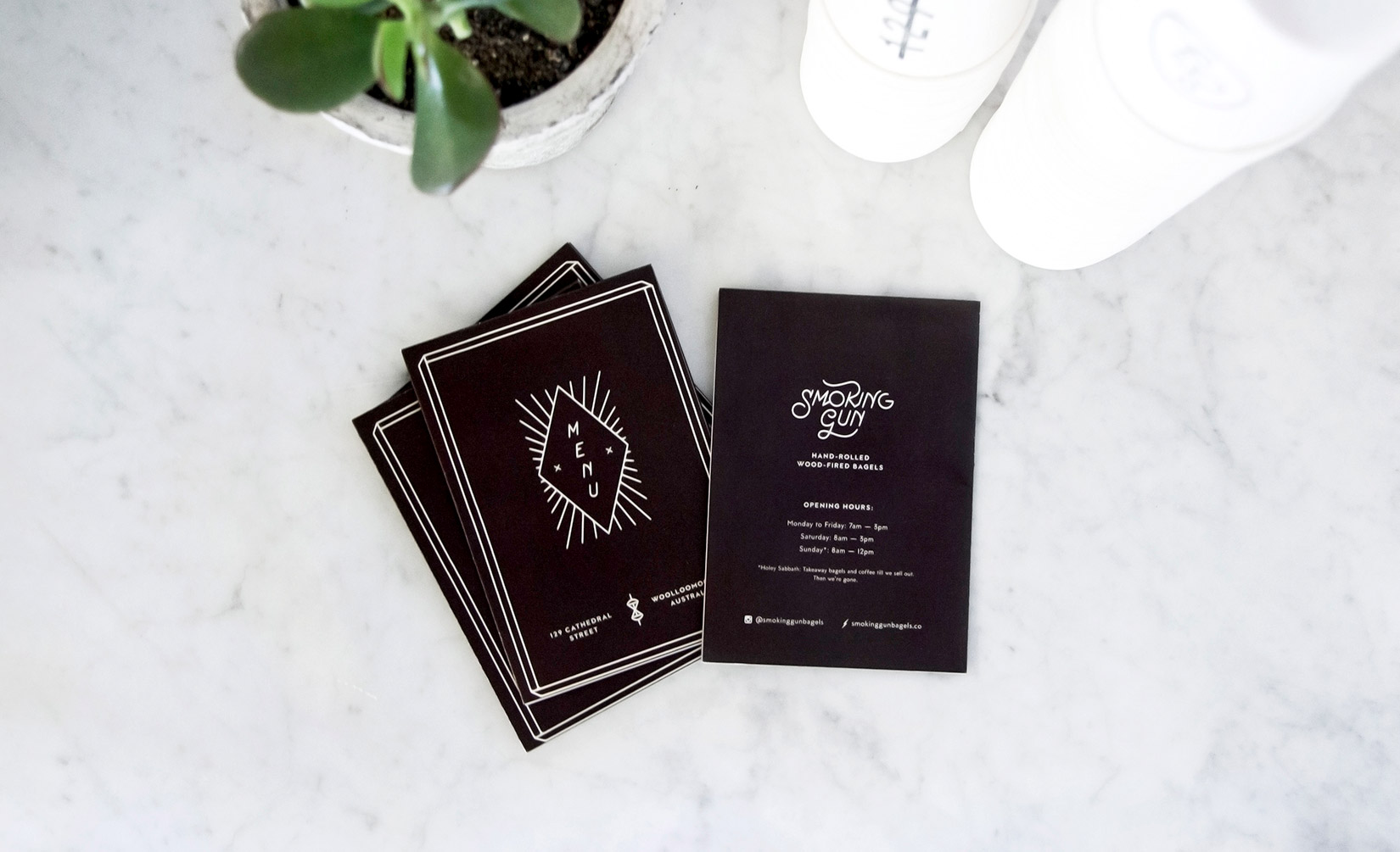
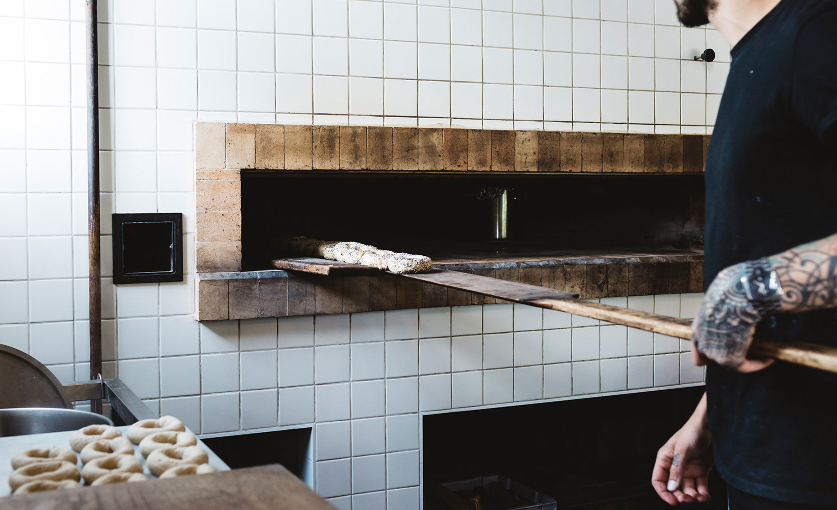
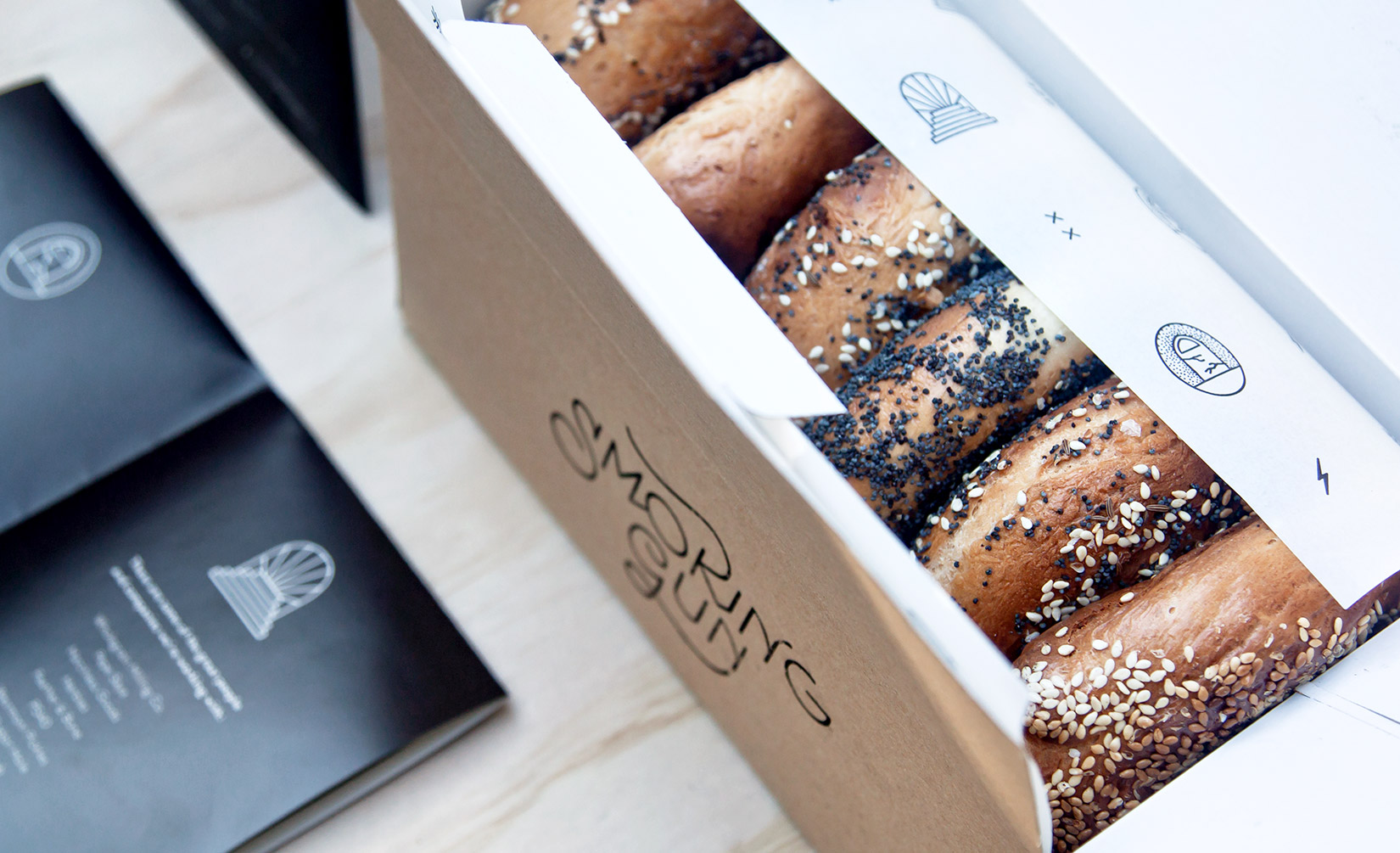
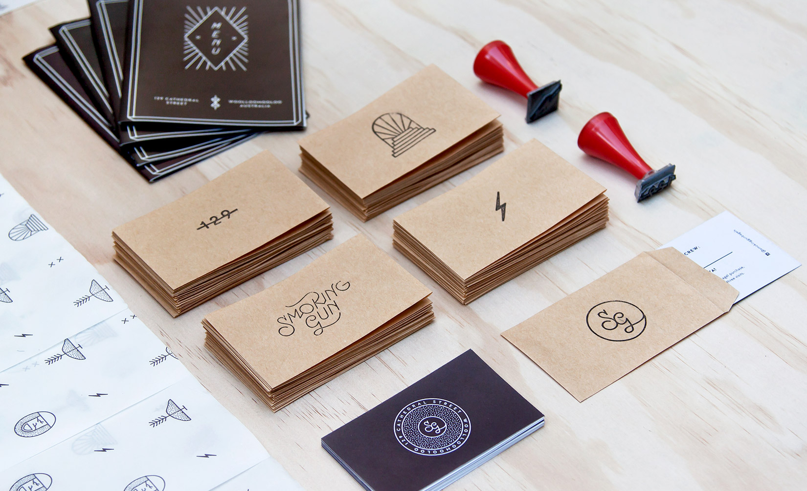
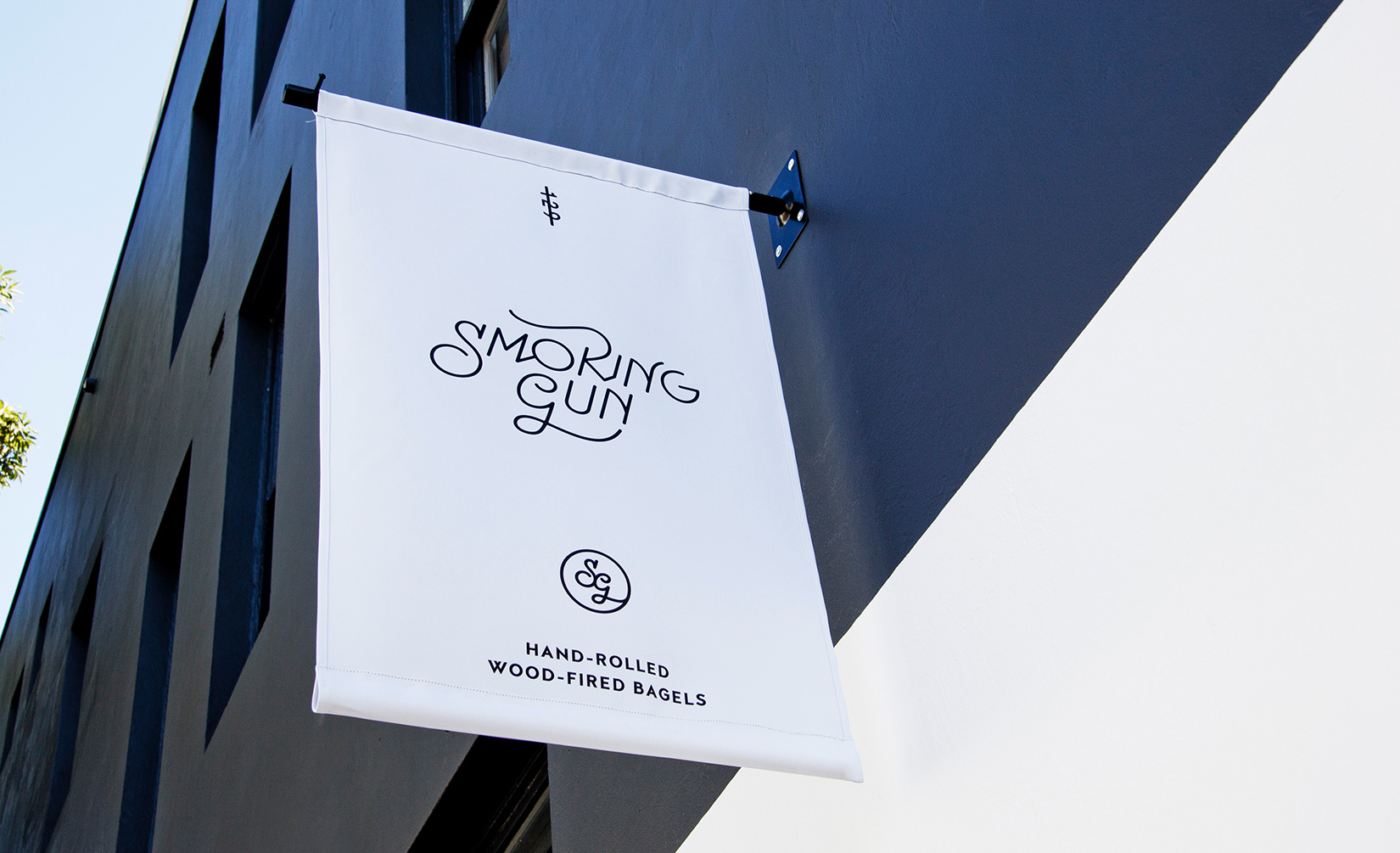
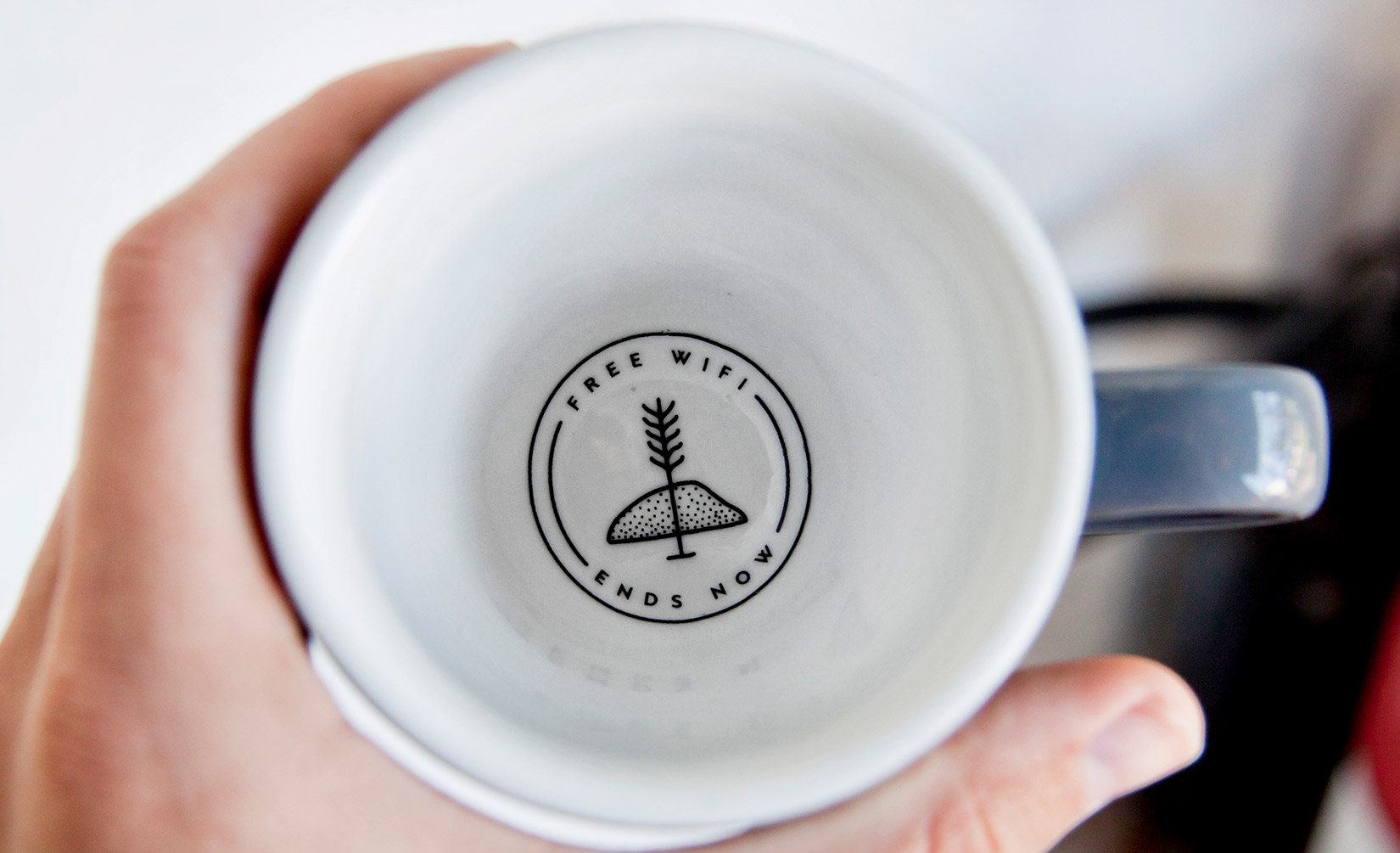
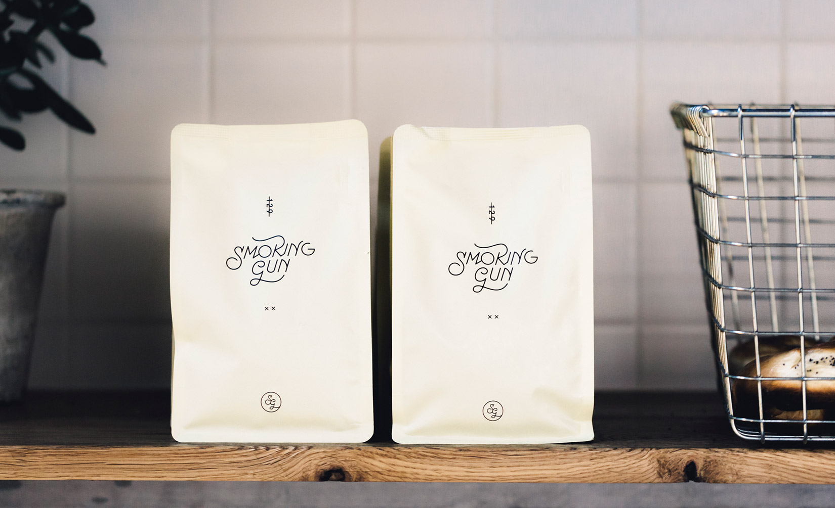
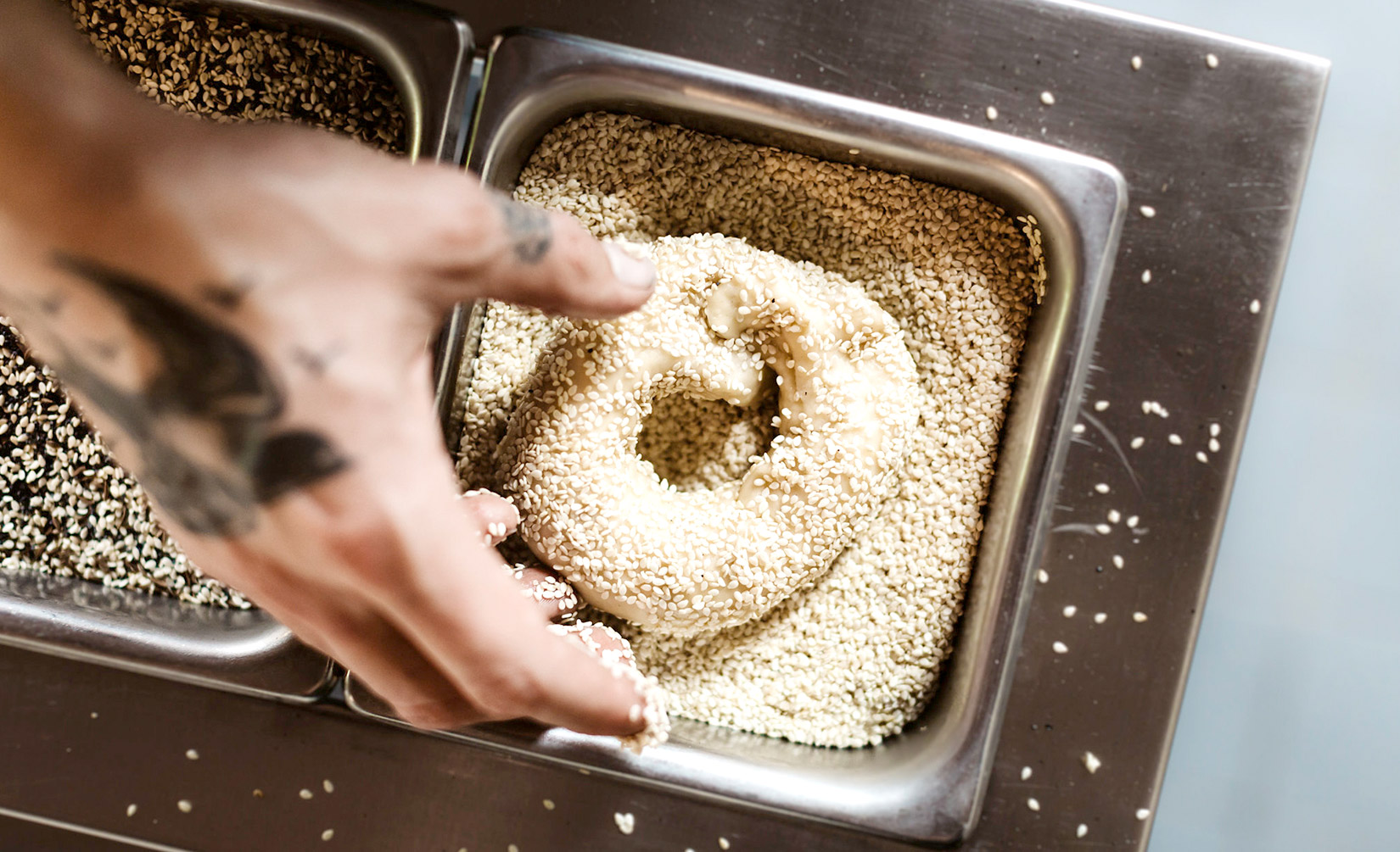
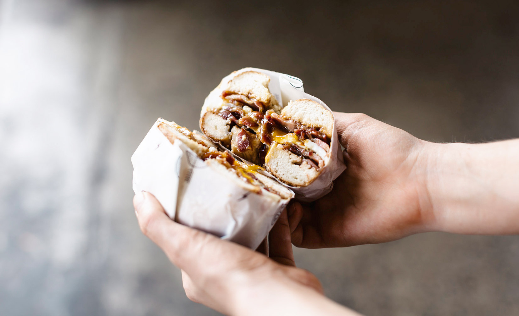
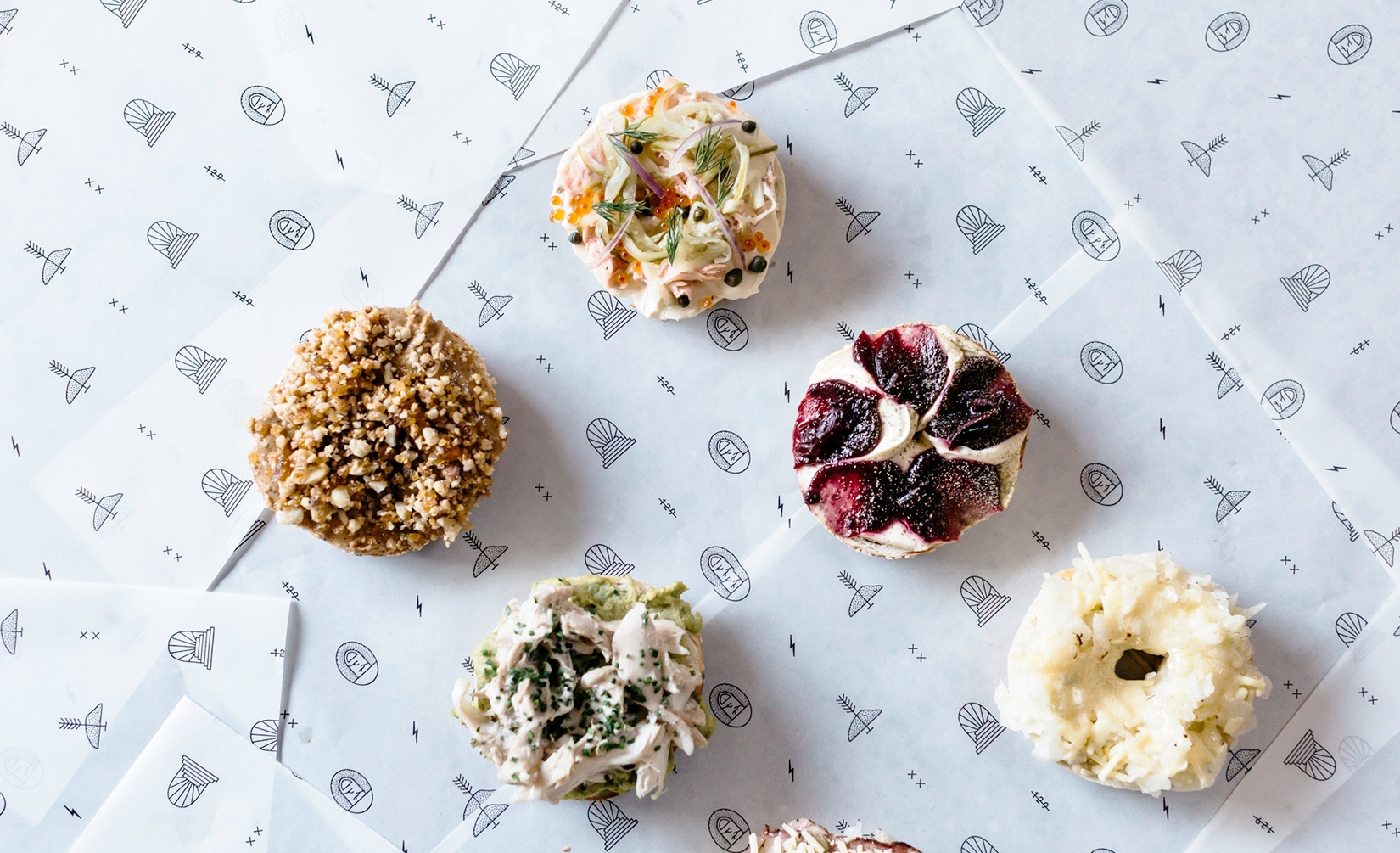
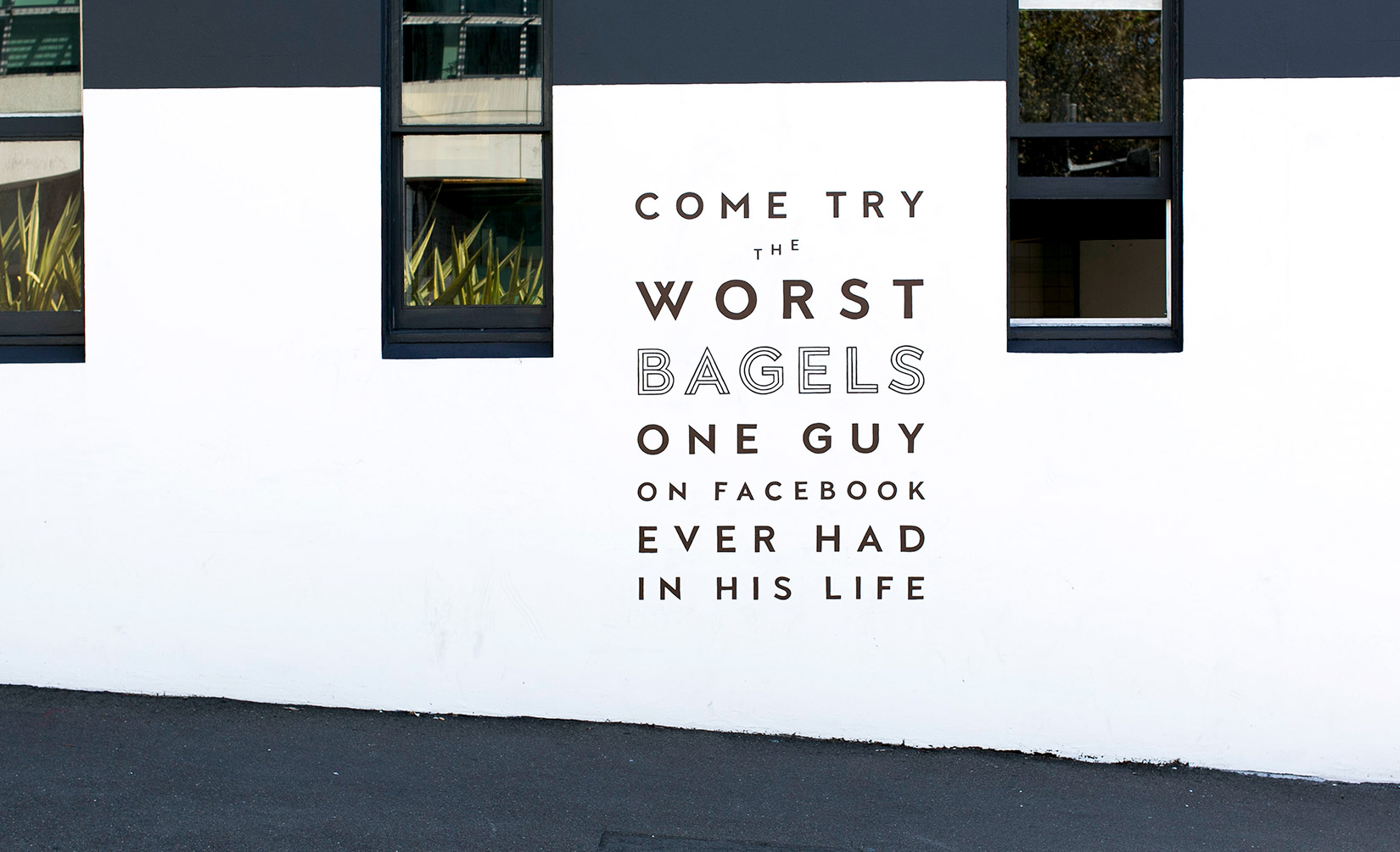
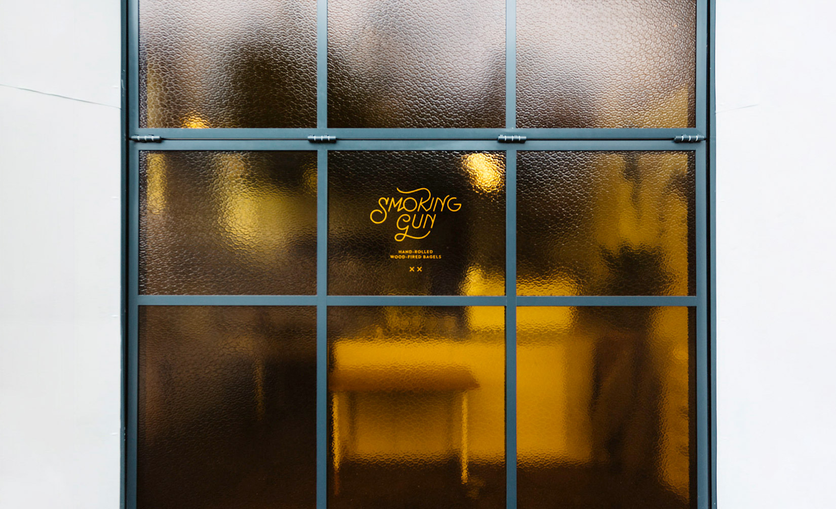
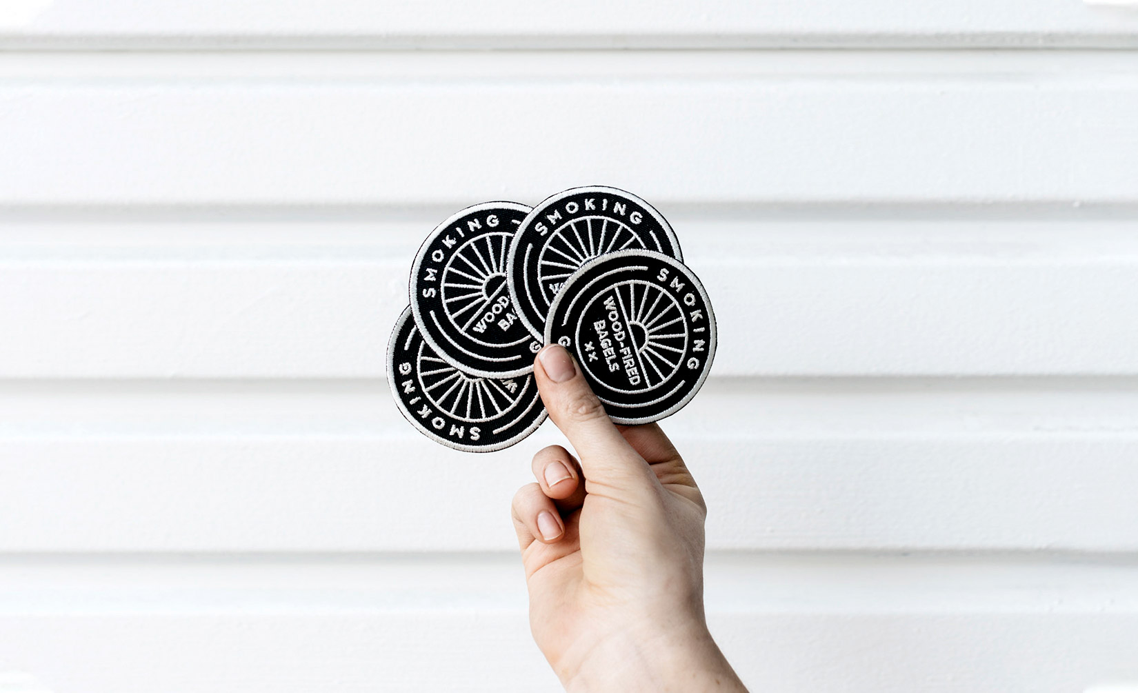
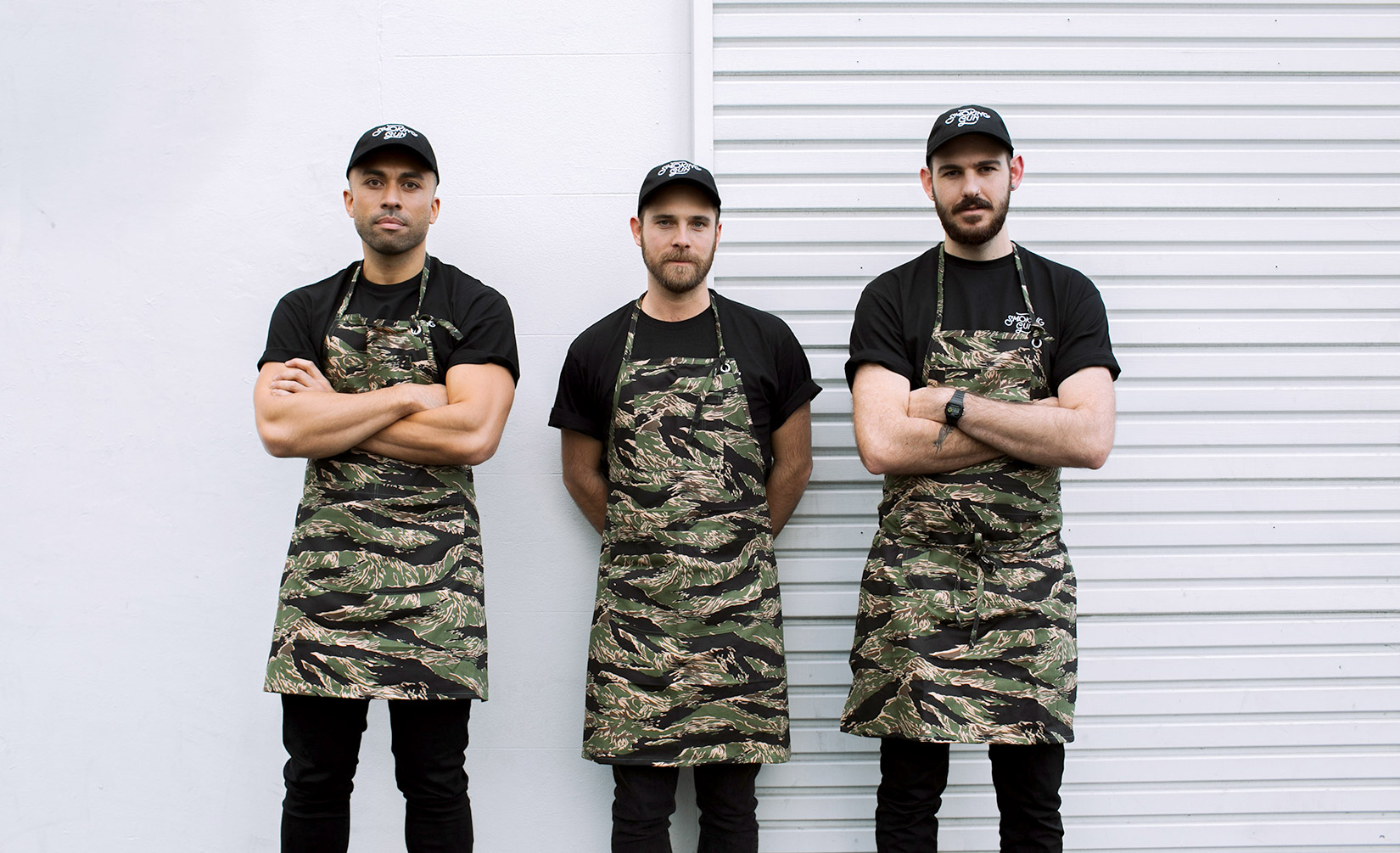
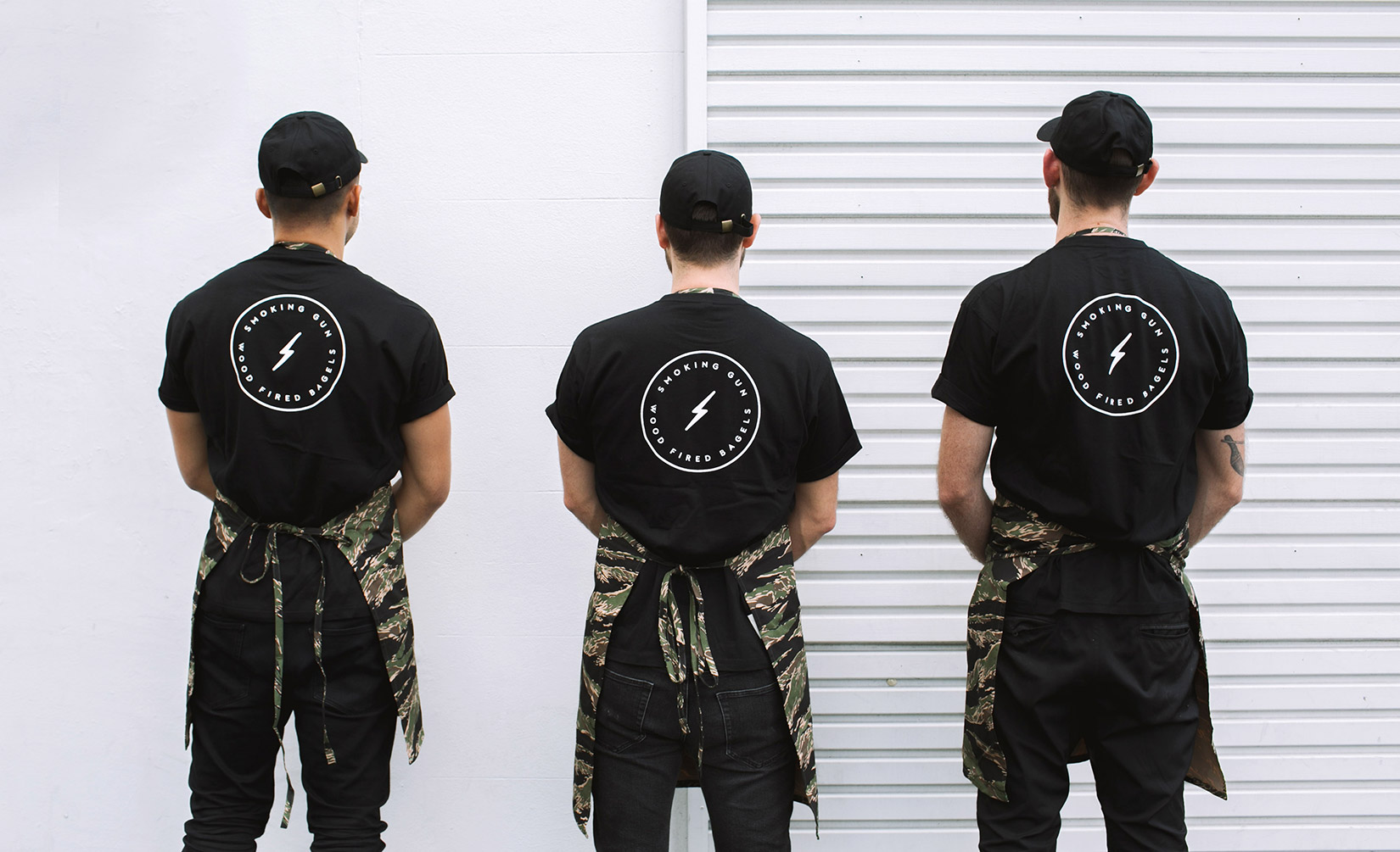
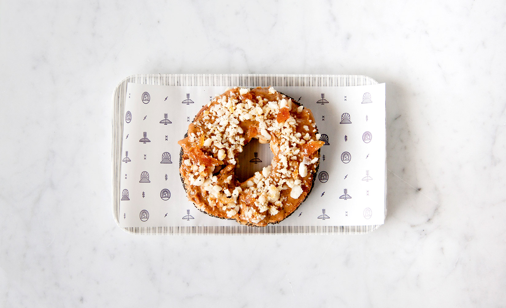
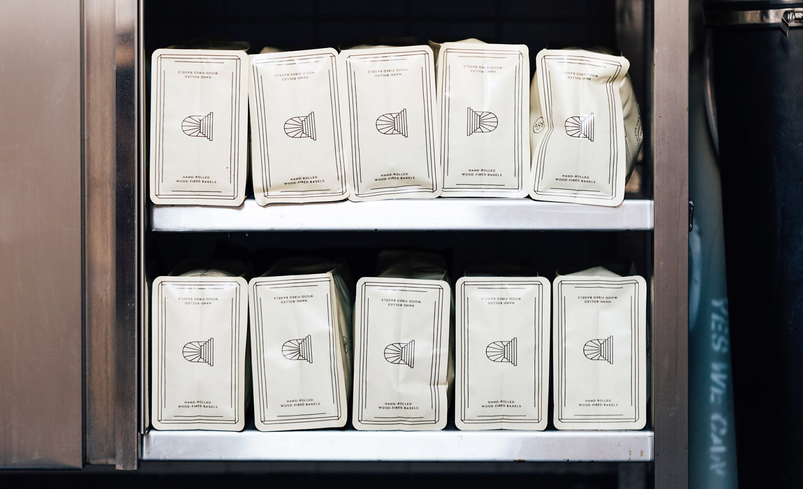
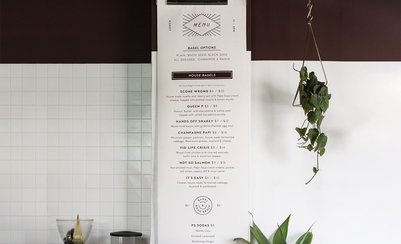
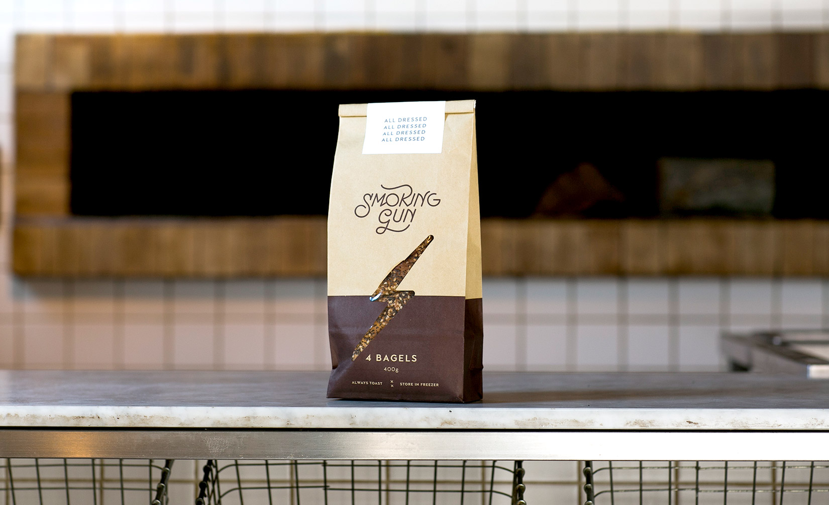
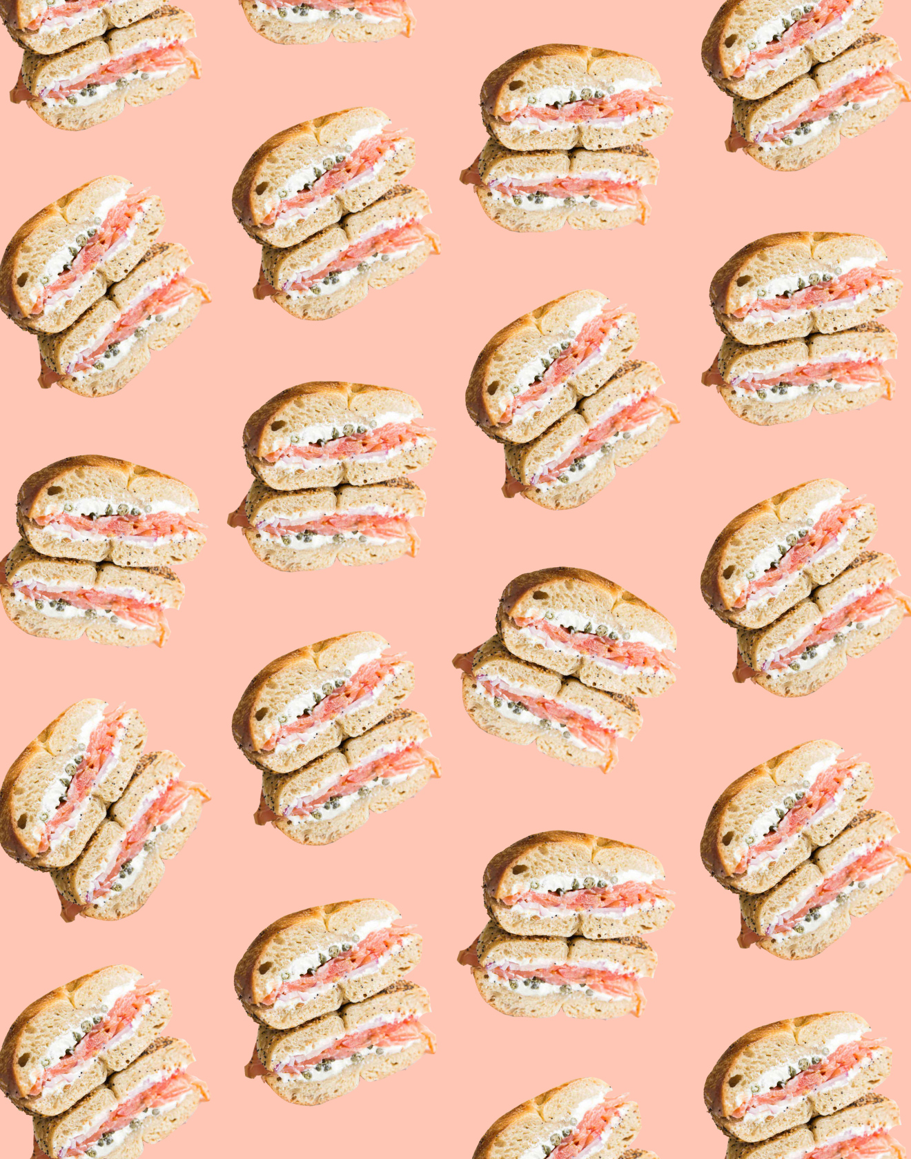
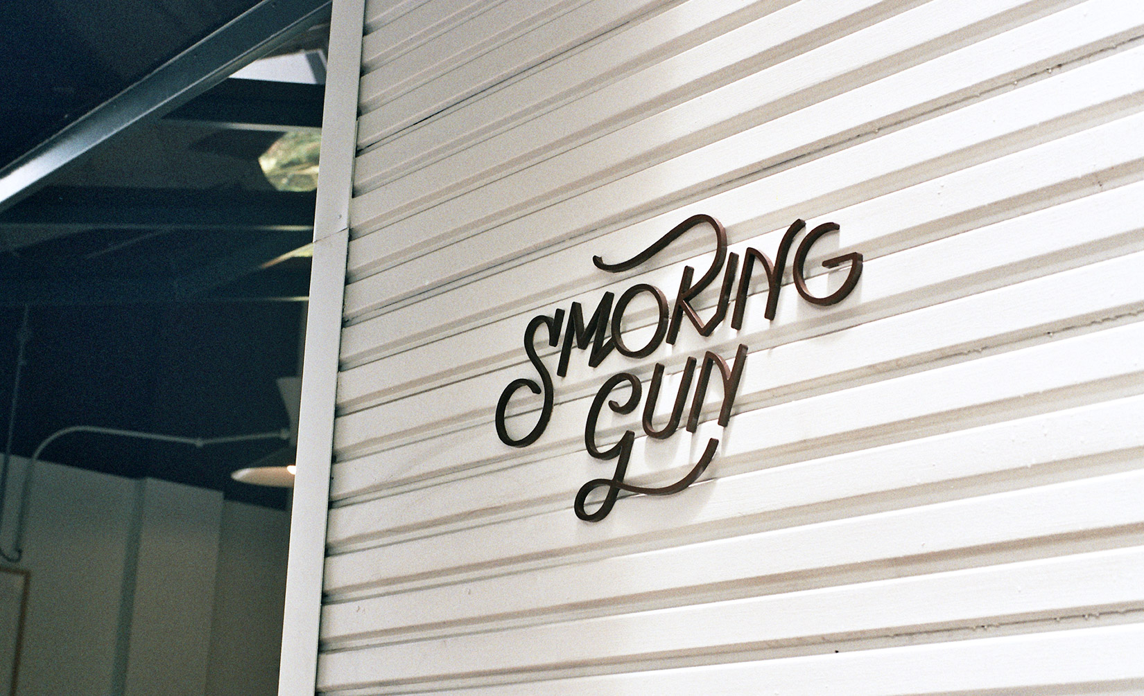
Smoking Gun Bagels
Turning hand-rolled, wood-fired craft into a visual language
Smoking Gun Bagels is where Montreal’s wood-fired tradition meets Sydney Australia’s café culture. The bespoke identity leans into the tactile, imperfect energy of their process: hand-rolled, fire-baked, and full of character. Paired with the script logo, I created an illustrative system of icons and brand elements that celebrate that craft without ever feeling precious. The result is a confident, contemporary bagelry that’s as playful as it is well-designed.
Read more
< swipe >
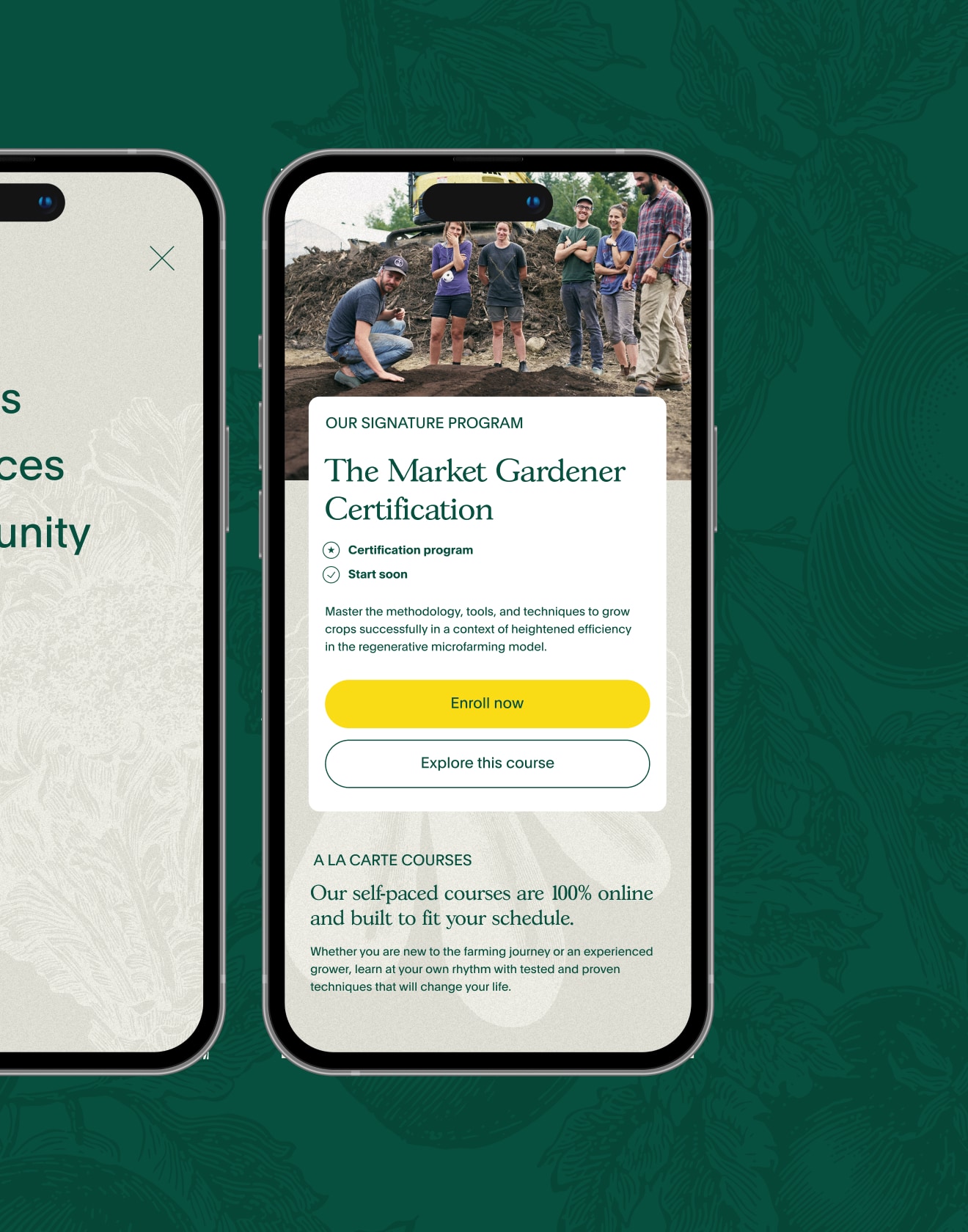
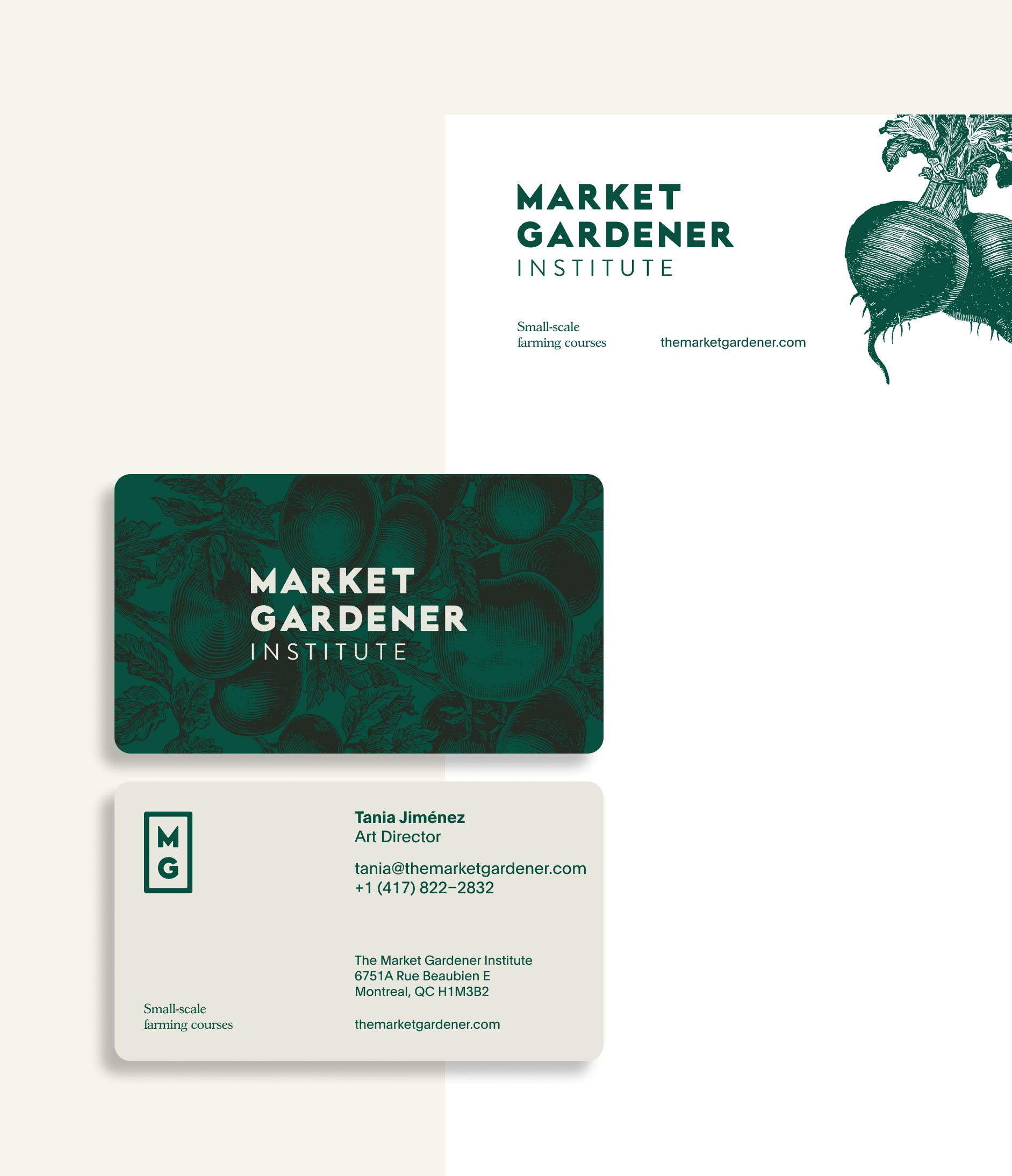
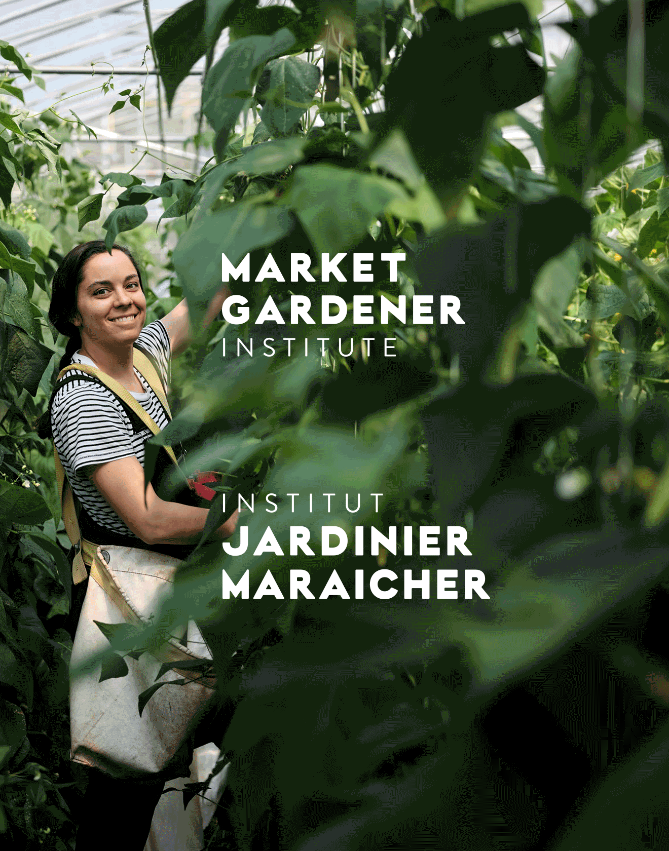
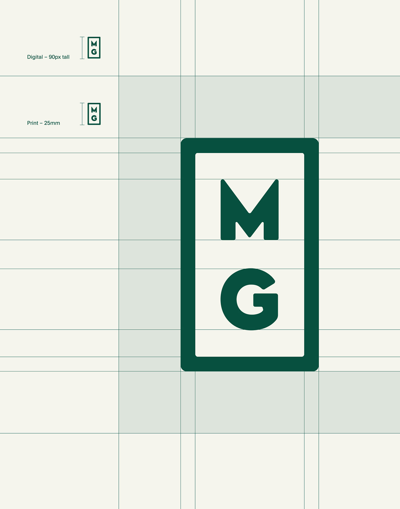
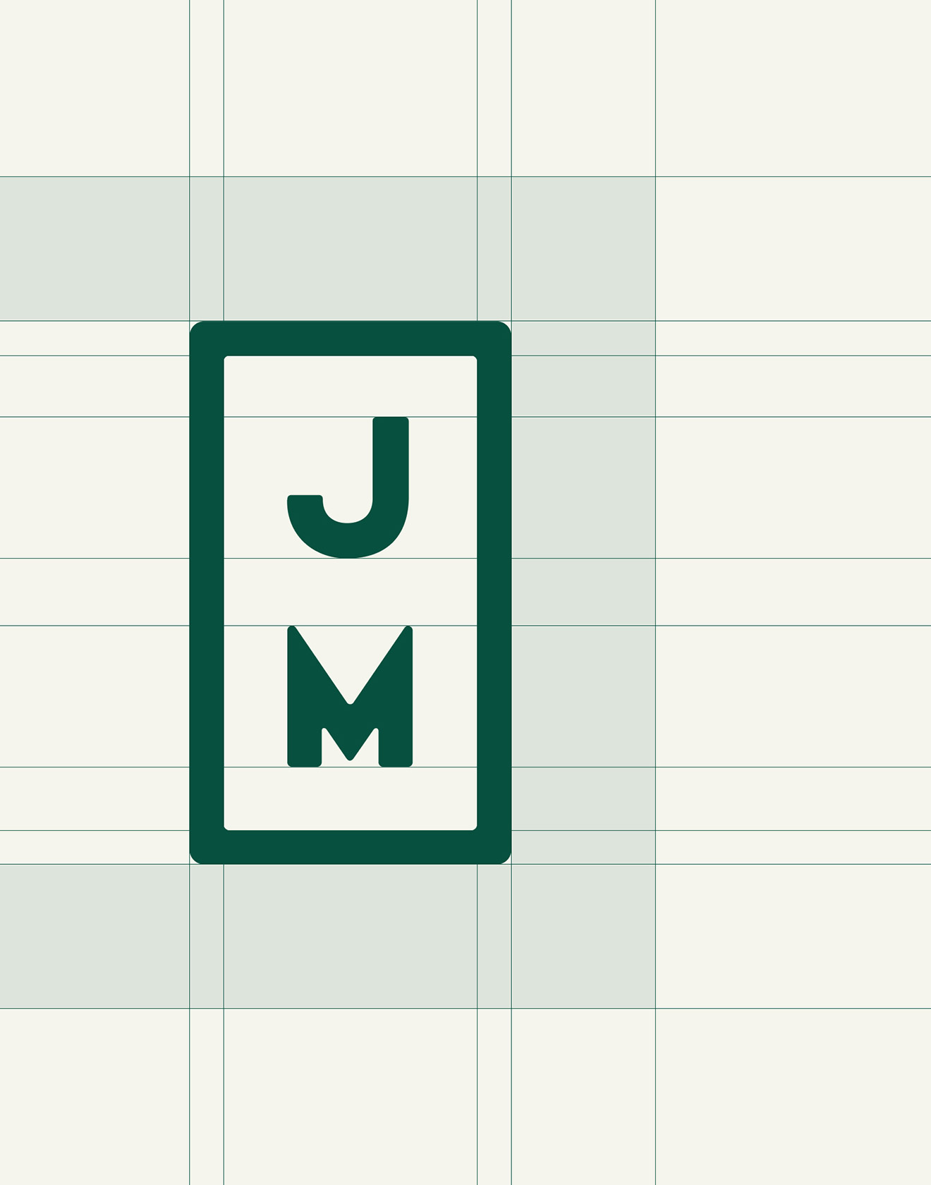
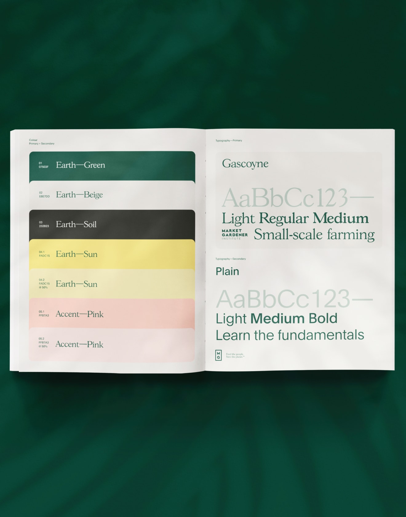
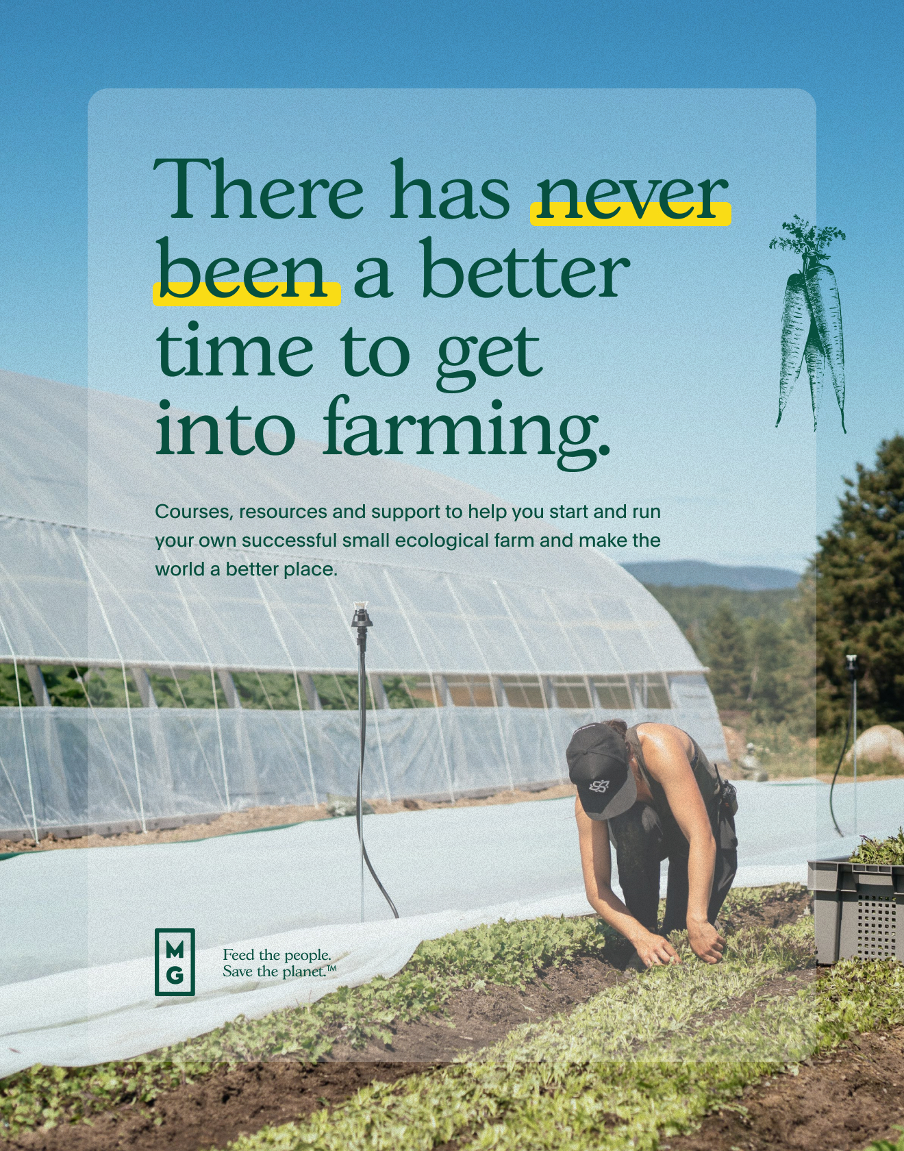
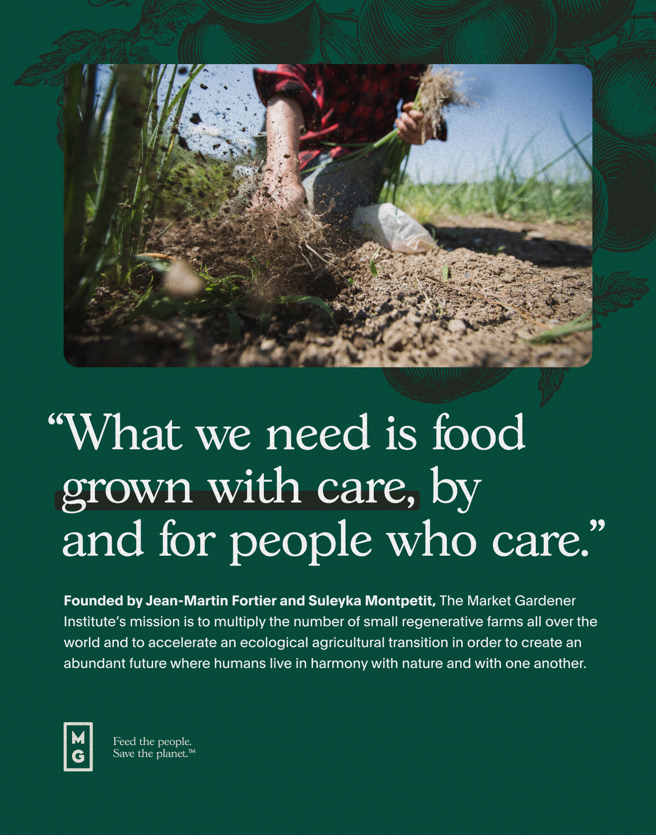
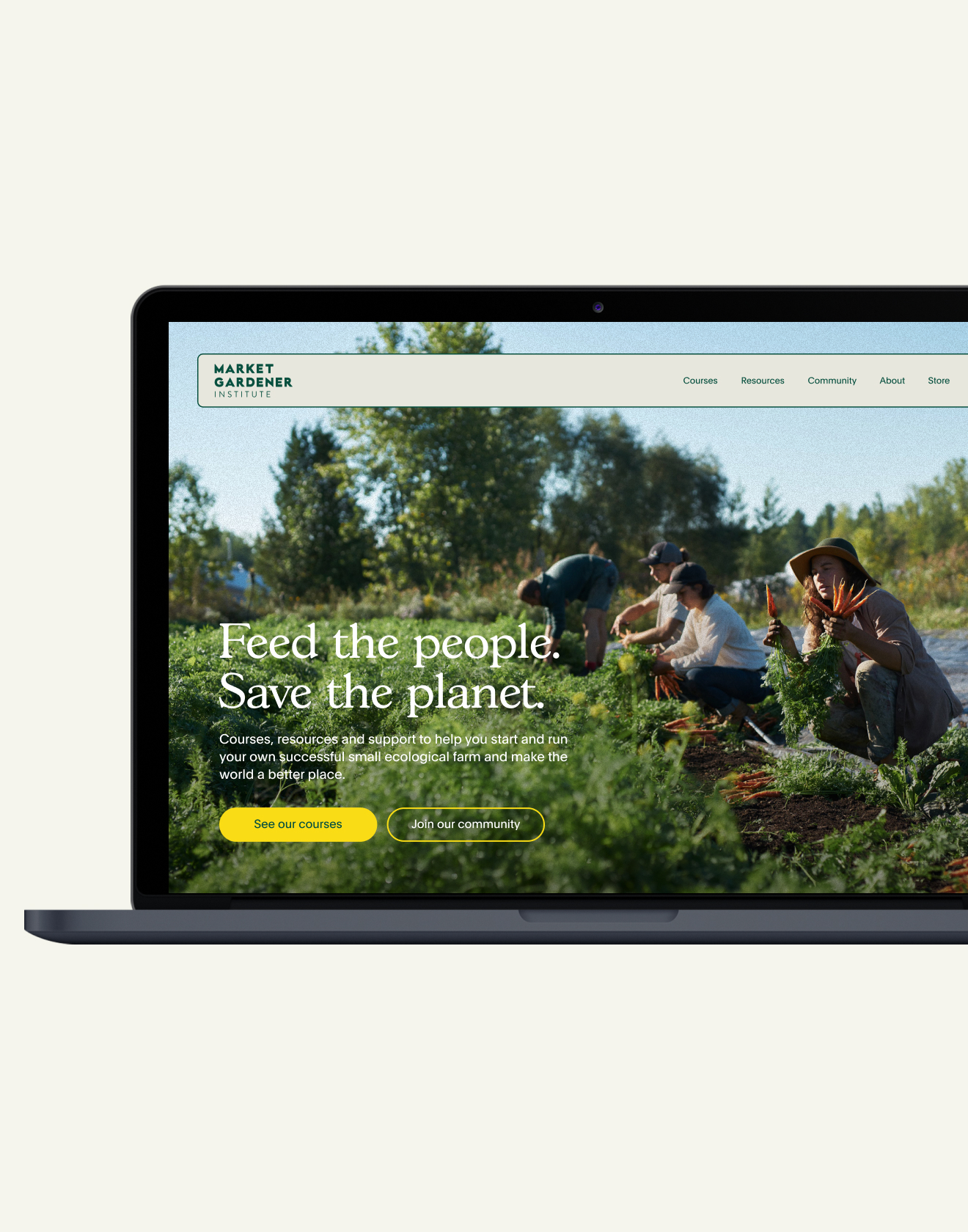

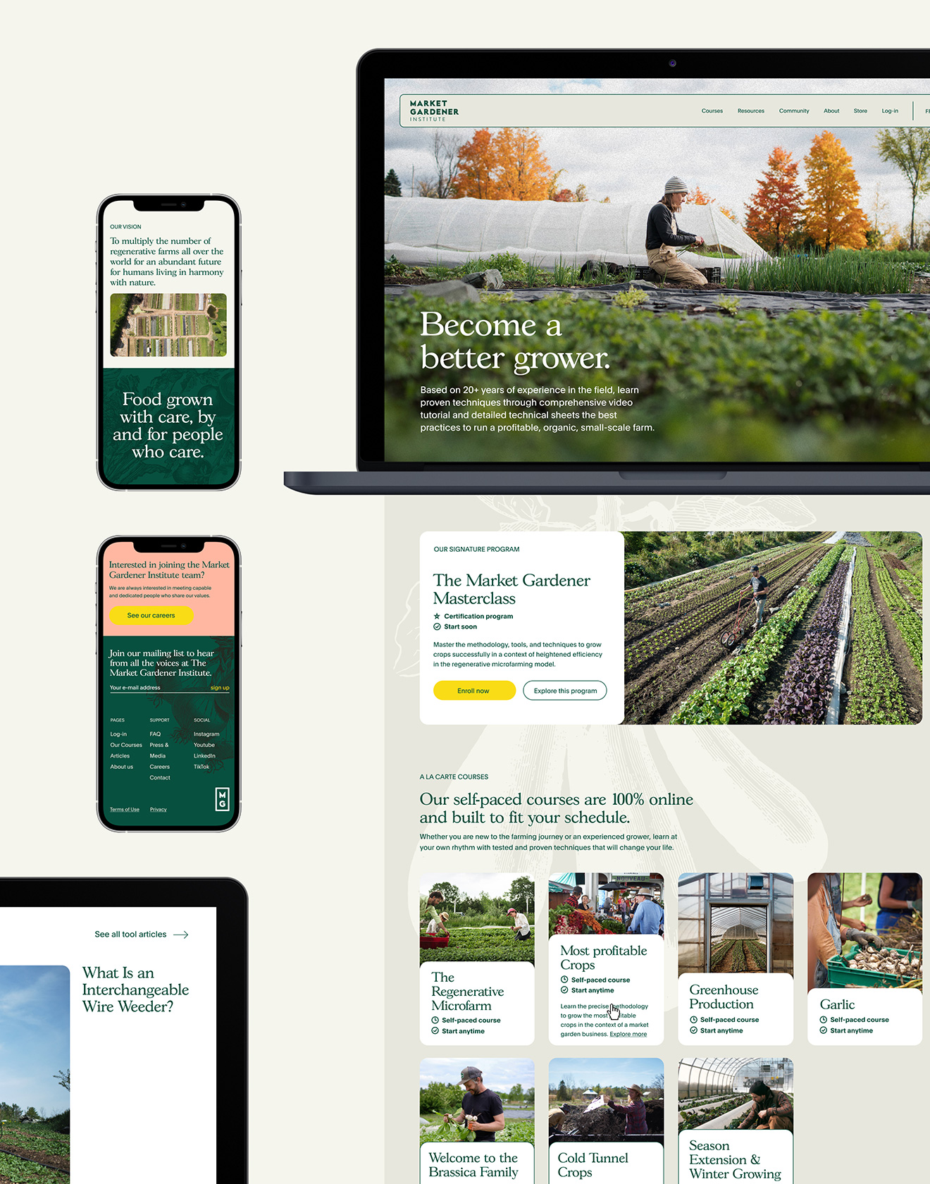
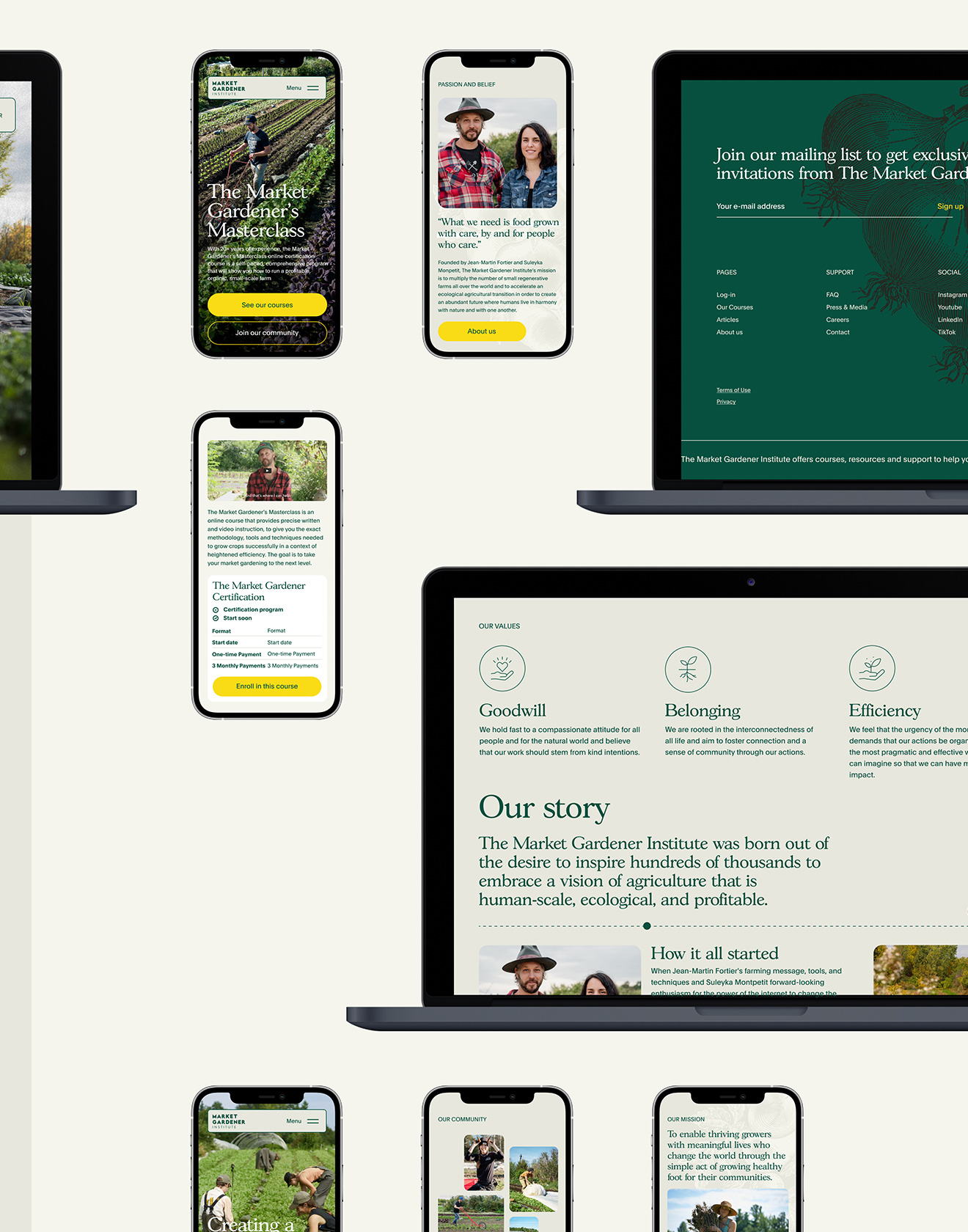
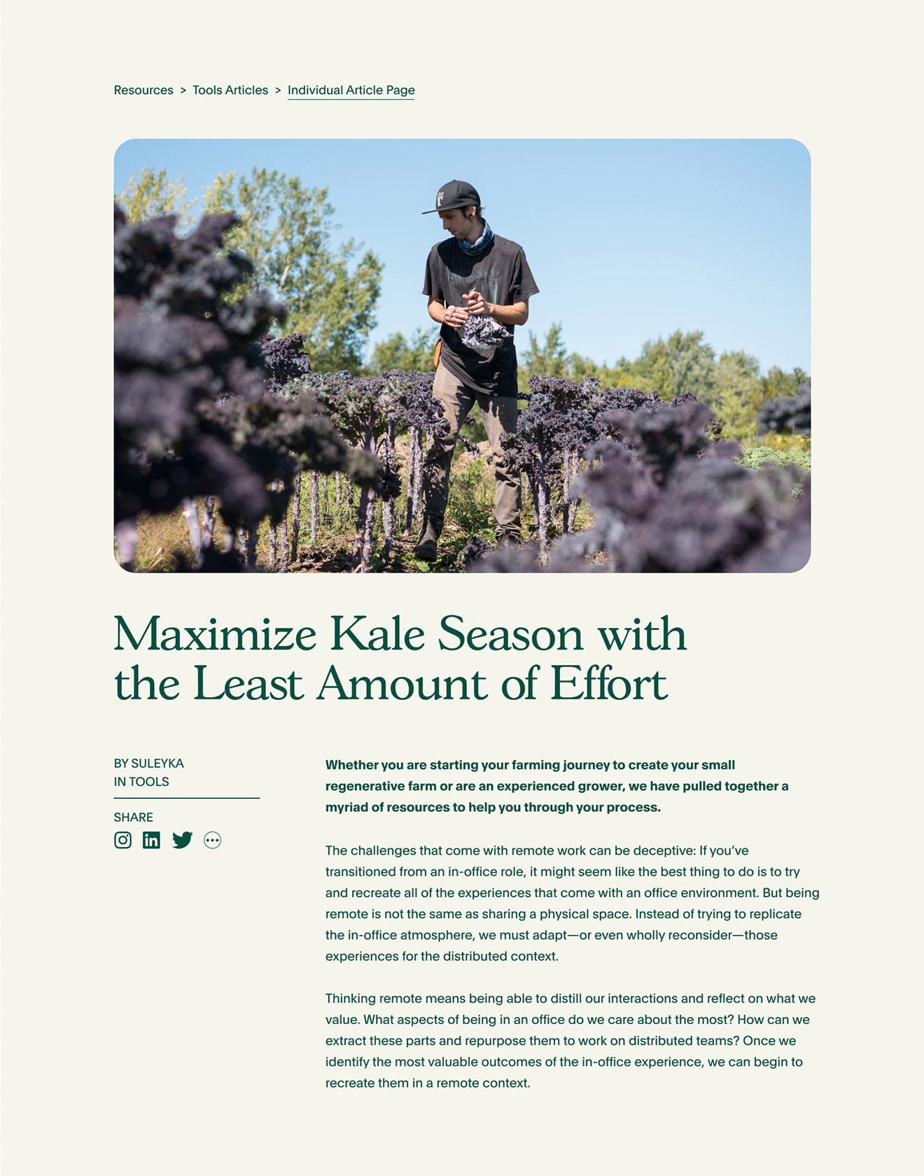
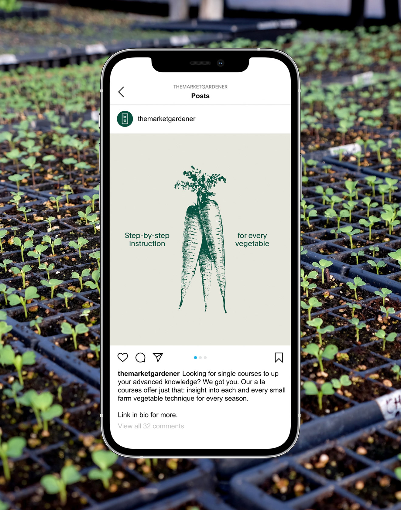

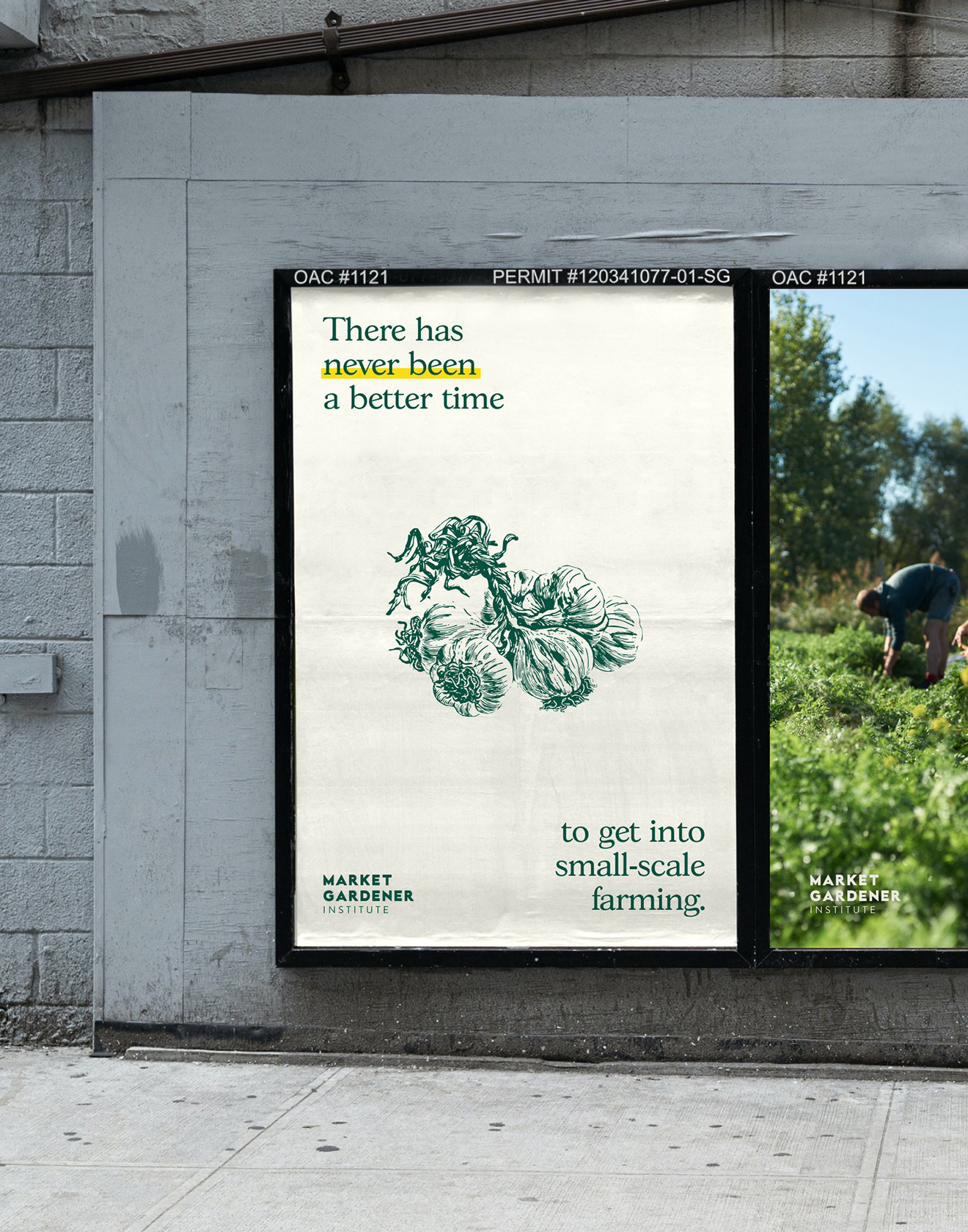
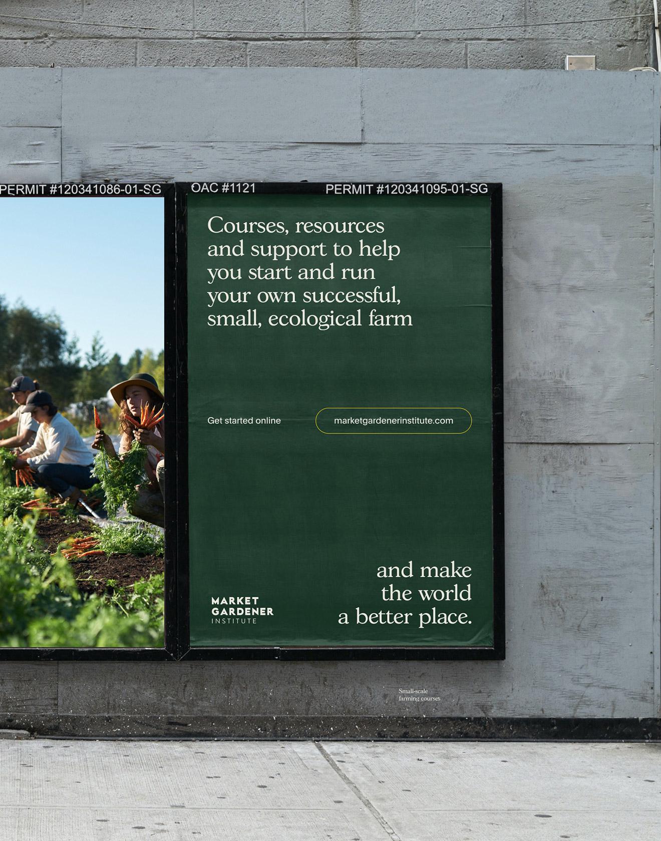
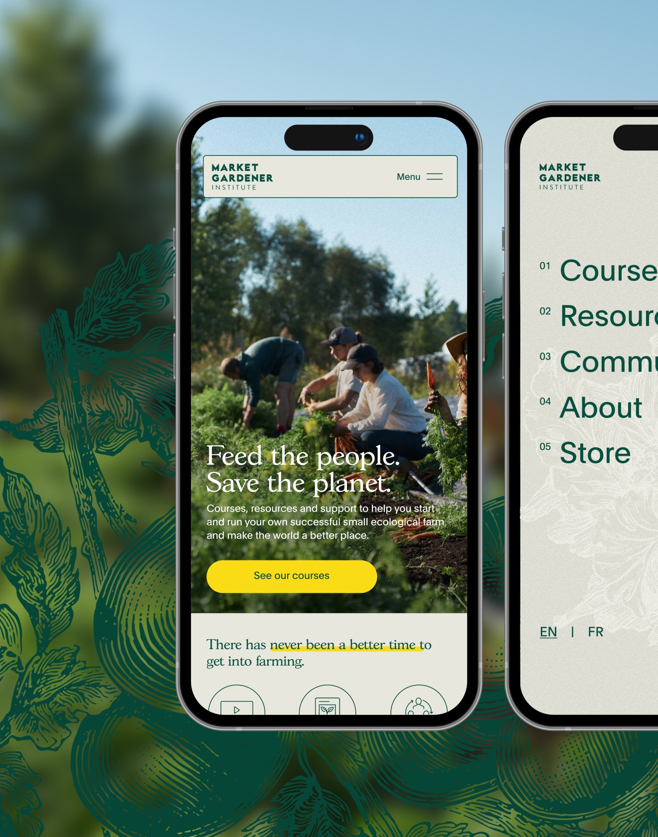
Market Gardener Institute
A digital-first brand and learning platform for small-scale farming accessible to anyone, anywhere.
The Market Gardener Institute in Montreal offers courses, resources and community support for learning, starting and maintaining small farms across all seasons and types. The Market Gardener’s website is their platform to access and engage with the world, so we needed to build a visual identity and web platform prior to launching their courses. Following onboarding and discovery, we created a light strategy and built brand identity components including typography, colour and a visual system to live across digital and print. Since the courses and platform are 100% online and self-paced, we needed to find contemporary design solutions that worked well holistically, with the ultimate solution feeling modern, intentional and gender-neutral – a fine balance of making it distinct but not confusing or distracting. With a huge amount of content, the website design was organized to support multiple types of user journeys, student onboarding and course modules.
Read more
< swipe >
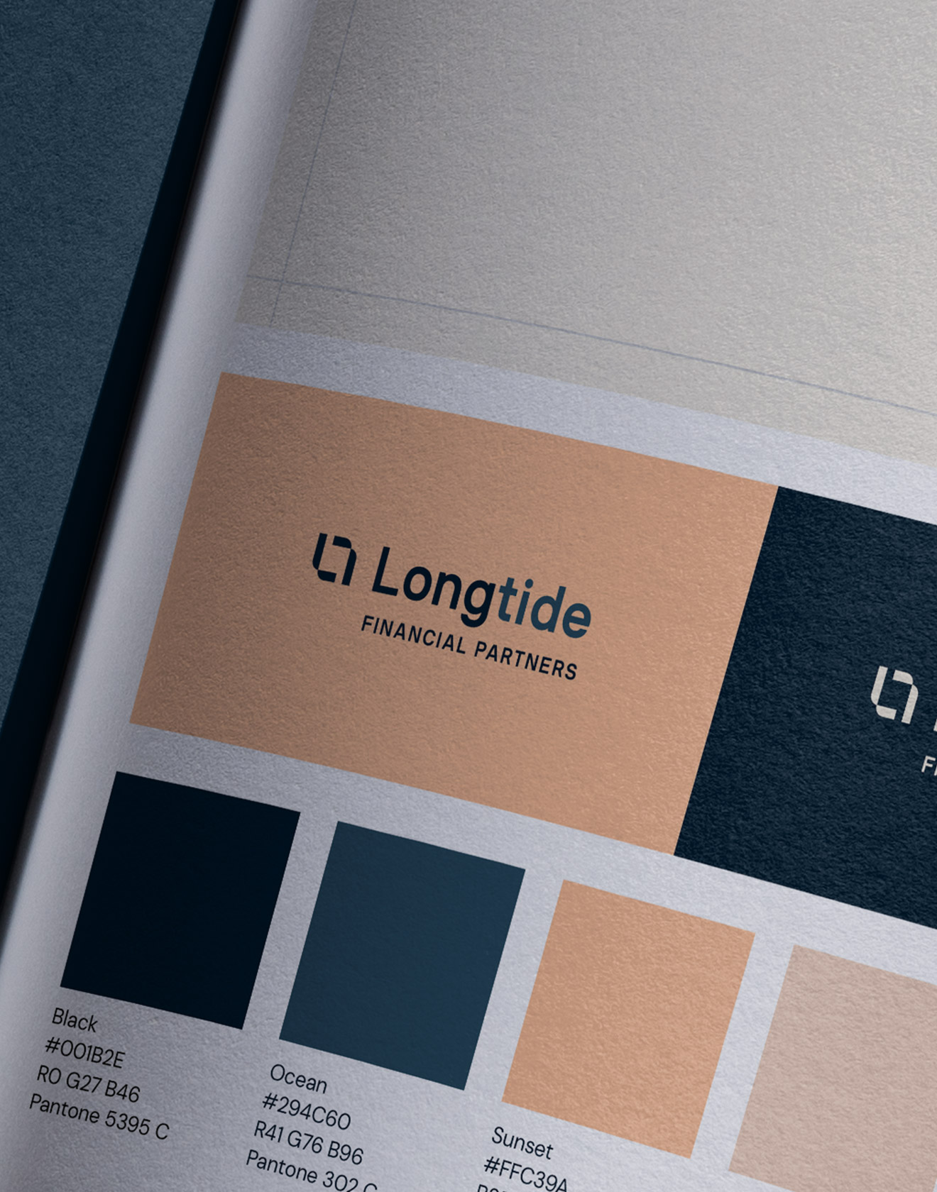
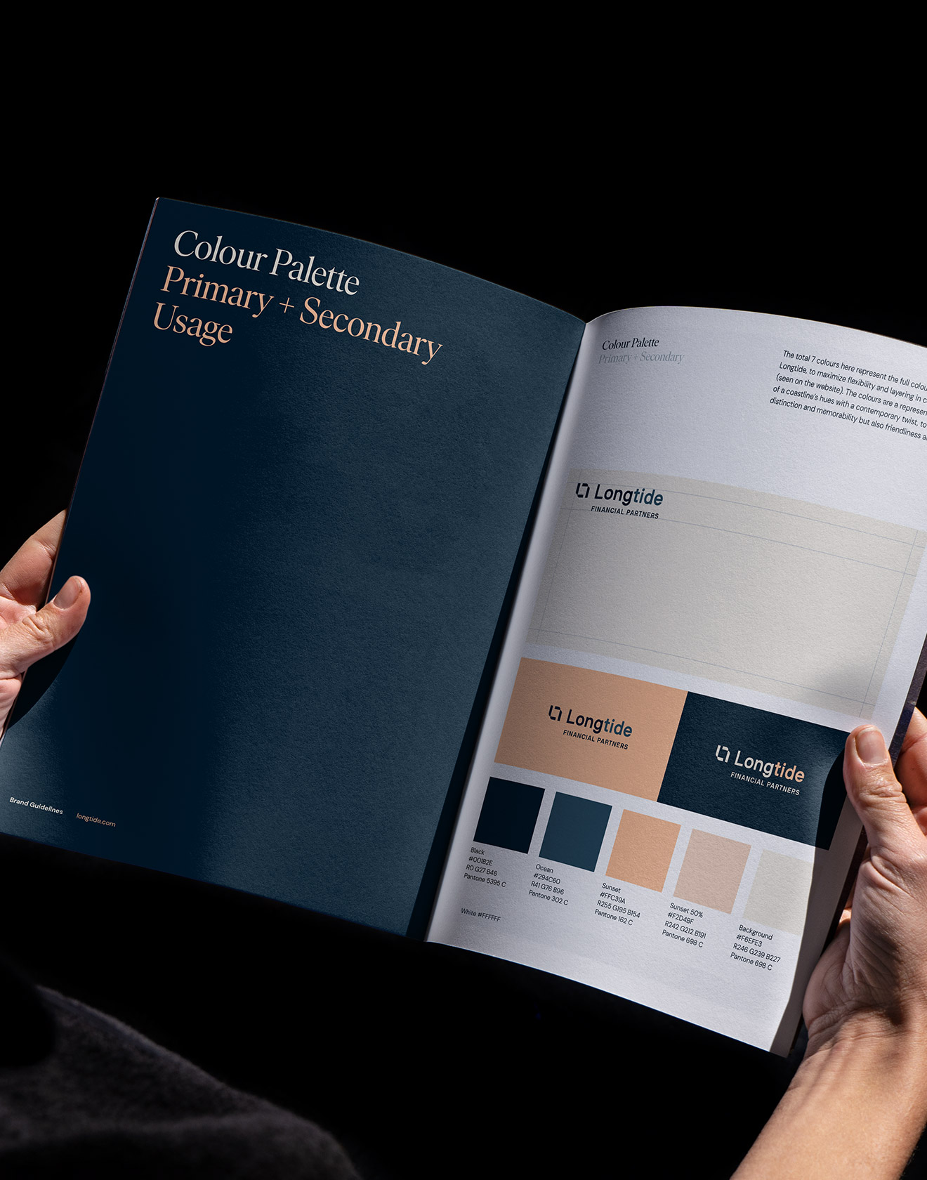
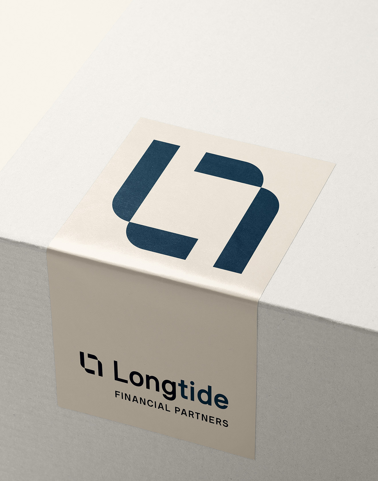
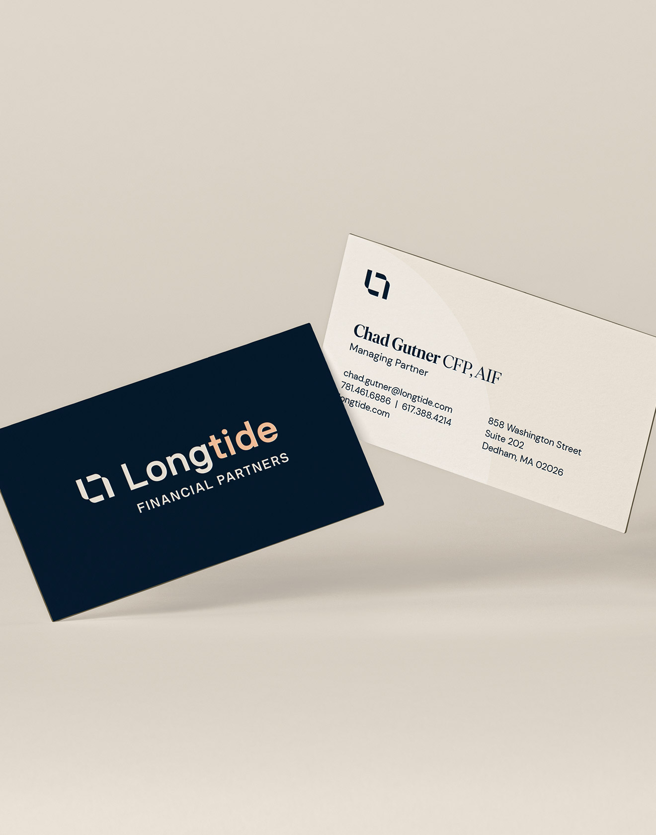

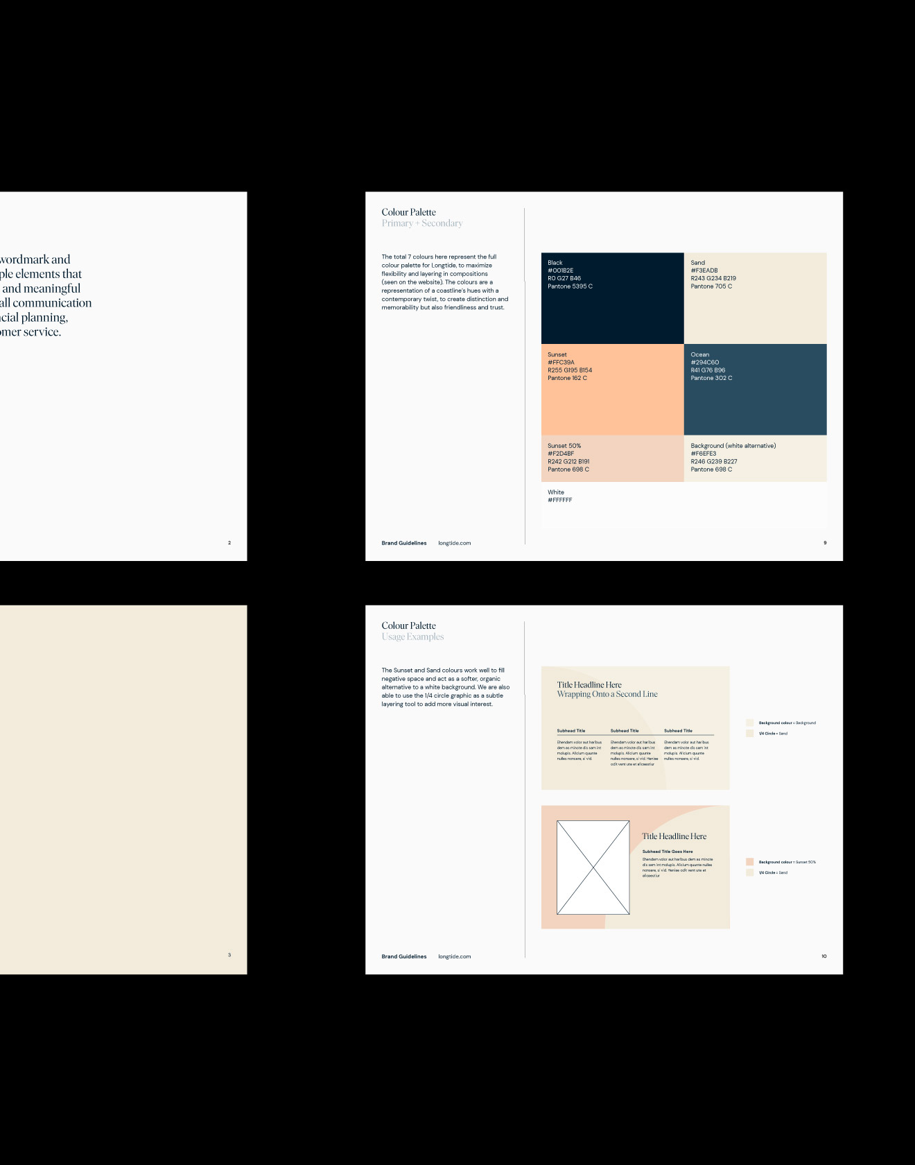
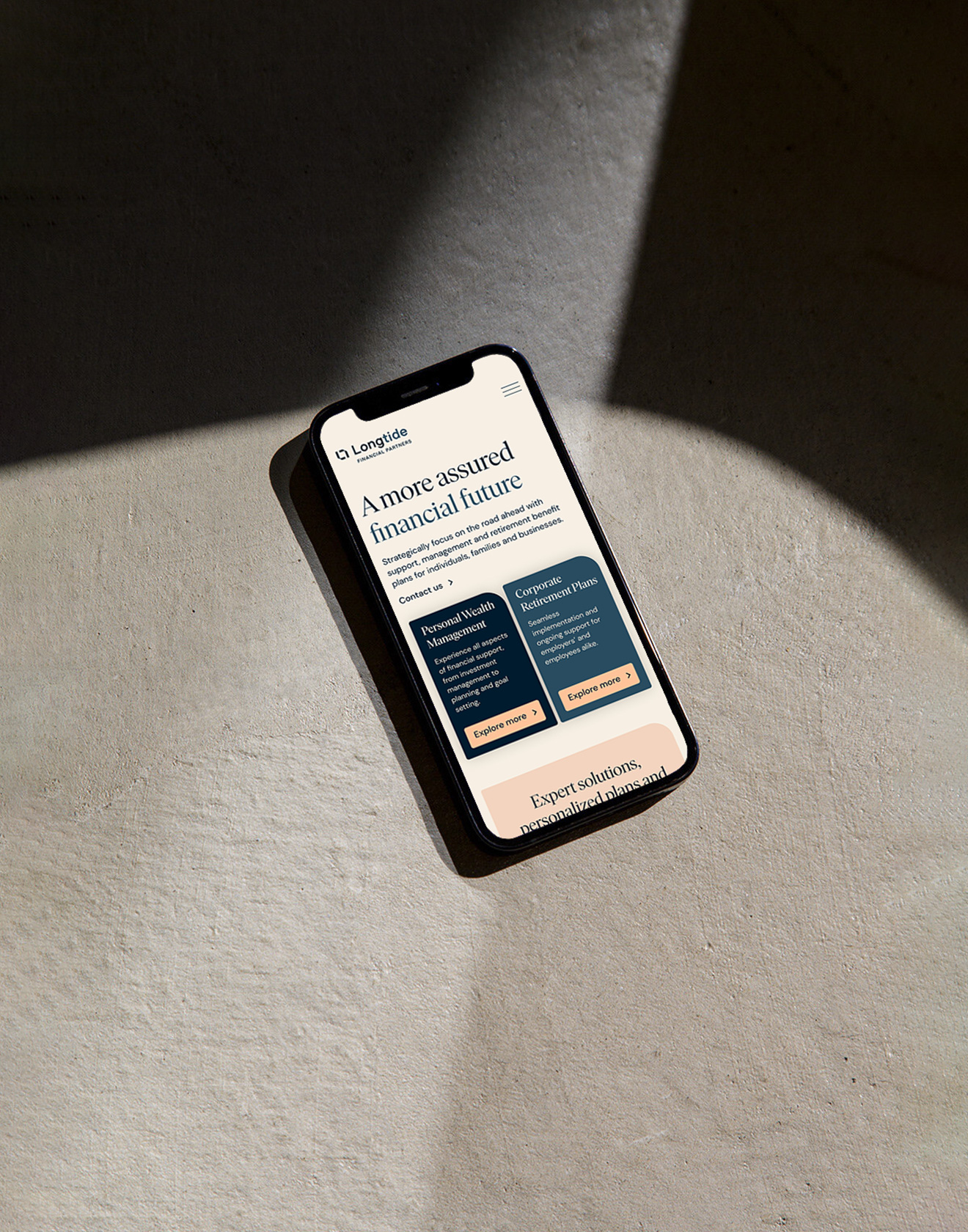
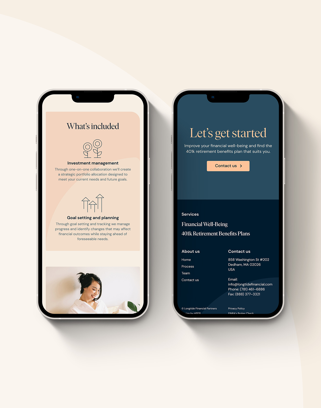
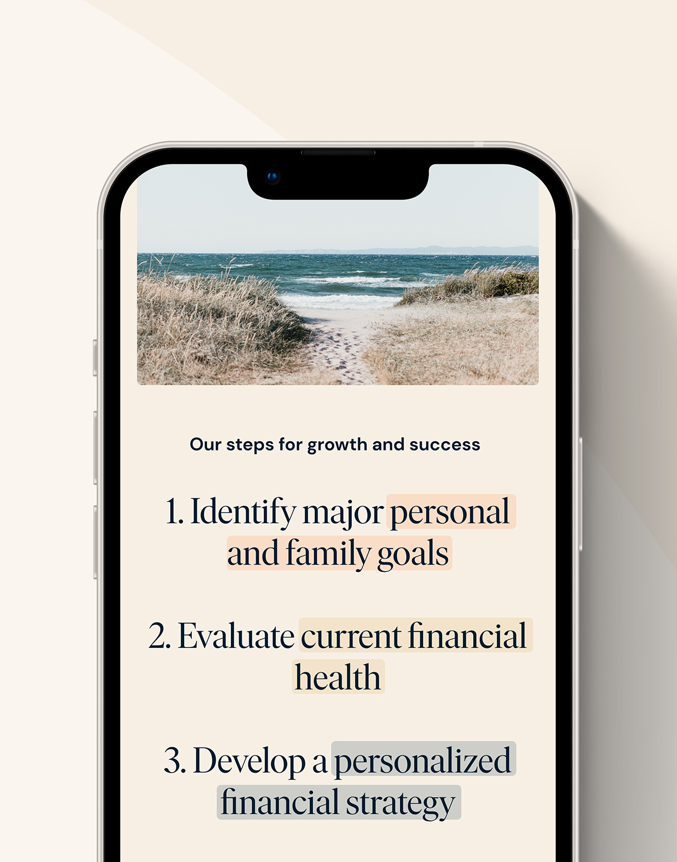

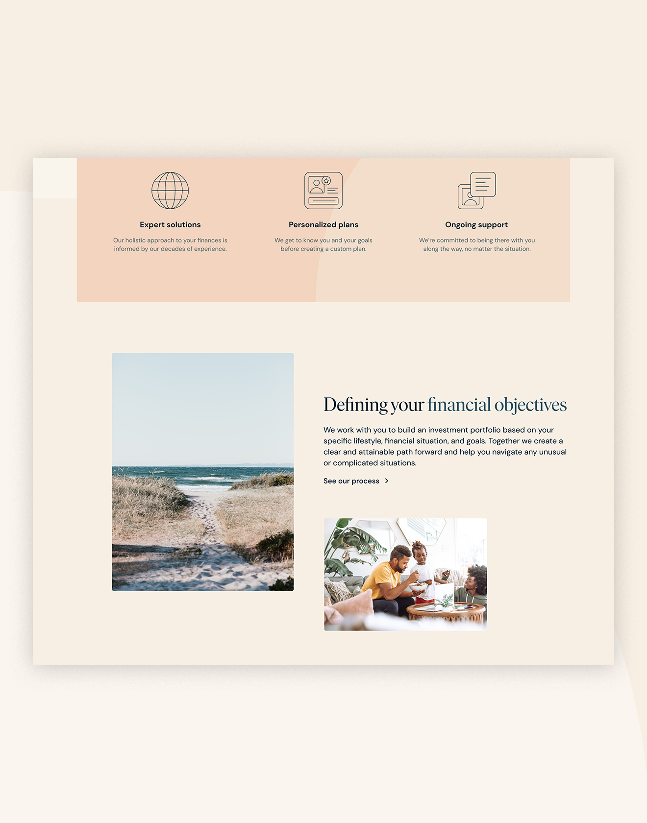
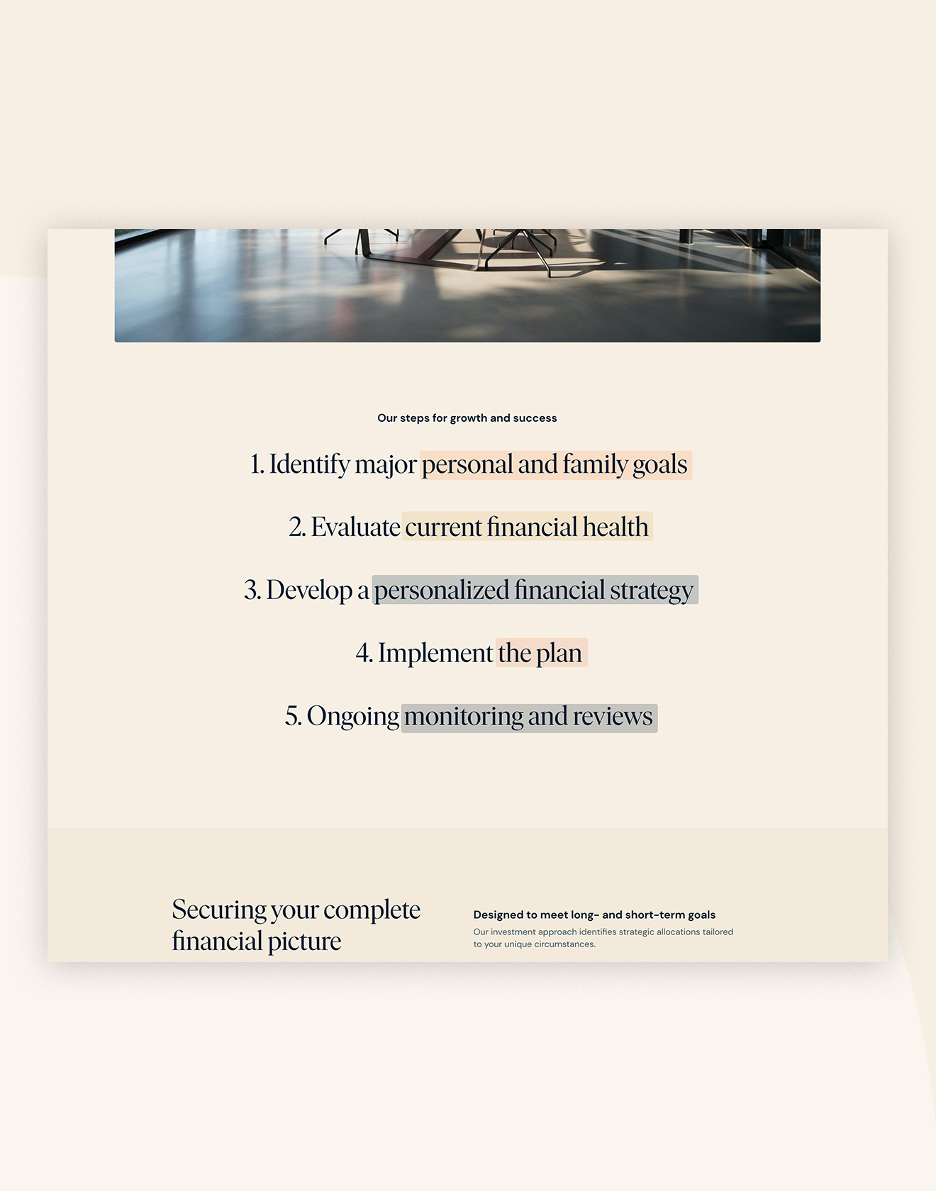
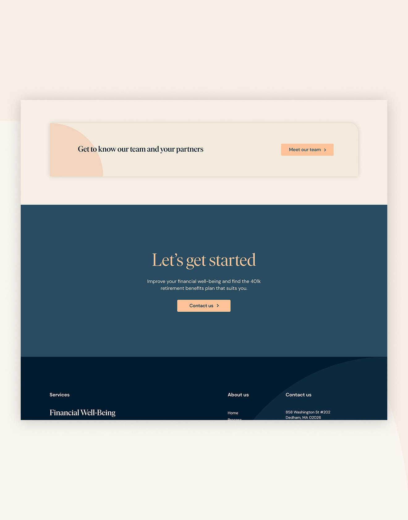
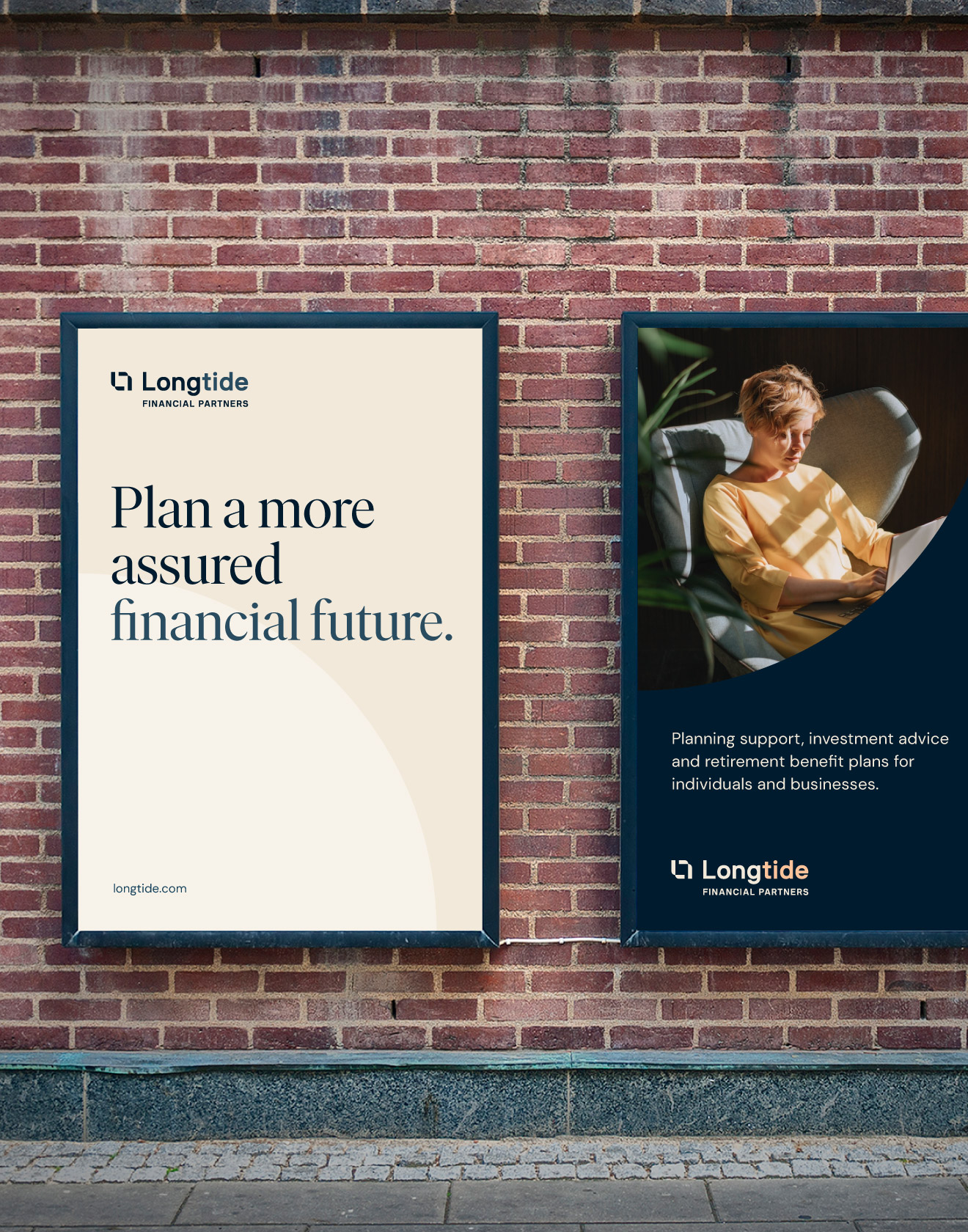
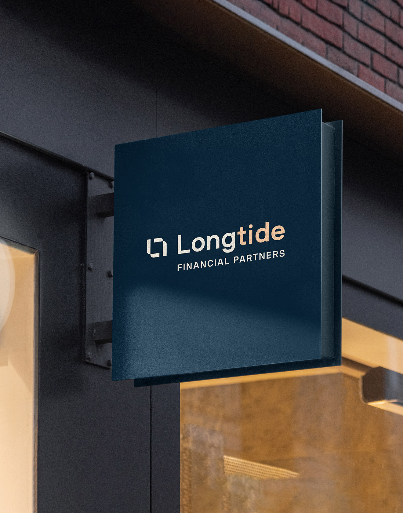
Longtide Financial Partners
Subtlety, sophistication and symmetry epitomizes a modern approach to financial support.
Based in Massachusetts, the 10-person team at Longtide know that sound wealth advice consists of long-term goals combined with contemporary customer care. They came to us needing a complete overhaul of their previous business, starting with a new name. Comprehensively applied across their website and printed collateral, we placed emphasis on connection and balance, taking opportunity to mimic the roundness of coastlines and the tide. From the warm and vibrant colour palette to the website’s use of bespoke icons, we shifted the brand’s focus to simplicity to create feelings of trust, highlighting a few elements to make the web experience as approachable as possible.
Read more

< swipe >
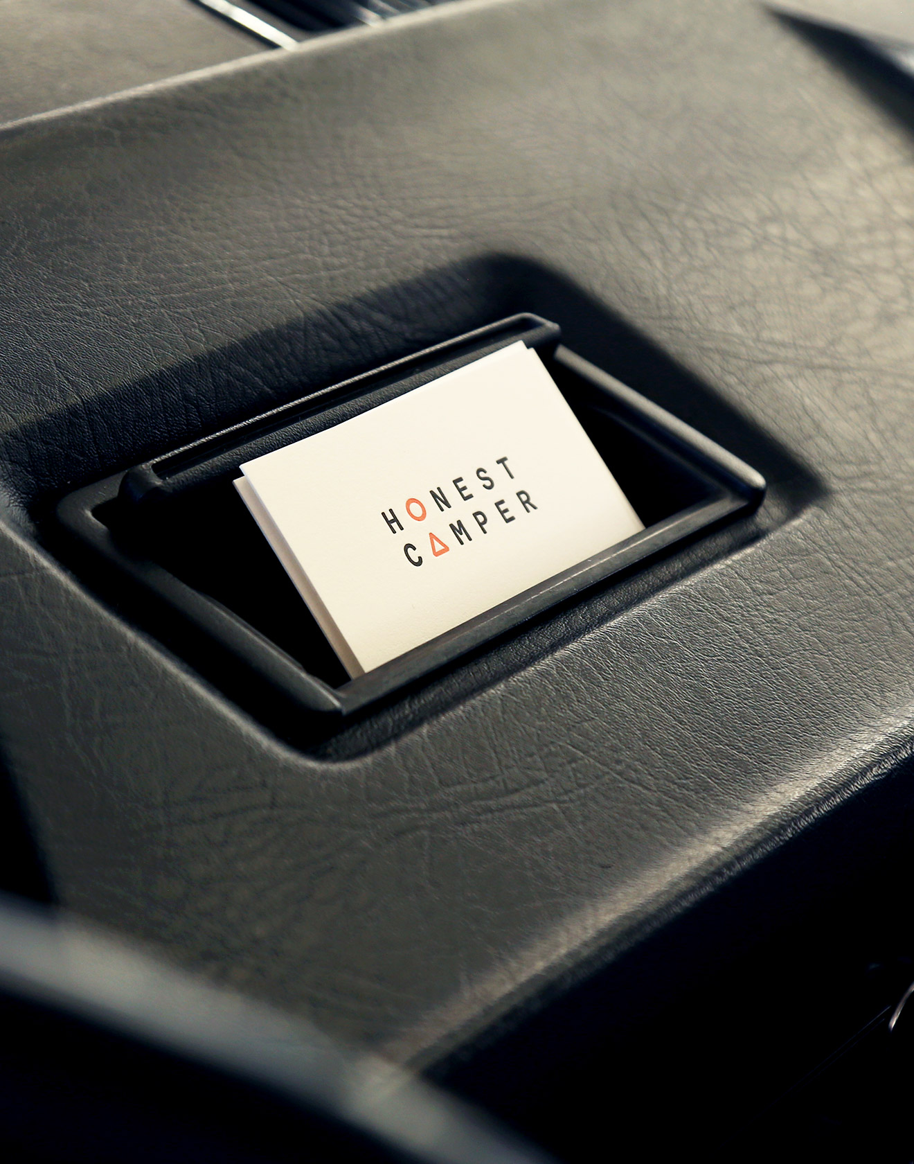
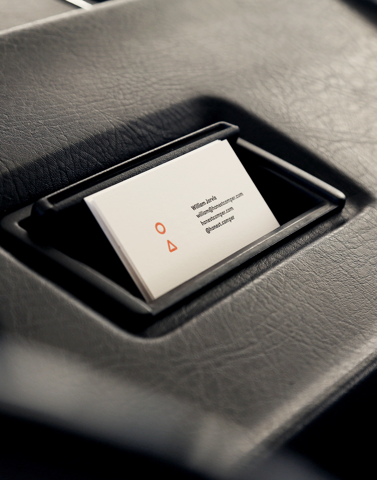
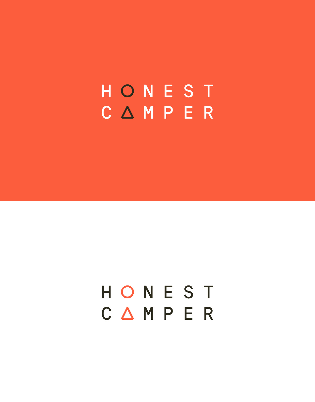
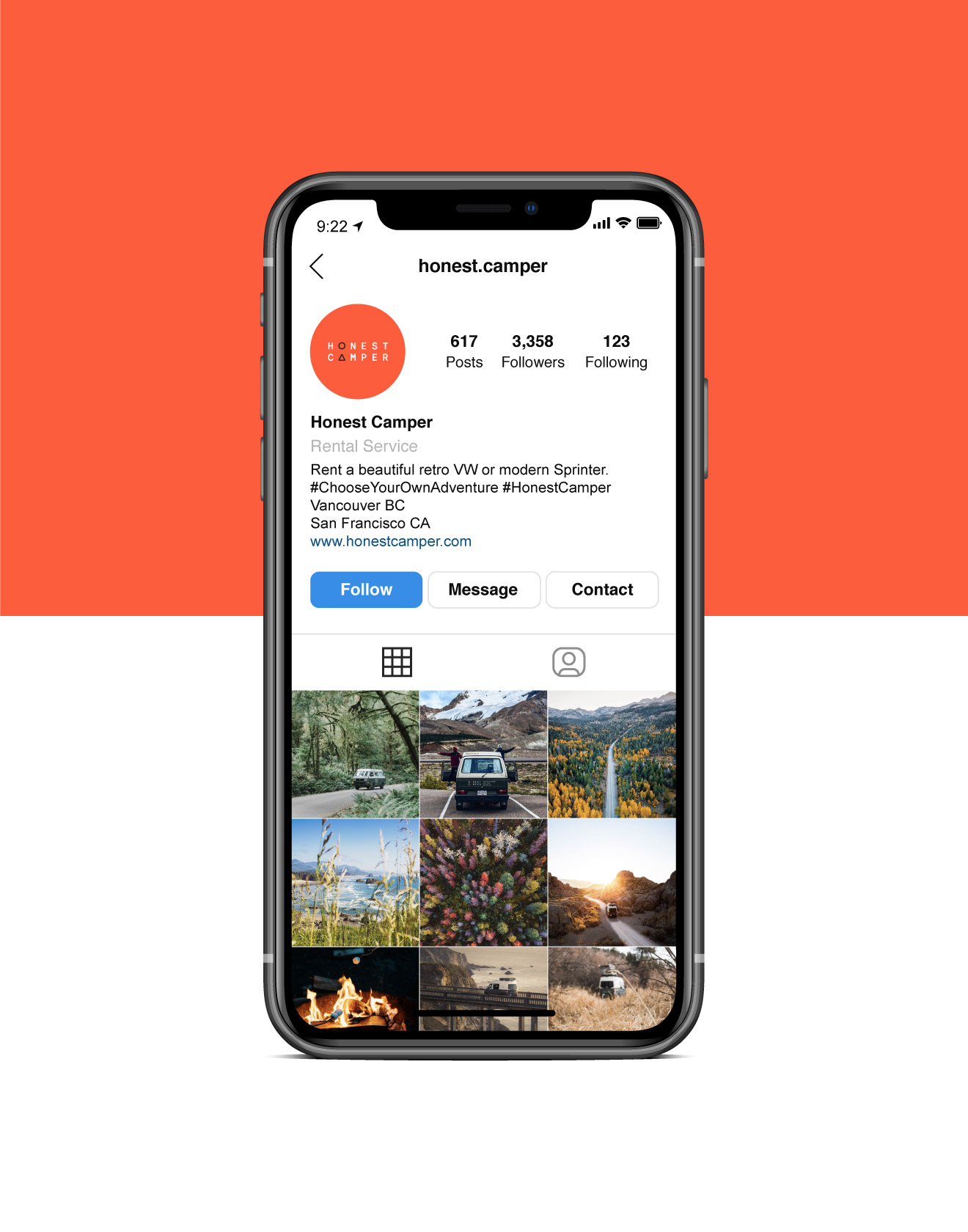

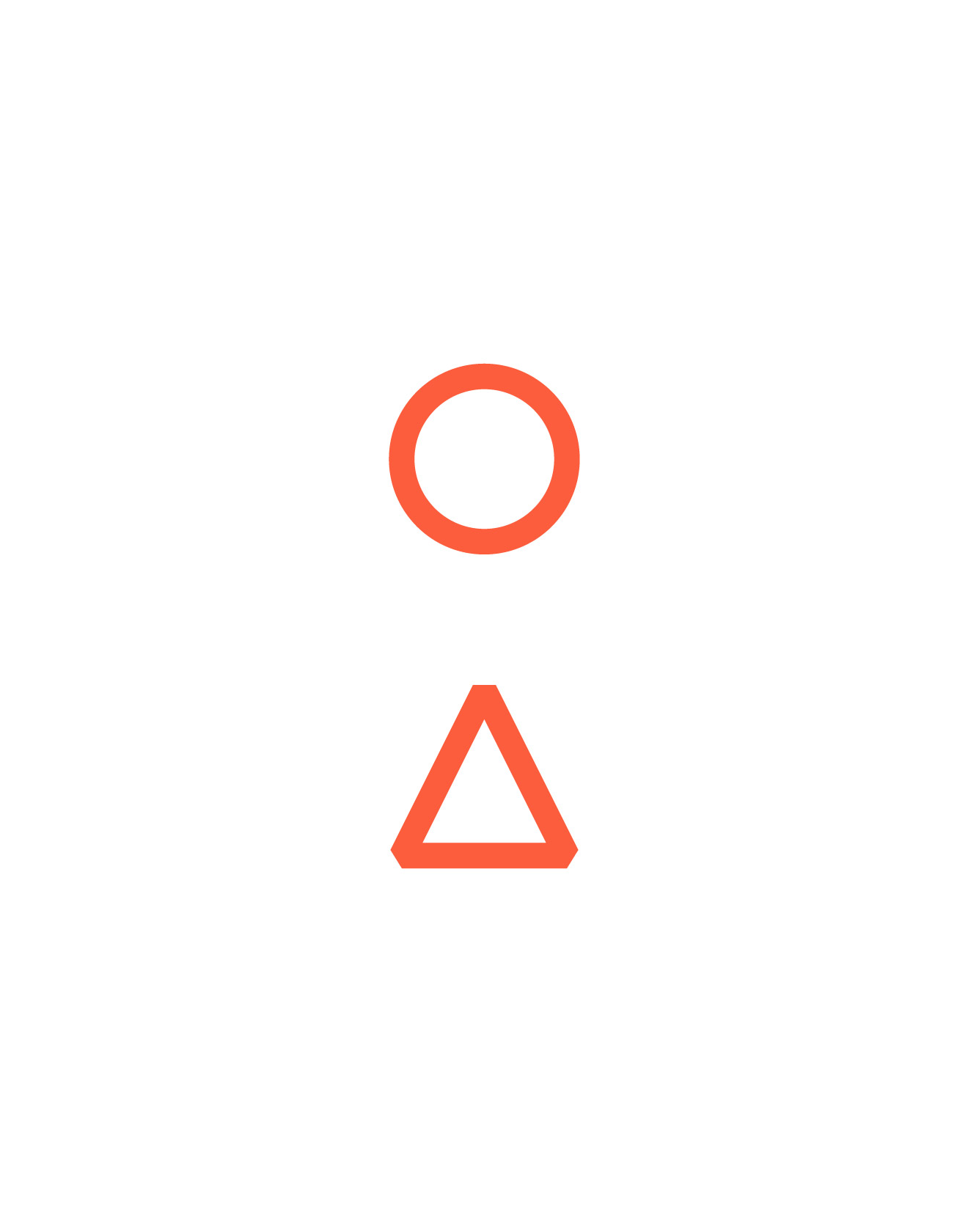
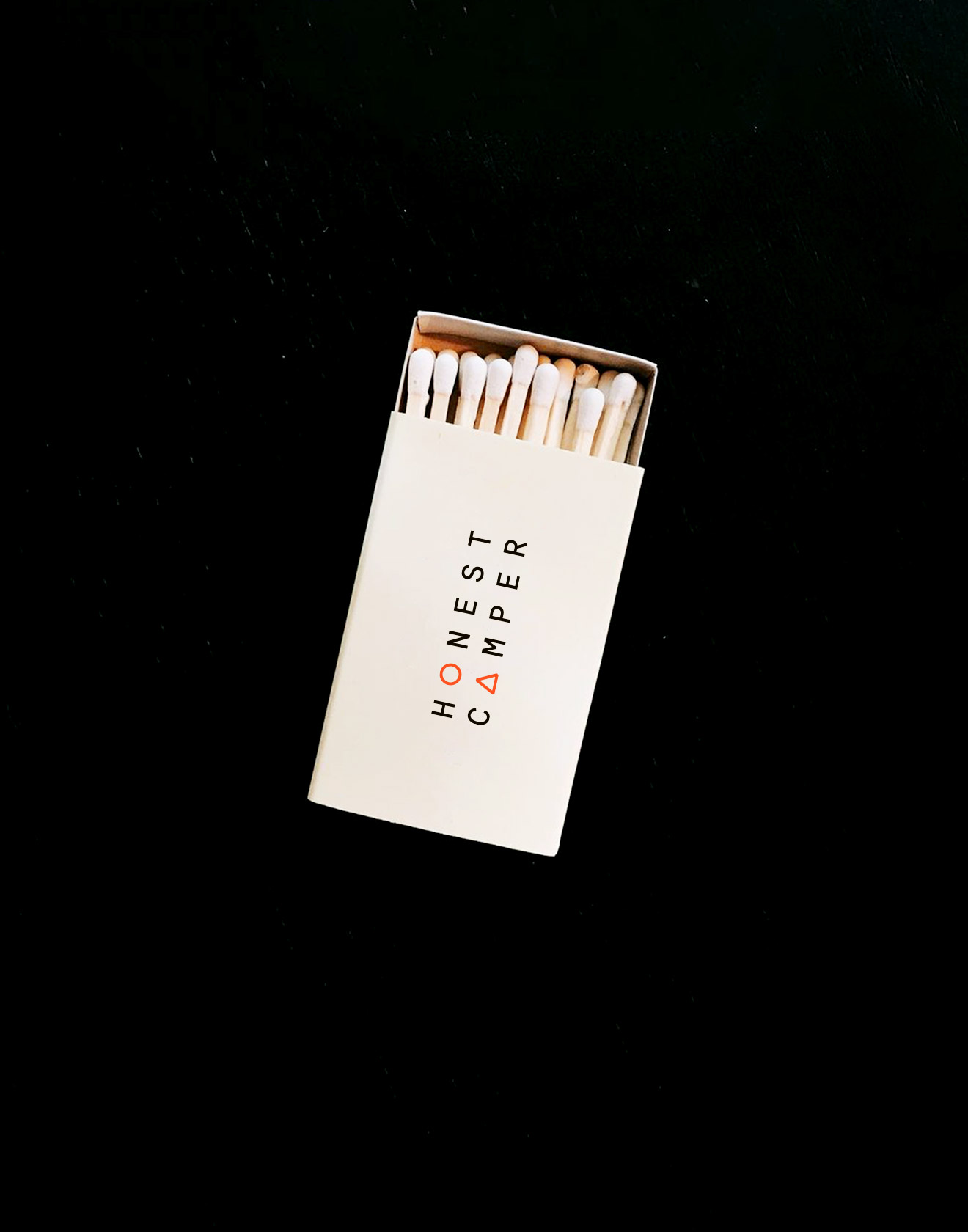
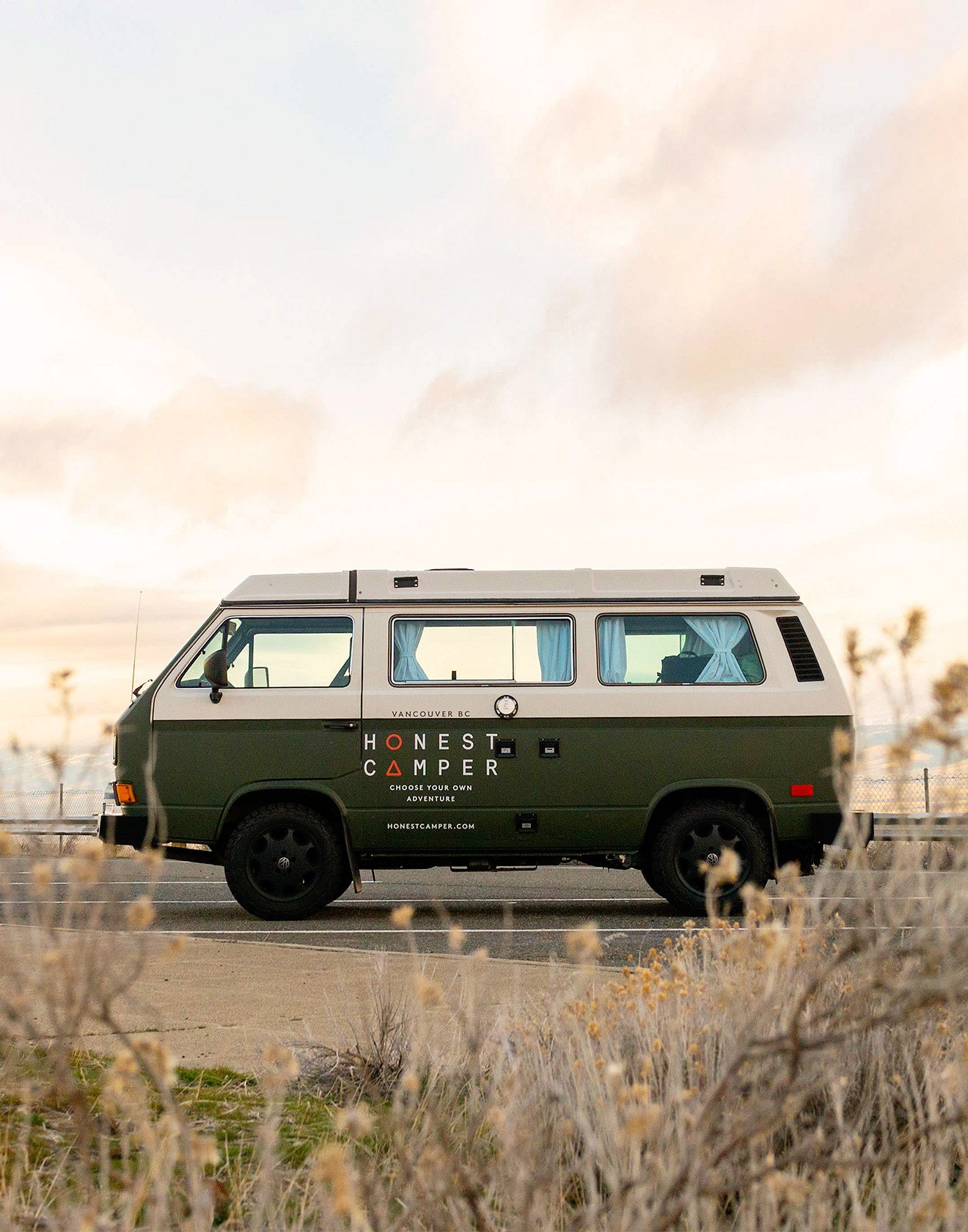

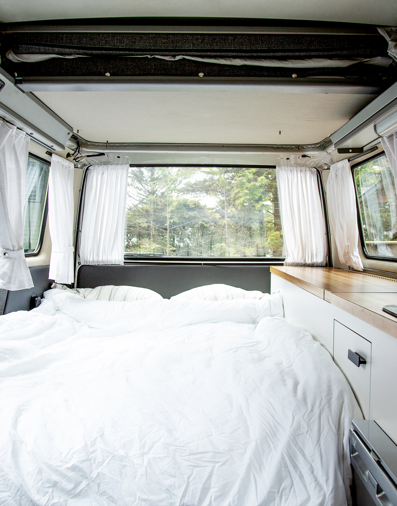

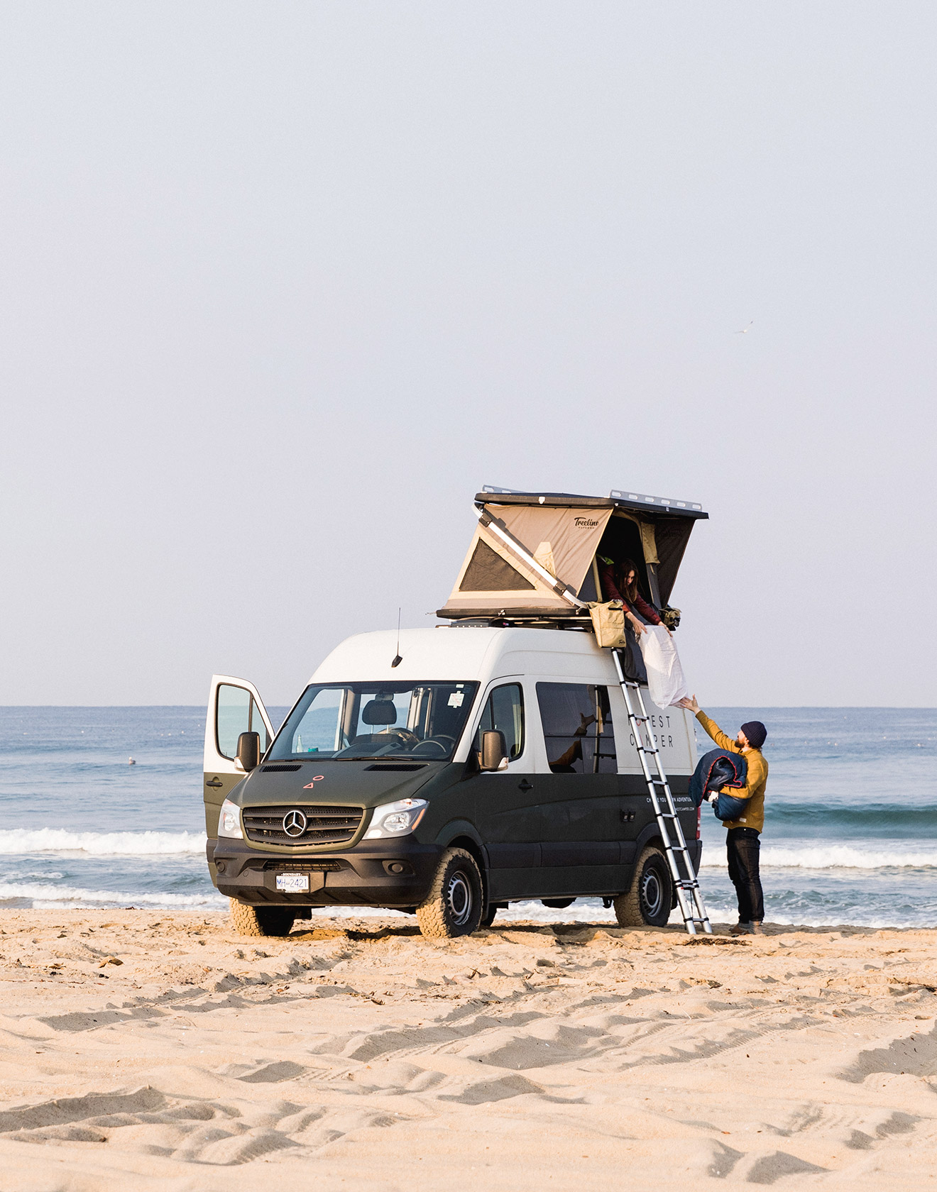

Honest Camper
Elevating van life with a brand that balances nostalgia and design.
Honest Camper set out to make road travel feel inspiring again, without the gimmicks or kitsch. I created a visual identity concept of the moon and mountains that captures the spirit of adventure with a modern, minimalist approach that feels both grounded and optimistic. Applied across the van exteriors, collateral, and digital touchpoints, the branding turns simple getaways into something design-worthy, inviting travellers to experience freedom with a bit more style.
Design support from: Mustaali Raj
Read more
< swipe >
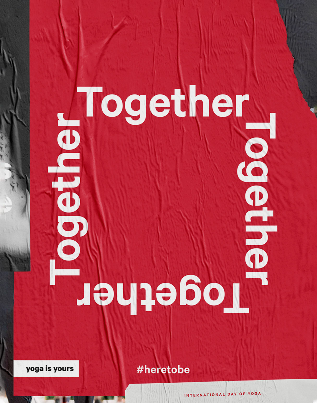
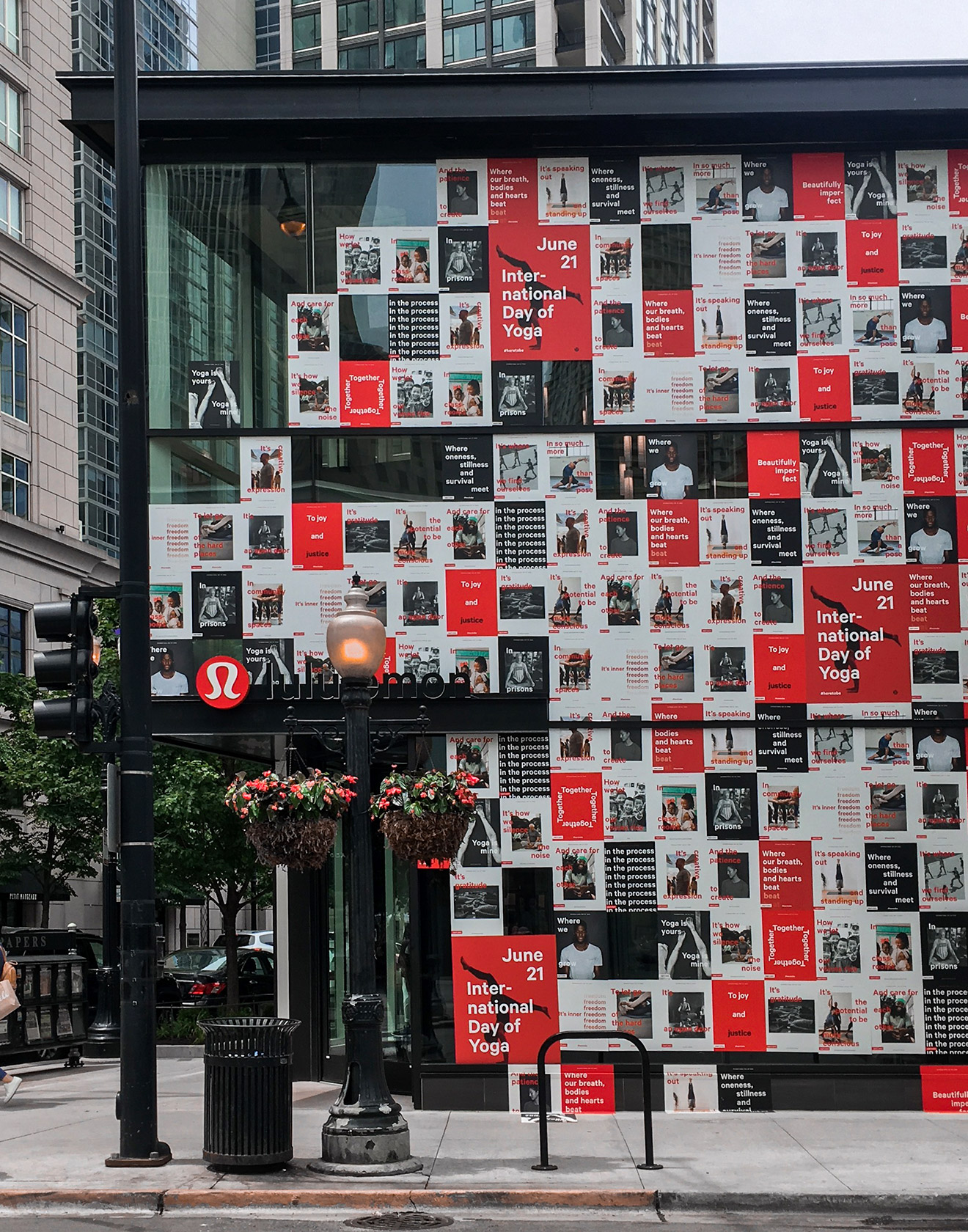
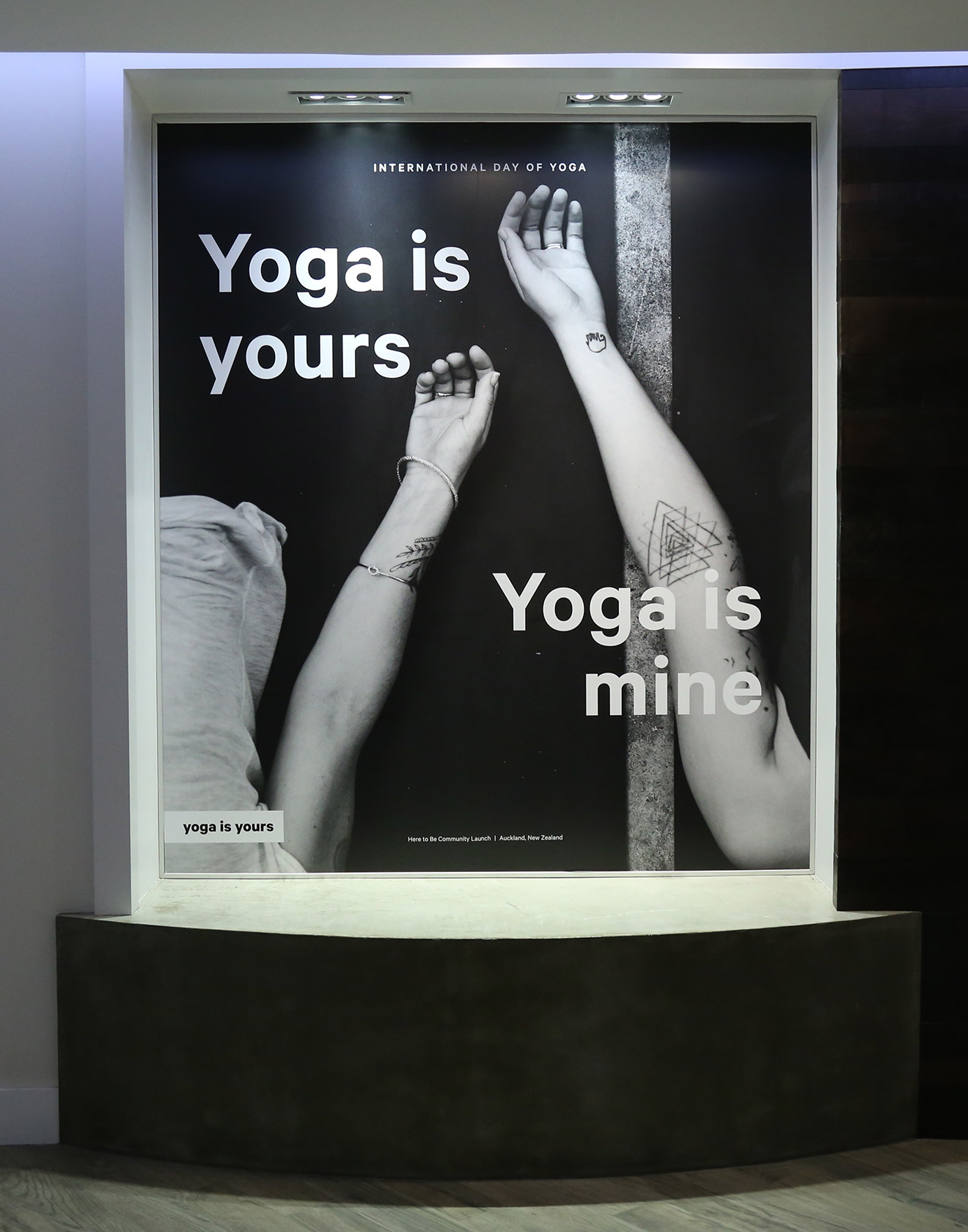
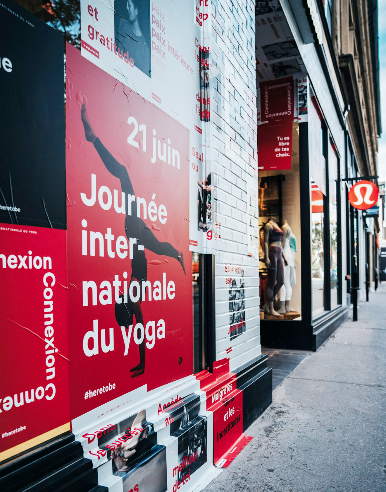
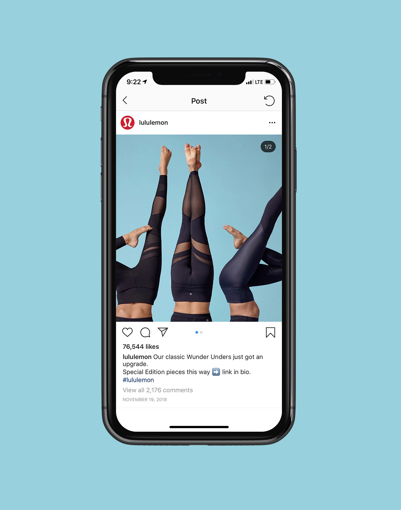
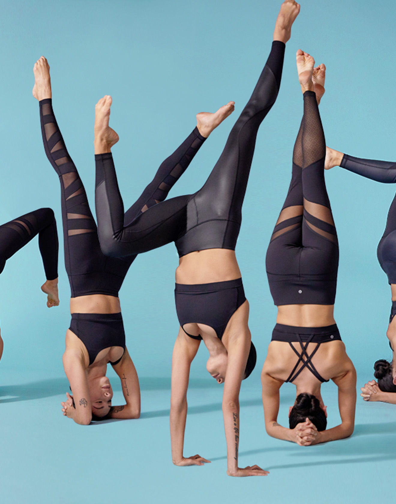
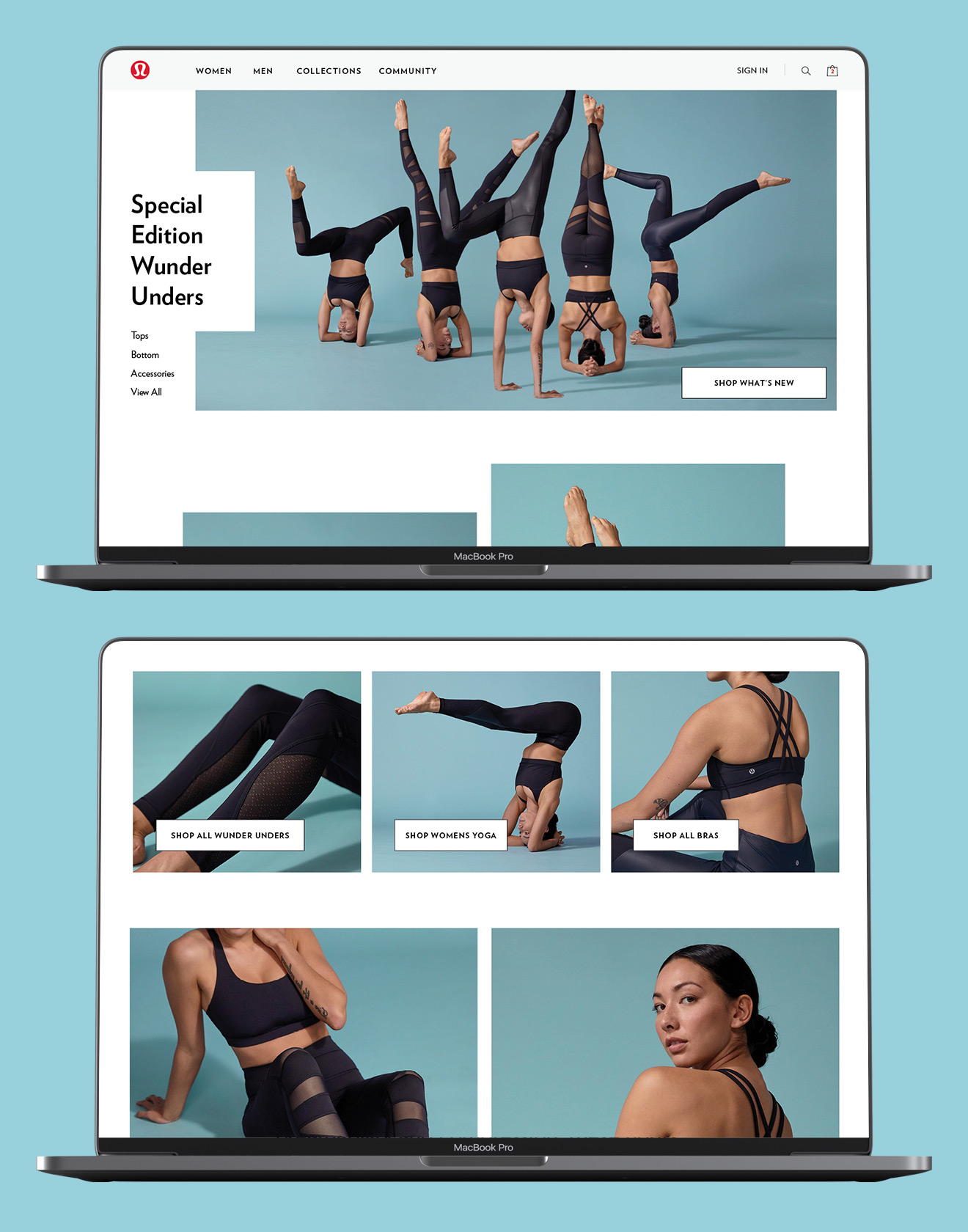
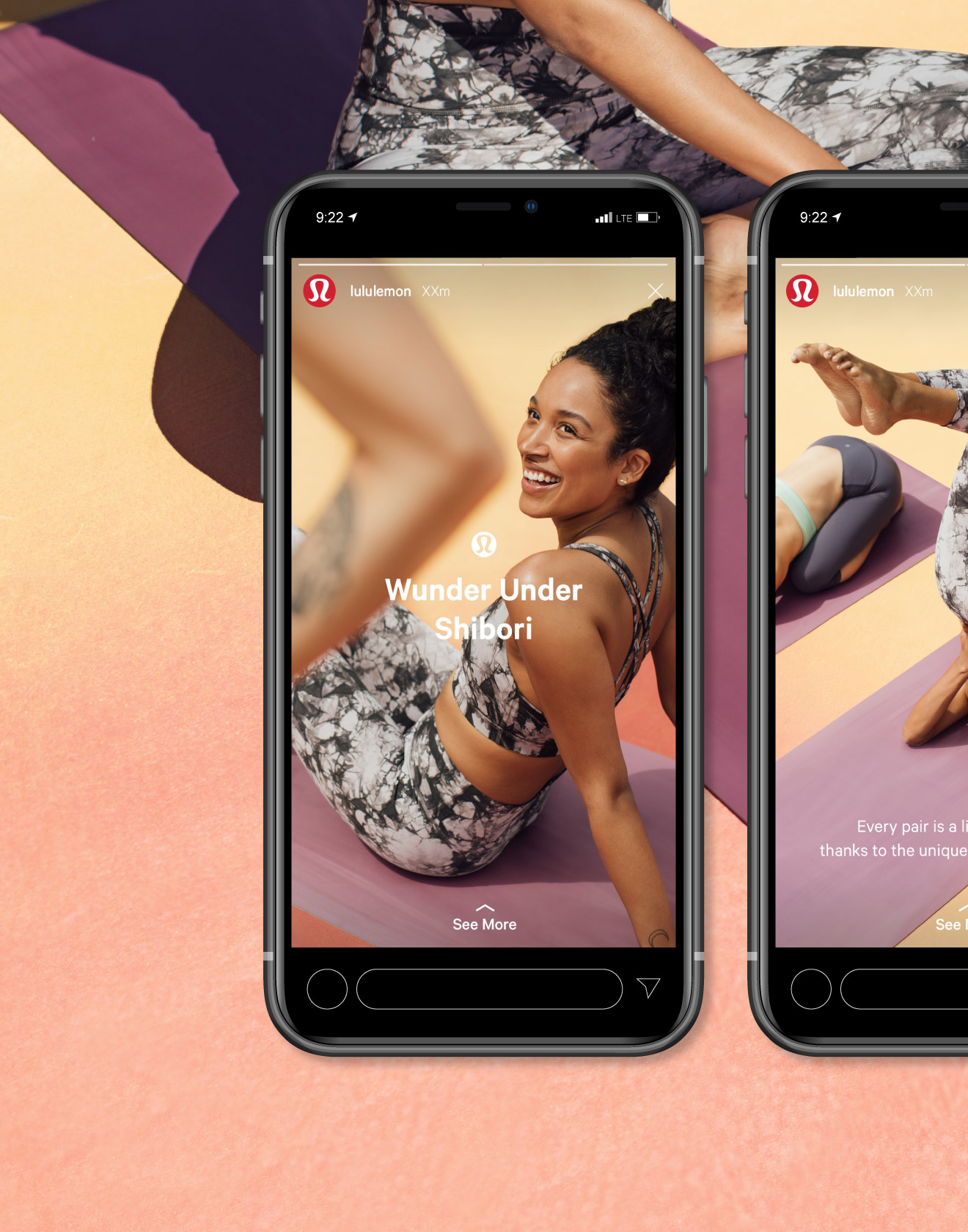
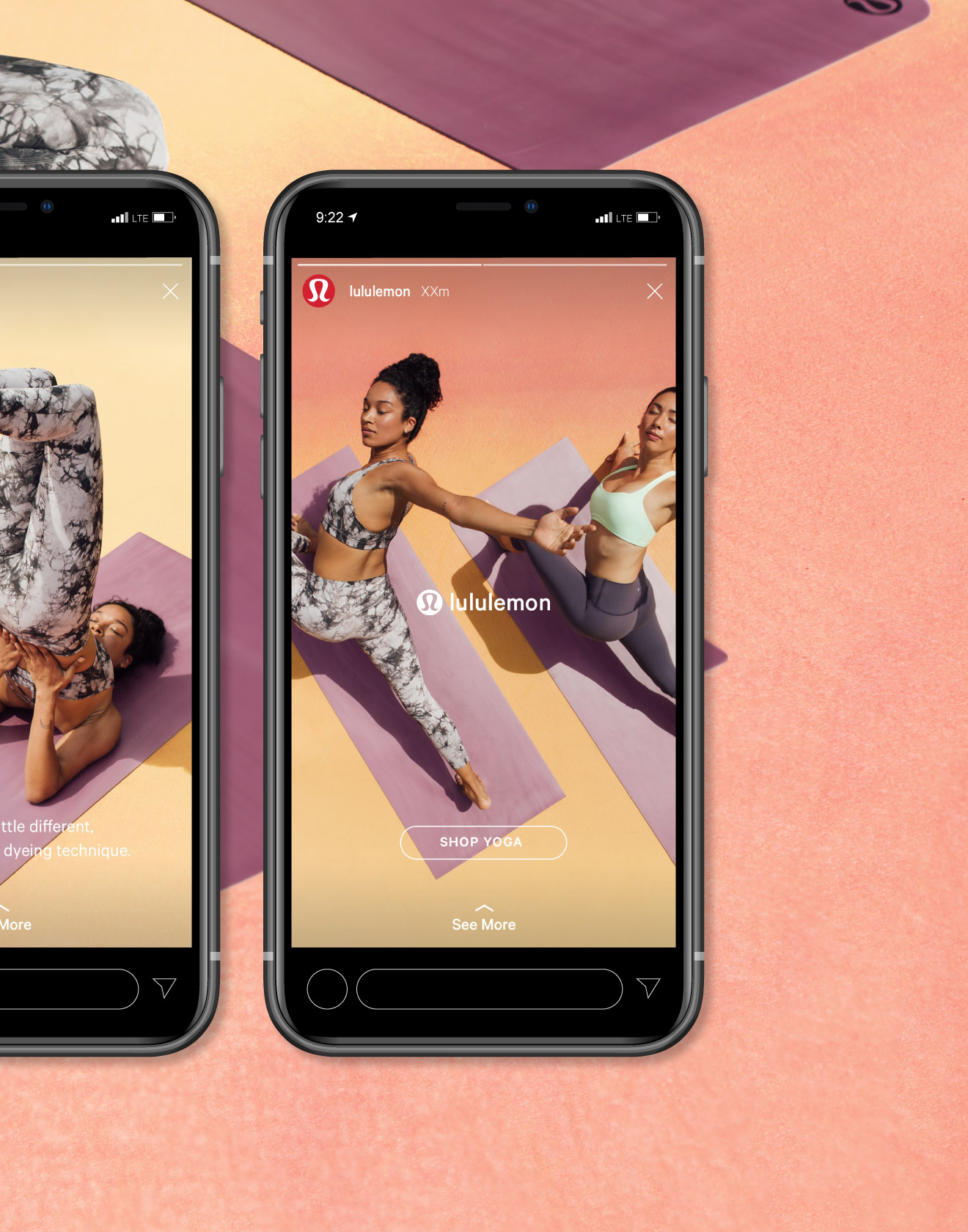
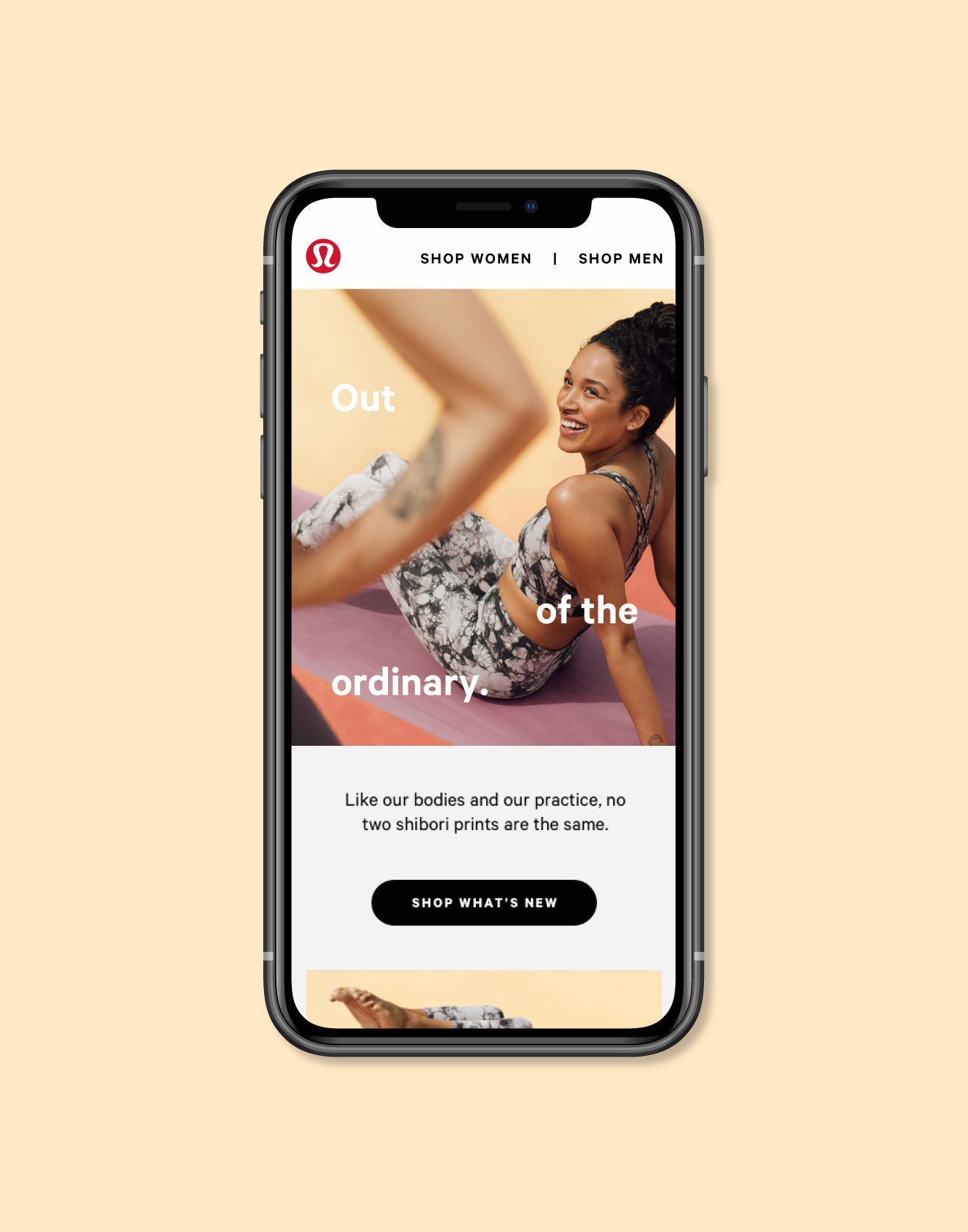
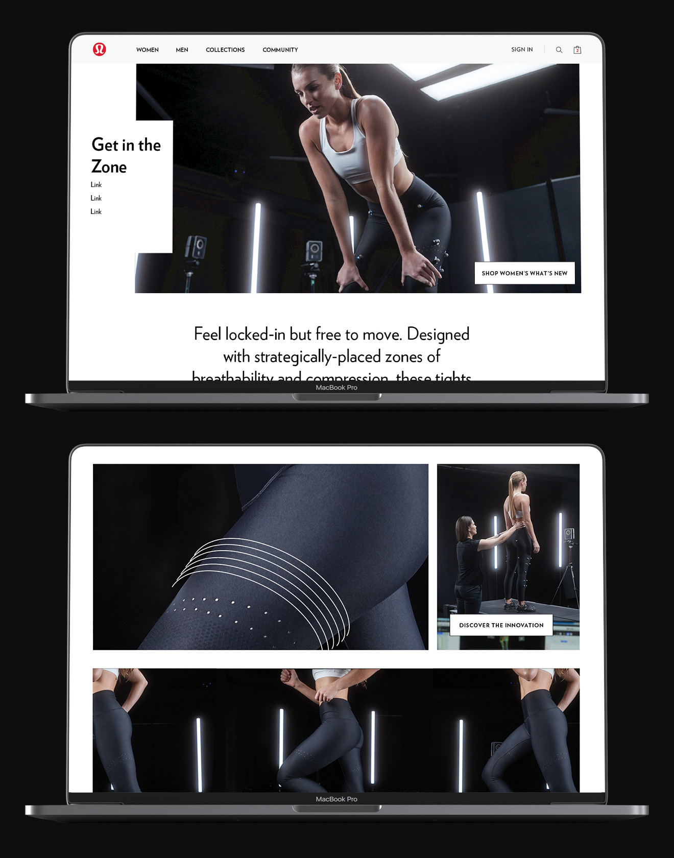
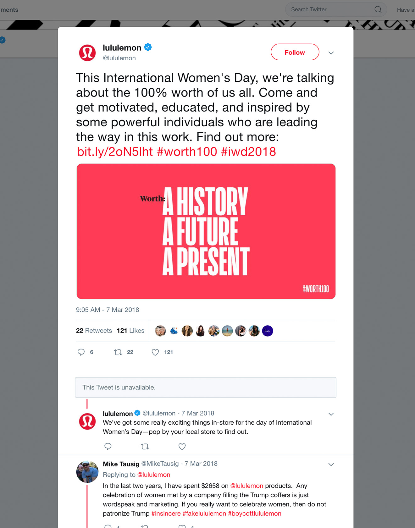
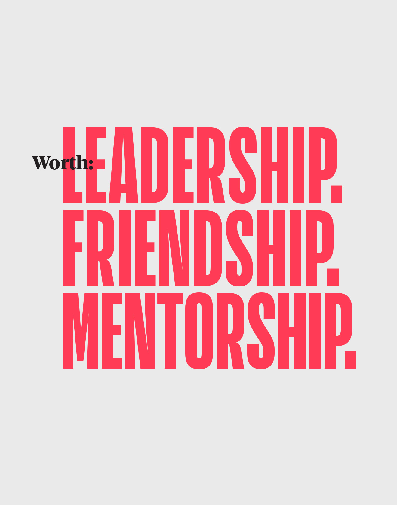
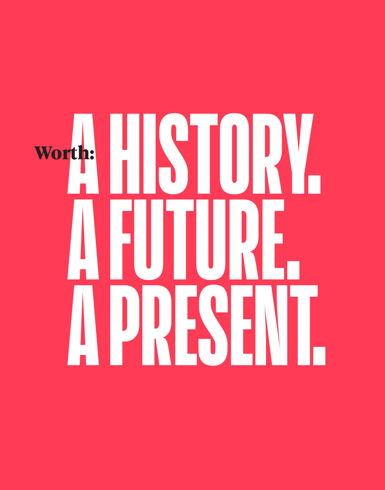
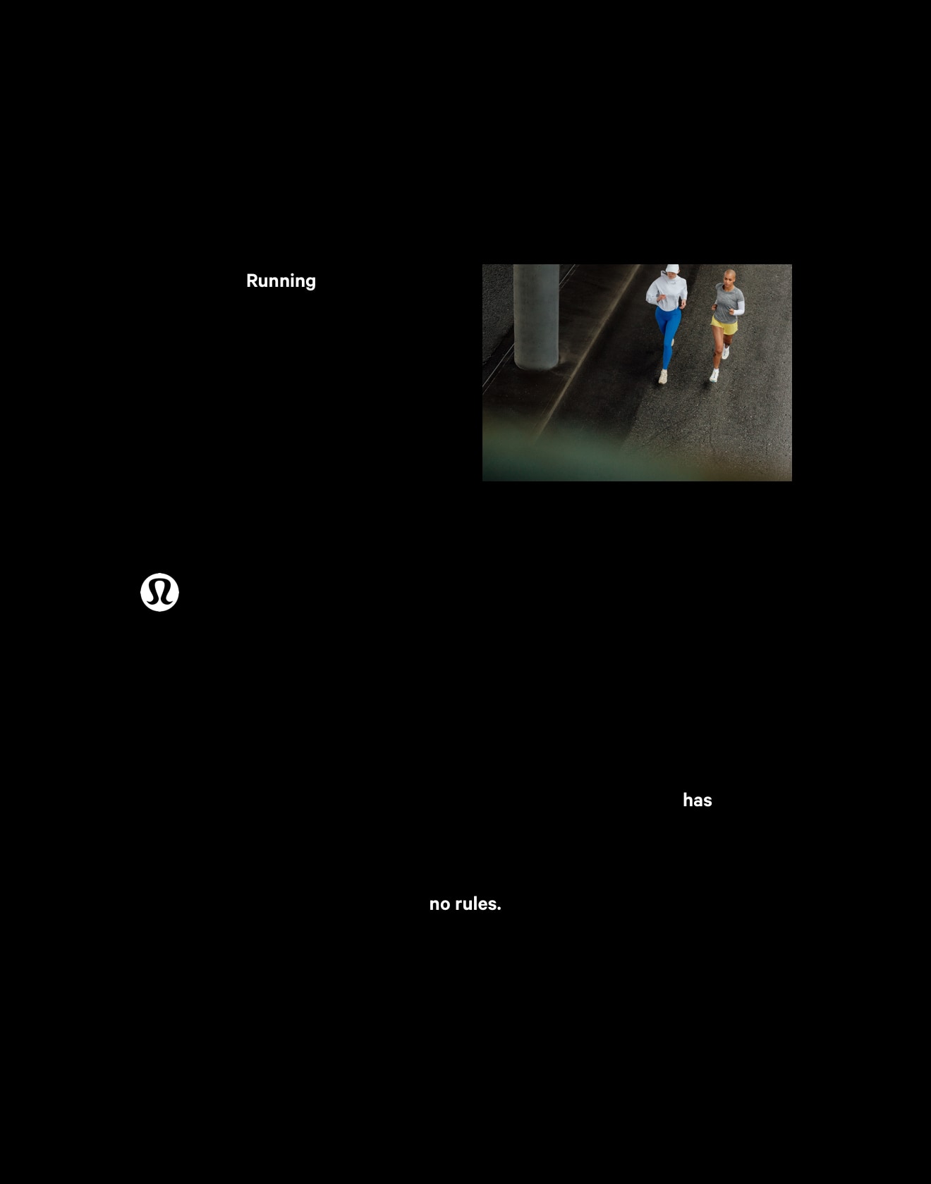
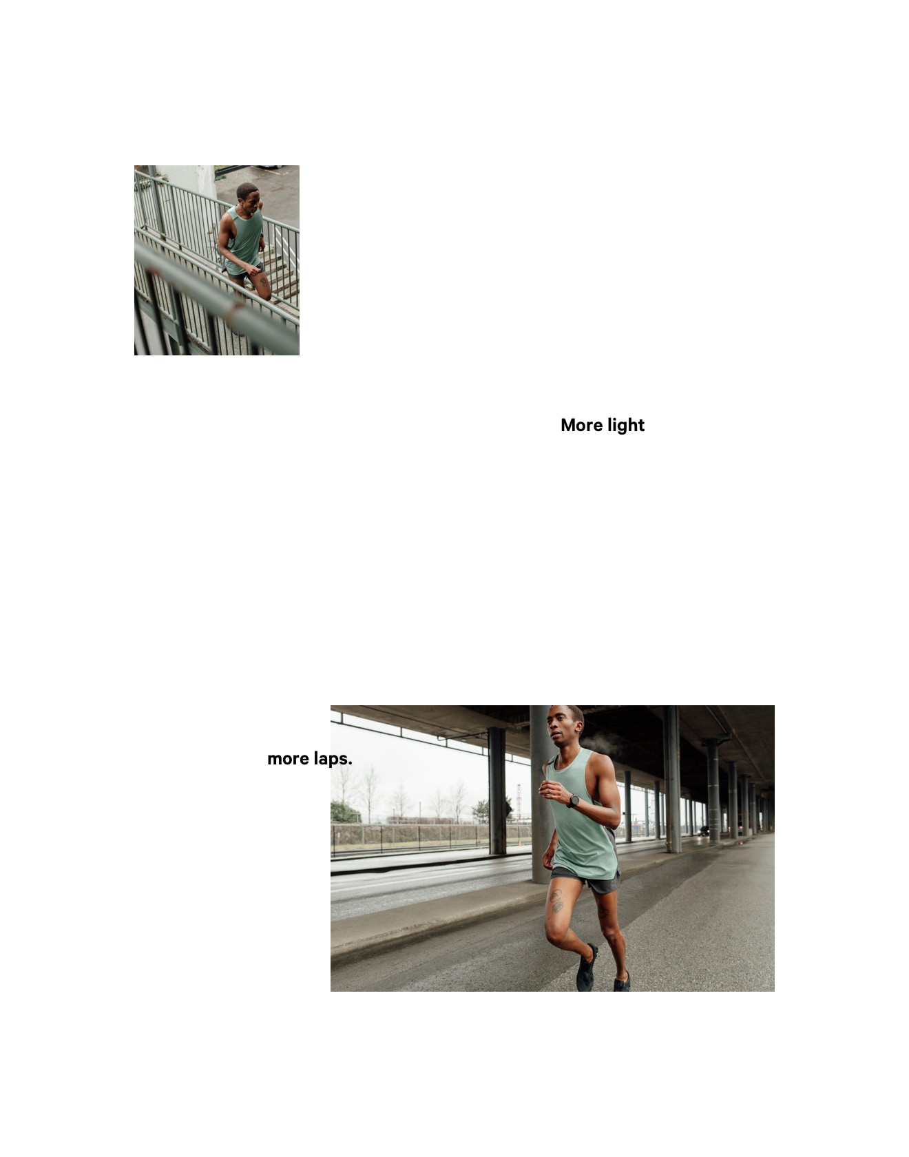

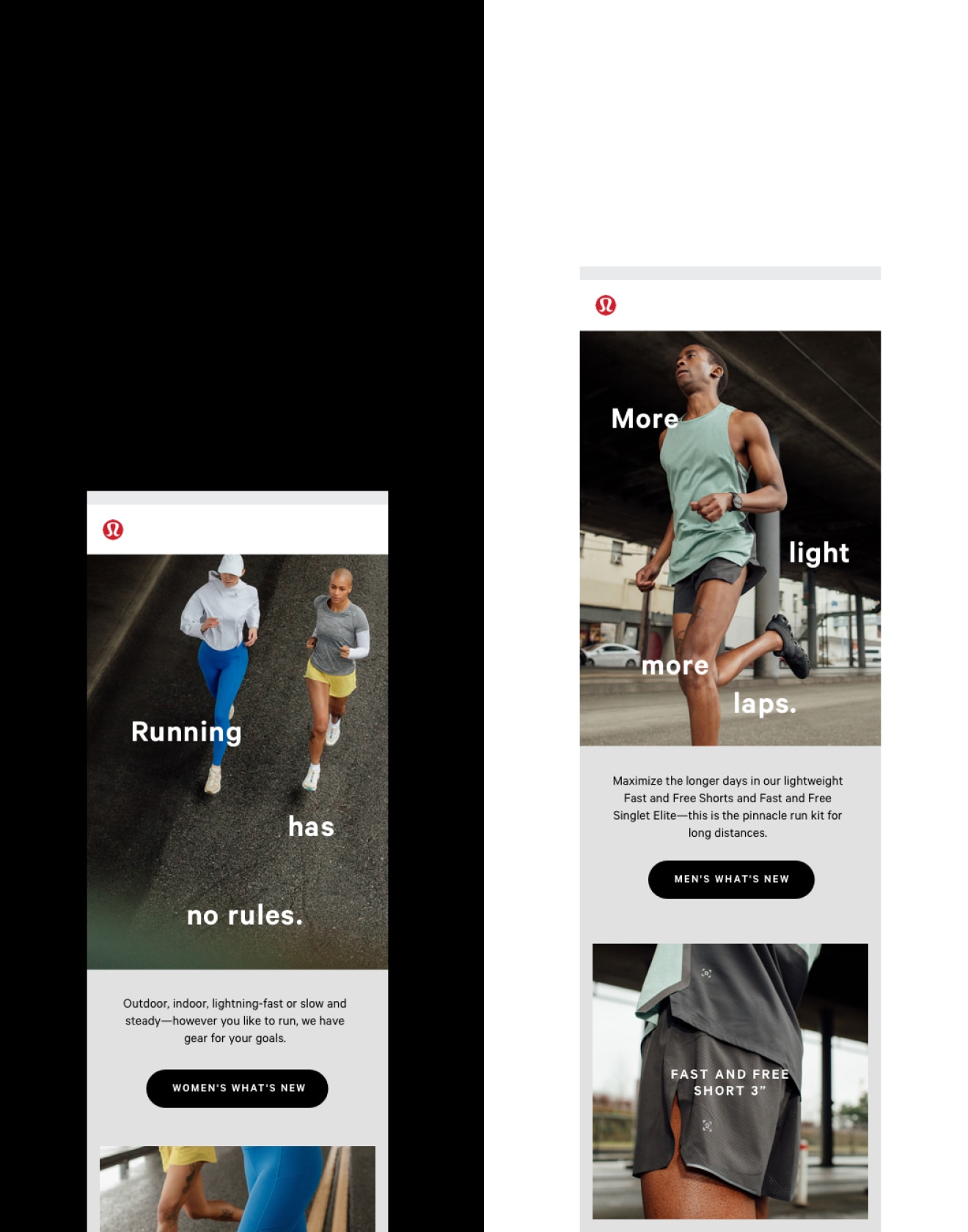
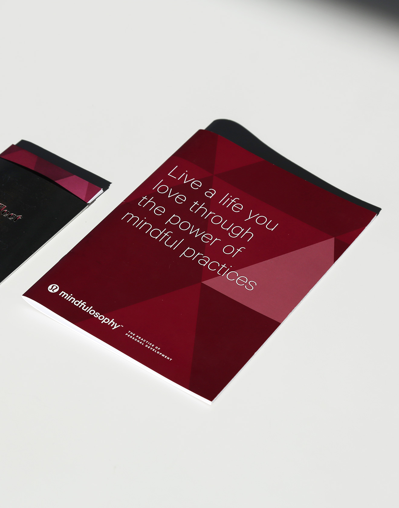
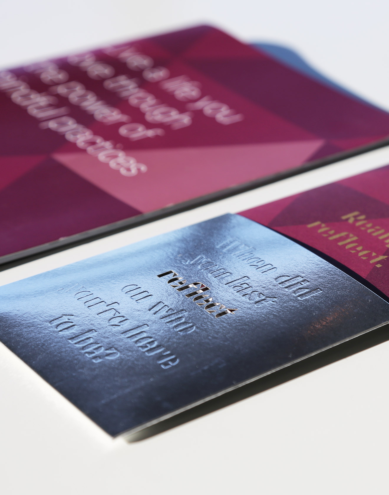
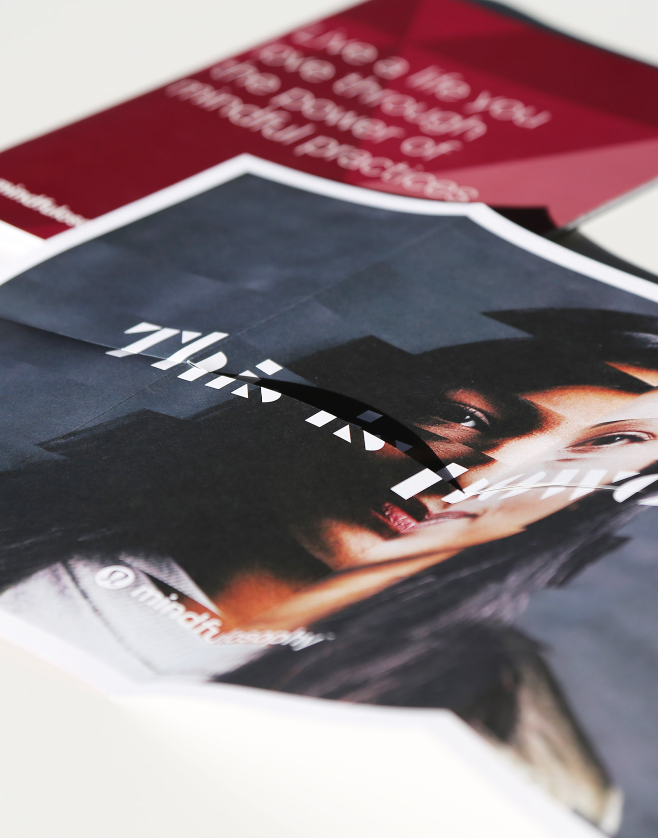
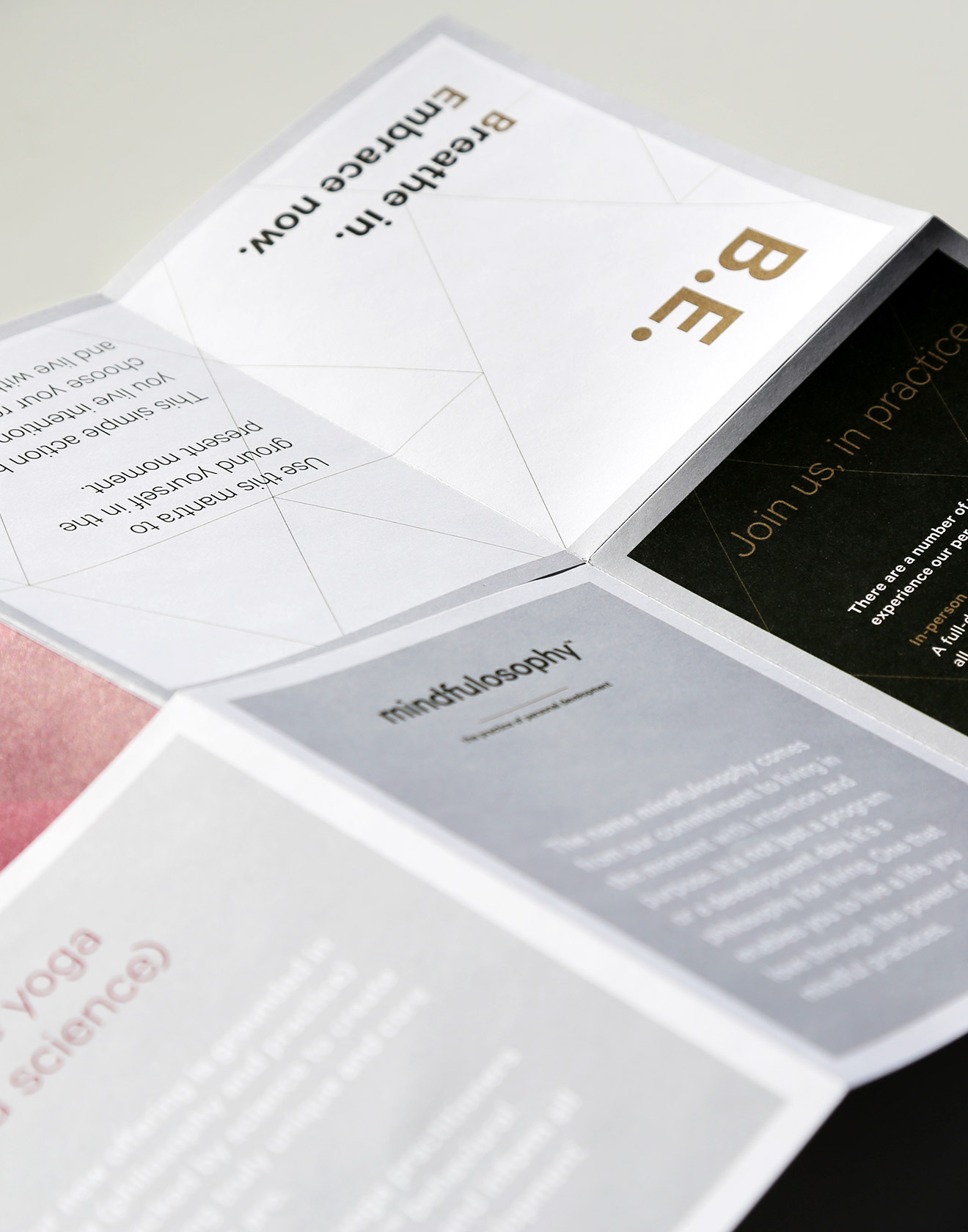
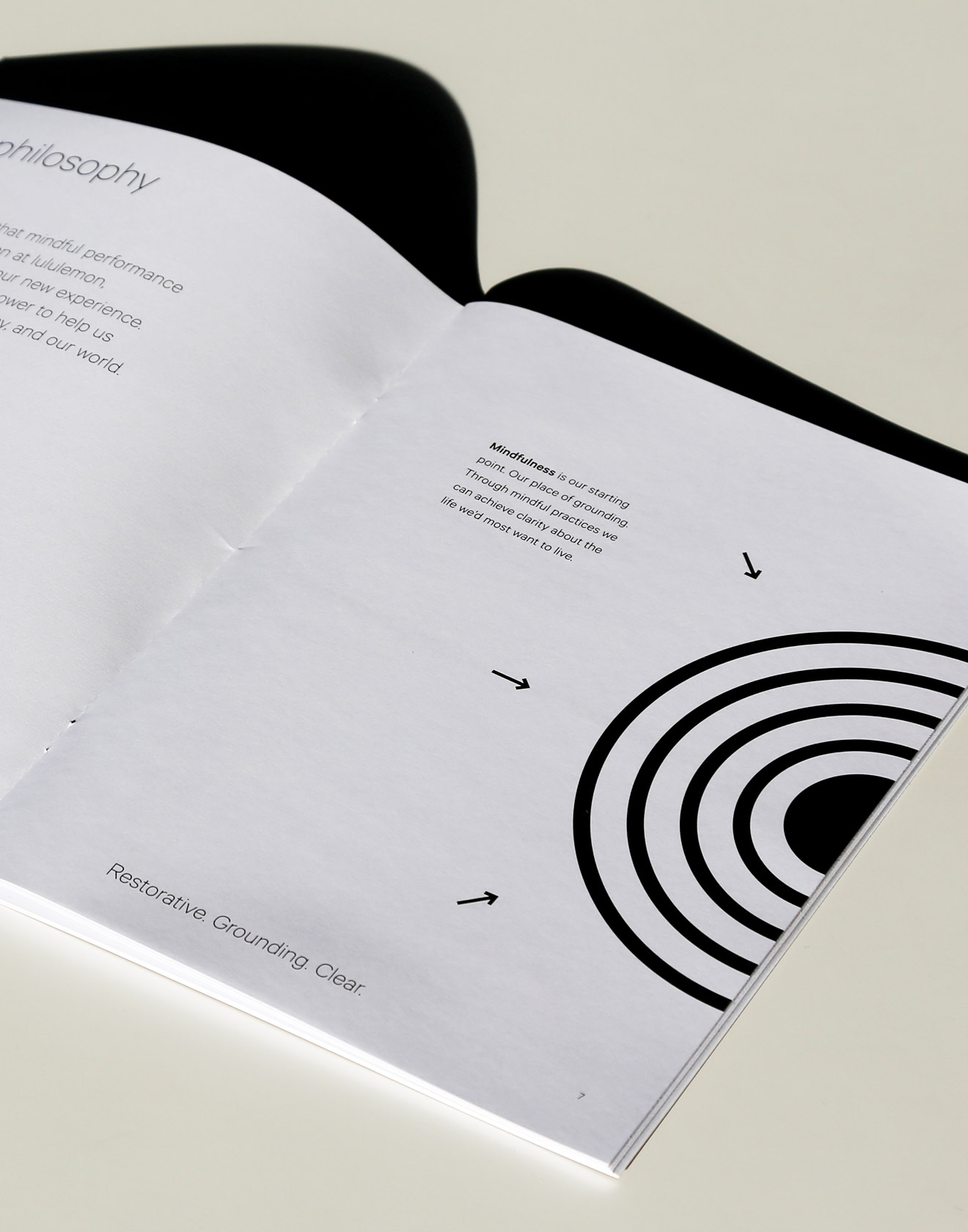
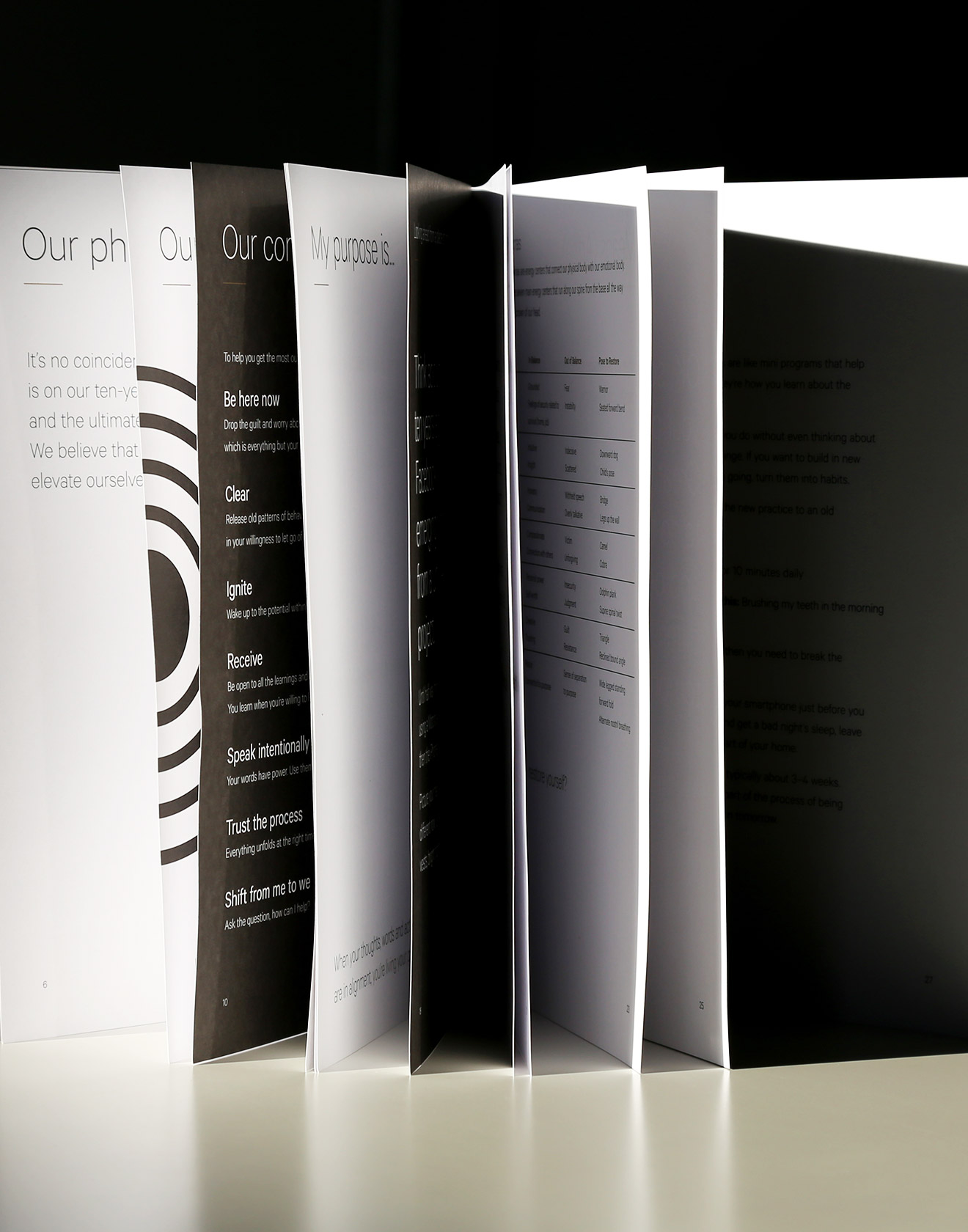
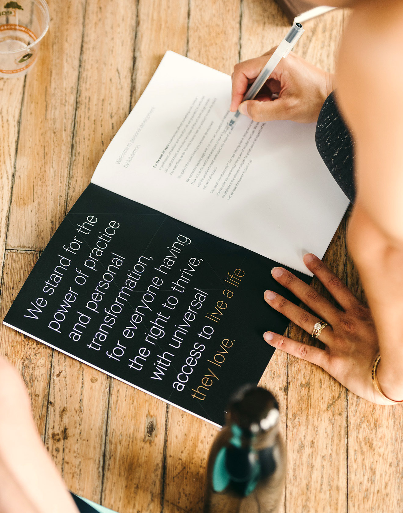
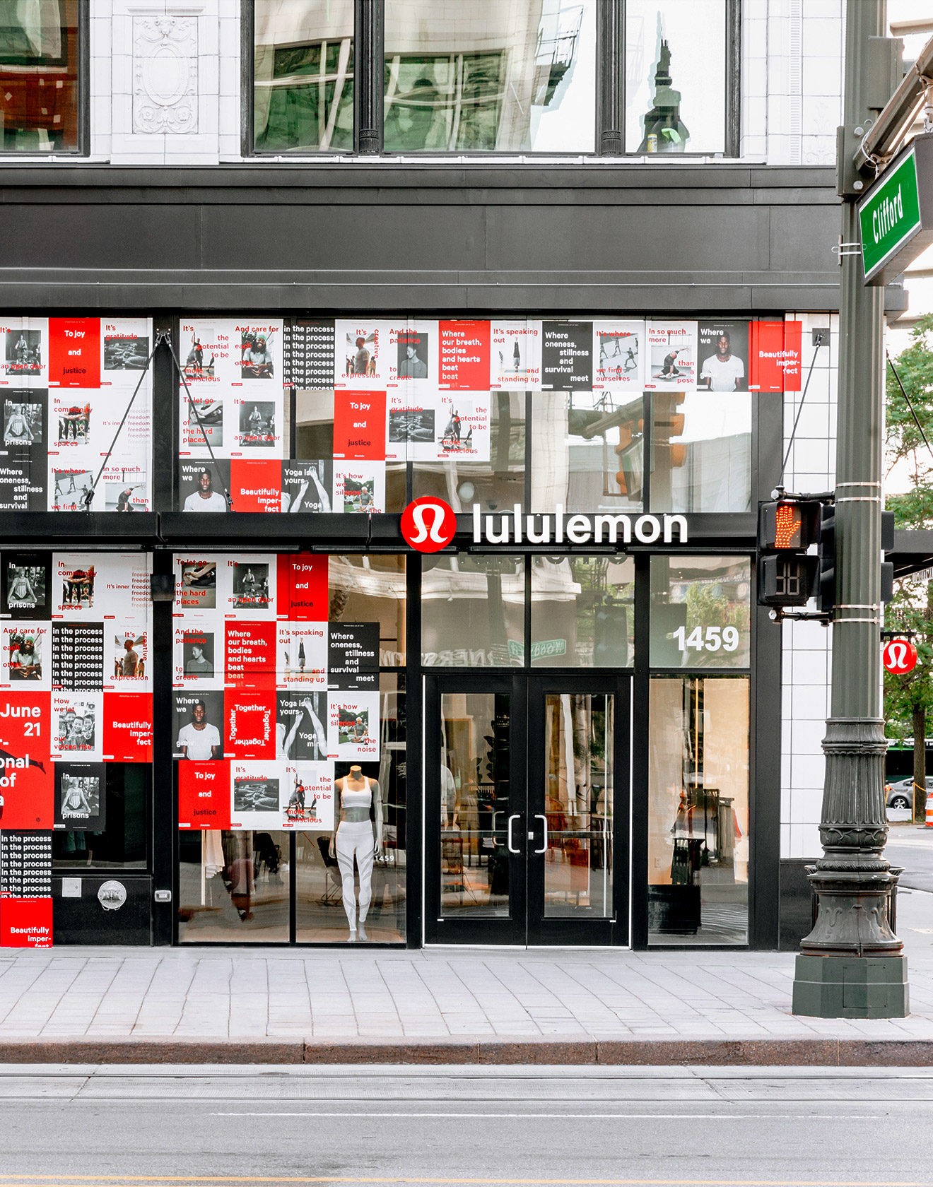
lululemon
Some very creative work exists to support the well-known, black, stretchy pants and lululemon’s brand team is at the centre of it.
Between completely creating its own apparel category out of Vancouver B.C. to competing with the greats like Nike and Under Armour, lululemon is constantly surpassing expectations. Their brand team is consistently dropping innovative weekly product campaigns amidst longer, global campaigns like International Day of Yoga, Global Run Day and International Women’s Day, to name a few. Among a huge staff of designers and art directors, my role was to help develop and execute these campaigns successfully to new and existing audiences across digital and printed channels.
Read more
< swipe >
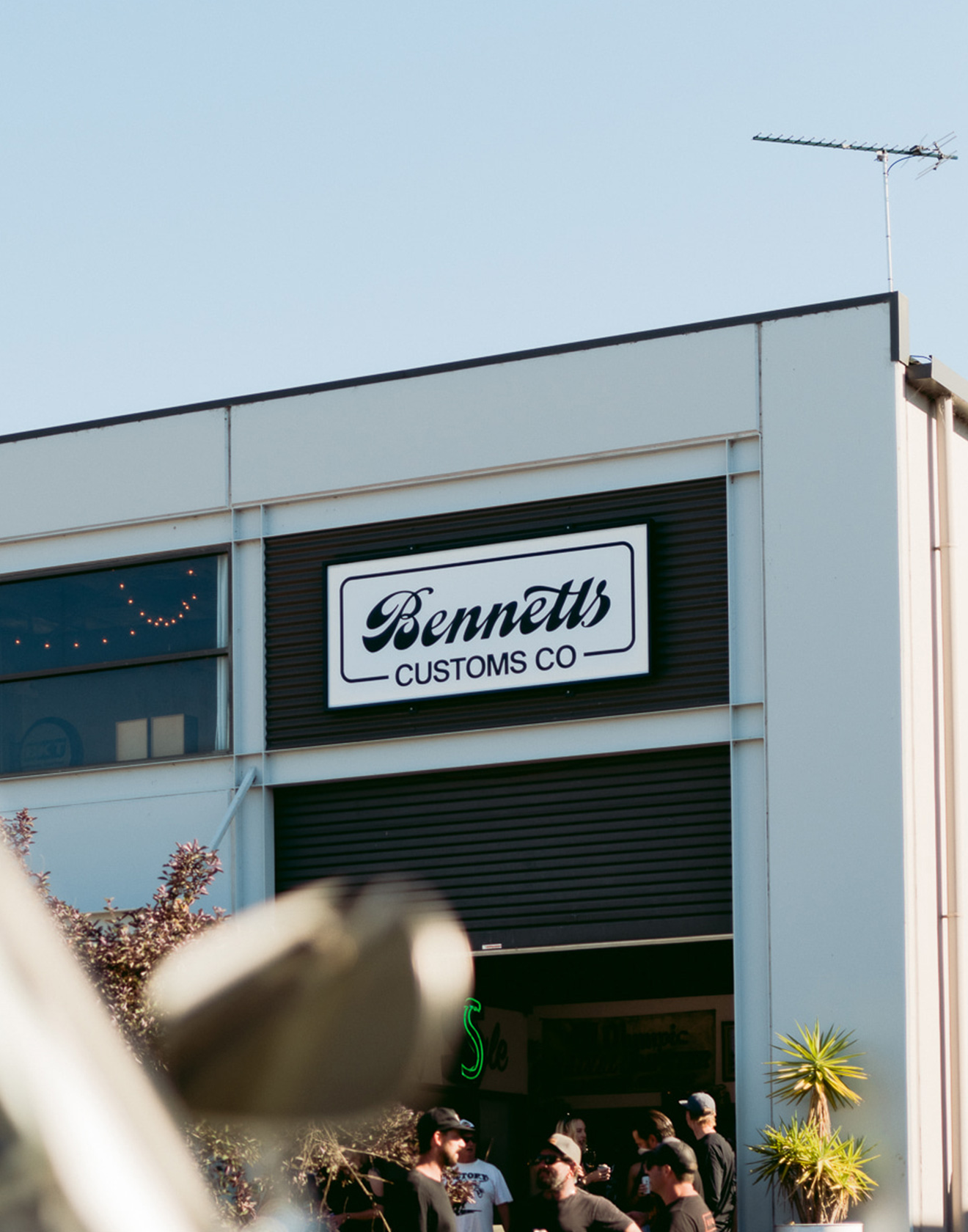
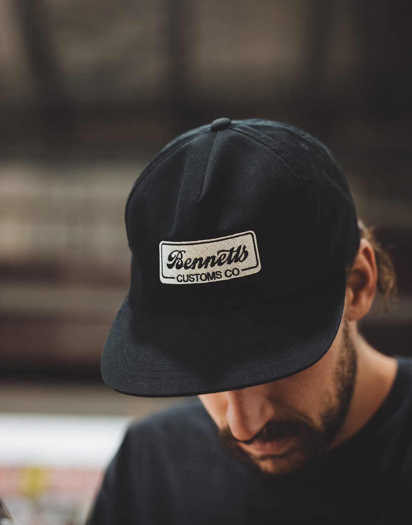
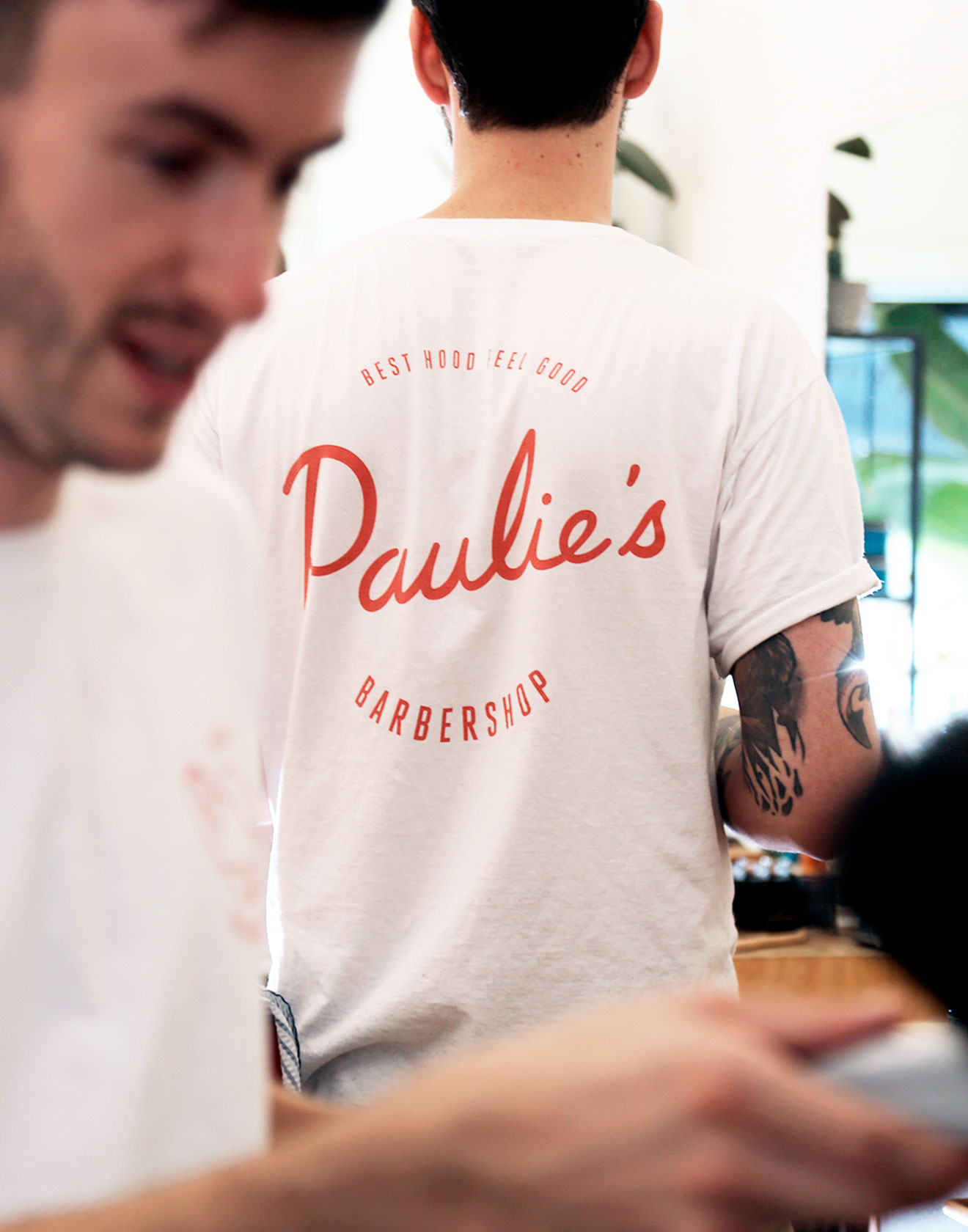
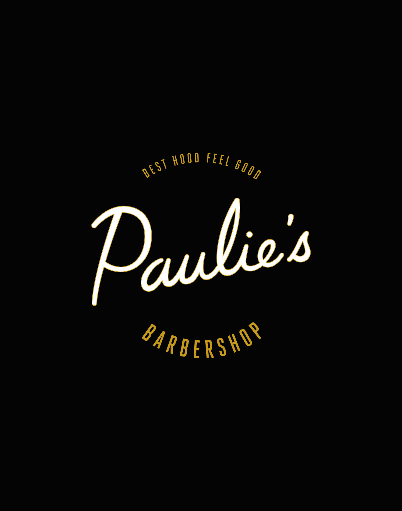
Project Archive
A collection of project fragments, creative moments and older design pieces.
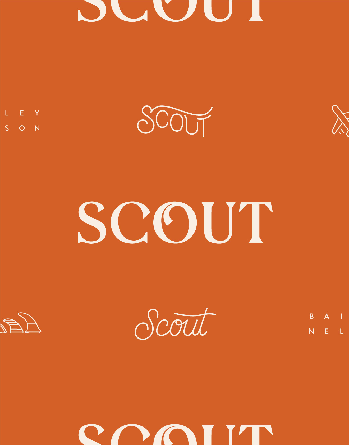
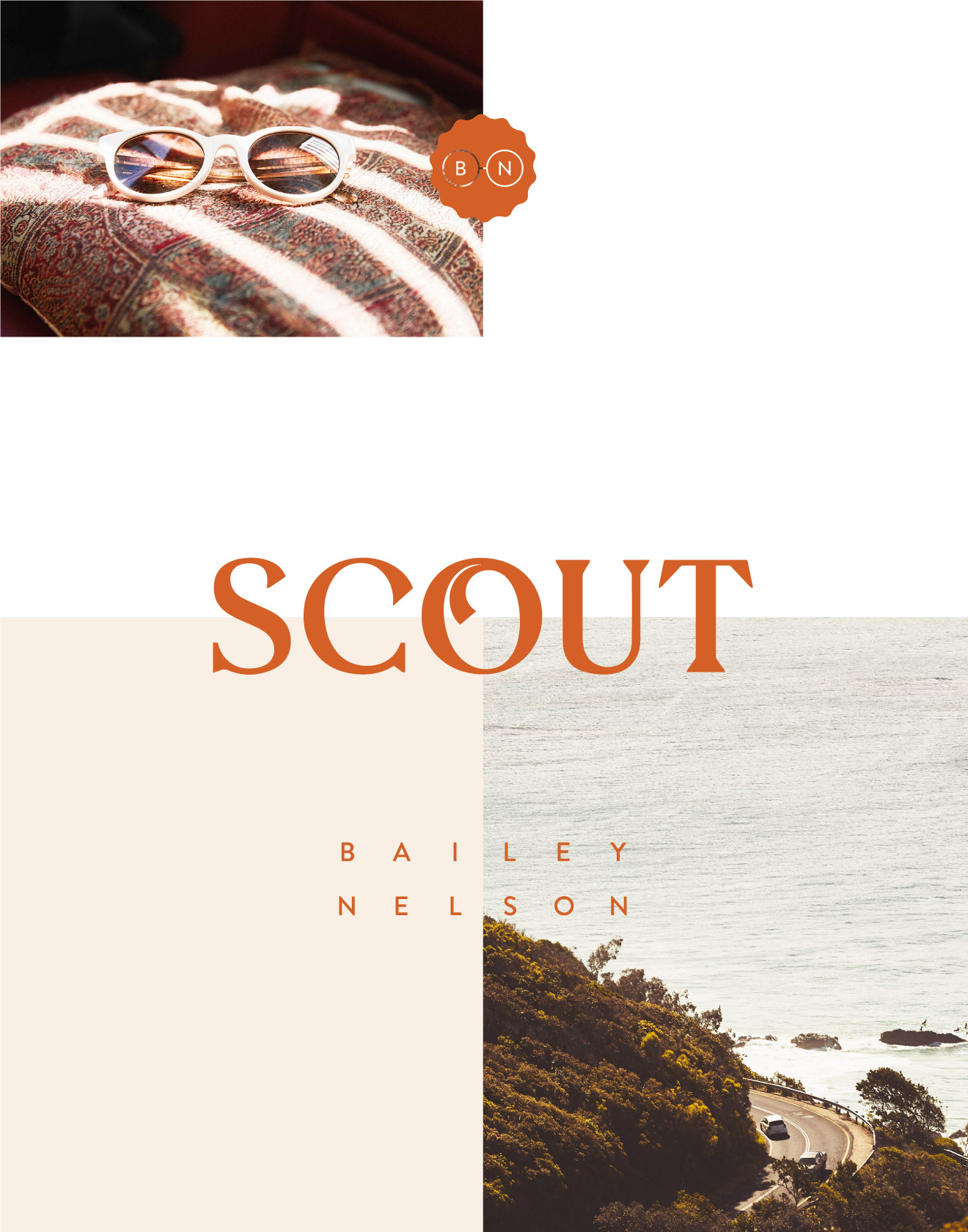
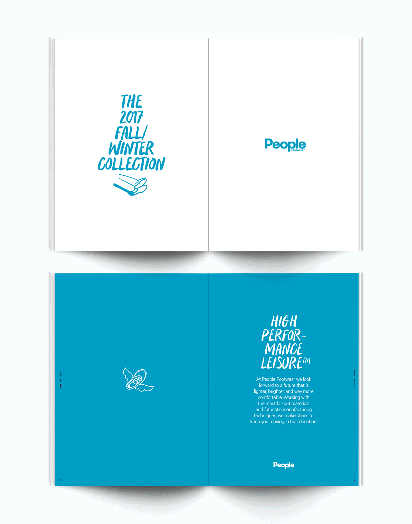
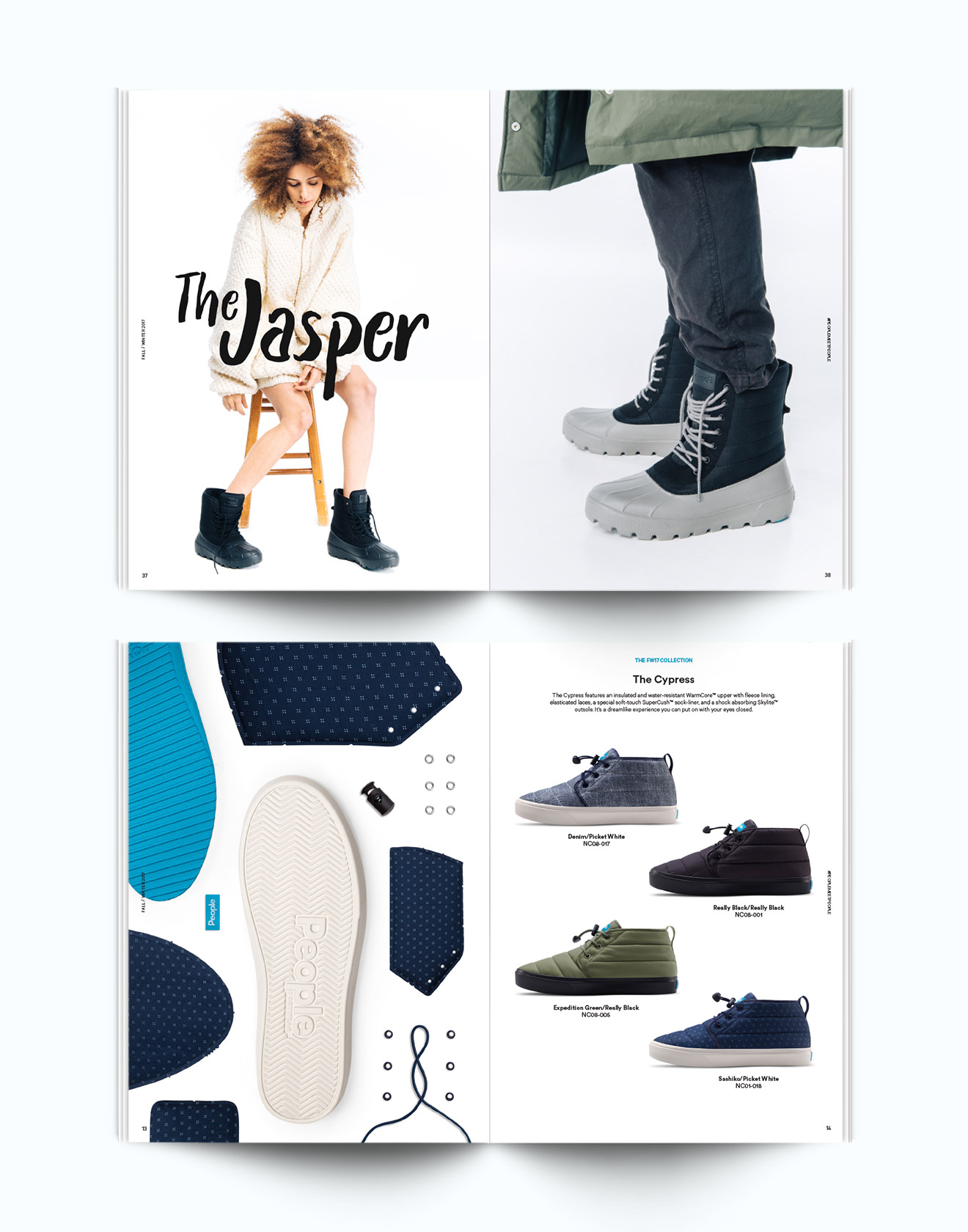
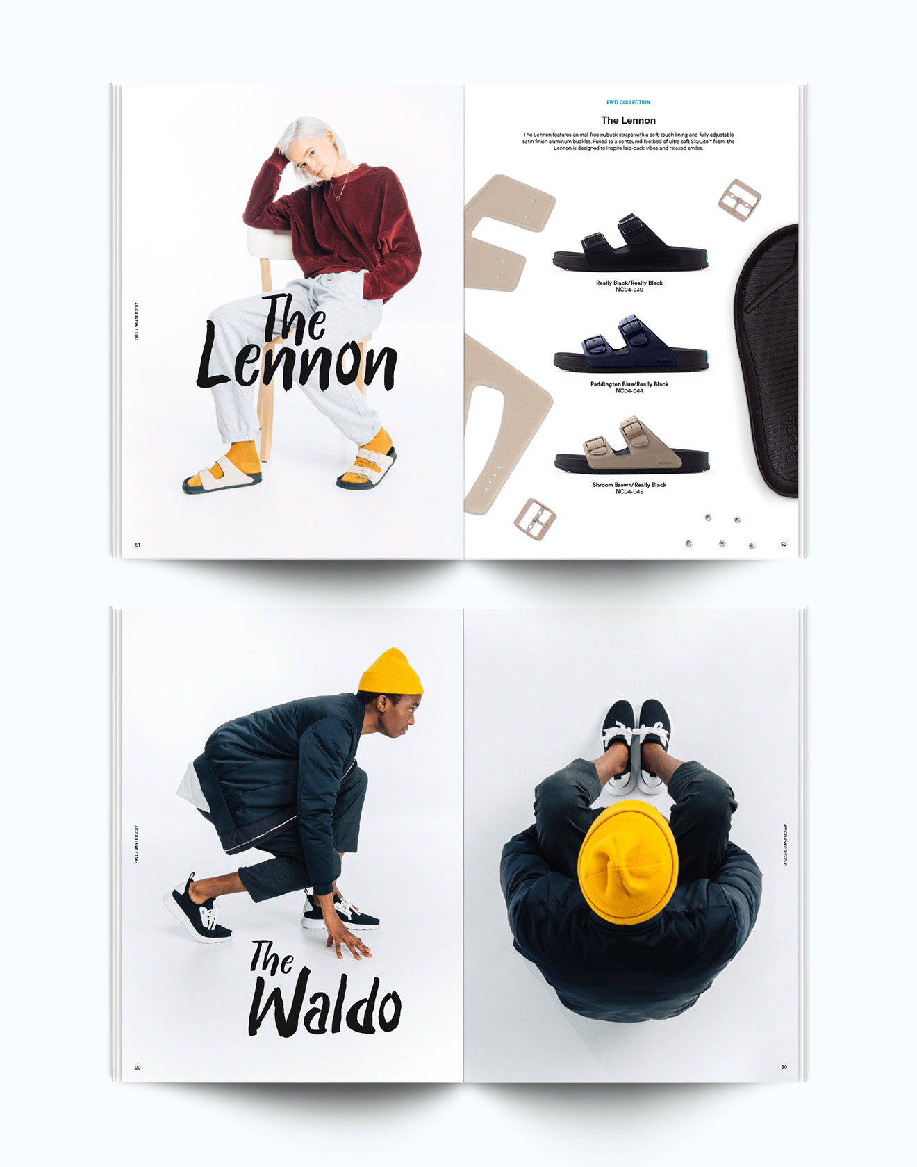
Snippets from smaller projects that were completed recently or as far back as 2015. From creating visual identities for hot rod shops in Western Australia and designing campaigns for Bailey Nelson to dentistry branding and catalogs for People Footwear. Thanks to those who’ve shared opportunities with me, and to anyone that’s still reading this far down.
Read more